Jaguar rebrands, annoys people
The new Jaguar needs to be a whole lot better than the baffling rebrand, which proves there is such a thing as bad publicity, writes CDN editor James McLachlan
We spend a great deal of time at Car Design News talking to designers from established carmakers about how to leverage brand heritage while not falling into retro-inspired pastiche. It is the hardest balancing act to pull off, but, as recent work has shown, it can be done. It requires a deep understanding of your brand, a deft touch and steady nerves. Pastiche is rightly kryptonite to most designers, betraying a lack of imagination, ambition, creativity. Almost better to be original and wrong, than recycle old ideas and hope to capture the nostalgia pound.
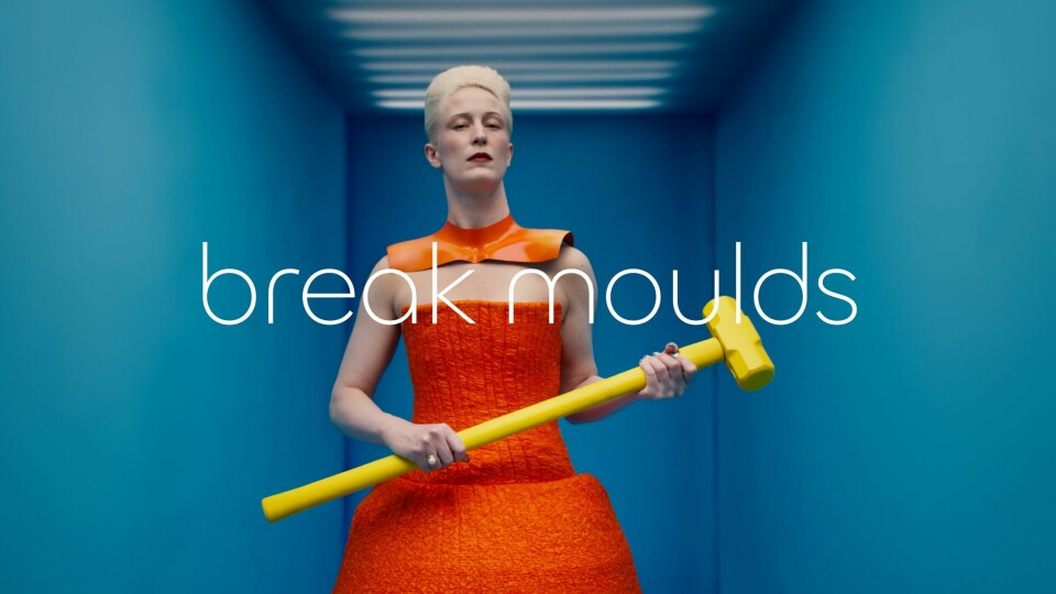
Which brings us to the recent rebrand by one of the world’s most beloved marques, Jaguar, which has missed both of these possibilities and landed in some alternate third space. Jaguar, which has paused all new models until the arrival of its new all-electric line-up is launched, seems to be having the equivalent of a mid-life crisis. In an effort to get down with the kids, the promo video featured joyless androgynous figures swirling in primary colours urging us to “Delete ordinary. Go bold. Copy nothing”.
When you’re a luxury brand being clowned by Aldi, it is fair to say you have missed the mark
That last one is particularly jarring, given the whole show felt like it had been lifted from a high-street fashion ad from 2017. Devoid of wit and, as most observers immediately clocked, anything remotely car-like, it quickly polarised the audience along culture war lines. The progressive midwit take was to pronounce it genius, chiefly because it annoyed Jeremy Clarkson types. And the latter were indeed irritated, denouncing it as “woke”. Incidentally, they also formed the dwindling customer base that was keeping the brand afloat. But who cares about them? They are old and square and probably voted for Brexit anyway, right?

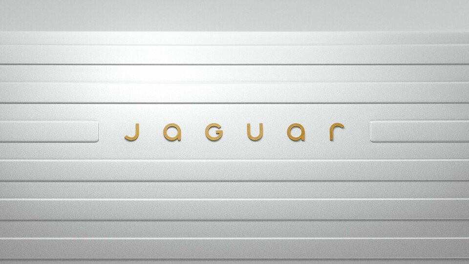
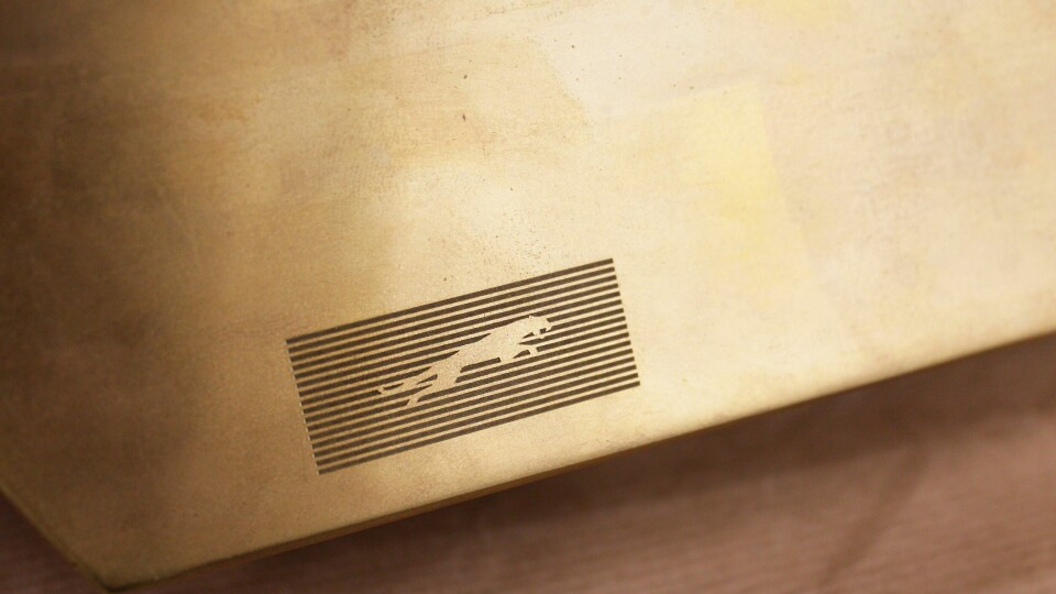
Amid the clamour, the actual rebrand, which is poorly executed, escaped attention. The logo typography now resembles the “mocking spongebob” meme from 2017 by capping up the ‘g’ so it reads “jaGuar”. wHo exAcTly ArE jaGuar mOckIng? Actually, it may inadvertently be themselves because the ’u’ lacks a tail so should be read ‘U’. A textbook graphic design fail. The snarling leaper is still part of the brand identity but has been subsumed into a kind of barcode while the purpose and placement of the lacklustre new rondel, a pair of Js in a soapbar circle, is yet to be revealed.
The backlash has been intense, with everyone from Elon Musk to political commentator Andrew Neil weighing in. The “rage clicks” were off the chart. Unrelated brands also chimed in – when you’re a luxury brand being clowned by Aldi, it is fair to say you have missed the mark.
The XJ-S, which followed on the heels of the timeless beauty the E-Type, was seen as a bit OTT, what with its gaudy flying buttresses. And those desperate to be seen as edgy and progressive have made the equivalent comparisons to this moment, scrabbling for a reference from the company history – a history that the brand itself has chosen to ignore. And that is the whole episode in a nutshell. Jaguar has a history that all but a few carmakers would give their eye teeth for (particularly those in new brands popping up a dime a dozen in China), the carmaker has incinerated it all in search of a customer that no one is sure exists.
All eyes are now on Jaguar , so by that metric the marketing campaign has been a success
Design director Gerry McGovern joked that they “hadn’t been sniffing the white stuff”. Perhaps it might have been better if they had; maybe then we would have seen a campaign worthy of the brand. Imagine an ad that showed a hint of the new form while gently (and affectionately) ribbing the stereotypical ’Jaaag’ owner at the same time, teasing in a younger audience. But that would have required creativity, wit and humour. English traits some would say. Instead we have ahistorical, po-faced sloganeering. Empty doesn’t begin to describe it.
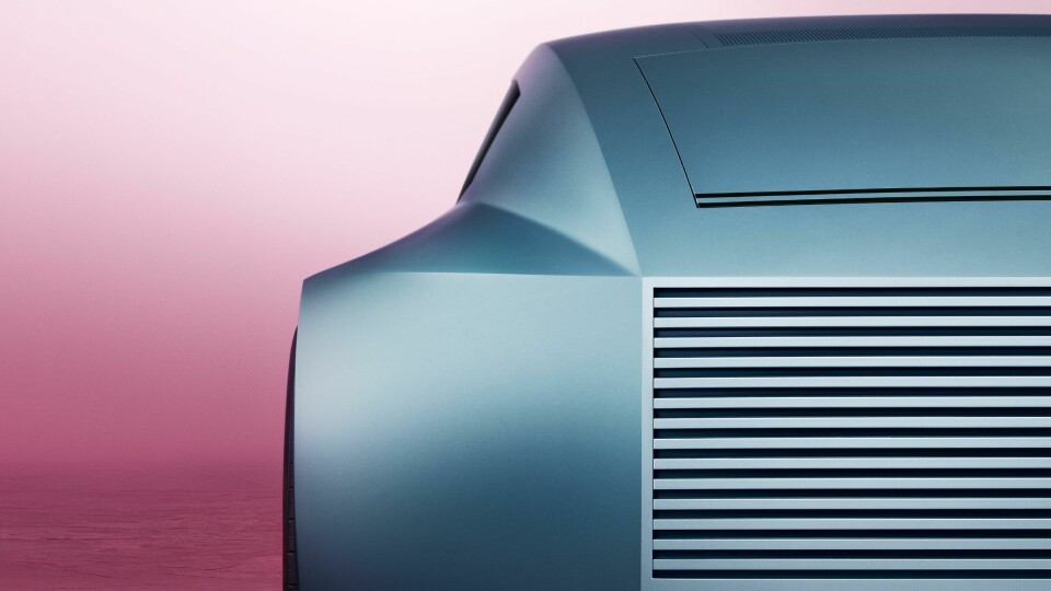
All of this will be forgotten if the car unveiled on the 2 December in Miami is good. From what CDN has seen, there is a strong chance it will be, but anything less than extraordinary will be met with withering criticism. All eyes are on it, so by that metric the marketing campaign has been a success. If eyeballs are all that matters, then well done. But the spectacle has been dispiriting to watch, nonetheless. One wonders how much goodwill has been lost among fans of the marque. It is true that brands might fight against complacency and that occasionally means challenging your customer to think differently about you. But ultimately, these are your people. Probably best to remember that.
