Design analysis: Designing a paint colour
Car Design News speaks to the CMF team at Envisage to delve into the highly specialised area of paint design
How do you design a new car paint colour? Automotive paint is an extremely technical area, also one for which there is very little formal design training. CMF designers may come from a transport design course or else from a fashion or textile design training but neither of these provide any specialist knowledge of paint technology.
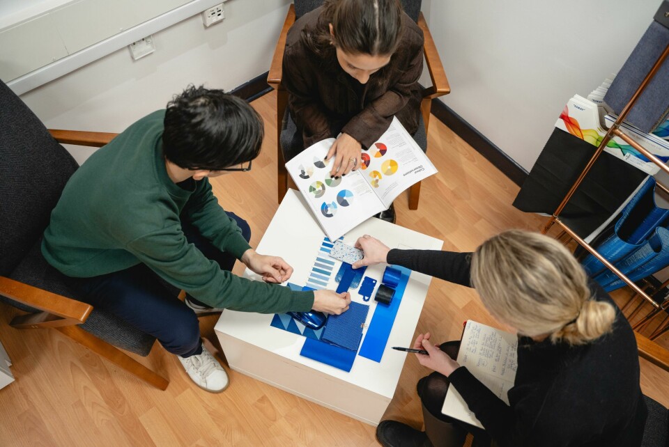
So, what are the starting points? We caught up with the CMF team at Envisage to probe their approach to colour design. ‘We use known fashion trend sources such as [American trend company] WGSN and Colour Hive to help define a colour direction, then use our own trend instincts’ says designer Hollie Rutter. ‘We generate our own trend reports based on what we’ve seen, what materials are there, what colours dominate in the market. We publish that on our Instagram posts, and on the company website.’
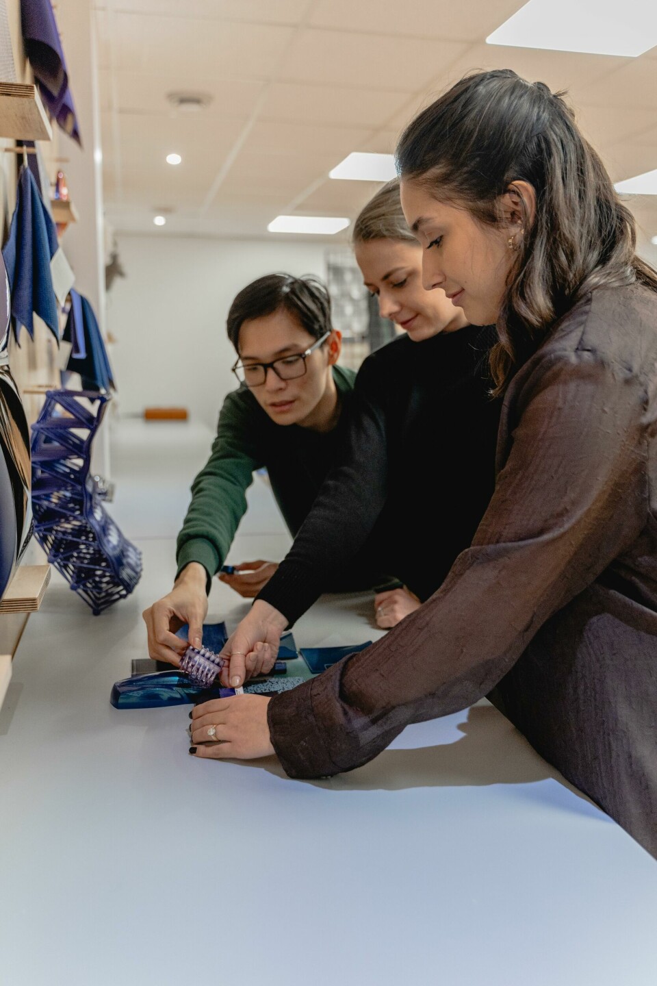
A lot of the CMF work at Envisage is for bespoke projects for individual customers, together with support work for OEMs. ‘We offer CMF support to our clients, including paint development.
Especially show cars and concepts’ explains Alicia Rudeck. For OEM teams, new paint colours fall into categories and a CMF designer will adapt their design approachto suit:
- A staple colour. A colour that is essential to have in the line-up, one of the basic colours that the brand needs to offer to ensure steady sales volumes. Staple colours include neutrals such as a silver metallic, black metallic, a dark graphite grey, possibly a solid or metallic white. These are popular colours that dealers can use for stock orders and will prove ‘safe’ colours for the used market too, less affected by fashion or taste changes.
- A launch colour, or image colour for the car. Typically to support the launch of a new model, the designers would be tasked with coming up with a strong character colour for the promotion and advertising of the car. It is not necessarily important that this colour generates high sales volumes, its role is to create awareness of the car in a crowded market and pull customers into the showroom. If these colours lead to widespread sales then that’s a bonus: a recent example might be the MG4 ‘Volcano Orange’ that has proved popular.
- A lot of colour design is refreshment colour work, replacing a colour after several years, but within the same proven colour area. Colours such as mainstream blues and silvers need regular refreshment for a new model year, or to support a facelift for the car. In this case the new colour does not need to explore a whole new colour area. For example, a dark blue metallic may be refreshed by making it slightly warmer in colour - or slightly greener, or slightly brighter, depending on latest fashion trends - but not necessarily any lighter or darker.
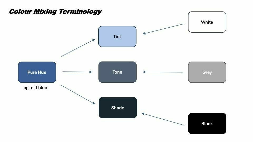
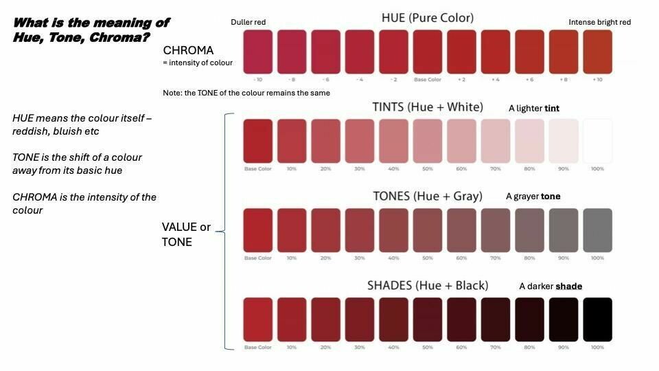
One of the difficulties with colour development is understanding the correct terminology, something where even other studio designers may not be wholly conversant. Hue means the colour itself, Tone is the shift of a colour away from its basic hue and Chroma is the intensity of the colour.
‘It’s more an understanding of the vocabulary, understanding the paint technology. To be able to communicate effectively, to get our point across, is key. We’re lucky in that we can work really closely with our in-house paint technicians,’ says Rutter.
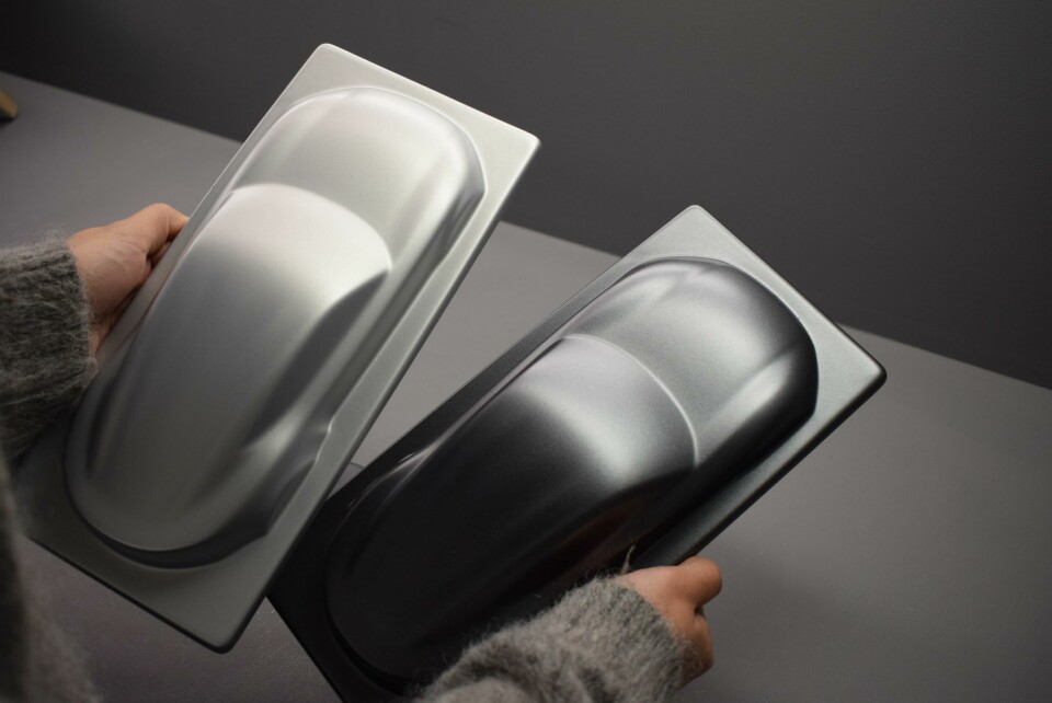
‘Initially we work on the colour area’ explains paint shop manager Joe Duggan. ‘If it’s a Pantone reference or a colour sample we’ll go through all our previous samples to see what’s close for a good starting point. Once the colour is close, then we’ll work on the effect. What effect do you want? There are so many different effects out there. Solid? Pearlescent? Chromaflair? Fine or coarse flakes?’
Metallic aluminium flakes come in six grades from super fine to coarse, whereas mica and pearlescents use non-metallic particles in the mix, again in different grades. Another area is Vacuum Metallized Pigments (VMP) that provide a super-smooth look. It is used on wheels, headlamp cans and exterior trim parts for a chrome look. ‘It’s our most intense process’ says Duggan. ‘You’re almost fully flatting and polishing the body to then simply apply the next colour! But we can manipulate things.’
‘Sometimes you cannot use a metallic’ continues Duggan. ‘We had a car where we couldn’t use metallic particles because of the Lidar sensors, we needed to use pearls. But pearlescent doesn’t have as strong an effect as metallics - so we had to try to get back to the full metallic effect within the mix.’
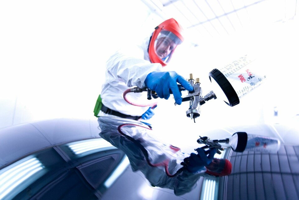
For Bespoke projects, the paint shop work at 20deg baking for all components, as there are many different materials that cannot be warmed-up too much, particularly 3D printed parts.
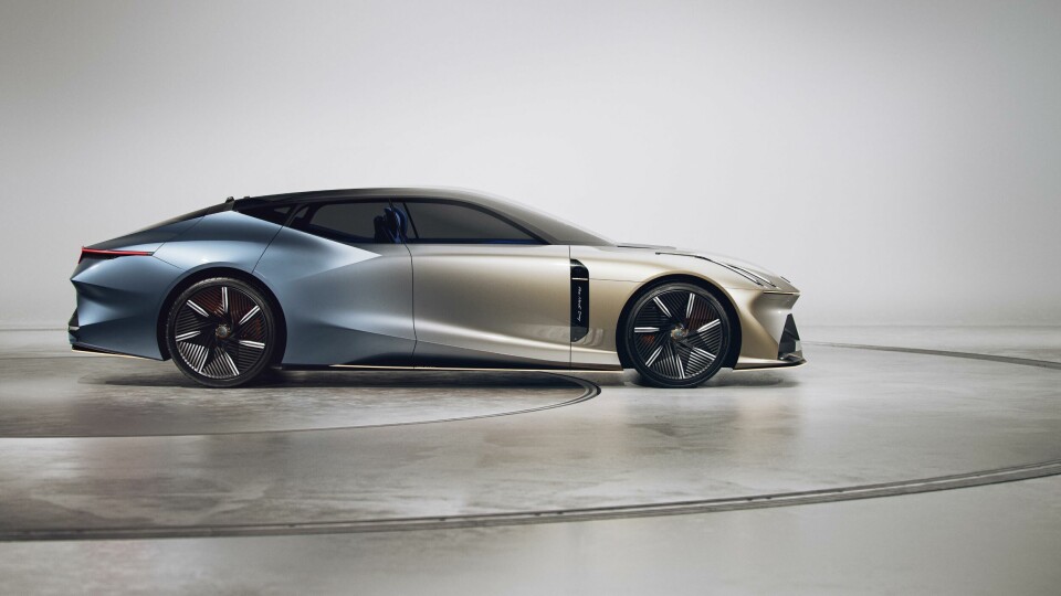
Joe Duggan: ‘Ideally we ask for a starting point, sometimes it doesn’t happen. For the Lynk and Co ‘Next Day’ concept the CMF designer wanted the car looking like the sun was setting. “At the front I’m looking for the golden sun, at the rear the midnight sky. Go away and do whatever you can…” We gave them several options for the front, several for the rear, it’s just a case of starting from scratch sometimes.’
Duggan concludes: ”We try to stay away from the chemistry side of things as we don’t want to complicate things. We understand what the different pigments can do, each pigment sits differently in the mix. We can go down the list and select one that sits at a different angle so we know that’ll reflect the light a bit differently. That’s as deep as we’d go into the chemistry side of things. For a designer, it’s a case of “I have this vision, how do I get it there?” We assist with that.”