All articles by Alex Orwin – Page 2
-
Article
Design Review: Renault Espace (2015)
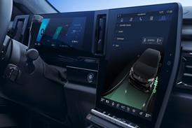
Touchscreens in cars are a contentious area, and as a general rule we are not fans of the breed. When we saw the sudoko and aquarium display on the Espace in Paris, we weren't sure whether to laugh or cry. Yet there is something amusing and playful about this side ...
-
Article
Design Review: Renault Espace (2015)
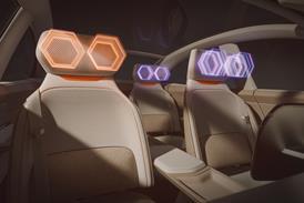
1. Brave new worldThe interior was the Espace's raison d'etre. And the feel in here is markedly different to before. There appears to be much less light inside due to the shallower DLO, although a new, extended windscreen will somewhat offset this in daylight, and the focus has moved from ...
-
Article
Design Review: Renault Espace (2015)
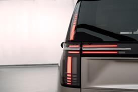
1. La derrièreWhile some manufacturers continue to struggle with their front-end graphics, Renault deserves credit for developing such a strong rear brand identity, the Espace following where Clio and Twingo have led.
-
Article
Design Review: Renault Espace (2015)
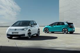
1. French Volkswagen?The huge diamond is a useful anchor here. Without it, the DRG, with its strong horizontal feature lines running from lamp into grille and with hooded brow, is getting close in appearance to Volkswagen's new corporate face.
-
Article
Design Review: Renault Espace (2015)
First seen 2014 Paris Motor ShowVehicle type MPV crossover
- Previous Page
- Page1
- Page2
- Next Page

