
Modern of the moment aesthetic
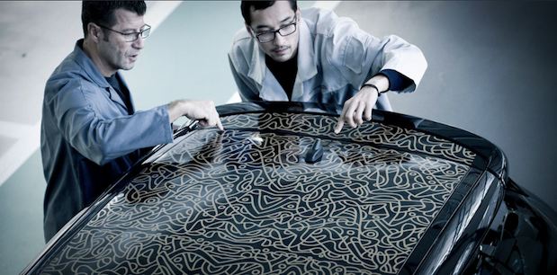
The use of graphics, color breaks and decals give the DS3 its modern feel that separates it from the Mini.
There are none of the twee union jacks and chequered flag graphics that characterize (or afflict, depending on your view) the British car. Instead Citroën has created a more urban, edgy aesthetic so the DS3's aesthetic relates more to modern street culture; clash colors, graffiti graphics and clothing apparel-like decals.
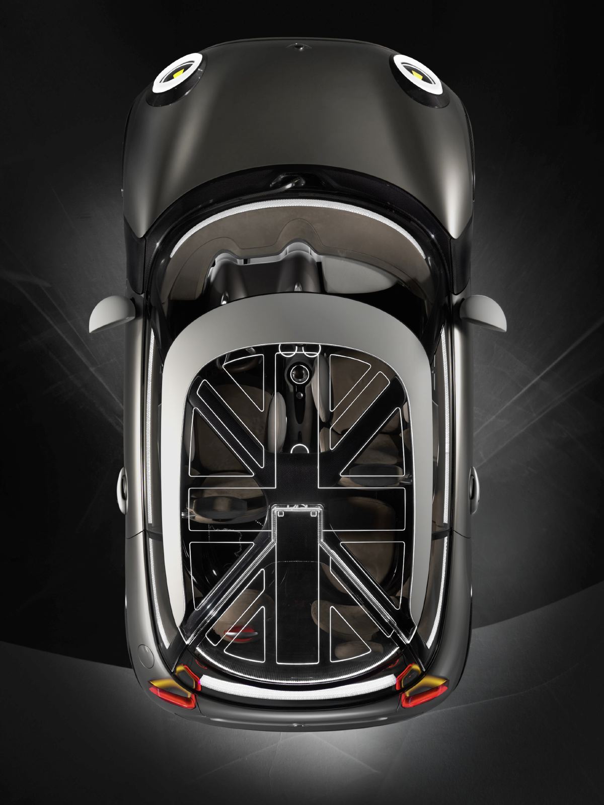
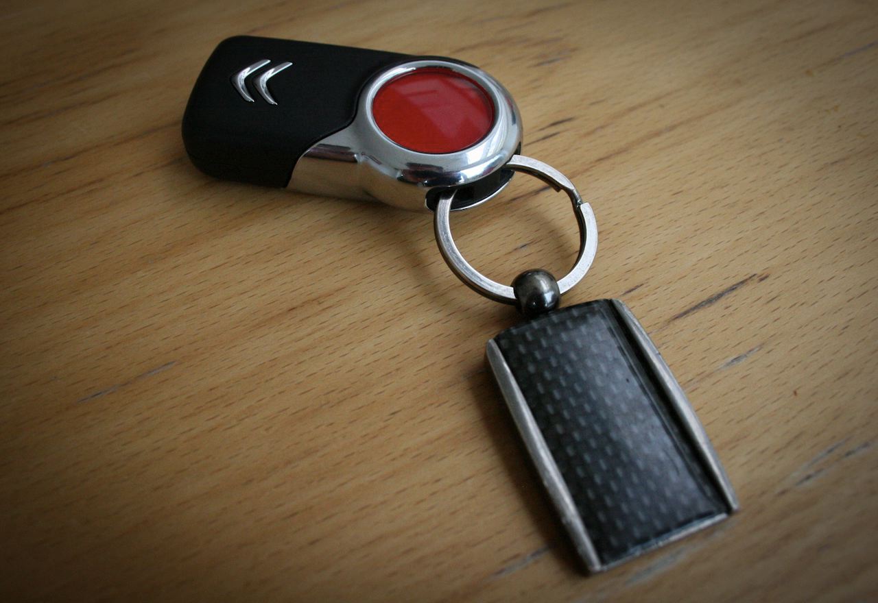
This sits harmoniously with the 'Anti-Retro' message Citroën has sold the car on, which is cleverly judged: it has positioned the DS3 relative to Mini in the customer's mind, but by throwing away its cultural baggage and jingoistic design rhetoric, suggests a greater degree of modernity.
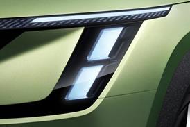
The detail elements - particularly the day-time running light strips and shark-fin pillar, further bring something new and help position the DS3 in the modern lexicon.
Design in the real world
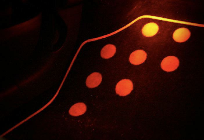
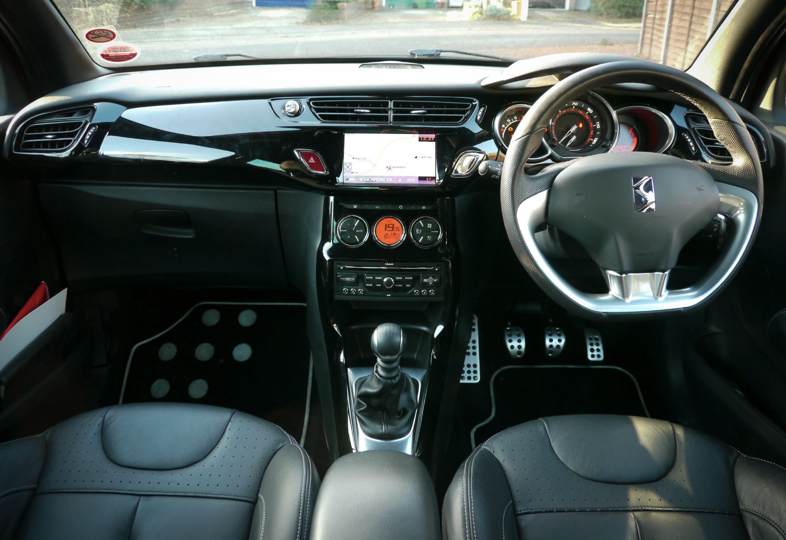
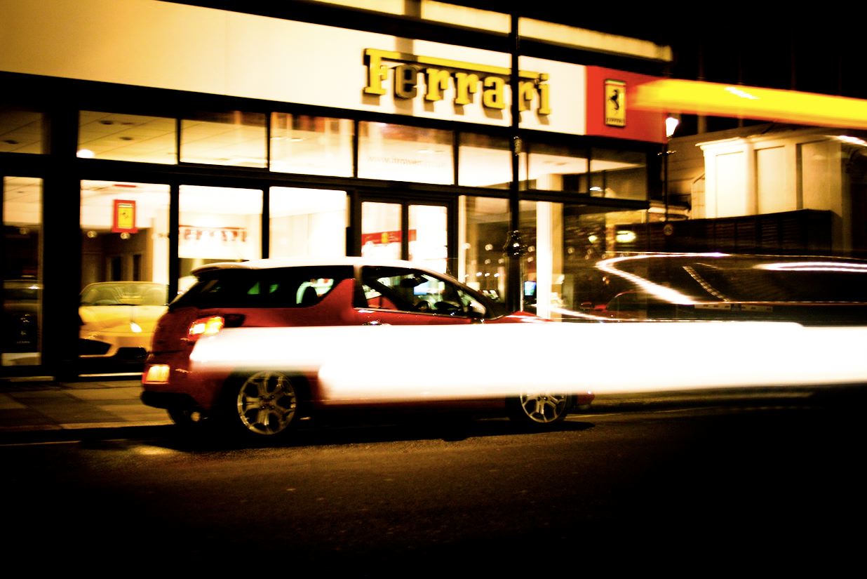
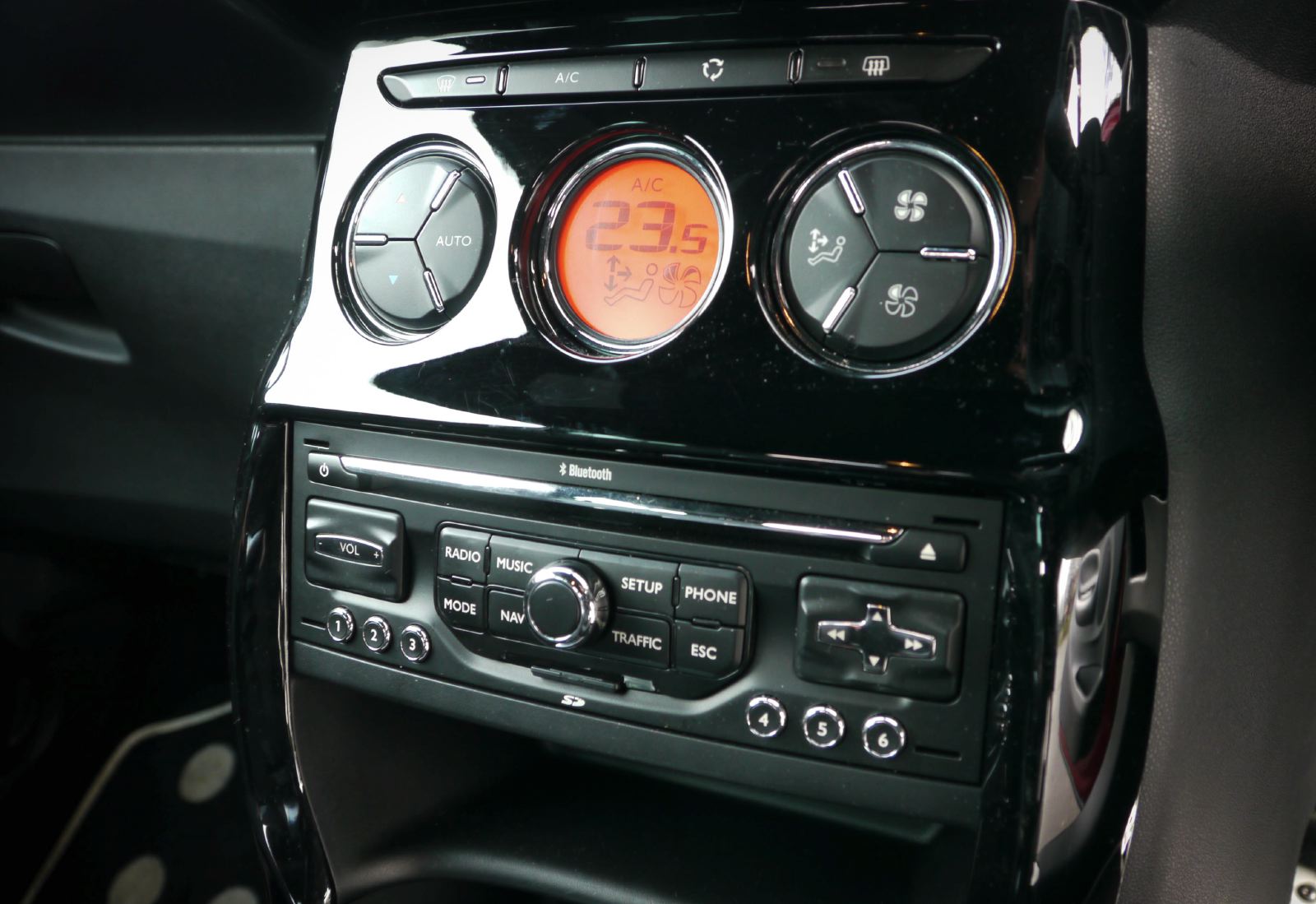
On the street, the car attracts real attention, particularly from urban 17-25 year olds. Its design strategy also creates an unprecedented level of showroom appeal. The way decals transfer through to elements such as carpet mats, the LEDs that reference Audi and the tactile, gloss surface of the upper IP and deep dishing of the speedo initially create a sense of special-ness. But over time, this sheen wears off. You notice how poor the quality of the lower IP plastics are, become frustrated by the un-intuitive infotainment set-up and the lack of standard in-car 'phone and music connectivity. And the seat position, view ahead and cowl point are all pure C3.
This strategy of ‘skin-deep' design is clearly paying off in sales and for that we applaud Citroën's approach. Yet ultimately this strategy is limited. The color and trim palette will need constant updates to avoid aging and when more competitors inevitably begin to ape the DS3's (and therefore the Mini's design/personalization approach), this car's raison d'etre will become much less clear.
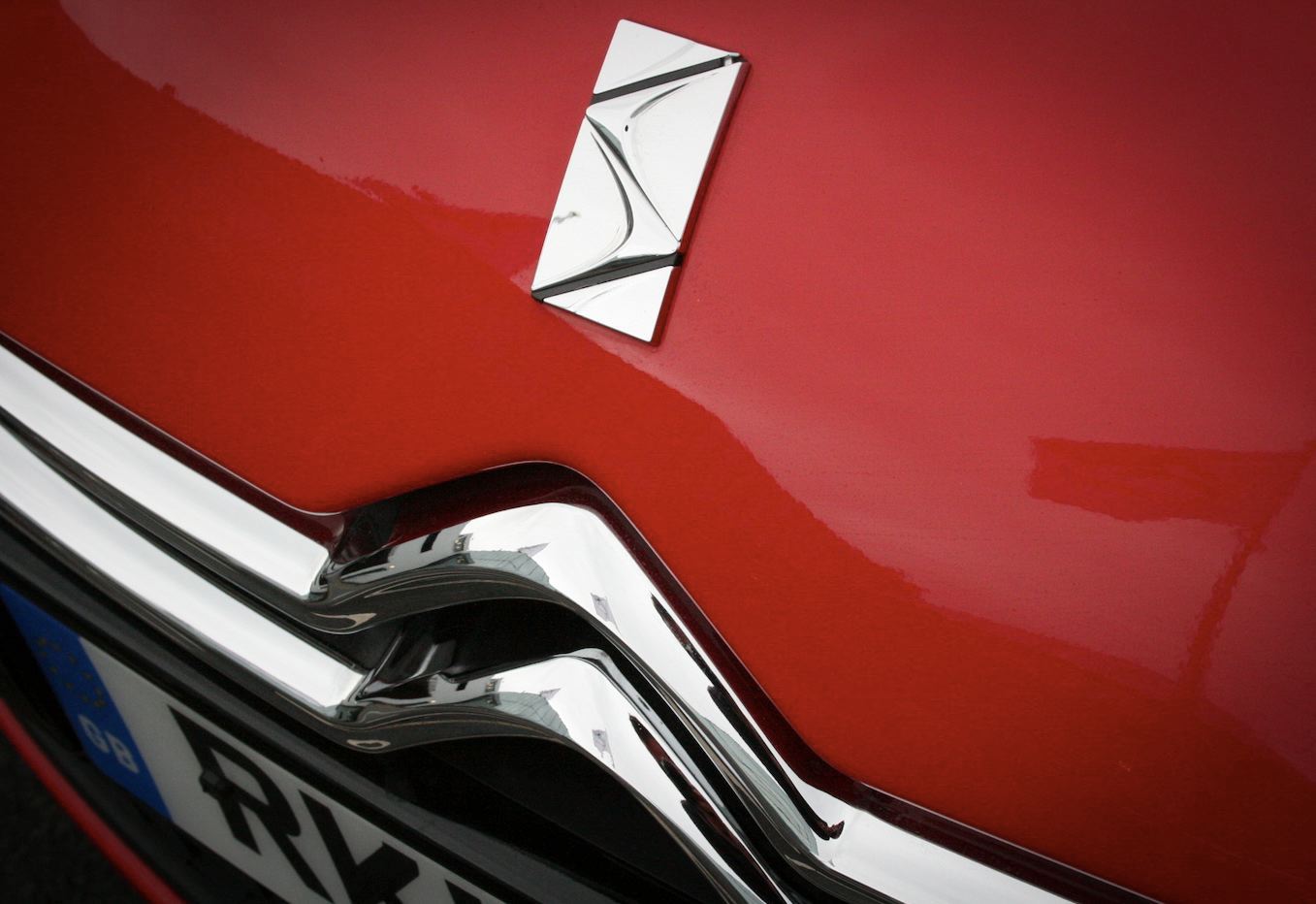
The 'DS' branding is also unconvincing and we'll be interested to see how and if Citroën evolves this. For us, this car doesn't have the single-minded focus of a traditional hot hatch such as the RenaultSport Clio 200. Nor, as a premium, special-feeling object, the Mini's rewarding proposition and depth-of-quality which stand out over the longer term.
The question is, to the customer, whether this matters. As designers, we look at cars in a specific way, but ultimately Citroën is providing great apparent value, and the features and choices the consumer wants right now.
While the DS3 remains a scarce site, with comparatively few competitors, it therefore has appeal. But with further DS models to come, and a host of premium and new-typology competitions hitting the market, we wonder if the DS3 will ultimately be consigned to becoming last year's fashion accessory.

