

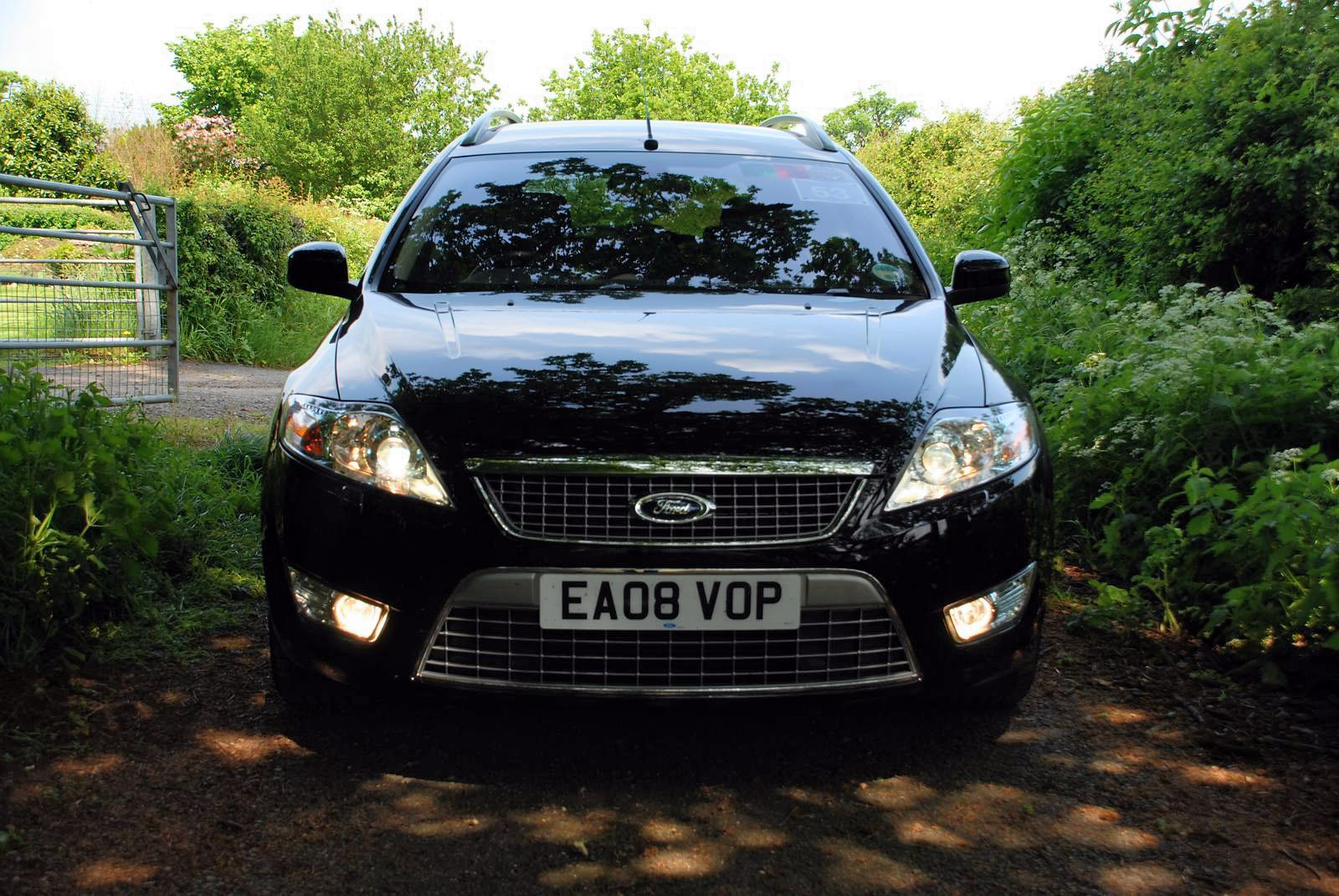
Your impressions when looking at, getting in, and driving an unusual classic or sports car, are strong and distinctive. The value the design delivers is clear to see - the peaks and troughs of consuming the design are explicit.
With a car such as the new Ford Mondeo the peaks are lower, and the troughs are shallower. This has to be the case; it is a mass market large family car, a car that will be used throughout Europe by a broad range of user for the everyday roles demanded of most 'normal' modern cars.
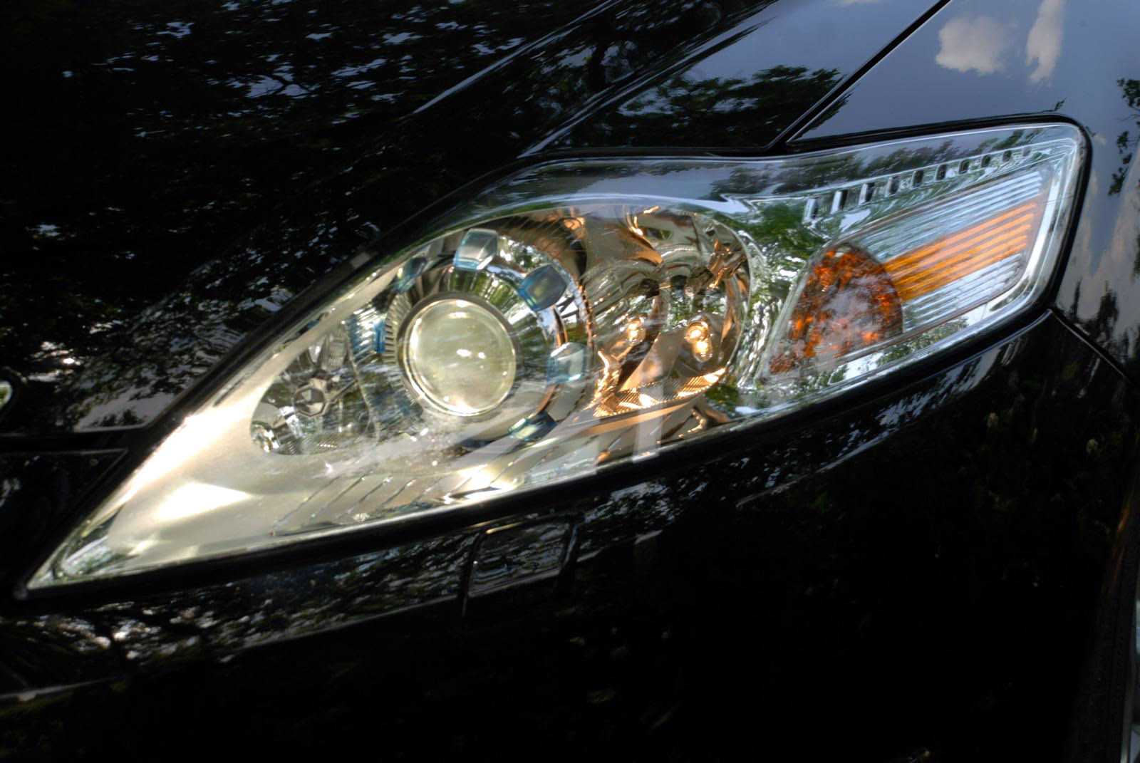
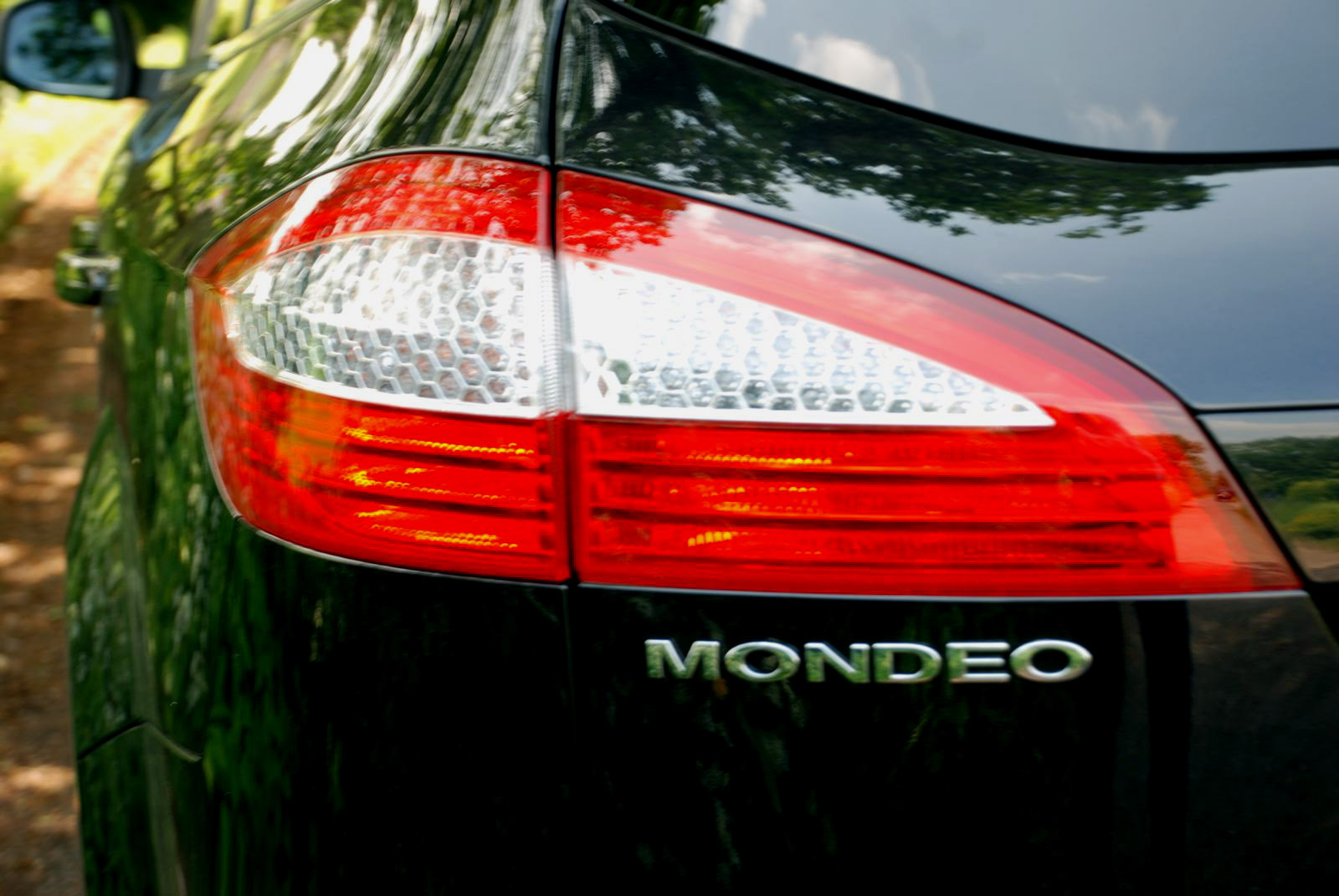
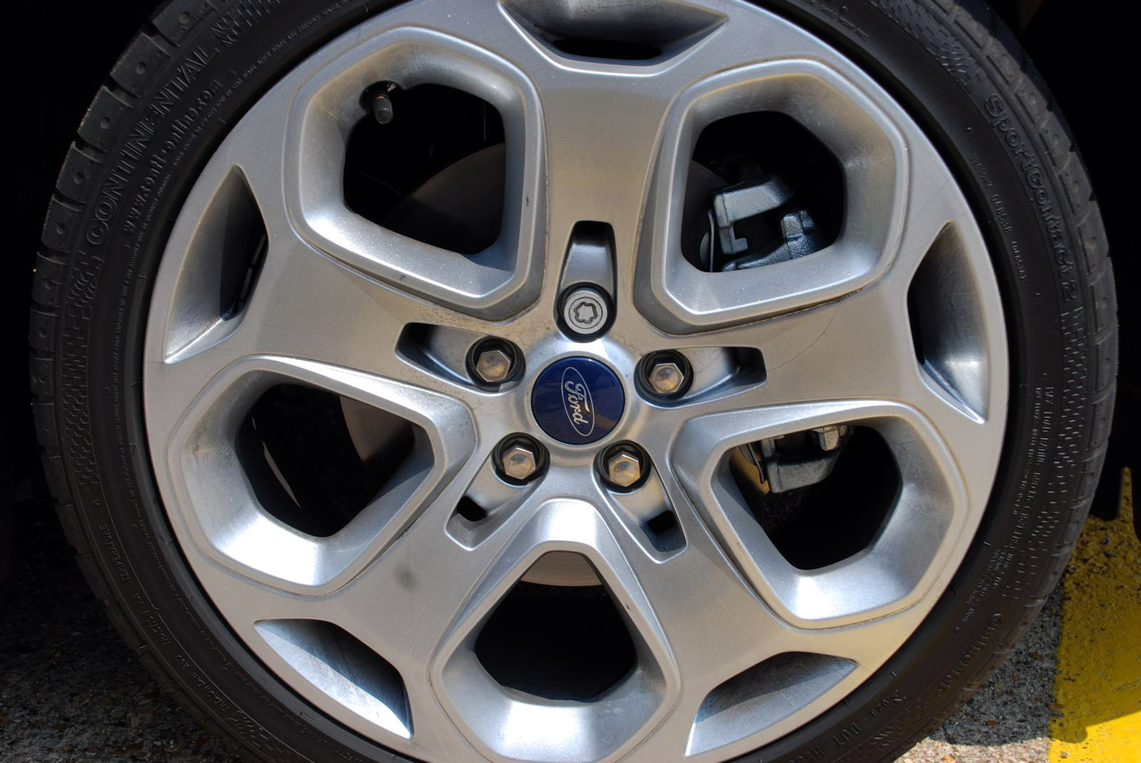
But the design of this Mondeo is interesting because of this, not despite this. The core challenge for the Ford design team was how to balance delivering a distinctively engaging design with being acceptable to as much as possible of the broad target profile of potential buyer. This is perhaps the biggest unspoken challenge for today's vehicle designer.
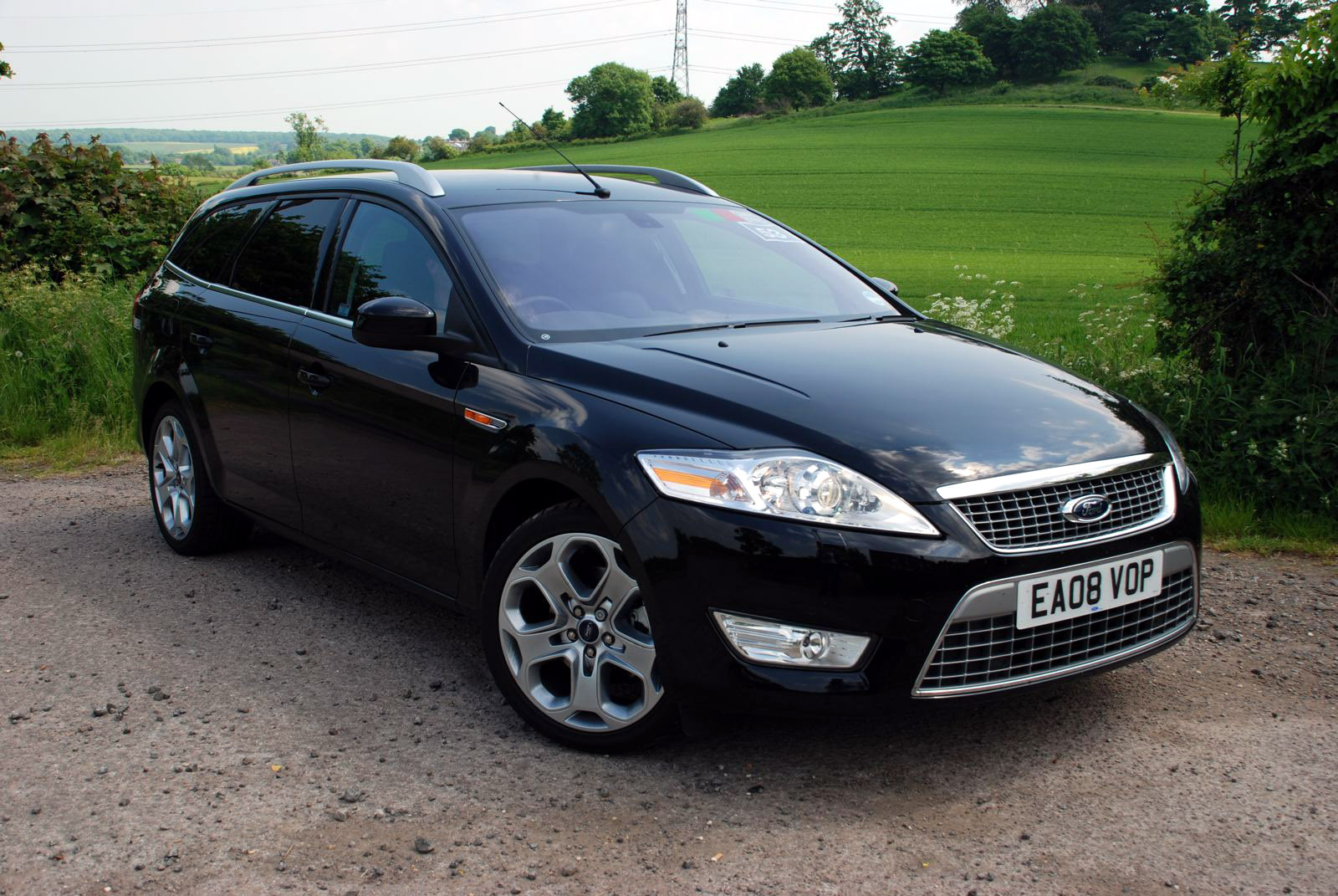
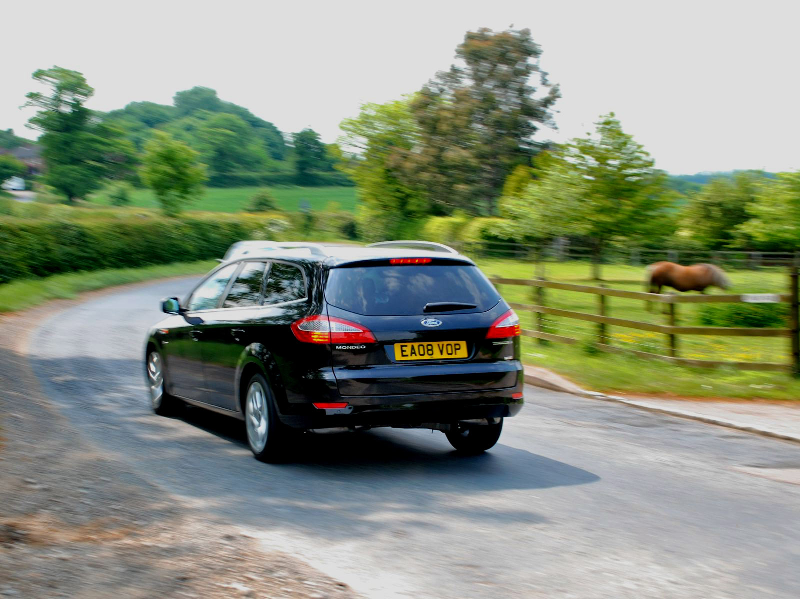
We had a week with a top of the range, fully loaded, Mondeo wagon (there are sedan and a hatchback variants also). The wagon version was the first of this third generation Mondeo to have been previewed by the Ford Mondeo Wagon concept at the 2006 Paris Auto Show as it is the largest selling variant in the mainstream brand upper medium European market sector - and perhaps also because it is the most attractive variant.
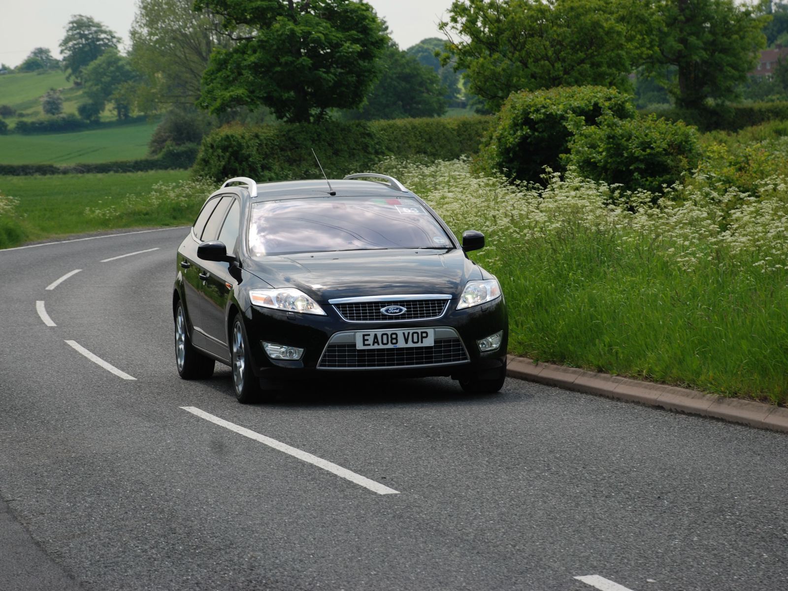
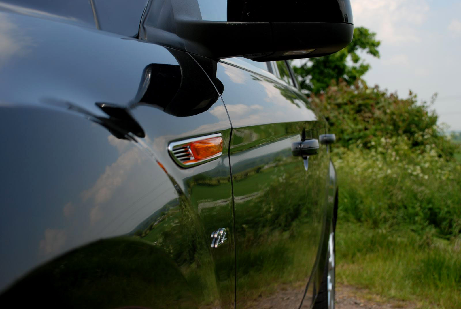
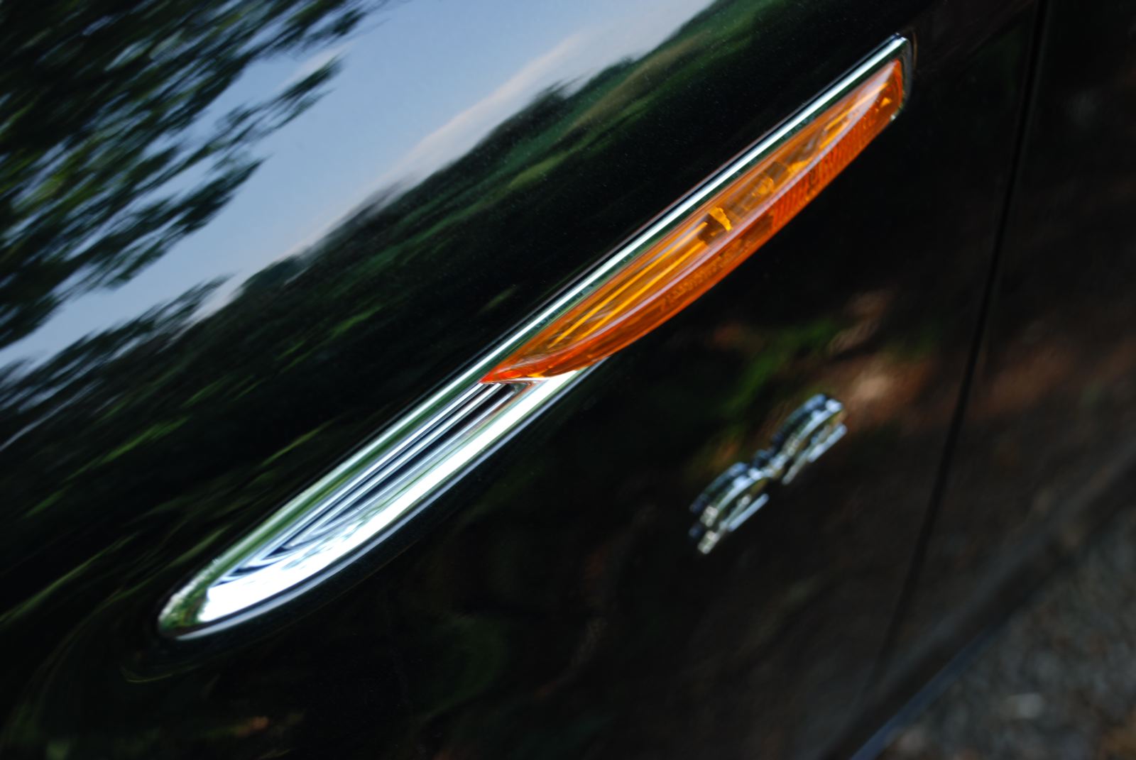
There are two strong impressions that the Mondeo makes. The first is in its form; a large, handsome, dynamic estate car, with a notably assertive demeanor. Our car in particular - with its large 'son of Iosis' alloy wheels, light metallic finish and privacy glass - had a keenness that suited its aggressive DRG and dynamic form language. Through its exterior design, the Mondeo proves how successful Martin Smith's 'Kinetic Design' form language is in making an ostensively prosaic type of car adopt so much 'attitude'; our Mondeo was universally recognized as making a distinctive and appealing statement, and the CDN team were unanimous in thinking its proportions balanced and its surfacing faultless.
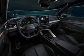
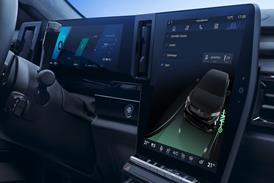
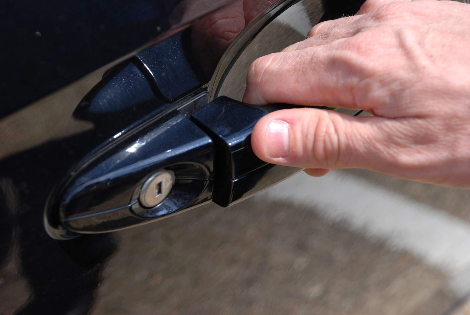
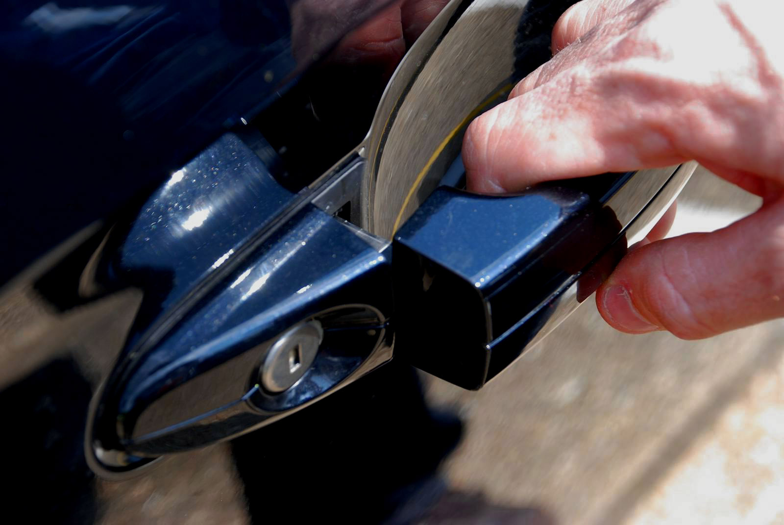
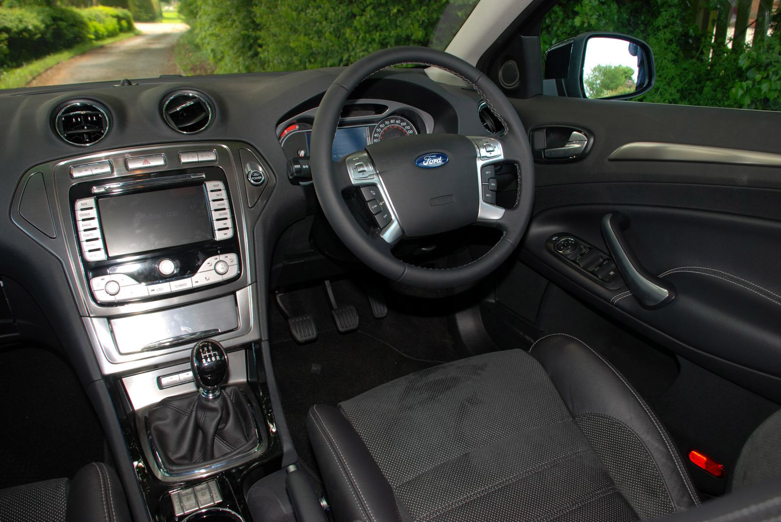
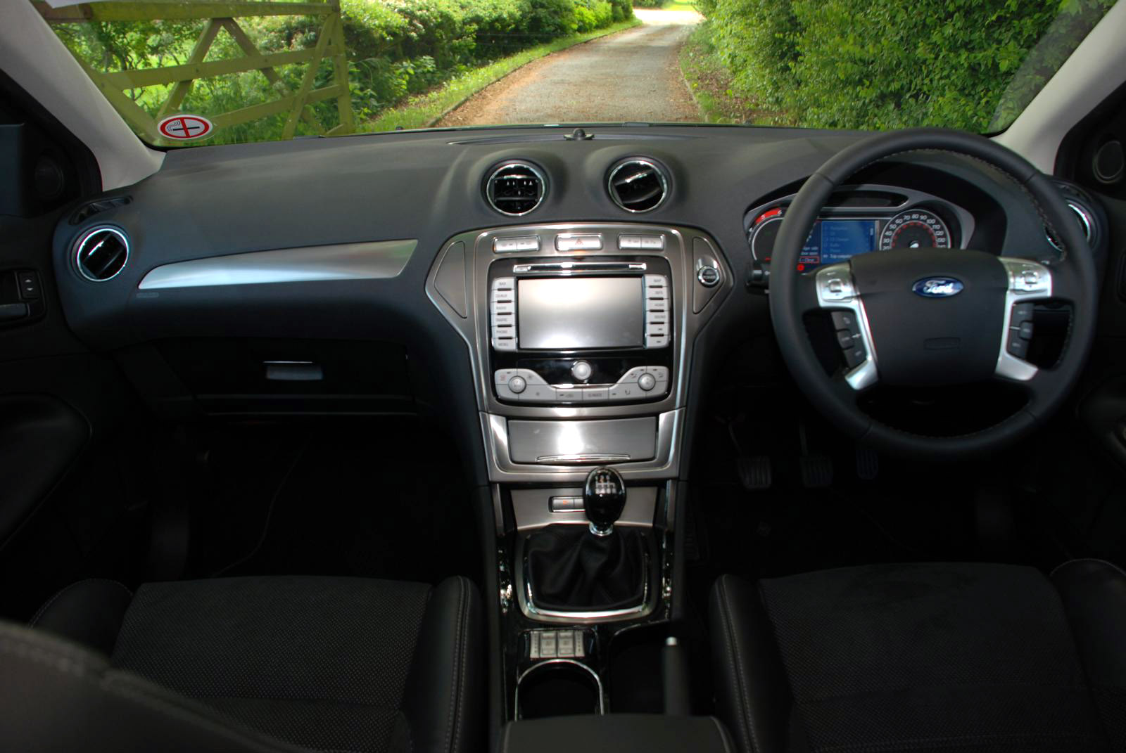
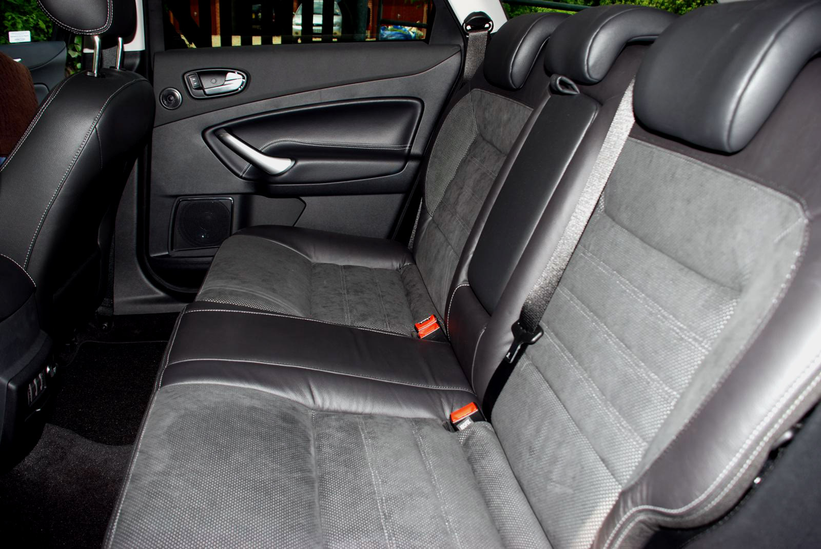
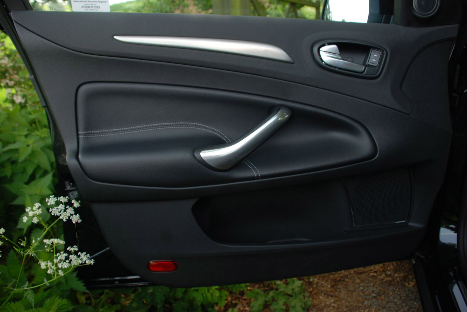
After the 'shaking hands' experience of opening the doors - a slight amount of 'stiction' adding to the low rent feel of the large square-ish section lightweight door handles - the interior makes the second impression. Like the exterior, it is faithful in theme to the Iosis concept. But relative to competitors such as the Renault Laguna, Citroen C5, and premium brand upper-medium designs, it lacks an apparent depth of consideration - there are no clever or subtly finessed details. Initially this doesn't matter so much, the Mondeo is commodious and comfortable, and its driving performance is exemplary - in particular its ride, handling and refinement mix. But after a week with the car you begin to resent that Ford has failed to put any God into the details of the Mondeo; it feels like a car designed quickly and with a focus on showroom appeal, not on fostering a strong relationship with its users.
Ultimately the third generation Mondeo design successfully balances a distinctively engaging design with being acceptable to many people. The core ‘Kinetic Design' philosophy has proven itself in this respect, and in the way it genuinely relates to the driving experience: the Mondeo looks like it drives. What perhaps needs to come next is a new level of depth and subtlety to build a stronger relationship with its users - perhaps the second biggest unspoken challenge for the modern car designer. And we think Ford should start with a better handshake.
Related Articles:
Paris Motor Show 2006 - Highlights
Design Review: Ford Iosis ![]()
Designer Interviews: Martin Smith, Design Director, Ford of Europe ![]()

