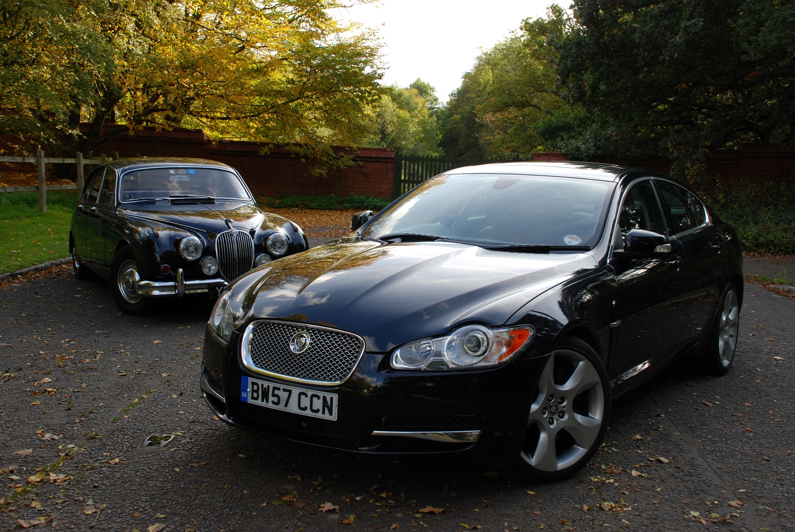
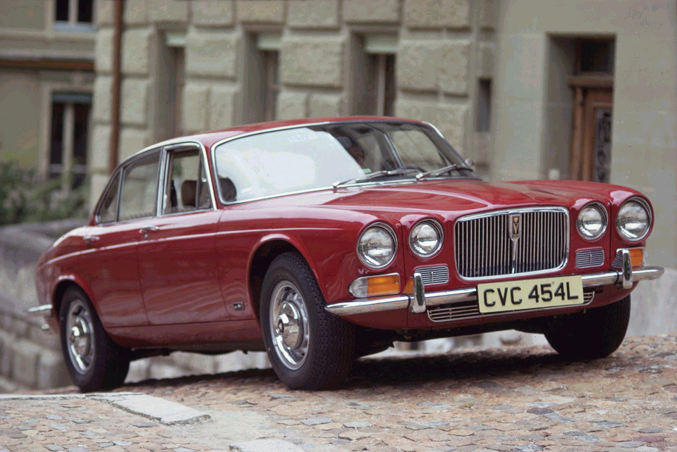
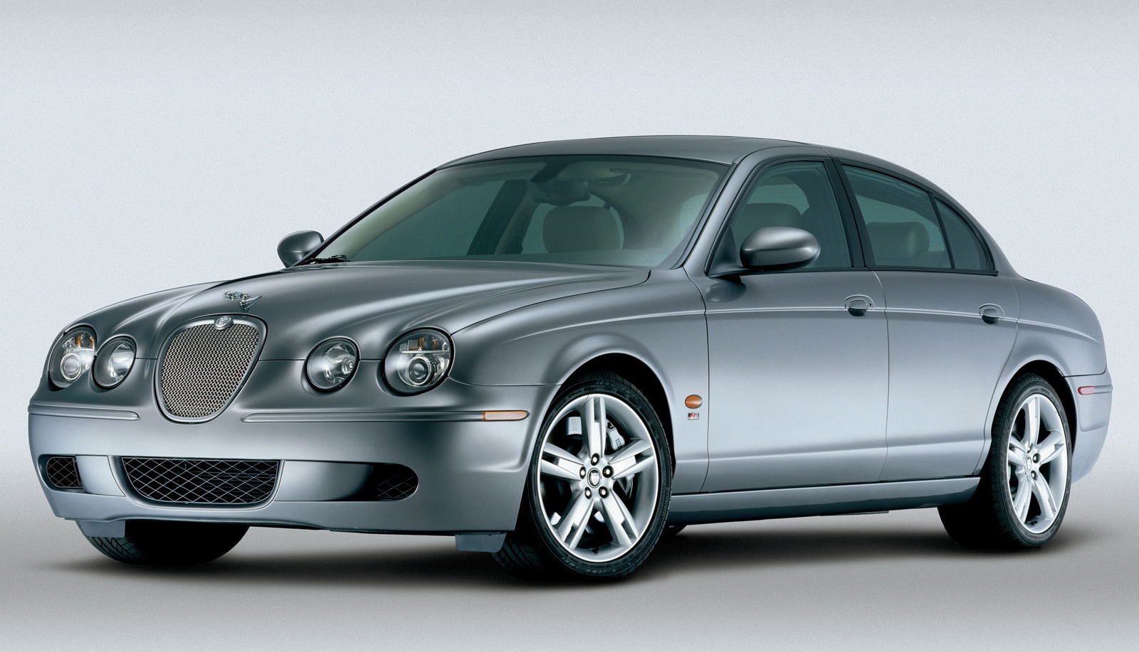
It is possibly harder to design a Jaguar than any other premium car brand. The essence of the firm's highly regarded design language is over 40 years old with the shadow of the 1961 E-type and 1968 XJ6 - and even the 1955 Mk1/1959 Mk2 - looming large. For decades the design group has taken cues from these old designs and reinterpreted them to appease the traditionalist Jaguar customer, but in doing so they have reinforced the 'old-man' image of Jaguar and pushed many customers to Audi, BMW and Mercedes-Benz.

With the XF, which replaced the S-type last year, Jaguar aims to change that stogy perception of the brand, and the company is taking a new strategy; one that rejects Jaguar classicism and creates a new meaning of 'Jaguarness'.
Competitor, but not a classic Jaguar
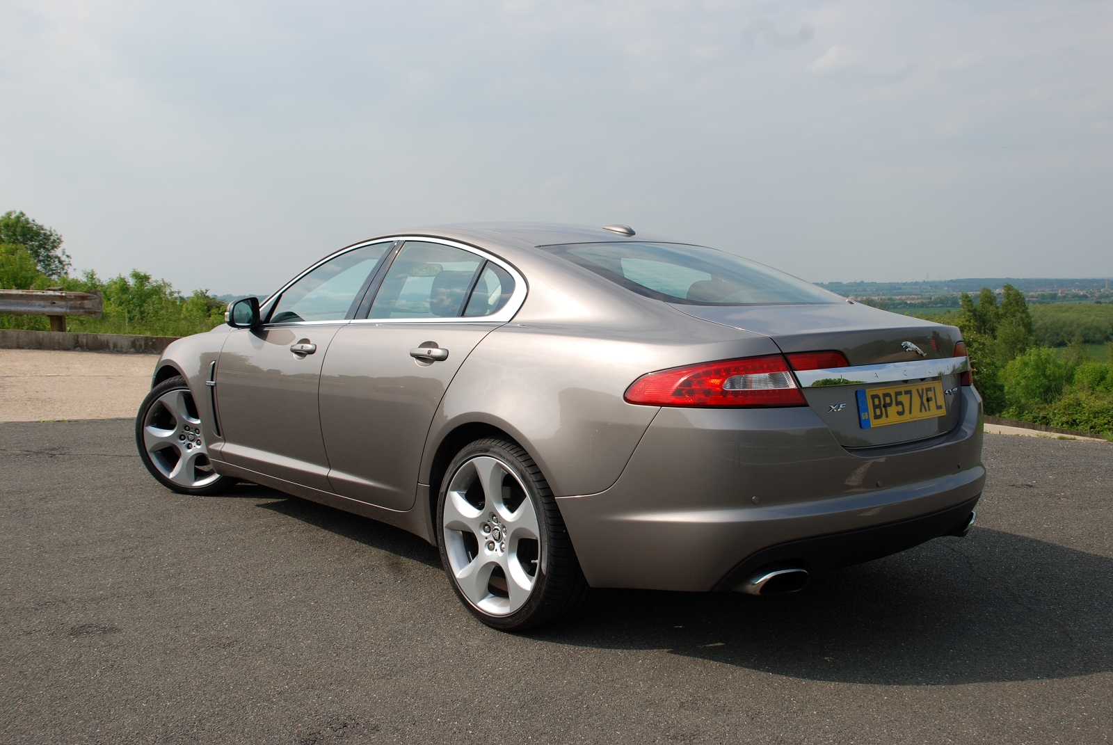
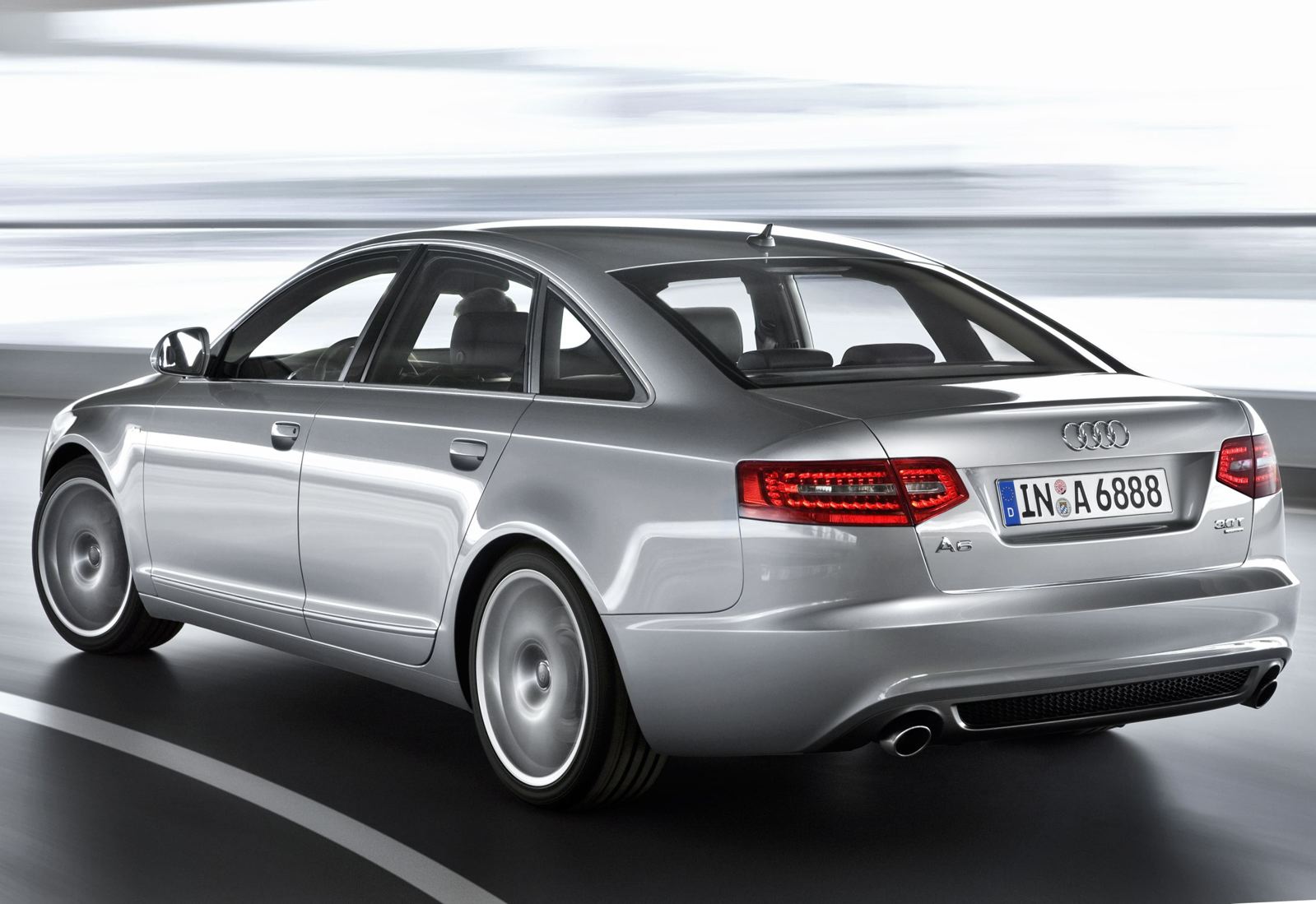
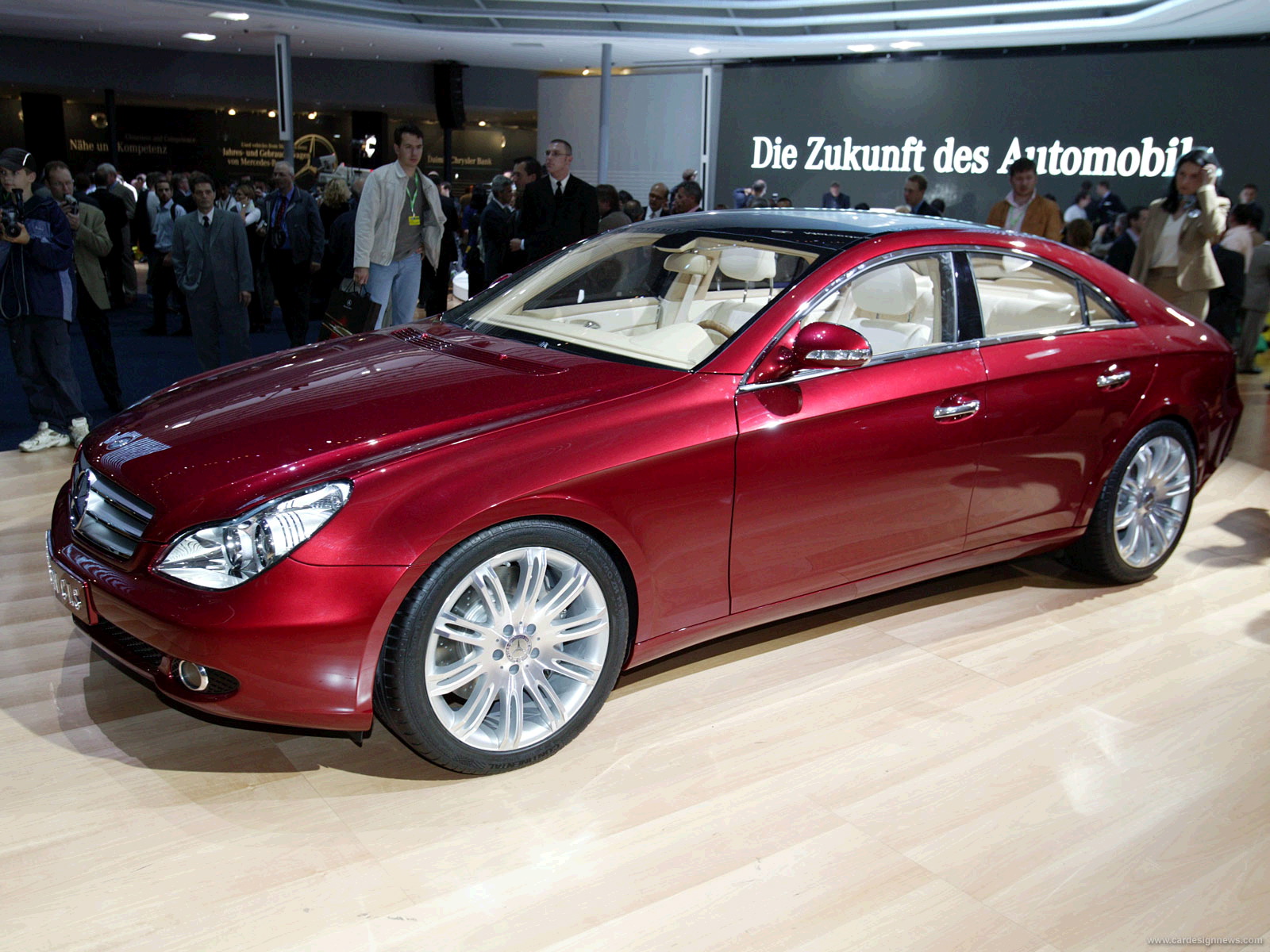
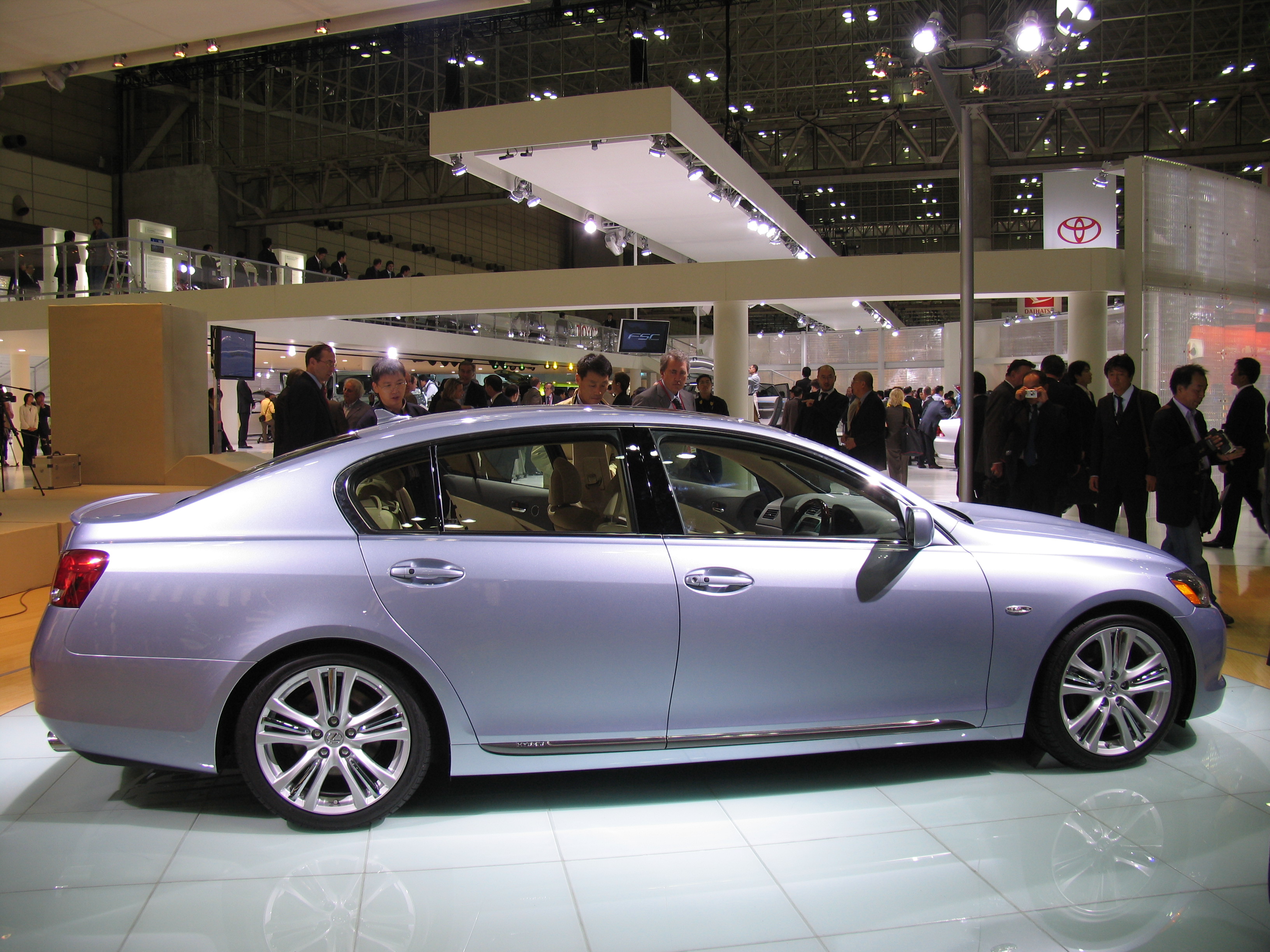
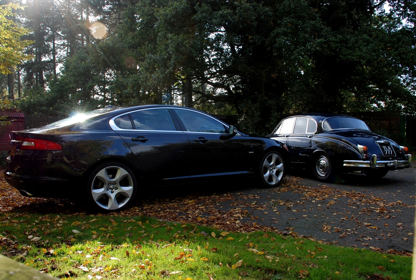
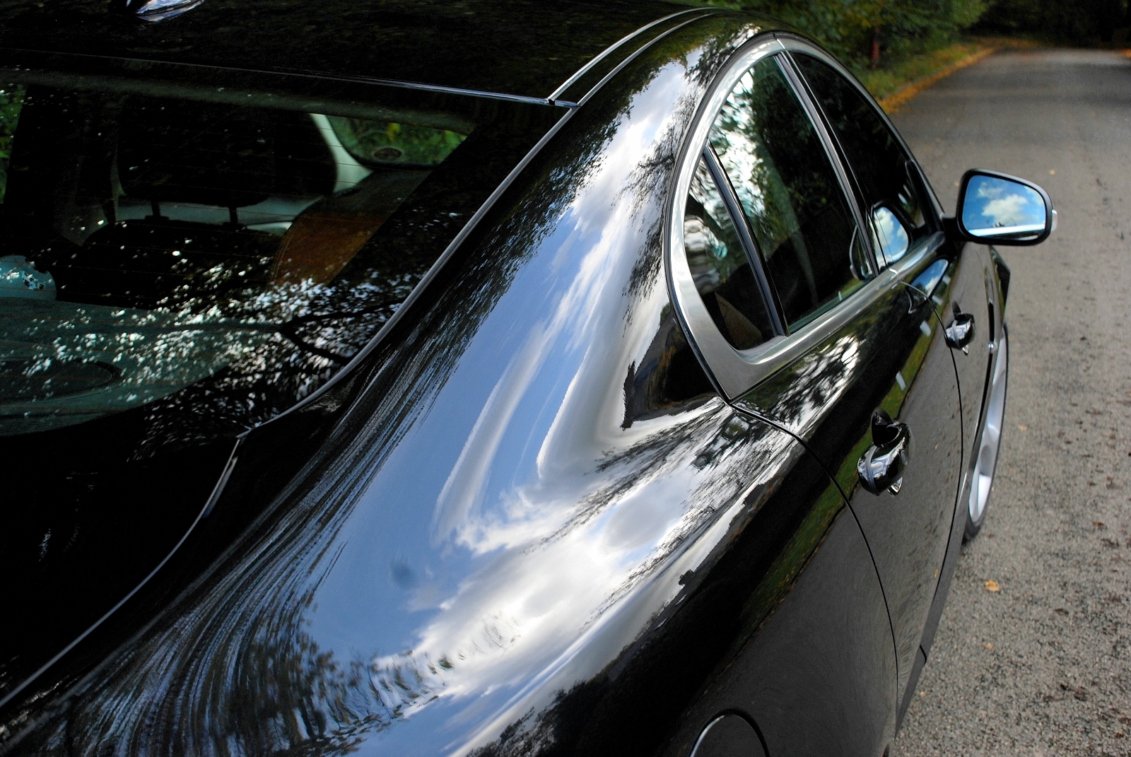
We showed our black XF on its 20-inch wheels to many people, and universally their first impression was that the XF is a seriously svelte 'executive' car: a new competitor to the Audi A6, BMW 5 series, Lexus GS and even the Mercedes CLS. Interestingly, no-one took issue with the car not being more like other Jaguars or the S-type it replaces.
Svelte, but slightly generic
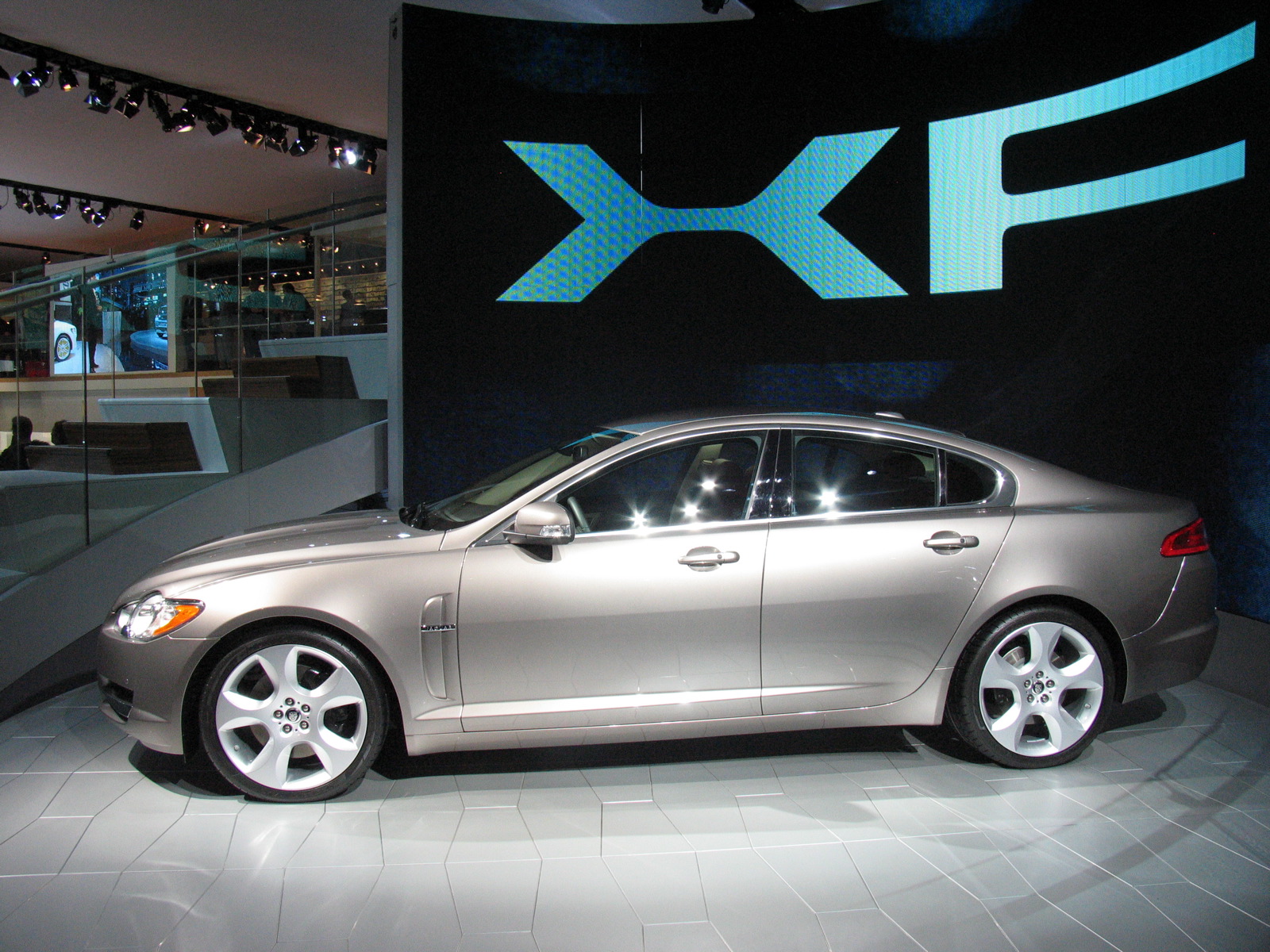
The most critical response to the XF that we consistently heard was slight but significant; that it made rather a quiet statement. This stemmed mostly from its generic proportions (several designers mentioned the Lexus GS as having a similar profile) and, to a lesser extent, from its calm surfacing and lack of adornment.
Assured except for its expression
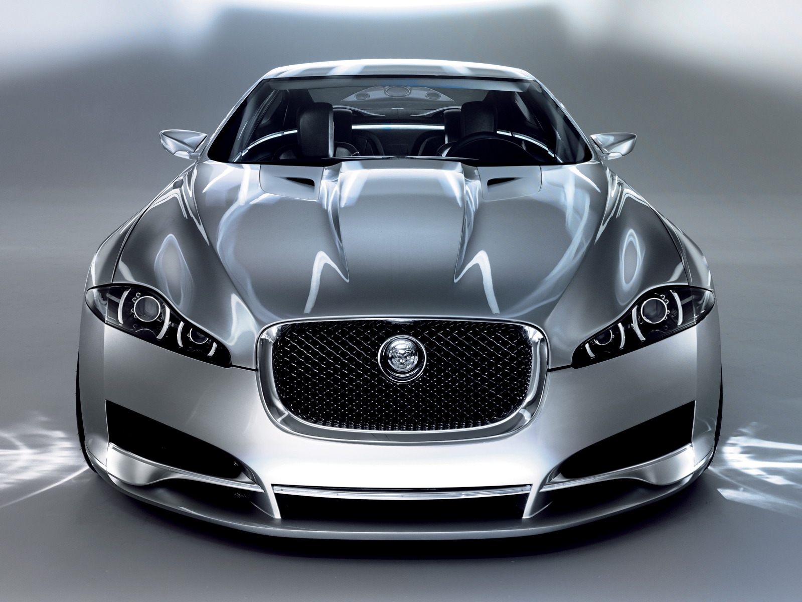
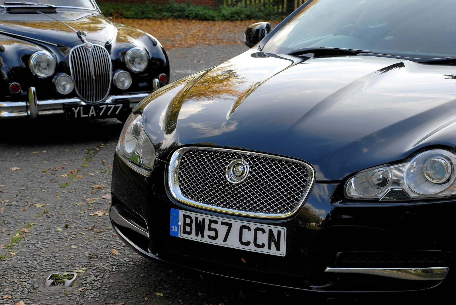
With a high shoulder, long DLO and cleverly managed rocker area to reduce its visual depth in elevation - and on our car's massive wheels that literally knobbled its ride - the Jaguar is effortlessly sleek and assured; except at the front. Its headlamps look slightly too tall (although this is perhaps because we can't forget its concept precursor, the C-XF) and look cheap up close. Fundamentally they have a 'Roger Moore raised eyebrow' graphic, a quizzical or surprised expression at odds with the rest of the car.
Without a hint of retro-design
The first medium-sized Jaguar was the MK1 of 1955, which ushered in new dynamic proportions for a luxury sedan. The 1998 S-type that the XF replaces borrowed heavily from the Mk1 née Mk2-based 1963 S-type in its aesthetic. But the XF emphatically does not reference old Jaguar designs. Instead it embraces the spirit of its 50 year old ancestor in having a progressive yet essentially Jaguar aesthetic.
Event quality, not total quality
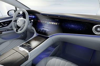
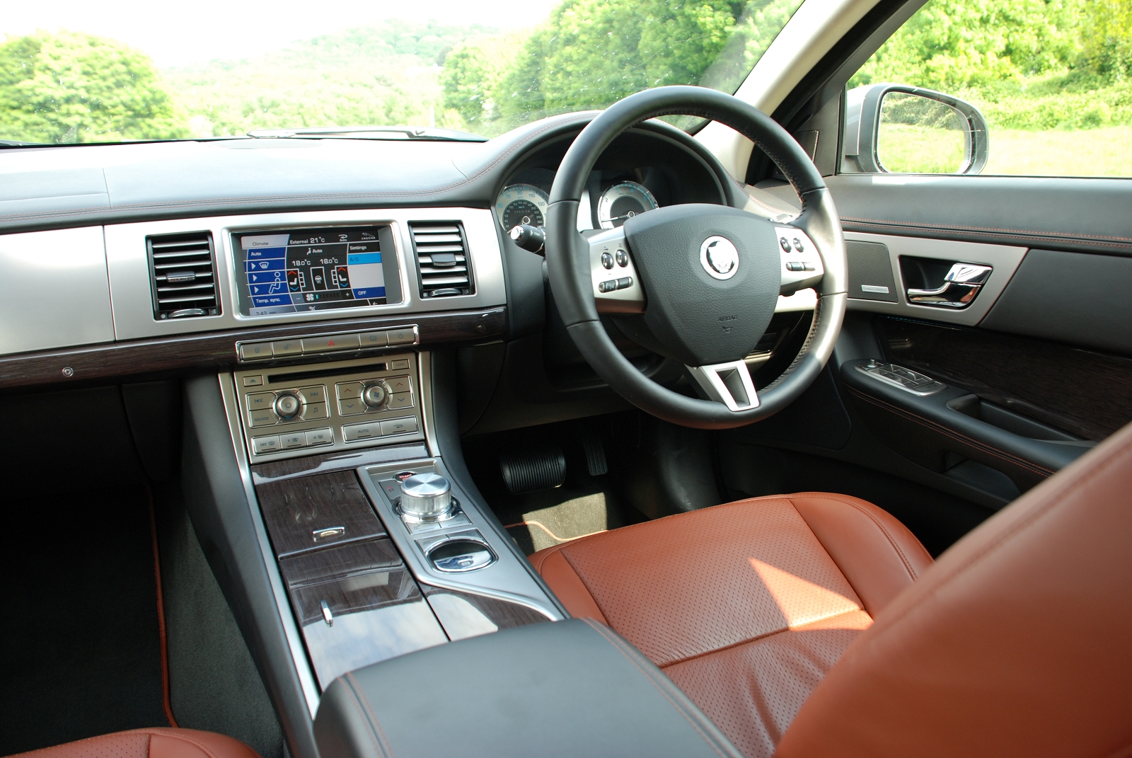
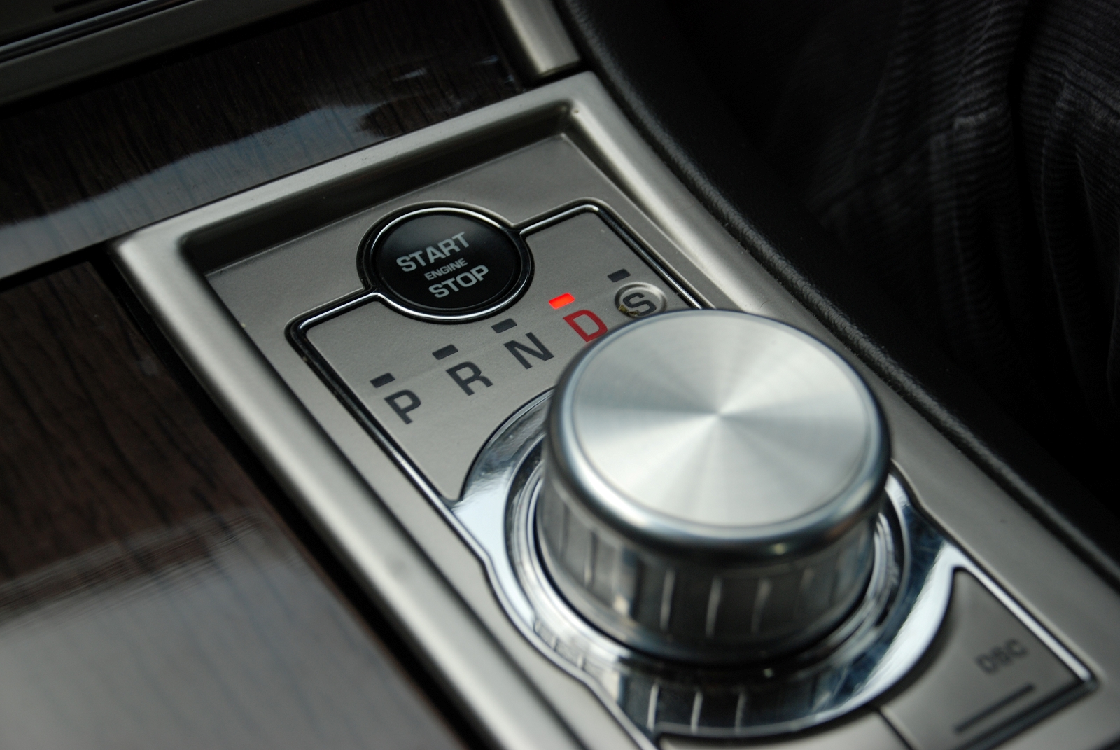
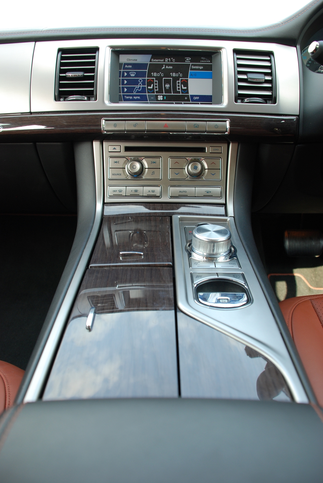
Get in, push the gently pulsing starter button and the stumpy cylinder gear selector raises up from being flush with the center console to stand proud. At the same time the air vents roll open like eyes opening. Passengers new to the car are wowed by the way it wakes up.
At night, the cool blue illumination also emphasizes the handsome graphics of the controls on the center console and bathes the door recess in blue. This, however, then highlights how the door-mounted switches are inconsistent with those on the console.
The design of the main instrumentation area is also inconsistent with the center console, as well as being rather bare - particularly when compared to an A6. Slightly puckering leather at joins on the steering wheel, a few cheap feeling plastics, poorly fitting lids to the center console storage and the 'growler' logo mark on the steering wheel also knock the corners off the quality perception of the XF.
Step-ahead and stepping-stone
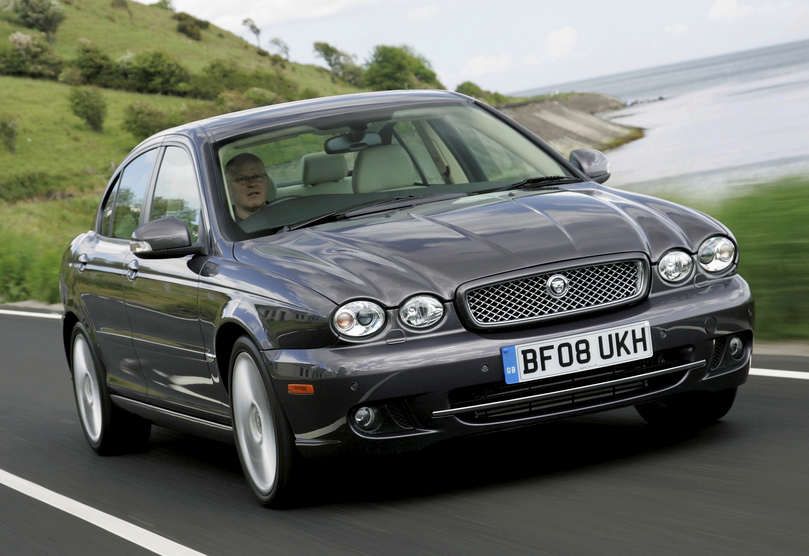
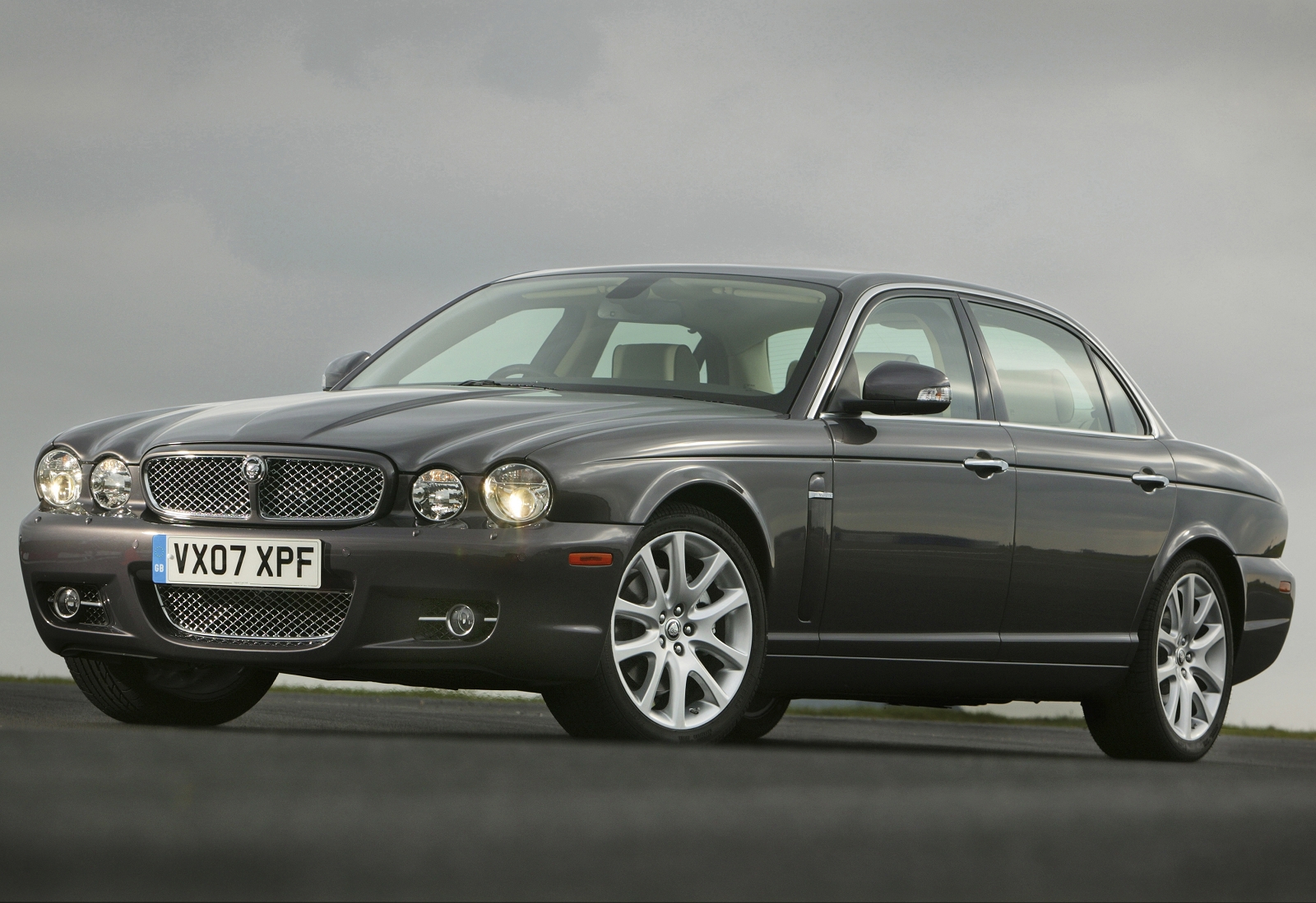
Without any doubt the XF is a huge step forward for Jaguar. Compared to its sibling sedans - the X-type and XJ6/8 - the XF is science fiction. But outside of Coventry, its audience sees it as a contemporary alternative to the German establishment, not an avant-garde design or a trend setter. Though it is a 'step-ahead' for Jaguar, perhaps it is also a 'stepping-stone' to future Jaguars, which are perceived as step-ahead designs that further progress the XF's new meaning of 'Jaguarness'.
Related Articles:
Review: Jaguar C-XF concept ![]()
Interview: Ian Callum, Design Director, Jaguar ![]()


