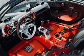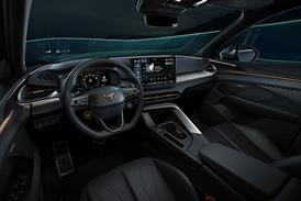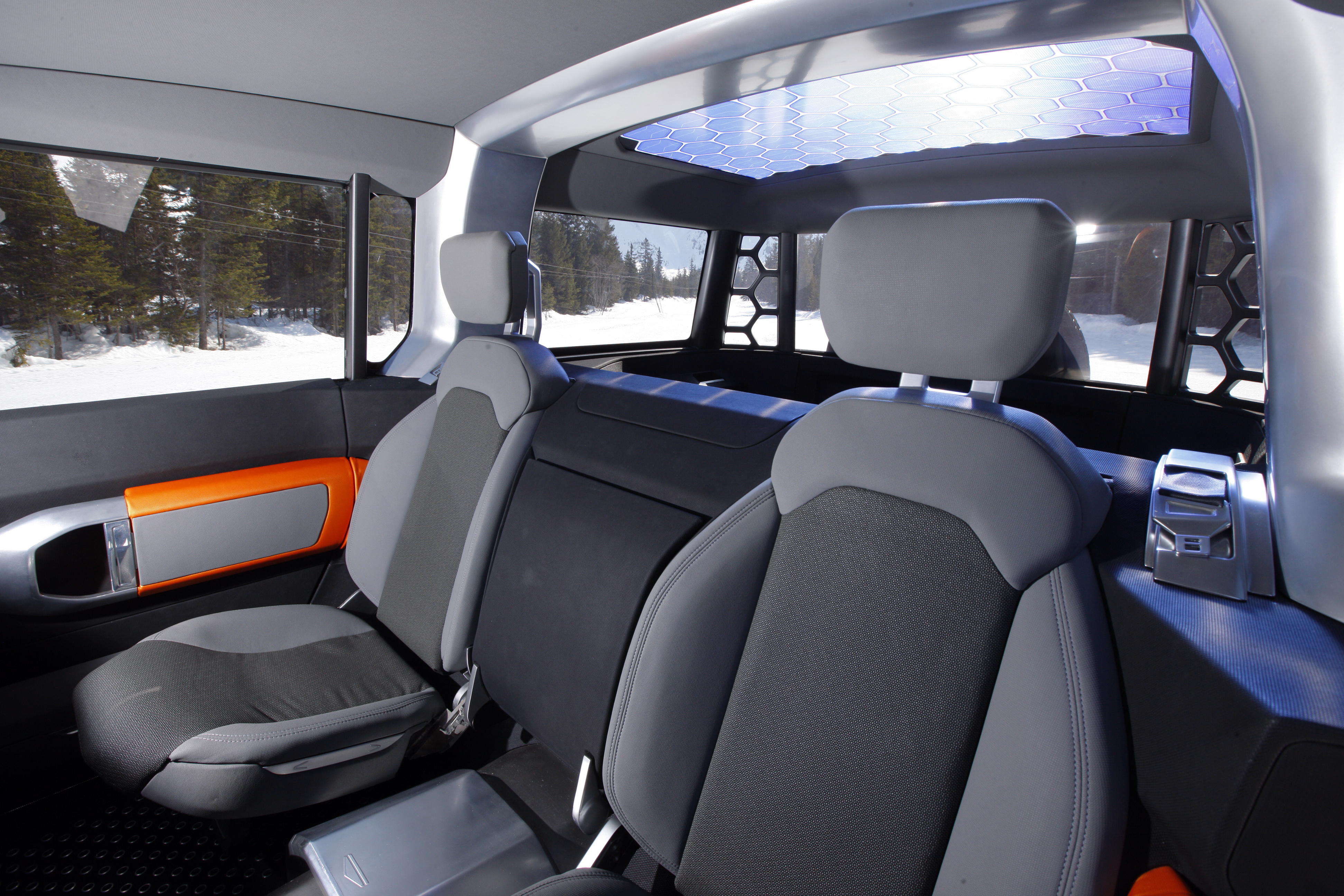
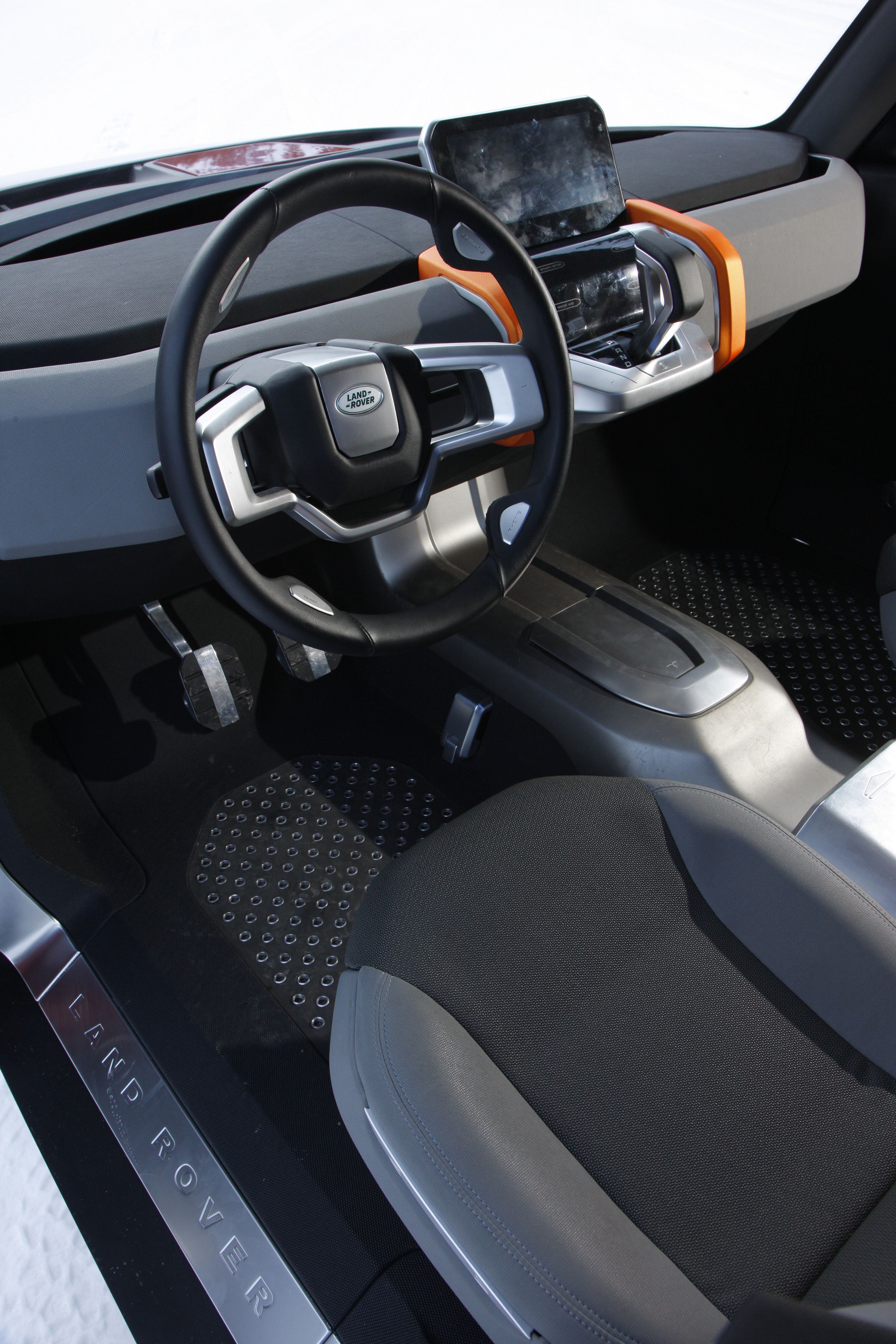
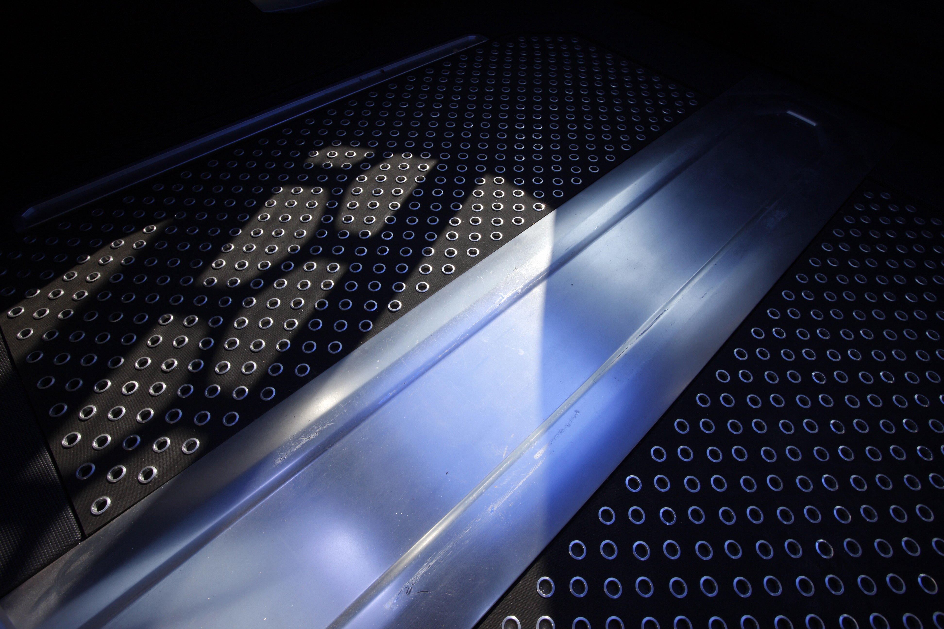

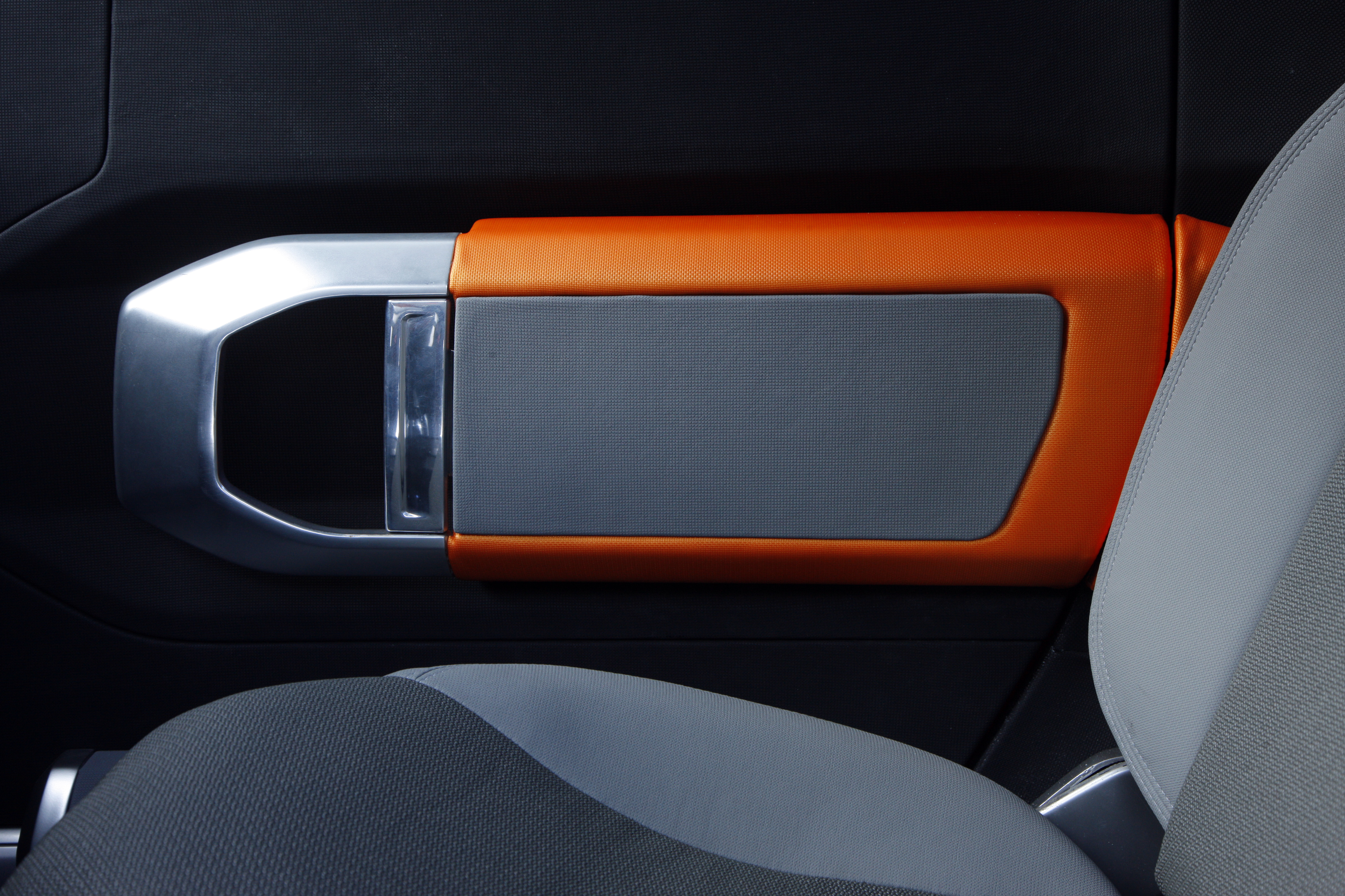
Despite the fact that this is just a show car, the interior looks like it'd survive a hosing down after a long day off-roading. Yet it's not devoid of style, with neatly shaped metal kick plates, alloy pedals and a metal-effect centre console all adding to the no-nonsense ambience. An architectural, chamfered-edge theme runs throughout, not too dissimilar to that of Land Rover's current production cars.
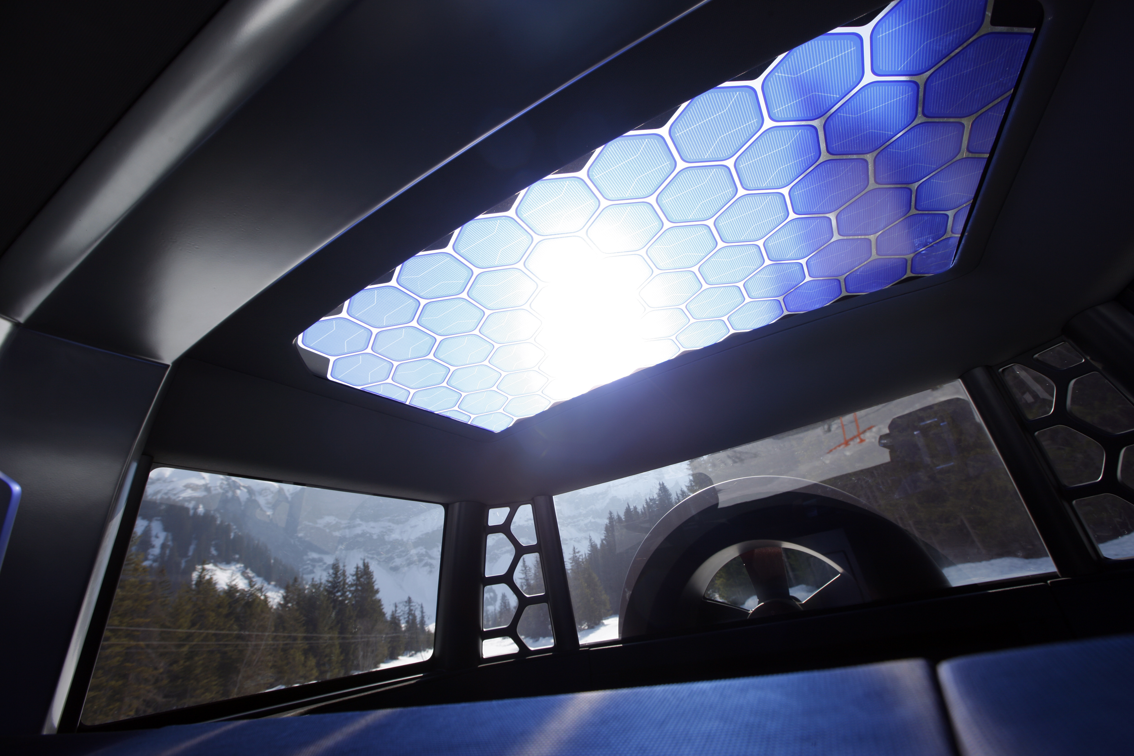
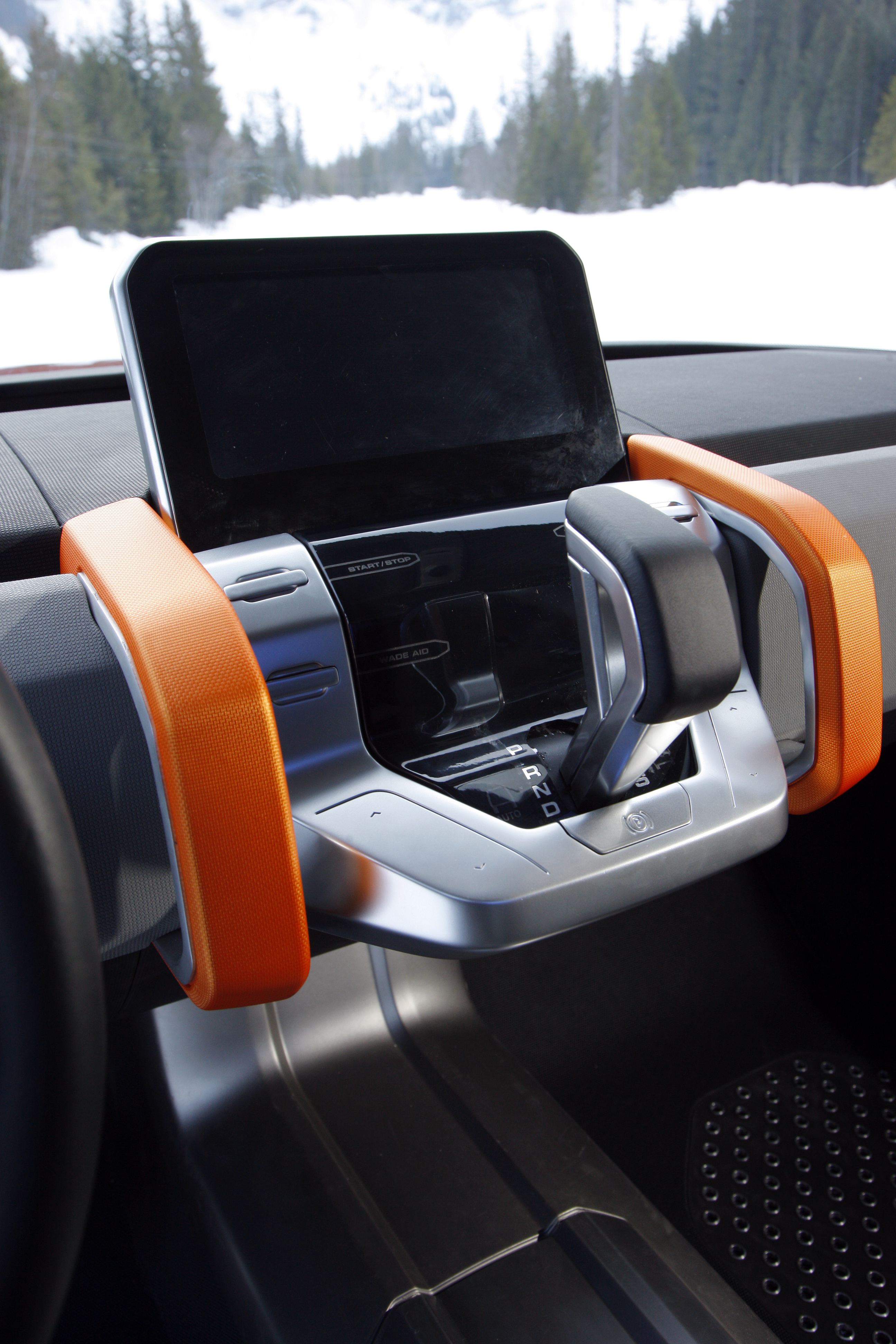
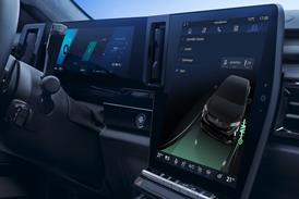
The back-to-basics approach is underlined by the apparent lack of instrumentation. Instead there's a tablet-like screen mounted above the gear lever, which allows the driver to customise the information that's displayed. Naturally it'll feature sat nav, internet and email too, while allowing adjustment of the car's various Terrain Response sub-system settings.
That infiltration of technology is unavoidable, despite grumblings from Defender purists. Land Rover has, so far, ensured that it is a relatively seamless transition and it also realizes it will have to offer a very basic variant of this car. In many circumstances a tablet computer built into the dashboard would be impractical. This concept demonstrates that versatility to a tee.
So how close is this design to the finished product? That's anyone's guess, though McGovern claims that measurable reaction to the show cars has been "90 per cent positive, 8 per cent neutral and just 2 per cent negative". When asked what he says to that two per cent and the Defender die-hards, he confirms that "we recognize the traditionalists, but we have to move on.
"I have no desire to replicate a vehicle that was designed 60 years ago when design was not a core element of the Land Rover brand. To people looking back with rose-tinted glasses I say get over it, as we have to design a vehicle that is relevant to today and the future of Land Rover," he adds.
Recognizing that the Defender comes in all shapes and sizes, McGovern continues: "I think that this vehicle has the ability to span the needs of the likes of Chinese construction workers and sheep farmers on one hand and Californian surfers on the other. It'll always be incredibly capable and incredibly durable; that's a given. The design should not compromise the vehicle's ability, but by the same token the engineering should not compromise the design."
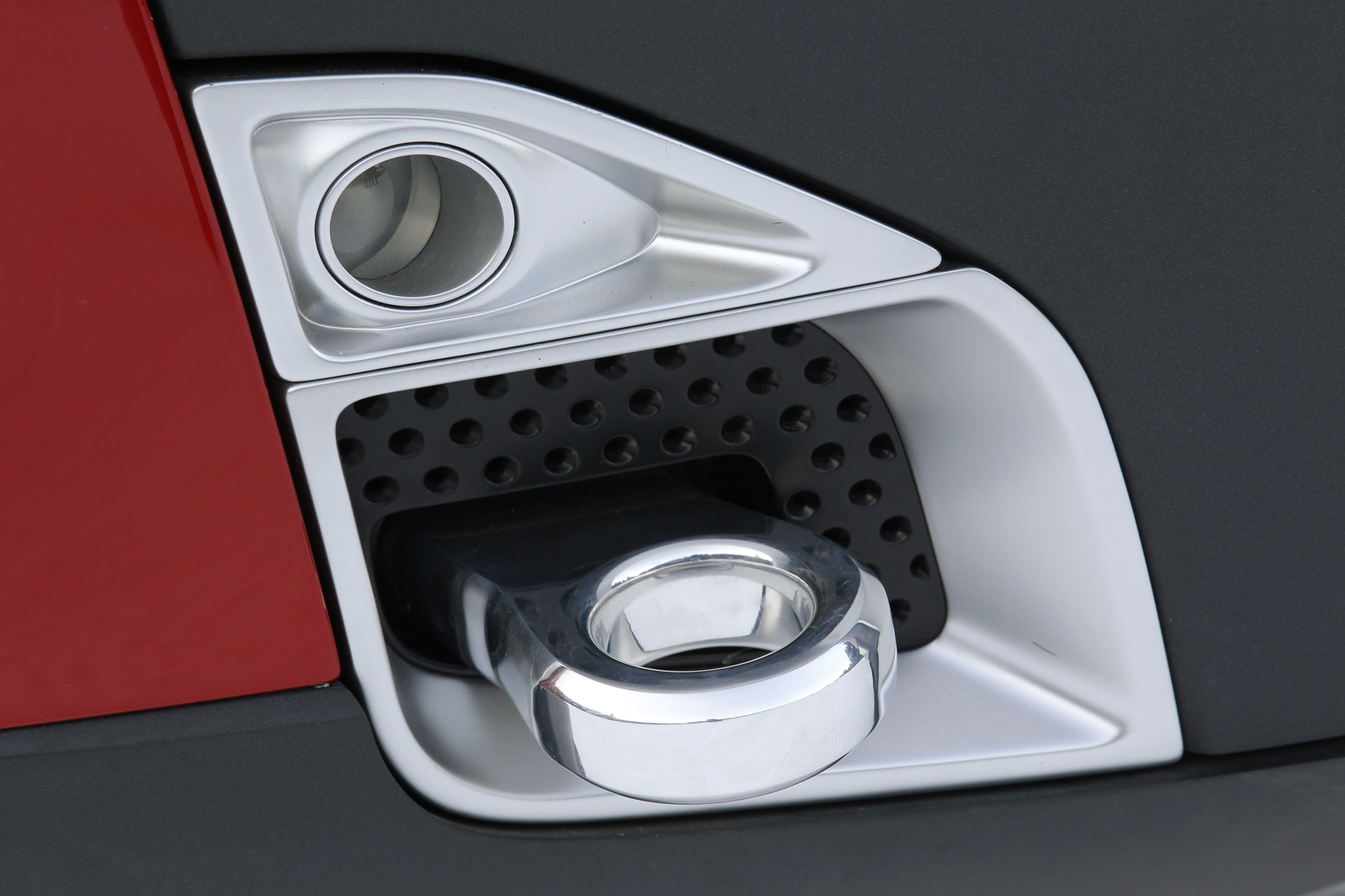
Time and again Land Rover was keen to emphasize the DC100 is not the final design for the next Defender. As noted in our original design review, there's a significant amount of concept car glitz, but getting close to the car in daylight eases the effect without such fripperies as the previous wheel design. One of the driving forces behind a new Defender is occupant comfort, which means more interior space.
This is likely to define a wider car than before, which is in keeping with the DC100's proportions. The show car's DRG may be a little fussy for the nameplate, but we reckon it's the least finalized aspect of the design. The relatively horizontal and vertical themes and strong shoulder line are set to stay, linking the new car with the old, but McGovern is determined to modernize the design. And he doesn't care if it doesn't look utilitarian enough for some people.
Related articles:
Design Review: Land Rover DC100 & DC100 Sport concepts ![]()
Interview: Gerry McGovern, Design Director, Land Rover ![]()


