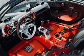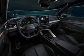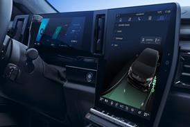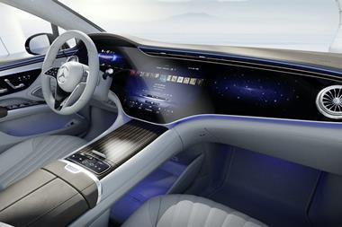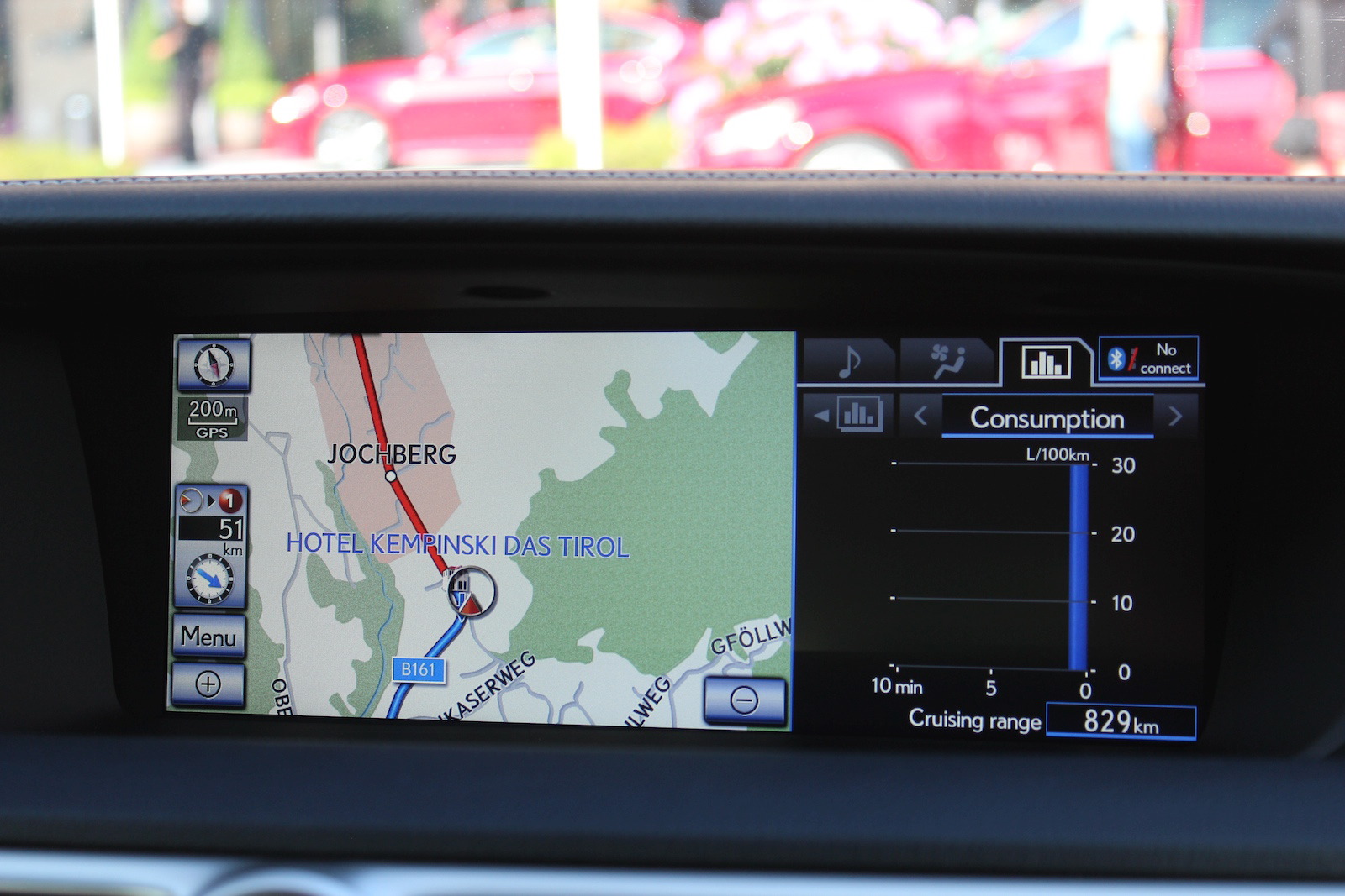
Unfortunately this tech-forward effect is ruined by the lack of consistency between each element. The graphical design and quality of the cluster and the corresponding 12-inch centre screen and HUD (which features a rev-counter graphic straight from an 80s child's toy) feel unrelated. It's a shame Lexus doesn't have a holistic screen, graphics and typographic strategy particularly given the impressive scale of the central display screen. In this regard, the company that wants to appeal to early adopters with its technology lags far behind Audi and BMW in terms of perception at least.
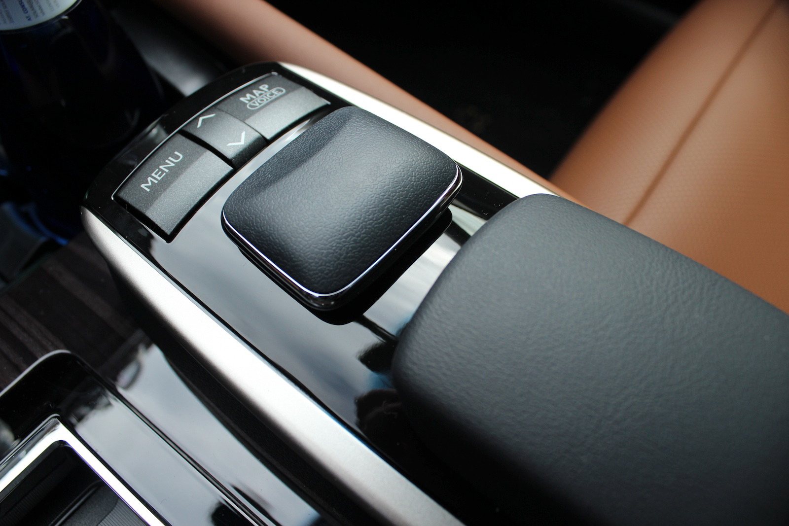
The remote-touch controller for the centre screen is better than before yet it still feels un-necessarily clunky compared to BMW iDrive or Audi MMI. It is also perplexing that no attempt has been made to integrate it or its wrist-rest into the center tunnel's design, leaving them looking stuck on, while their materials feel plasticky and cheap.
Quality perception
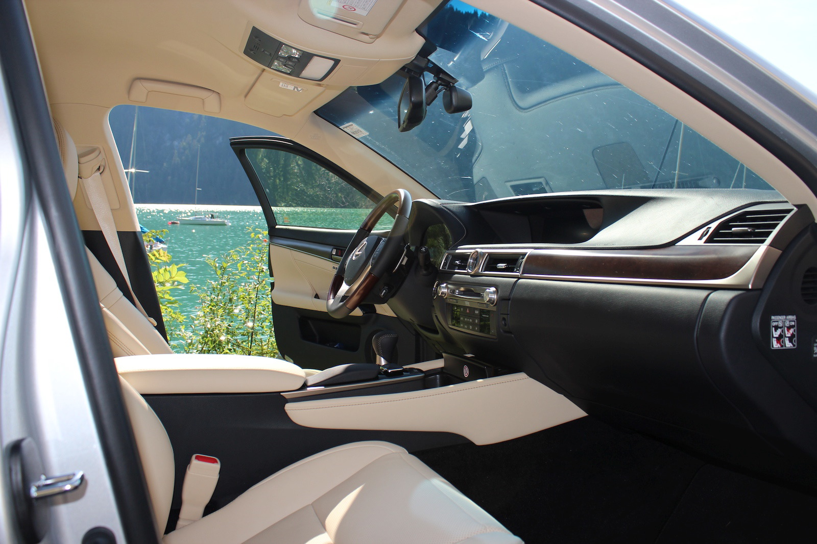
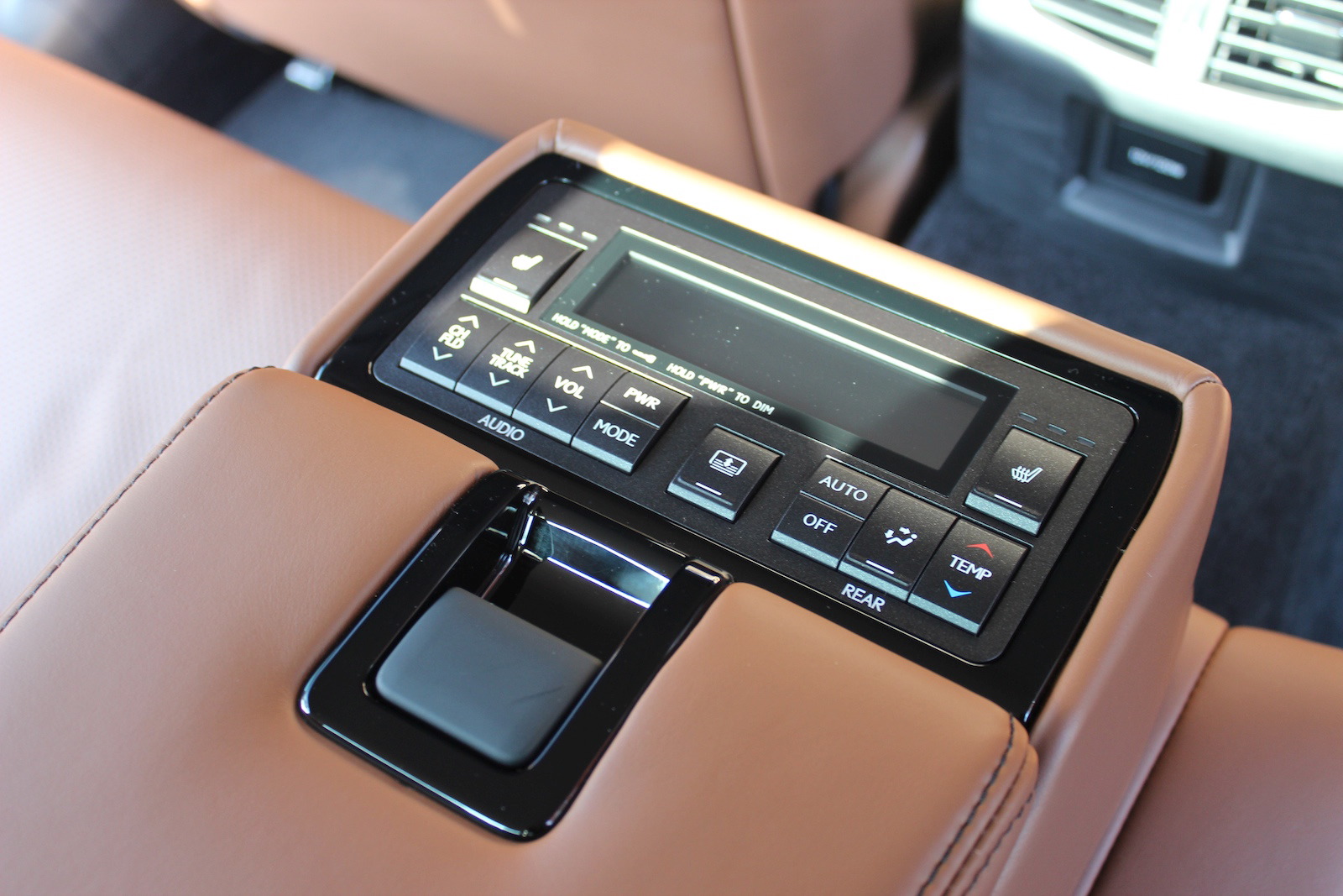
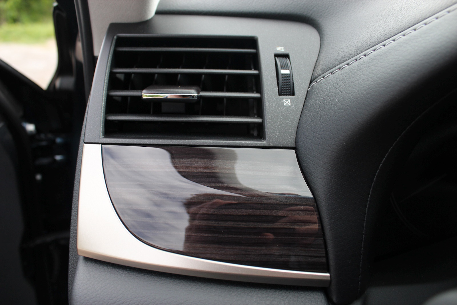
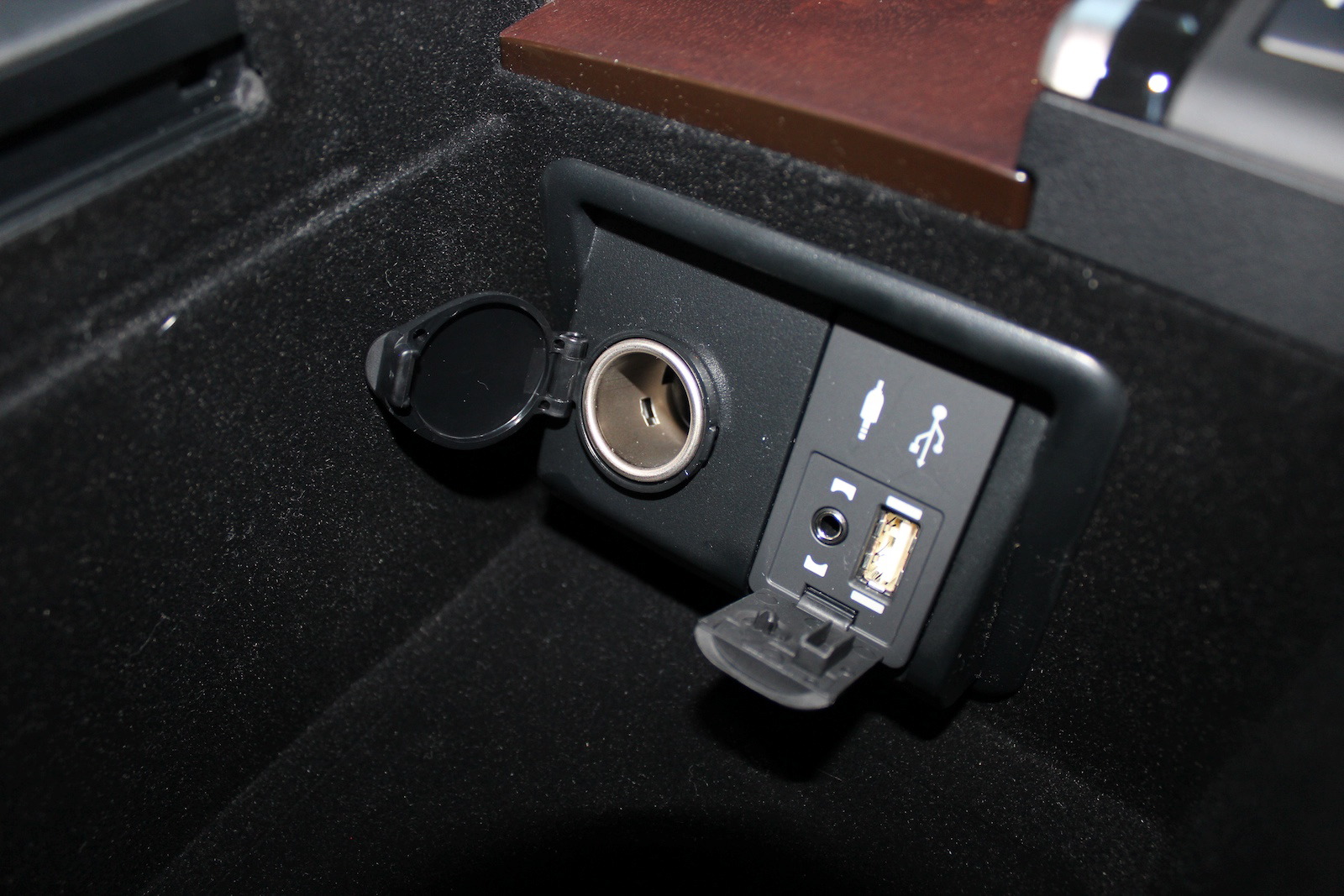
Perceived quality and materials choice is generally haphazard. The steering wheel, for instance, mixes five different grades of plastic, metal-effect plastic and leather, topped off with nasty, un-damped buttons. And given they are a touch point on every single journey, why are the door pulls made from palpably the cheapest grade of plastic in the cabin?
While the GS' cabin can lure you in with its ‘look closer' array of brightwork, glosses and screens, if feels less than the sum of its parts. While a BMW 5 Series' cabin at first underwhelms with its drab appearance it wins you over through a depth of logic and ergonomic-infallibility, the longer we spent driving the GS the more we became annoyed that fundamentally strong elements had not been optimized into a coherent whole.
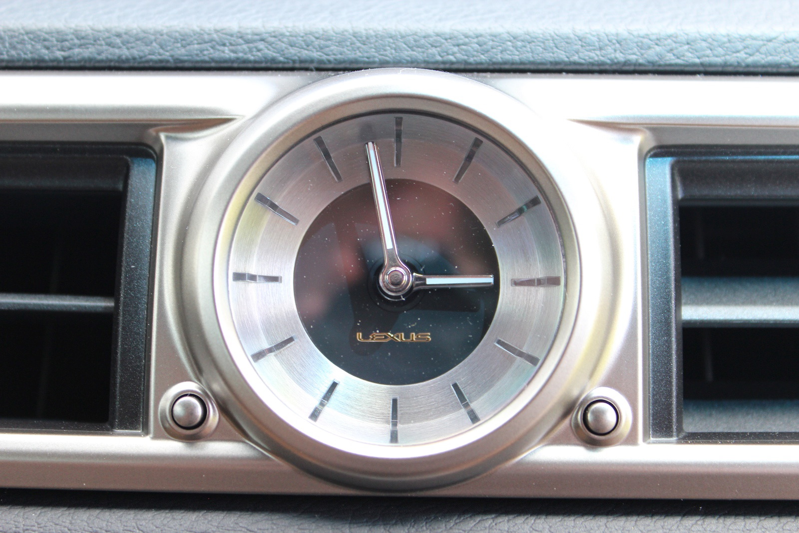
One high note is the analogue timepiece Lexus has fitted after years of our castigating Japanese cars and their one-of-a-kind green LCD digital clocks. Elegant, spare and cast into an aluminum surround, you wouldn't be ashamed to wear it on your wrist.
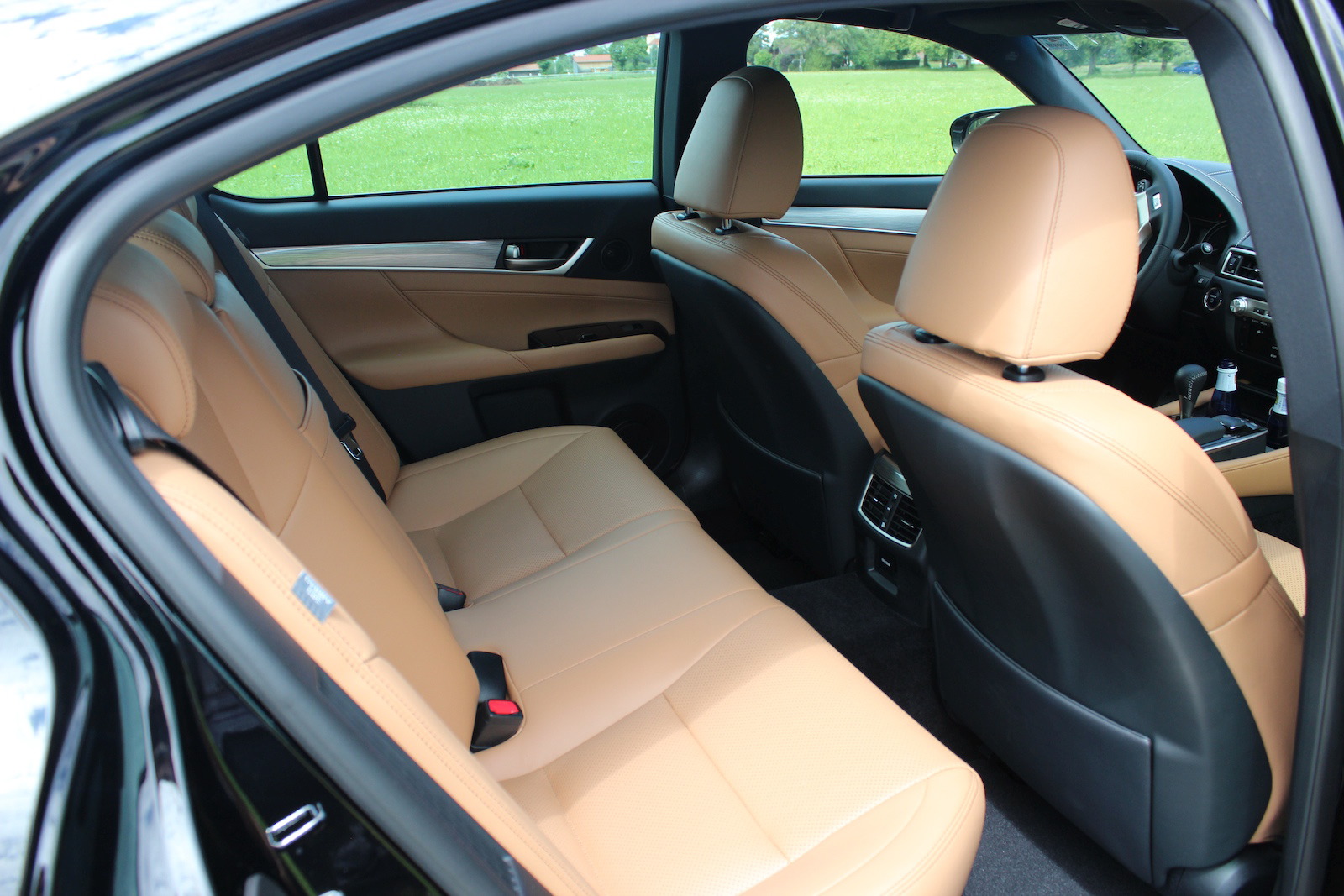
On a practical note the re-engineered battery stack creates 60 per cent more luggage space than the outgoing car, allowing four sets of golf clubs to be carried. For its likely buyers, that may be a sales clincher.
Verdict
Lexus has got much fundamentally right with this car however it marks it out as a company that is in a similar conundrum to Volvo: so desperate to stand toe-to-toe with the German opposition they have little sense of unique identity.
In many ways the GS is close to matching the design of the premium German makers but for many customers we suspect that simply being a ‘me too' is not enough. The hybrid powertrain strategy makes for a clear point of difference that isn't capitalized on. With a clearer theme, an emboldened character and, above all, the implementation of a perceived quality process during development, this Lexus could take on the European premium opposition. Judging by concepts such as the LF-LC, the capability within the company exists, its management simply needs to offer the right people creative freedom.


