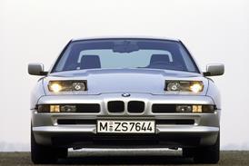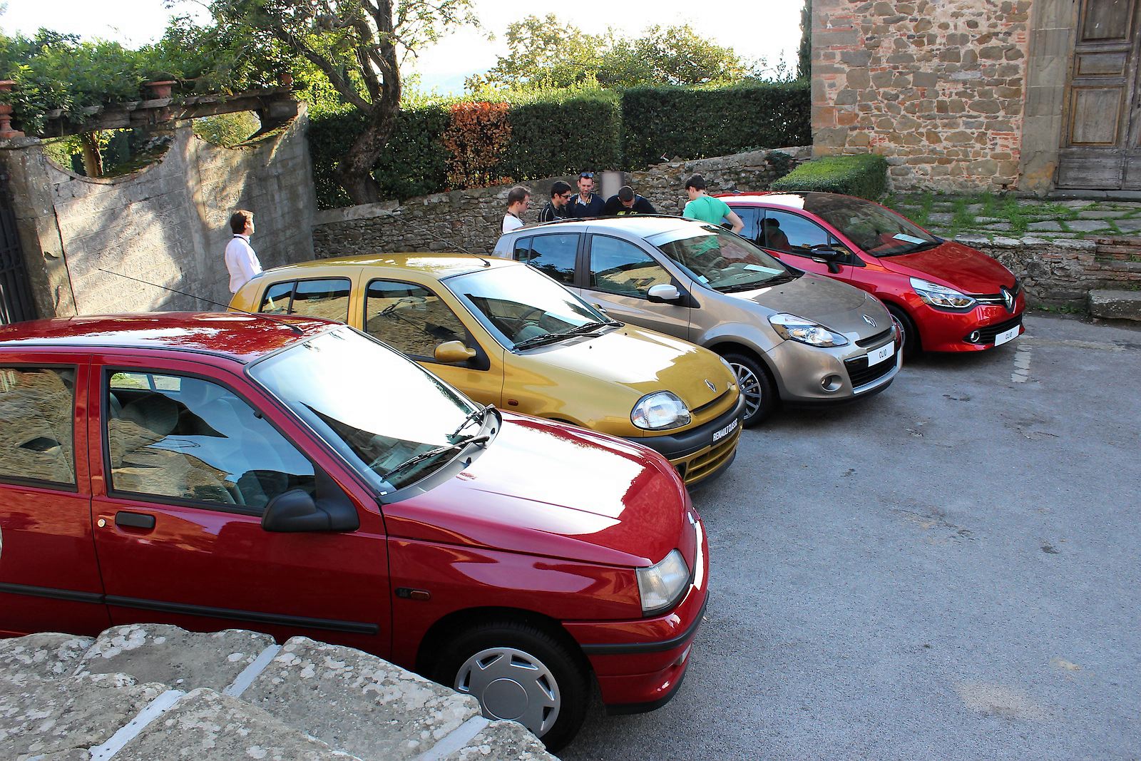
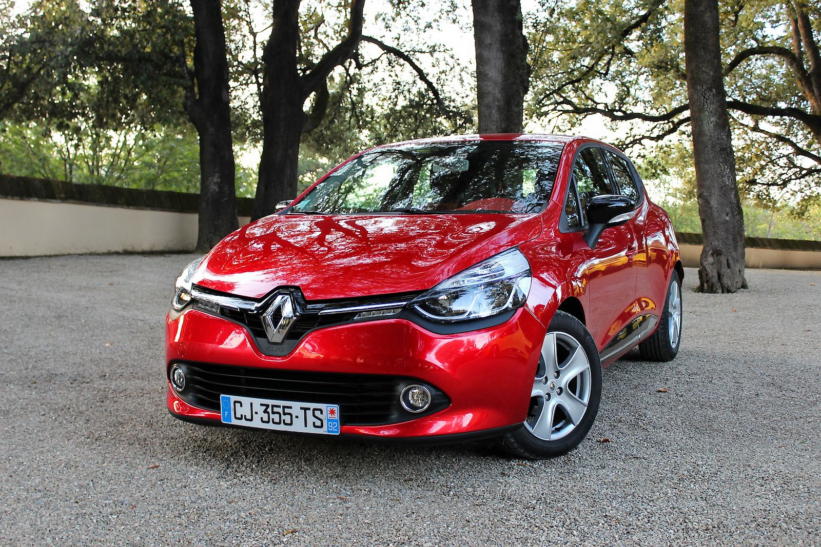
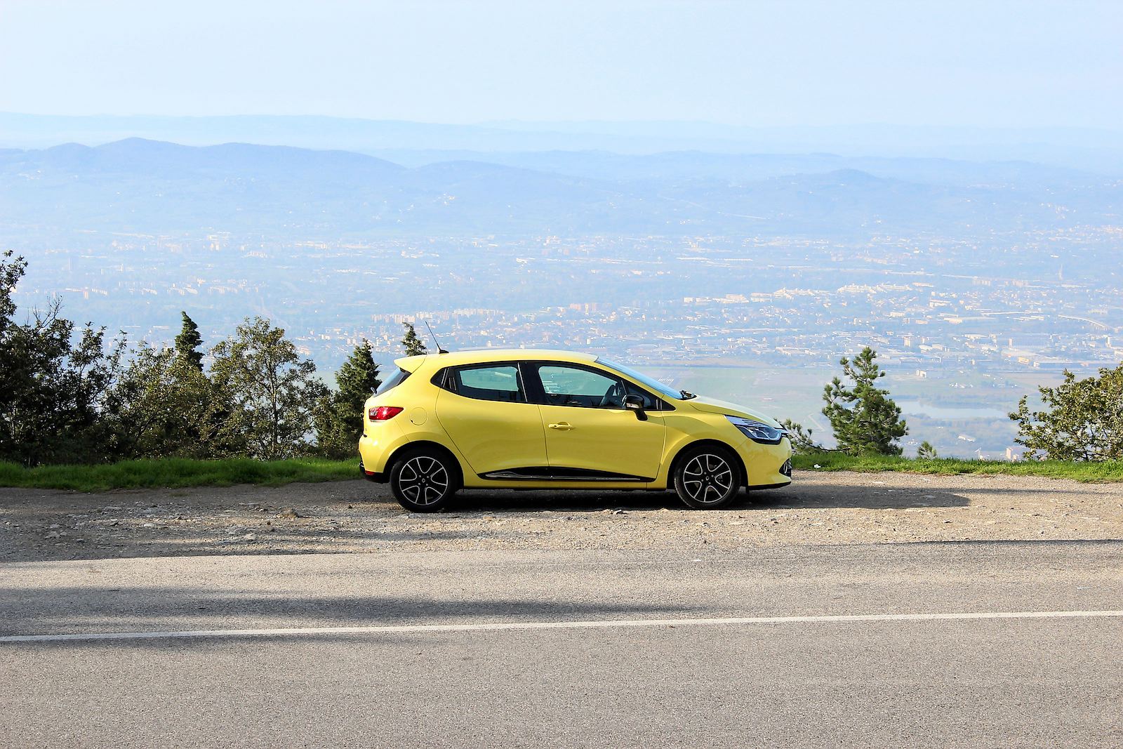
Having pioneered the ‘small car, big-car features' trend with original version, Renault has sold over 12 million Clios since the model was launched in 1991. The box-fresh ‘91 Clio RT Renault displayed alongside its successors at the launch of the Clio 4 is testament to what a successful formula was struck. Will time be as kind to the new Clio 4?
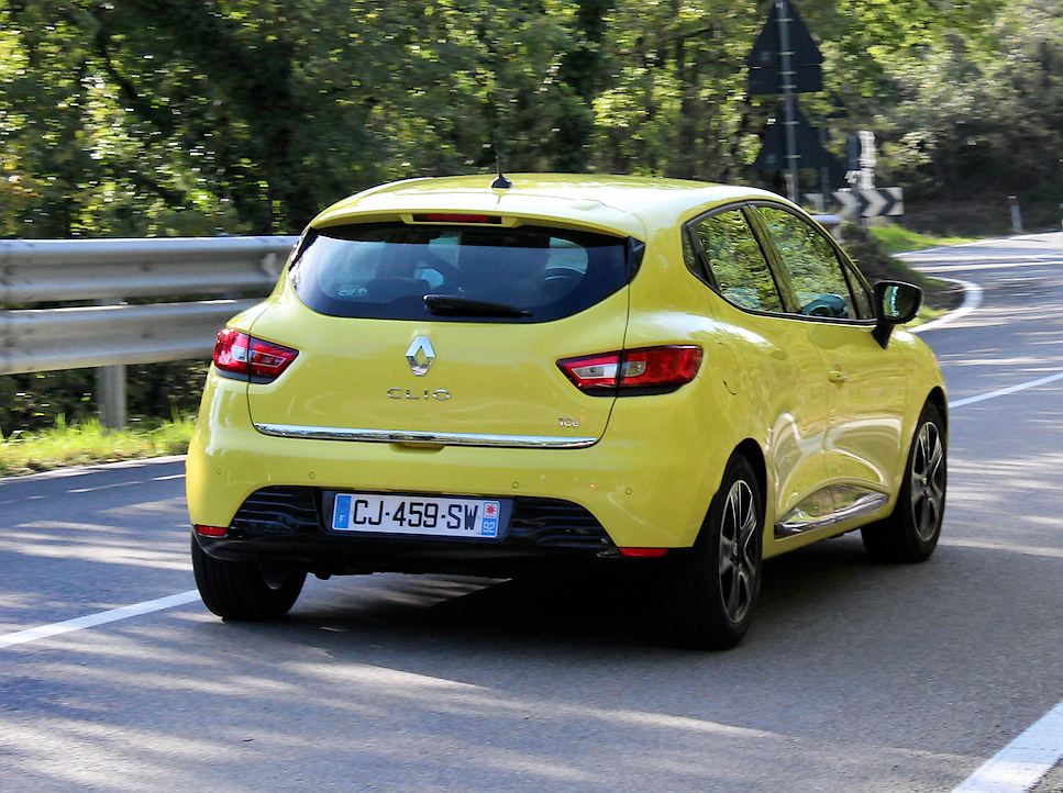
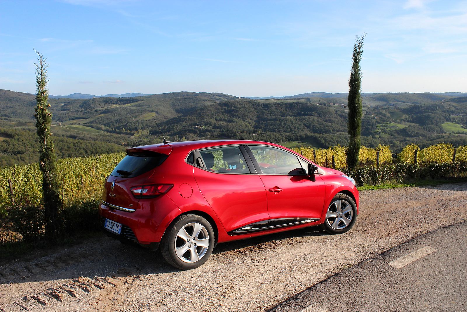
It certainly needs to be, at least during its production life. Seeing it on the road, the van den Acker-inspired design revolution is clearly well under way; perhaps more so than it might have seemed when we first saw the new Clio in Paris.
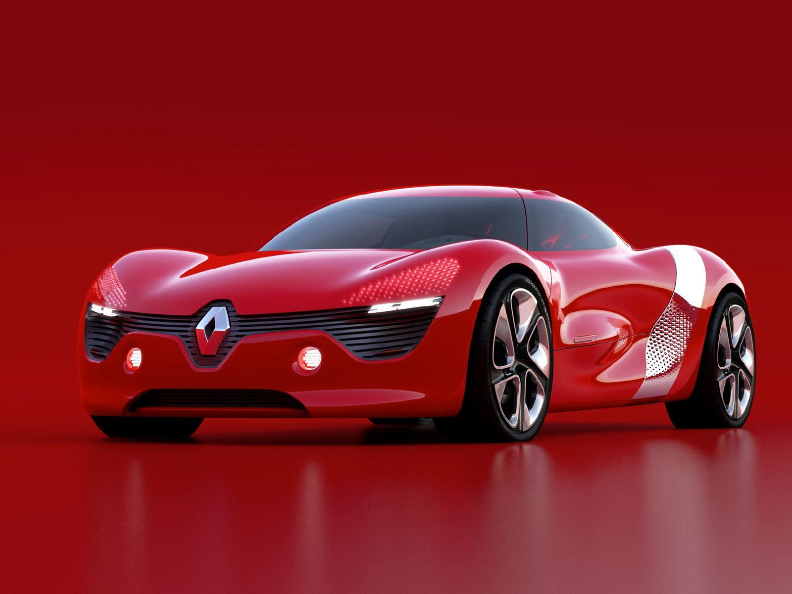
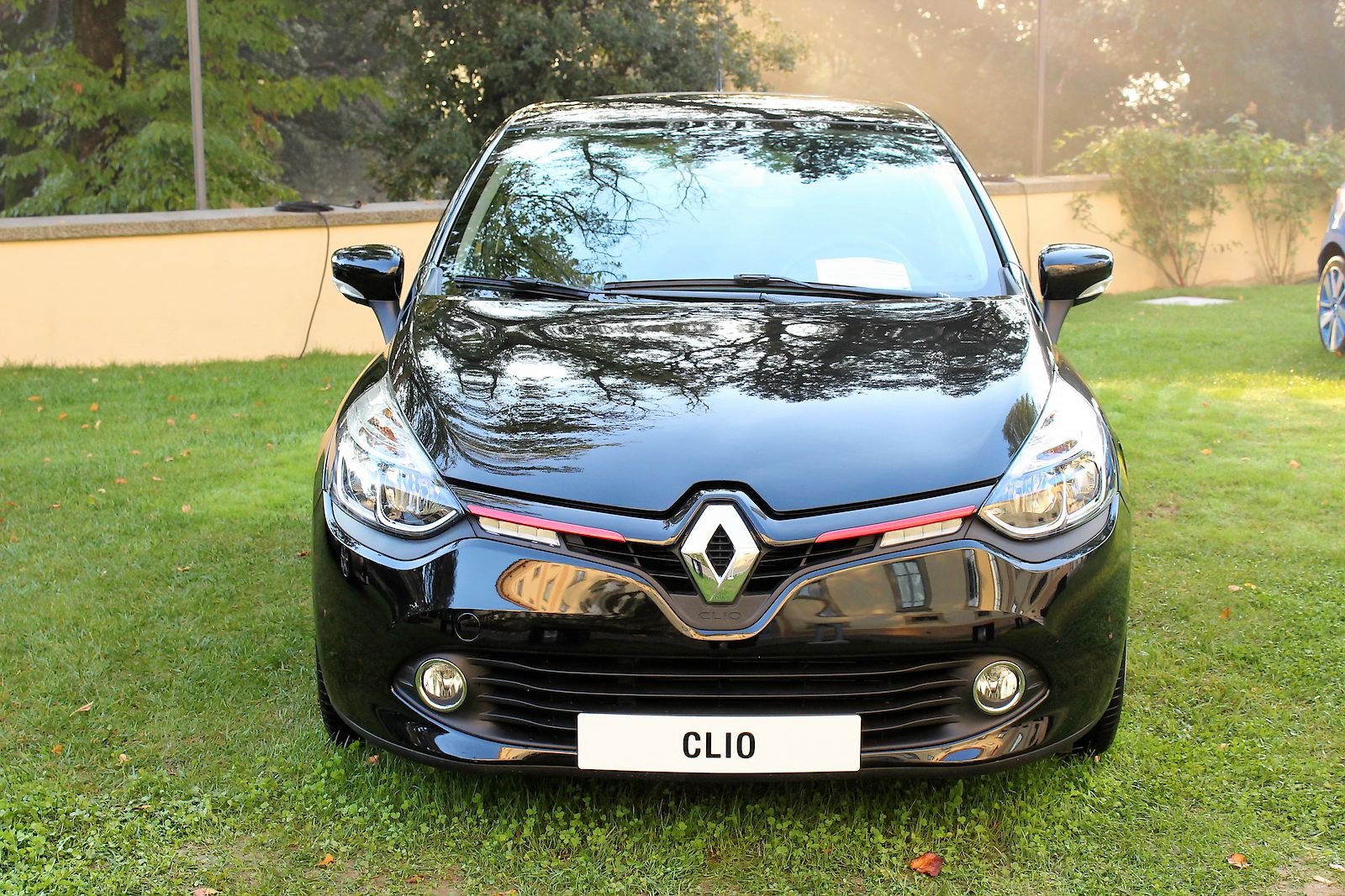
The new Clio is interesting from a design strategy perspective. The connection between Clio and DeZir concept Renault is flogging may seem tenuous, but can you remember the last time a concept car was so intertwined with a production car's launch message? And while the new Renault face is the shared aspect many will focus on, it's in their use of volumes and continuous surface sculpture that the DeZir and Clio are truly linked.
So will we fall in love with the Clio - and Renault - again, as van den Acker hopes? Its appearance should certainly draw in customers in a way its predecessor didn't. And in a series of key areas Renault has been clever, creating a car of strong appeal.
Perceived quality
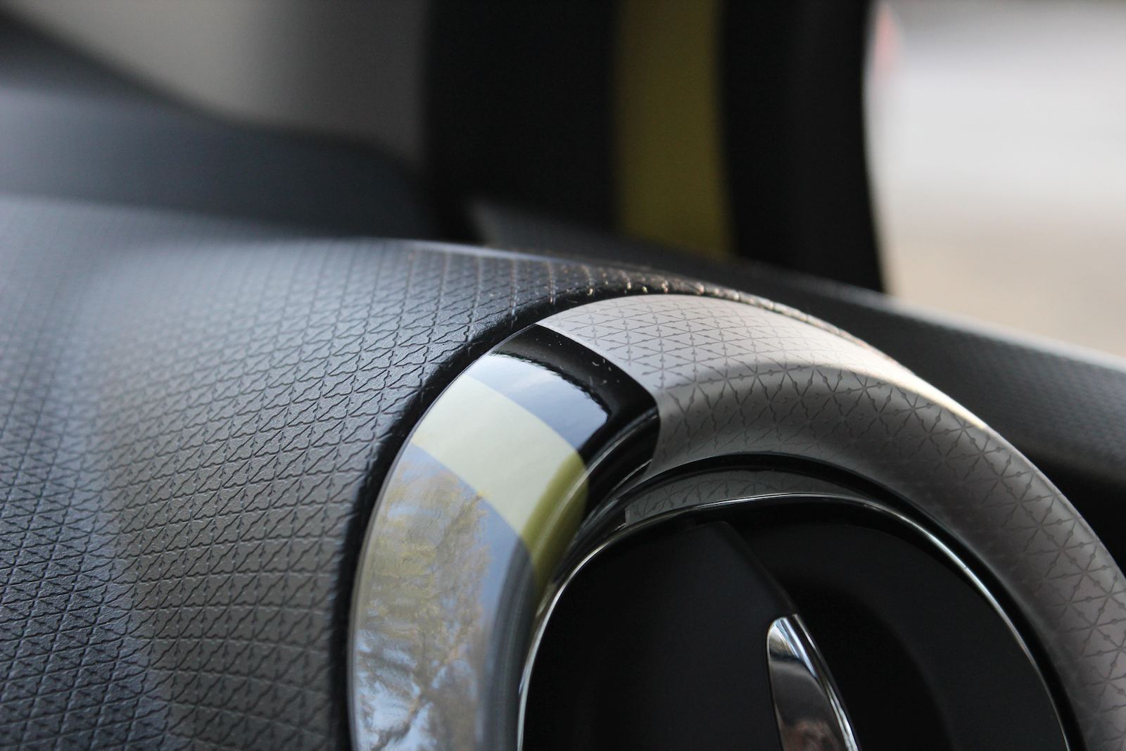
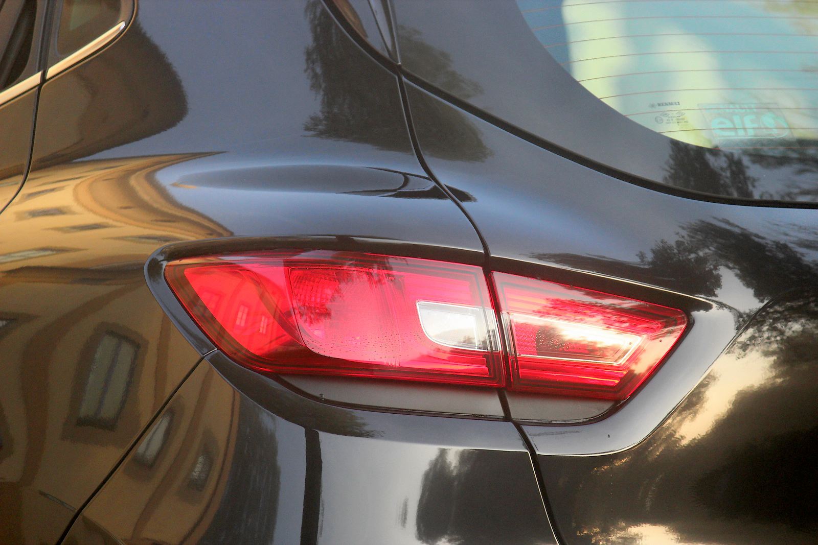
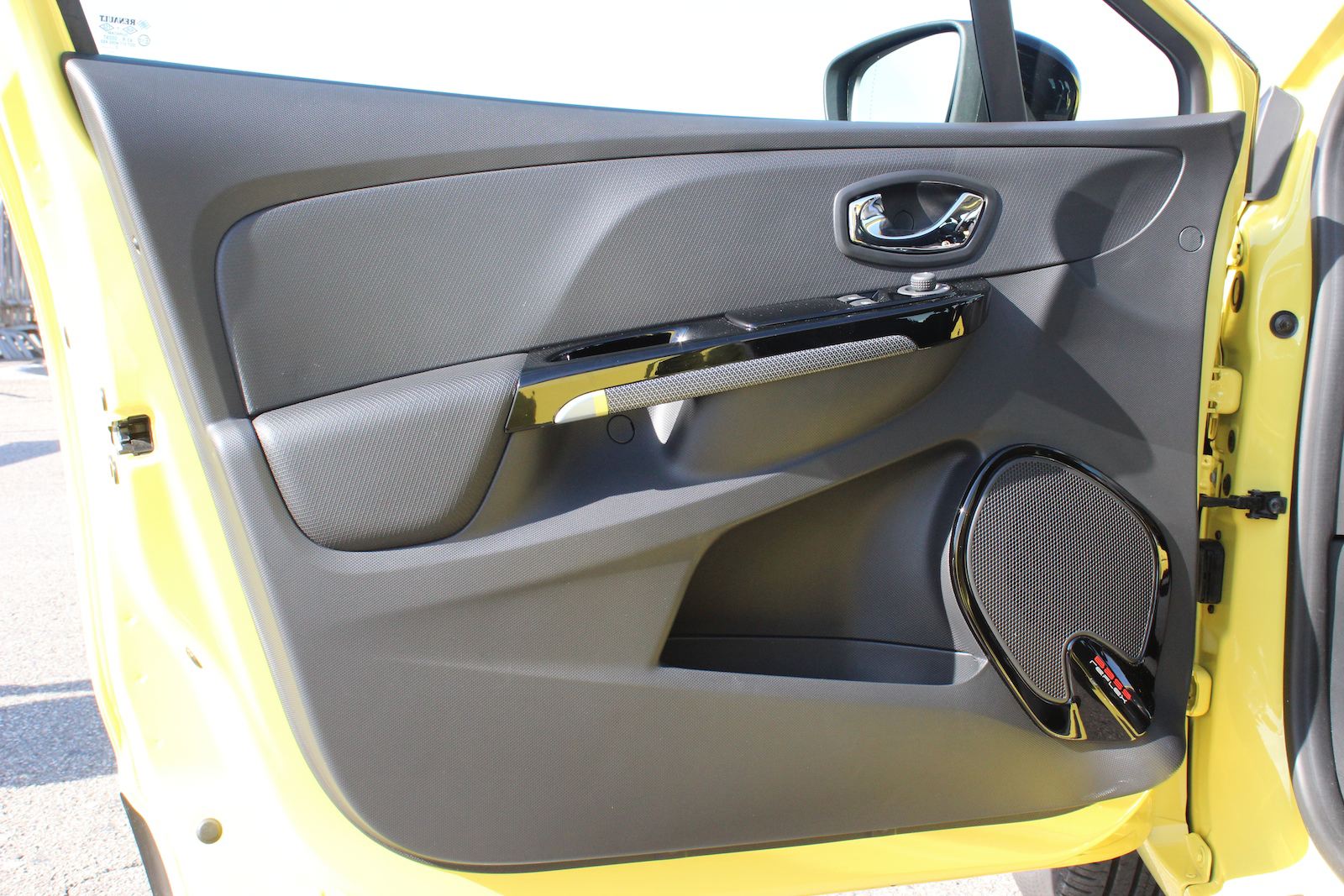
Renault benchmarked Volkswagen for the quality of the new Clio and it shows. There's a reduction of 2mm in its panel gaps and very tight wheel arch gaps. That large, lower rocker adornment with its gloss black plus-chrome/color insert gives a premium value and on the inside the air vents turn with an Audi-like click-clack. Most noticeably the lack of parity in plastic quality between the upper IP and the lower section and doors you get in many cars in this segment is absent.
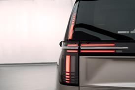
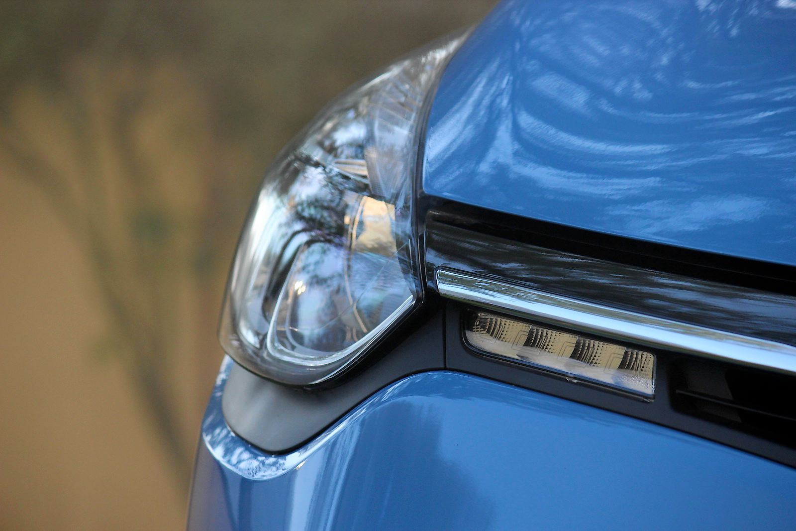
Only the awkward black plastic fillets under the front and rear lamps and the DRLs mounted in the grille rather than forming a graphic in the lamp can spoil the impression. And while keyless entry is appealing to customers, the large, cheap plastic keycard feels old-hat and is unpleasant in the pocket.
Technological appeal
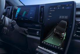
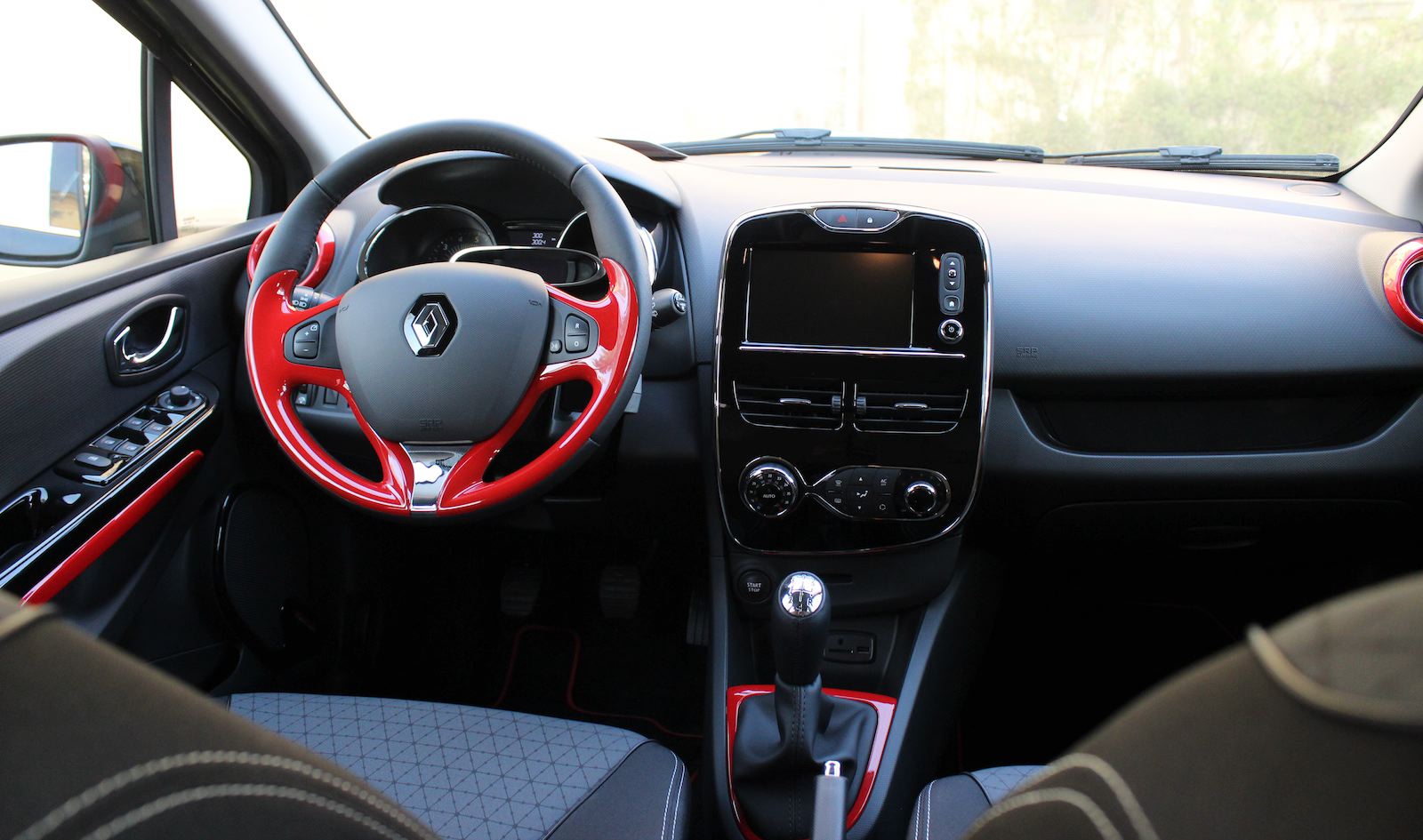
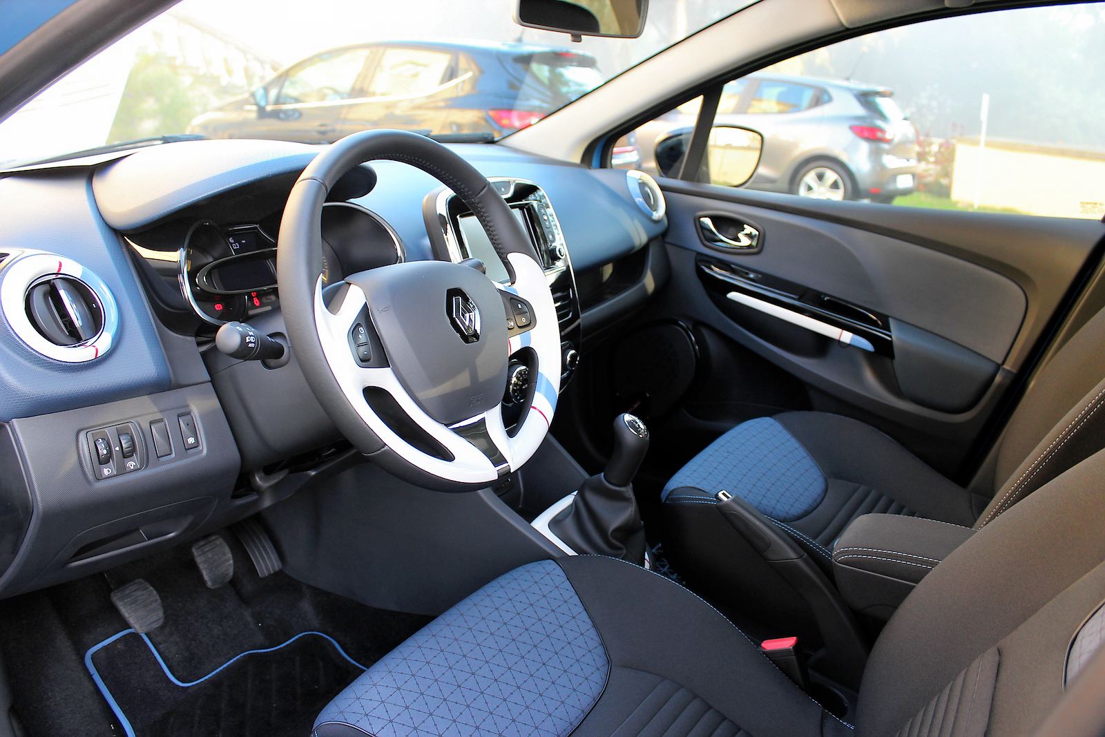
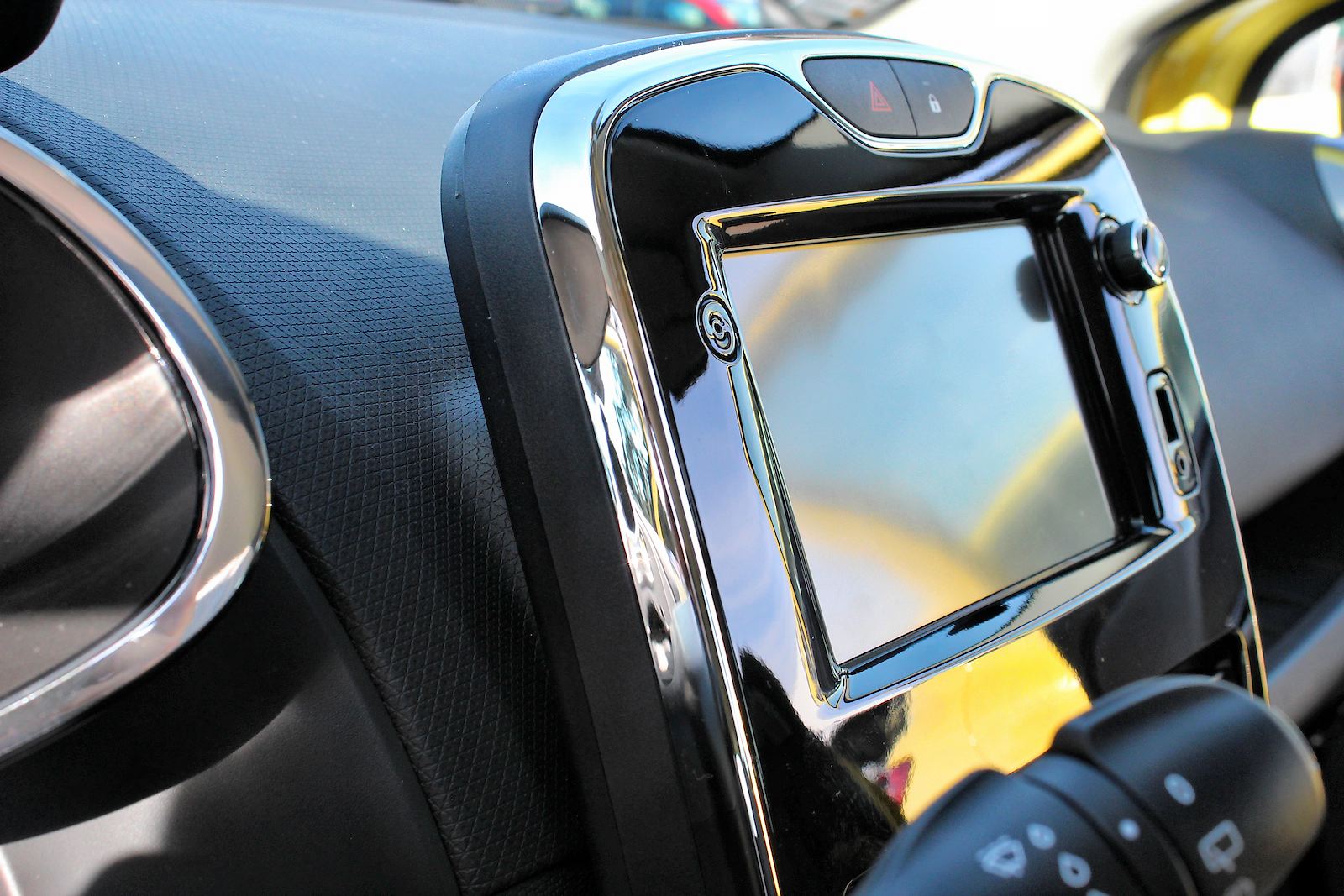
The ‘tablet' that floats off the horizontal IP surface is well judged for today's market. It instantly positions the Clio as ‘modern' in a tech sense, helped by its dominant touchscreen and gloss finish. Will the approach feel dated in three years time, in the same way that the 2008 Fiesta's mobile ‘phone keypad-inspired interface now does? Possibly.
Branding this centrepiece as a ‘tablet' and the R-Link system as having ‘apps' has created a rod for Renault's back, however. Consumers expect certain things based on that terminology, which comes from the smartphone world of today and is not necessarily appropriate - or able to be the same - in the car.
However most customers won't opt for the full R-Link system, instead taking the 7-inch screen in ‘Media Nav' form, without the Apps bit. Easy to use with logical, color-keyed menus and clear graphics, it worked well during our time with the car. Our complaints are that it completely mutes music playing when giving navigation instructions, which can create a very staccato soundscape and also that it lacks physical home and back buttons. But it's worth noting that Renault's radio/media control stalk still lurks behind the steering wheel boss and does a better job and is more intuitive to use than many other manufacturers' favored on-wheel controls.
Simplified personalization
It may seem odd for Renault to be launching an apparently conventional, 5-door only Clio in the light of opposition from downsizing premium brands and up-scaling fashion cars like Opel's Adam but there's an interesting personalization that manages to broaden the Clio's bandwidth of appeal with minimal elements and therefore cost to both consumer and manufacturer.
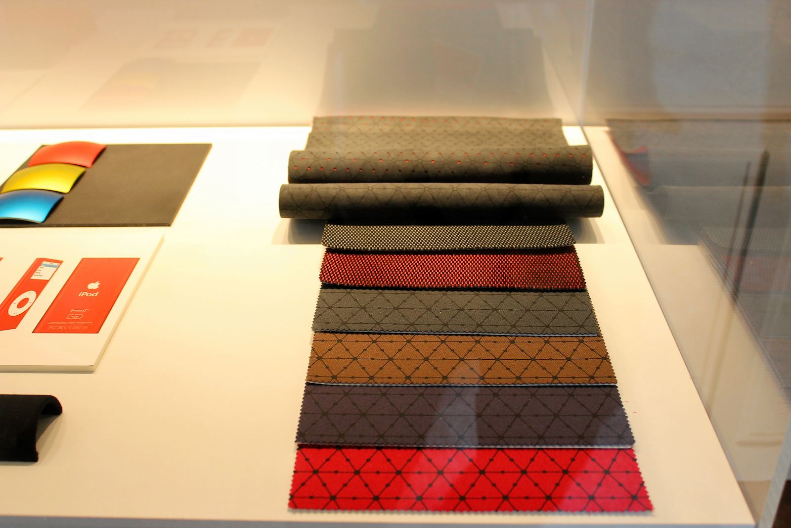
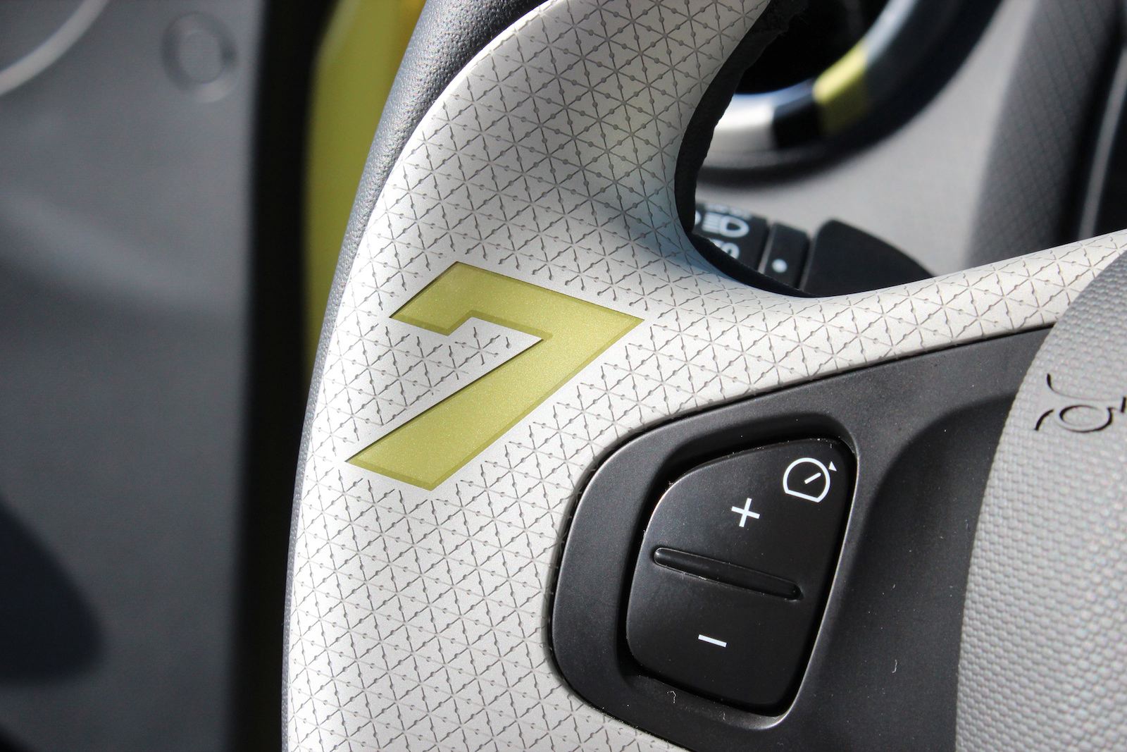
There are five core color schemes - red, black, blue, chrome (grey on the interior) and ivory. These can then be augmented by either ‘Le Mans' or ‘Tricolour' decal appliqués, which run inside to form little highlights on the vents, wheel etc.
On the exterior, these elements show up as changes in the grille strakes, wheel inners, the rocker inset and the tailgate edge finisher. Inside the scheme extends to accent fillets on the doors, a surround at the base of the gear stick, a gloss inset on the steering wheel and air vents surrounds. Together with five color choices for the IP top, door cards and seat trims, they make for a very different feeling Clio interior depending on how the car is configured between masculine sportiness and a more feminine, boutique vibe.
Because the overall interior architecture and design theme are simple, the bright and fun elements have an increased impact. There's a real sense of quality too, for example all the matte plastics feature a texture that creates interest and contrast. It's the antithesis of the dull monochrome, derivative slush-moulded plastic grades some manufacturers choose when benchmarking VW and Renault should be applauded for finding a third way between gaudy fashion and dull Germanic precision.
The Clio gets its Va-va-voom back
It might not be obvious, but creating a car slightly larger than the segment norm, offering 5 doors only and attempting personalization in a limited, inexpensive way is actually quite a daring move by Renault. There's nothing overtly ‘different' when you open Clio's door as there is with Peugeot's 208 but Renault seems to have looked at the way the market is moving closer than some. It understands that many B-segment customers are downsizing from segments above, so the Clio is better equipped than most of its competitors, that 5-door B-segment products are increasingly used as family cars, so its luggage compartment is 300 liters in volume and that people want it all without having to pay the earth in this segment, so it's priced as a mainstream, rather than premium, product.
Judging by the reaction on the streets around Florence, the new exterior design language stands a good chance of helping the customer fall back in love again. It's lacking the chic qualities of the first Clio, but has managed to grow up without becoming Germanic and dull, unlike the last car.
Its key achievement is in bringing perceived quality and big car appeal that's at least on a par with the Polo, while mixing in enough of the young, fashionable qualities of cars like Citroen's DS3. It then ices the cake with arguably the most of-the-minute in-car tech in the segment. Customers - and sales figures - will be the proof, but on this first real world acquaintance, the Clio has got its va-va-voom back
Related articles:
Design Review: Renault DeZir concept 
Interview: Laurens van den Acker, Vice President of Corporate Design, Renault ![]()


