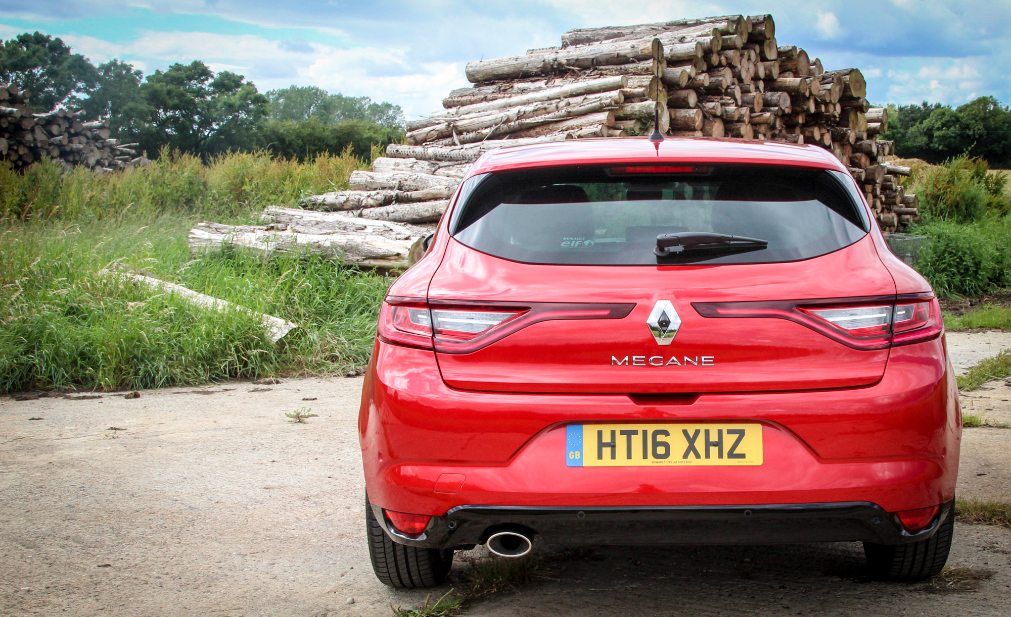
We spend some time in Renault’s fourth-gen C-segment hatch, the Renault Megane, to see how it works in the real world
In 1995, Renault replaced the 19 with an all-new lower-medium hatchback, the Mégane. The first generation car was conservatively styled, its standout element being its availability in six bodystyles at a time when most of its rivals offered just three. But it was the second generation Mégane II that made designers take note. Developed under Patrick le Quement’s ‘touch design’ philosophy and bearing a clear relationship to the Vel Satis and Avantime of the time, it was the boldest C-sector product of a generation, and highly polarising among consumers. This factor (on which Renault’s management were surprisingly outspoken) led the third generation model to revert to conservatism.
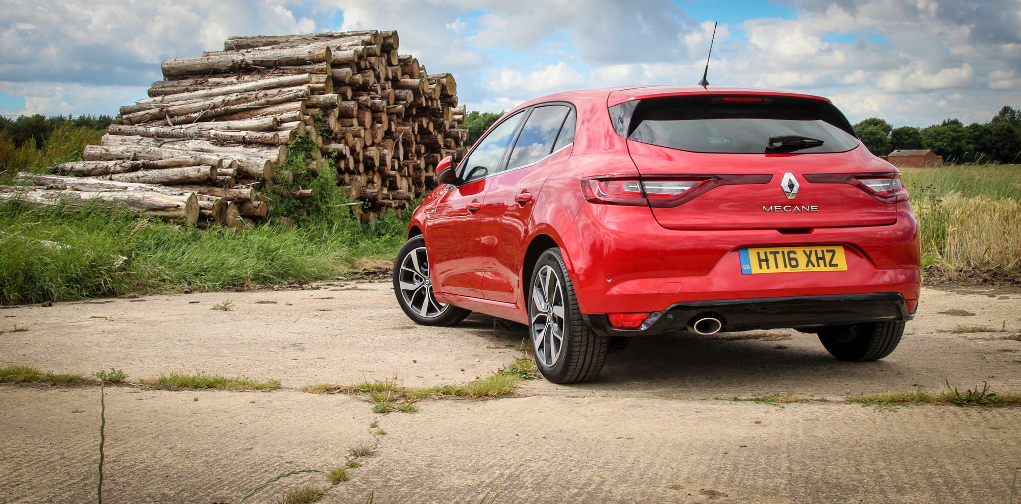
Unlike Volkswagen’s Golf, Renault’s lower medium hatchbacks have tended to change significantly each generation. This proves true again with the fourth iteration of the Mégane. The C-segment remains a significant market in Renault’s key European sales territory, but with the Scénic MPV now a separate model-range and three-door hatches slow-selling, this Mégane IV will come as a five-door hatch, Sport Tourer wagon and sedan only. The five-door hatch, launched first, all but completes Laurens van den Acker’s ‘circle of life’ design strategy in production car terms.
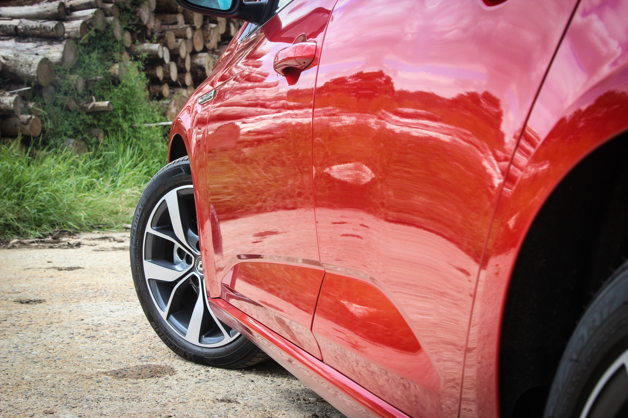
Lower-medium Renault hatchbacks have always done their own thing in design language compared to the rest of Renault’s range, but the Mégane IV takes on the van den Acker-devised family clothes. Surfacing is characterised by highlights rather than creases: there’s a very strong rear shoulder haunch, eye-catching treatment above the rocker, a large wheel package and very bold front and rear graphics.
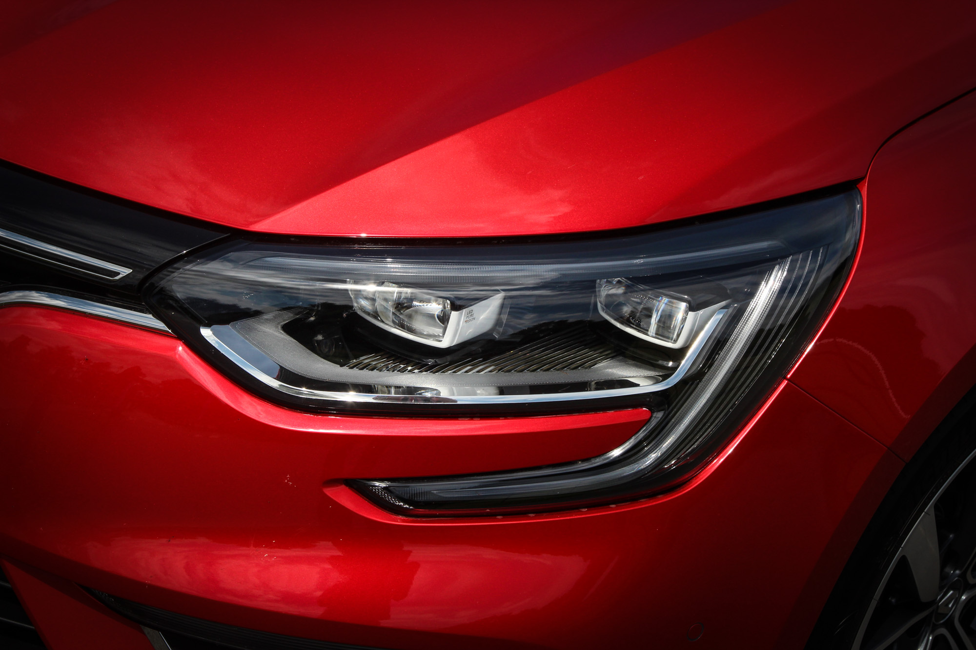
On the road it’s the DRG that catches attention. This is the first aggressively-faced Mégane, albeit stopping short of the menace of some German cars. Much of the aggression comes from the large DRL signature, which spills out of the lamp can and into the bumper surface below. Renault’s designers have been clever across the range with this graphic — on certain cars it is contained within the lamp, on others (as here) it spills out. The family resemblance is clear, but avoids the ‘same sausage, different length’ effect. The diamond logo is now vast: partly due to it accommodating radar sensors behind, avoiding a clumsy array of blanking plates and digital cameras poking out of the grille.
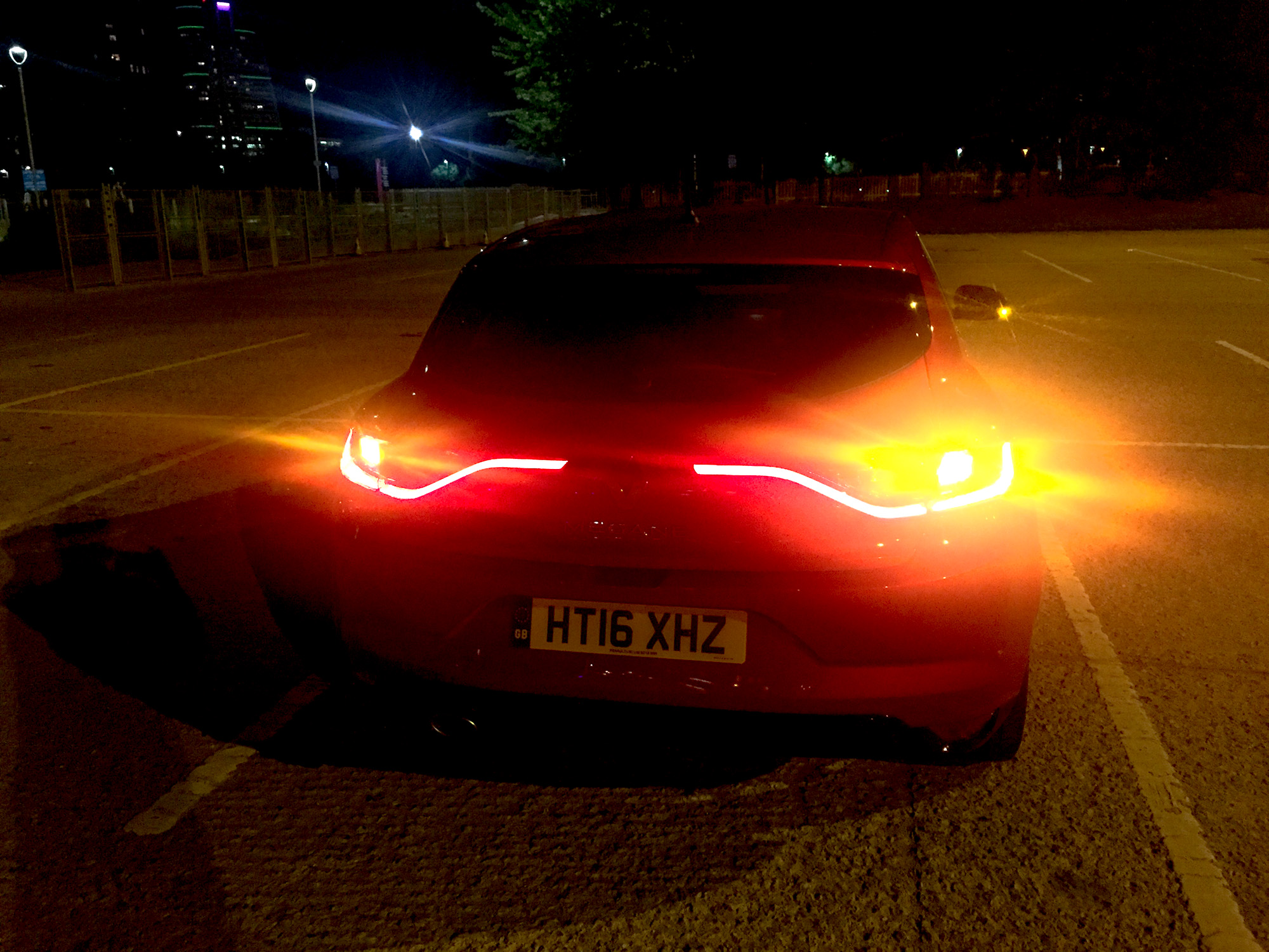
Follow a Mégane at night, and you’ll be in no doubt as to what it is, either: Renault usurps Alfa Romeo’s Giulietta for the most distinctive rear night time signature in this class. The Mégane’s lighting design is a strong point, Renault using full end-lit LED pipes for a more modern and high-tech look than individual arrays of LEDs.
Like all brands occupying the mainstream market, Renault makes no secret of its desire to be seen as more premium. With the fourth-generation Mégane design this is achieved in three ways: proportions, technology and personalisation.
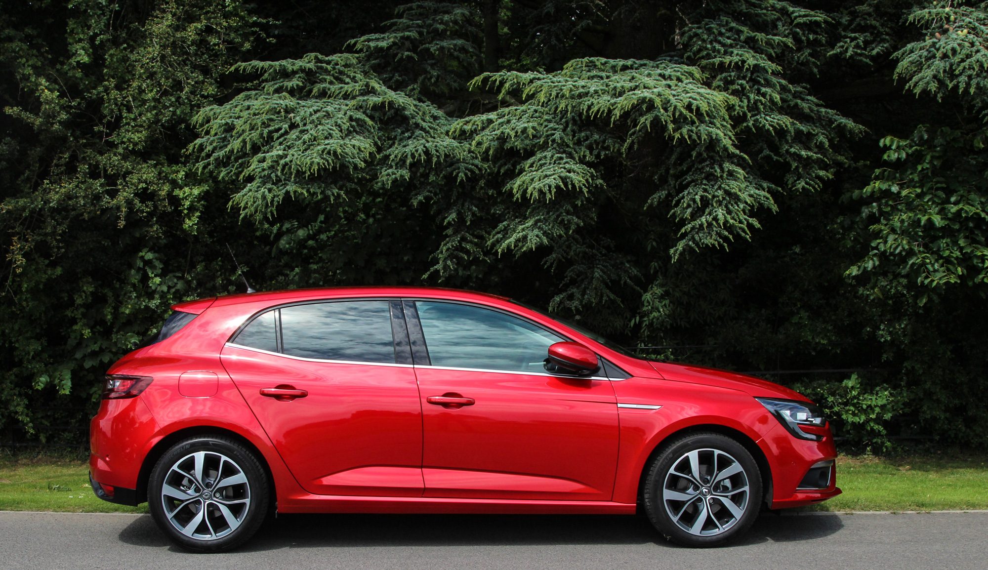
The proportional shift is subtle but noticeable, created by a number of design devices. The Mégane doesn’t reinvent major proportions — it’s still front-wheel drive, with a long front overhang and relatively short axle-to-dash ratio — but these elements are well controlled, helping it sit closer to a Golf or A-Class than a Focus or Astra. The front screen is at a slightly shallower angle, giving the Mégane the more distinct, two-box silhouette which all of the premium C-sector vehicles adopt. The management of the DLO — with a relatively flat belt line, and a graphic contained above the doors — creates the look of a compact, separated cabin, again a premium C-car trait. Finally, the angle of the rear screen, with the help of some fairly crude black wing panels, appears more upright than on mainstream hatches. This is an approach that the first generation Audi A3 Sportback adopted, and which every premium car in this sector has subsequently aped.
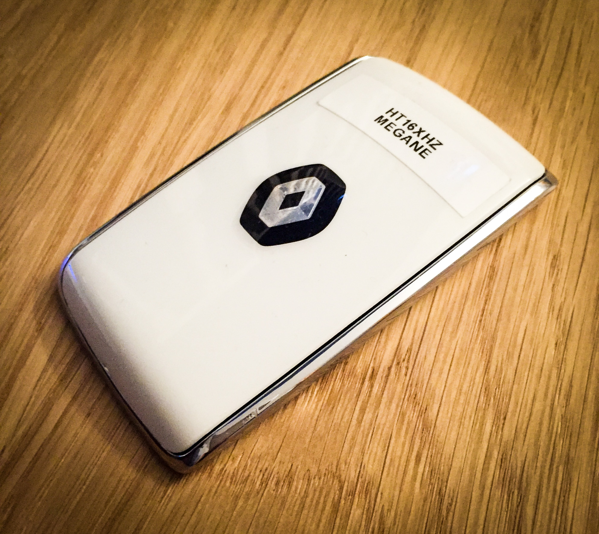
Beyond lighting, the Mégane’s focus on technology isn’t particularly apparent until you get very close. At which point — assuming the rather bulky, key-ring resisting keycard is in your pocket — the car will unlock as you approach, with no need to touch a sensor on the handle. At the same time the mirrors unfold and the interior lighting turns on. Renault has been trying to get its hands-free system right for some time and appears to have finally nailed it, such that the car’s quite human, natural approach to opening and closing is something that endears it to its user — it’s highly practical when you have arms full of shopping or young kids, for example.
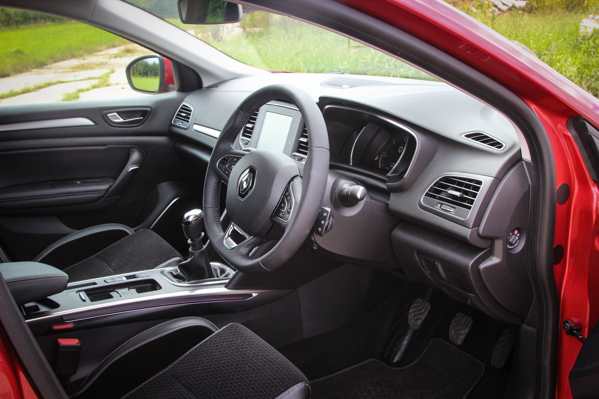
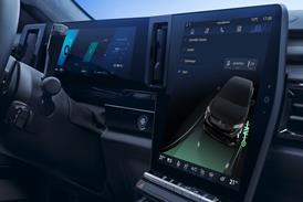
The Mégane has always been comparatively better-equipped than competitors. But while the level of features are available — LED headlamps, radar cruise control, blind spot warning system and full surround proximity sensors — is impressive, it no longer has a clear, distinct technology or specification advantage. Instead, the differentiating factor is left to Renault’s digital cluster, a 8.7” portrait centre touchscreen and their seemingly infinitely customisable modes, skins and lighting schemes. Such is Renault’s focus on this, a centre tunnel button is one of the few remaining physical interfaces in the cabin: its sole purpose to adjust modes. Confusingly, of five modes — eco, neutral, comfort, sport and perso — this button only switches between comfort and sport settings. A separate ‘eco’ button sits below the touchscreen.
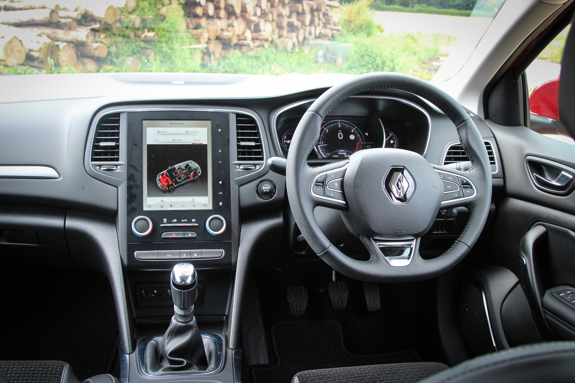
While the lighting changes at night to create a pleasantly theatrical atmosphere, across the primary interfaces the displays feel gimmicky and a little cheap. The cluster graphics in sport and neutral modes are relatively clear and easy to read, but despite the level of adjustability (the home screen of the centre display can be configured like your smartphone to contain various menu tiles), certain basic setups remain elusive. For instance, regardless of the cluster set up selected, navigation turn-by-turn instructions are never displayed larger than a tiny graphic within, or top-right of, the huge digital speed/rev counter; nor were we able to select one of the homescreen tiles to contain the phone menu.
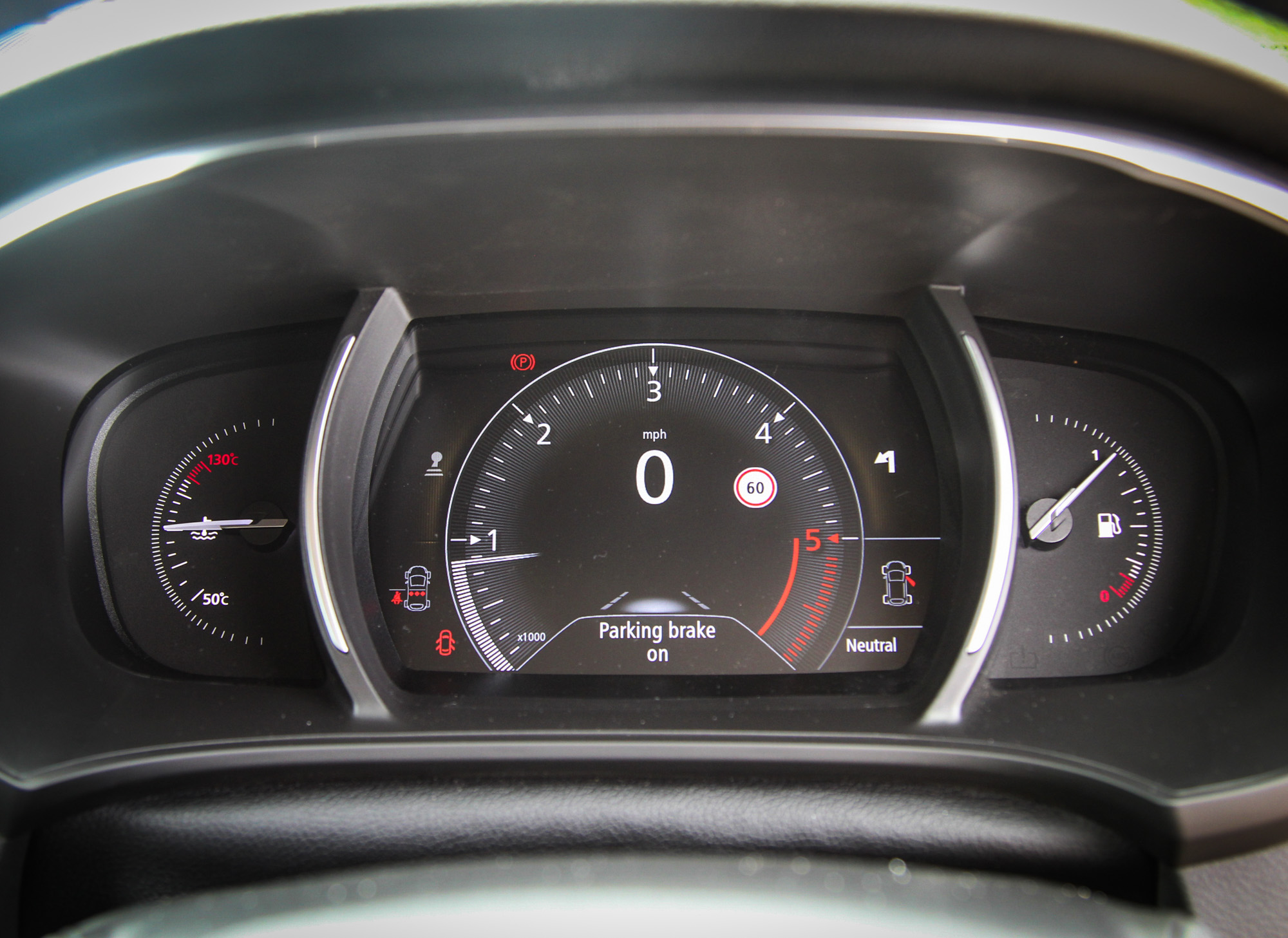
There are elements that truly work — the TomTom-based sat nav is clear and pinches to zoom, some of the on-screen buttons are big and easy to hit, and Renault’s steering-column volume controller falls naturally to hand and works brilliantly simply via feel.
But overall, the in-car user experience is disjointed. And partly because of the level of available customisation, the driver feels like they’ve never quite got the system optimised, always searching for a better set-up: the paradox of choice. On-screen graphics and definition don’t live up to the premium lighting technology and feel of the exterior design, either. Renault is not alone in this, of course, but it’s sad to think that this interface — applied across many new Renaults — already has issues and will clearly feel and look horribly outdated very quickly.
Which is a shame because, while it is less distinctive than the second-generation car, the Mégane IV is a significantly improved, more appealing product than the model before it. It lacks a stand-out element, but van den Acker has shown how to rebuild a car company based largely around strategic design values. The Mégane might not be the boldest of the new family, but it should still sell purely on how it looks. What Renault sorely needs to do now is carry that clear, bold strategy through into its user interface design.
