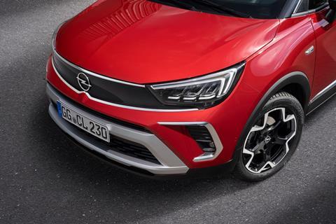
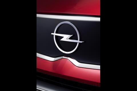
The Crossland has taken on Opel’s modern new grille design, but other areas of the model are less impressive.
The new Opel Crossland has been unveiled, and with it comes the evolution of the company’s design language.
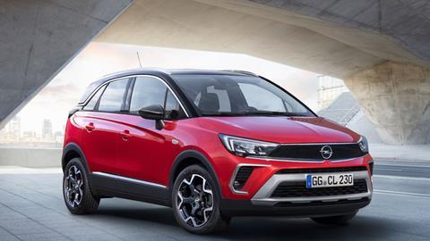
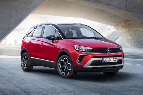
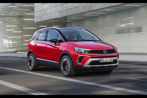
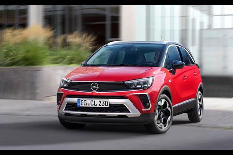
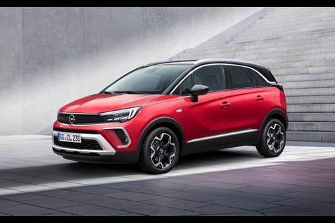
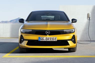
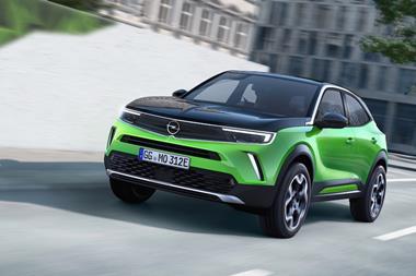
The front end looks modern and sleek, with the new ‘Vizor’ grille (first shown on the Mokka) stretching from headlamp to headlamp. The ‘L’ shaped lamps wrap around the body work to finish above the wheels. Under them are two air intakes that are outlined on three sides by chrome, with the inner sections running into the body. It is all pretty neat, in a chunky sort of way.
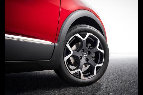
But other details are less convincing. The side profile of the Crossland is almost retro, with the large black wheel arches and two lines scored into the body. These lines meet just behind the front wheel and form a similar shape to the air intakes on the front end.
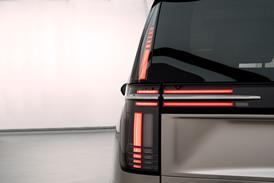
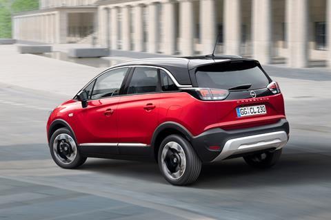
There are new dark-tinted tail lights at the rear, sitting high and eating into the space of the rear window. The thinking is to convince the viewer that the car is wider than it actually is. Between the lights is a new glossy black surface that has the Opel badge in the centre. The glossy black plastic continues after the rear lights and into the quarter glass windows, joining a strip of chrome that runs above each of the windows.
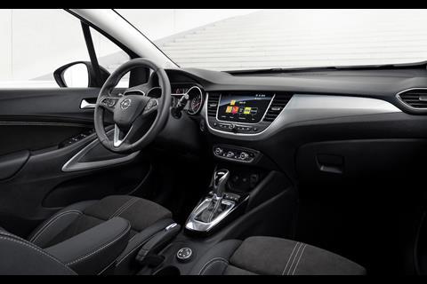
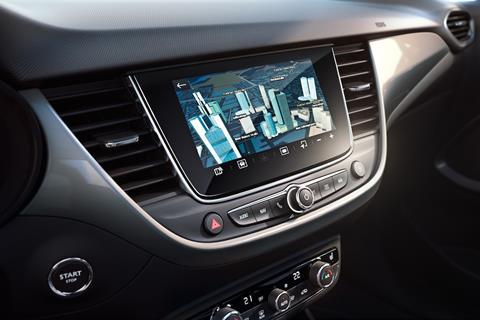
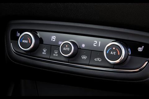
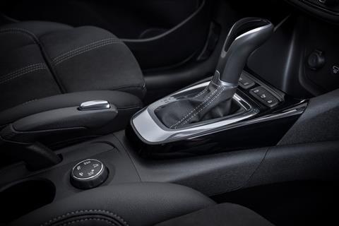
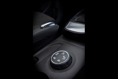
The interior continues where the previous iteration left off, that is to say the cabin is typical of Opel models of the past, with plastics used for most of the surfaces. Some chrome has been included in an attempt to break up the plastics, outlining the touchscreen and running across the passenger side of the dash. There is also chrome used around the gearstick and the speakers on the doors as well as for the button on the handbrake, emphasising its size and clunkiness.

















No comments yet