It’s bigger and much better looking than the outgoing car, but is the fifth-generation Nissan Micra a hit or a miss inside?
Before pondering the fifth-generation Micra, it’s probably worth stopping to assess the mountain Nissan gave itself to climb. The previous Micra (K13) was unveiled alongside the Nissan Juke at the 2010 Geneva show, and the pair could hardly have been more different. Where the Juke was a brave, inventive and polarising design, the Micra was bland, timid and almost universally disliked by critics.
Buyers responded accordingly; sales of the Juke took off like a rabbit, while the Micra’s numbers dropped away like a stone.
A thorough facelift in 2013, inside and out, couldn’t correct the car’s basic shortcomings, which included bulbous proportions and awkward dimensions that put the car midway between A- and B-segment norms. The old car managed no better than 12th place among superminis in Europe during the first quarter of this year.
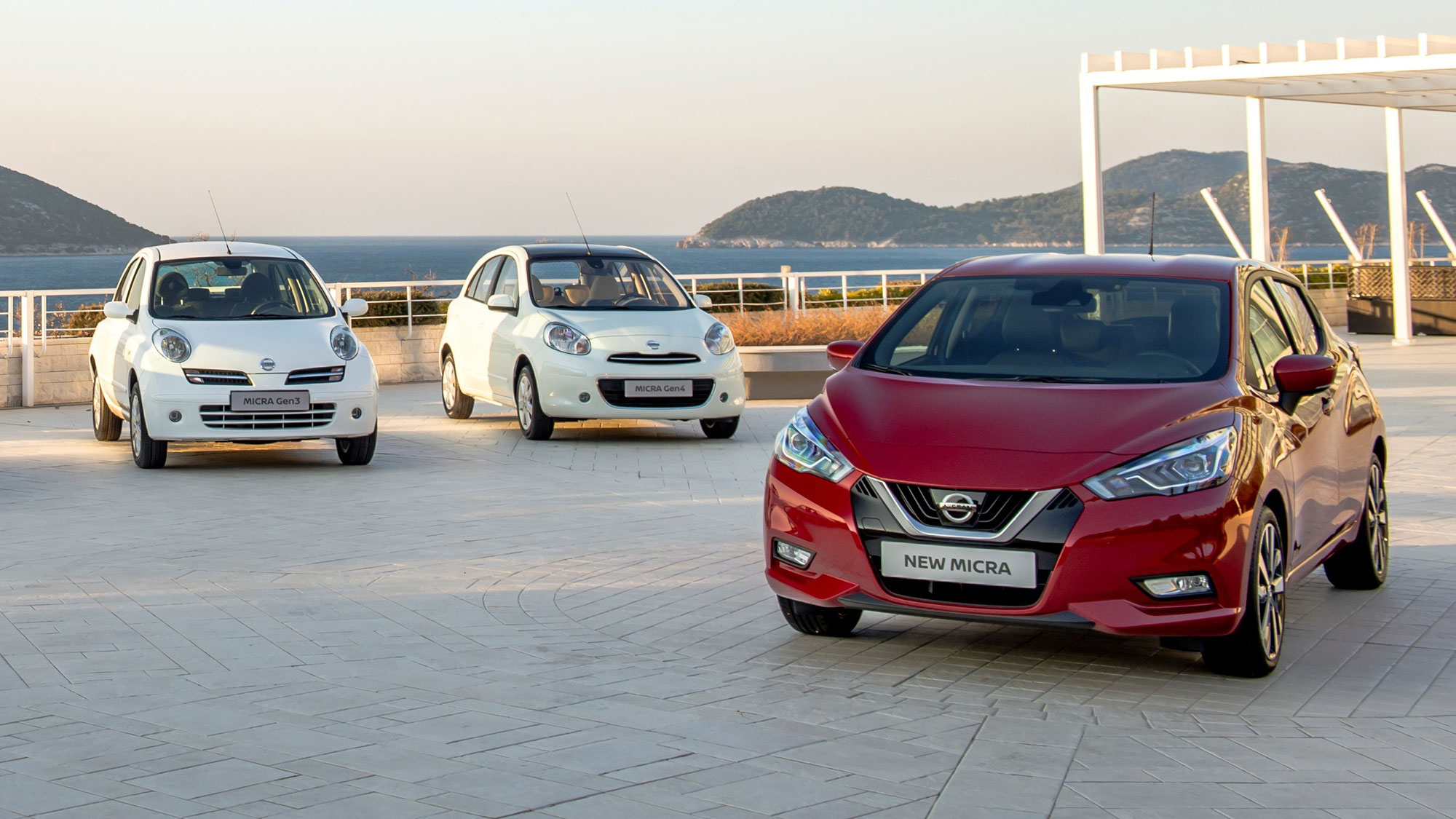
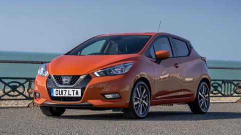
Third, fourth and fifth generations, left to right
Unsurprisingly, Nissan has taken a clean-sheet approach to the latest Micra, unveiled in production guise at the 2016 Paris show after debuting as the Sway concept the previous year in Geneva.
The sharply styled new body is significantly longer, wider and lower than before, pitched much more accurately into the European B-segment. At a millimetre under four metres from bumper to bumper, the new Micra has jumped up a massive 220mm from the 2010 car, landing in much the same ballpark as the latest Fiesta. The new Micra also stretches 77mm wider across the doors than its predecessor.
Bigger interior
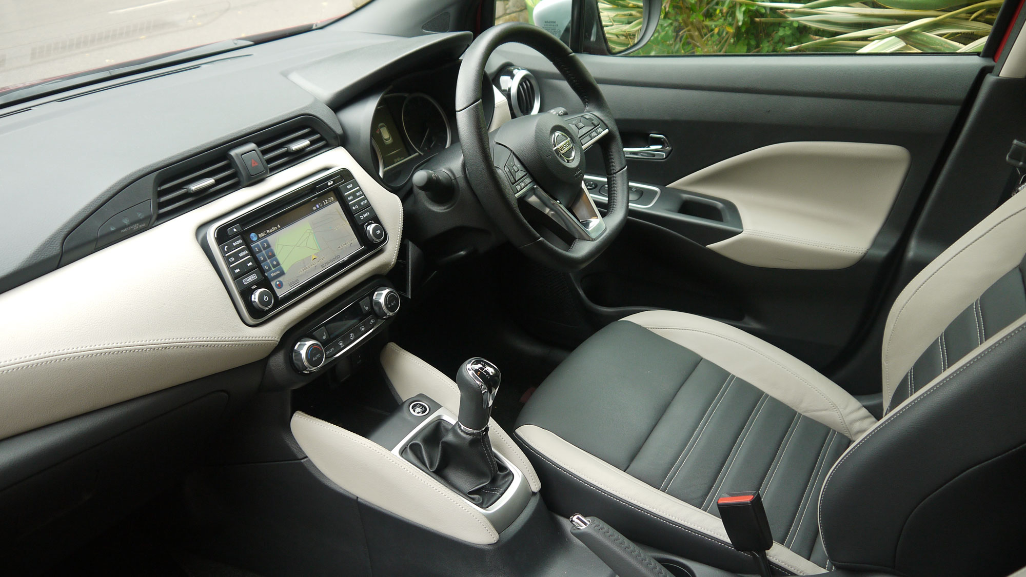
The extra size – plus a longer wheelbase – provides a much more spacious feeling inside, with the new horizontally layered rather than vertically aligned dashboard helping to advertise the extra width.
All trim levels get a soft-surface dash top, while premium editions gain stitched synthetic leather across the decor panel, door card inserts and knee pads either side of the gear lever housing. There are lots of vibrant interior colourways for customers to choose from.
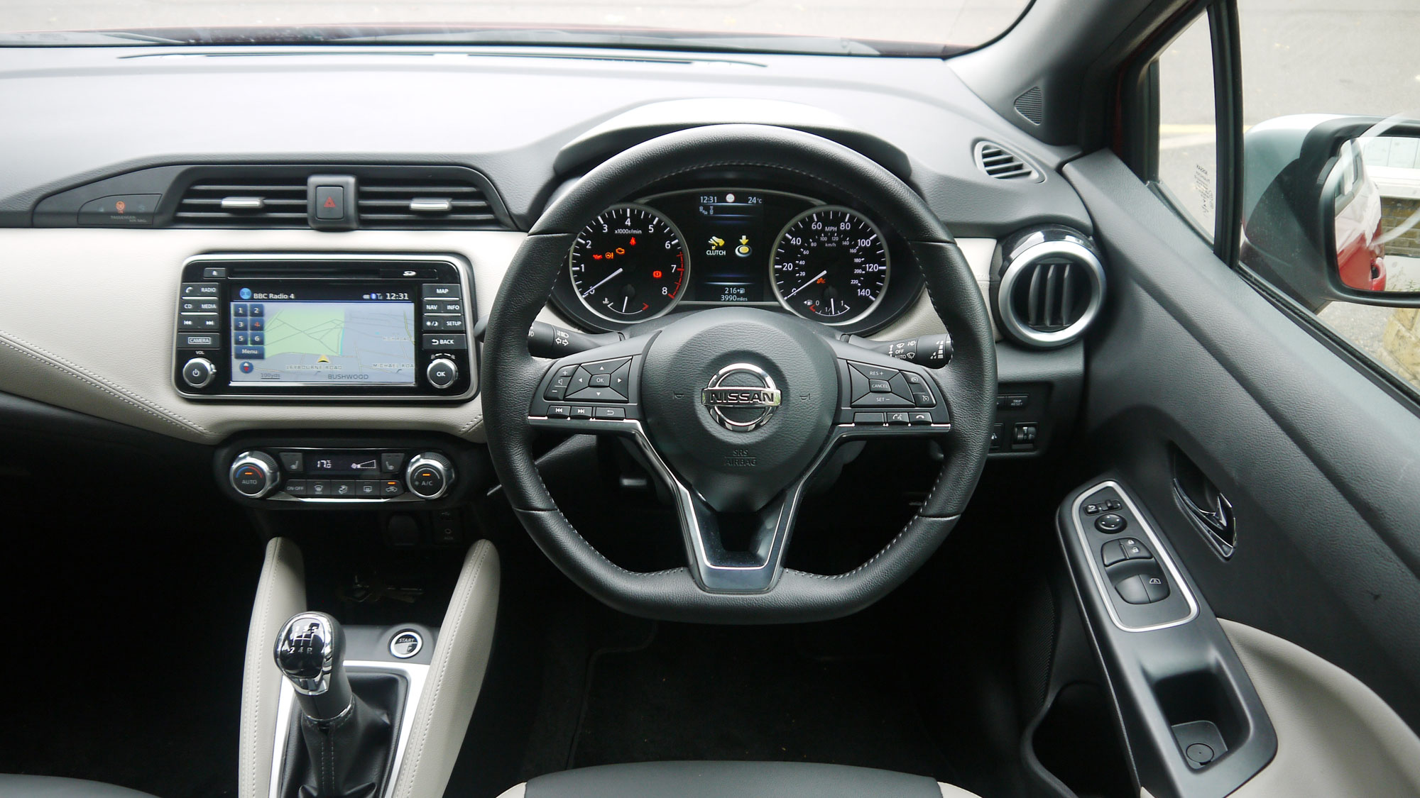
The centre console tray, ahead of the gear lever, comes pleasingly lit with a polka-dot pattern of LEDs, helping to make items tossed into this otherwise dark recess more visible. The shadow cast by the IP sculpting, meanwhile, creates a dramatic wing-shaped motif across the width of the dash.
The steering wheel is very neatly done at all trim levels, with a compact airbag housing and an array of sensibly arranged buttons, illuminated orange at night. The wheel is visually identical to the one added to the Qashqai as part of its 2017 facelift, with a V-shaped metallic spoke design that echoes the family “V-motion” signature seen on Nissan noses.
Digital displays
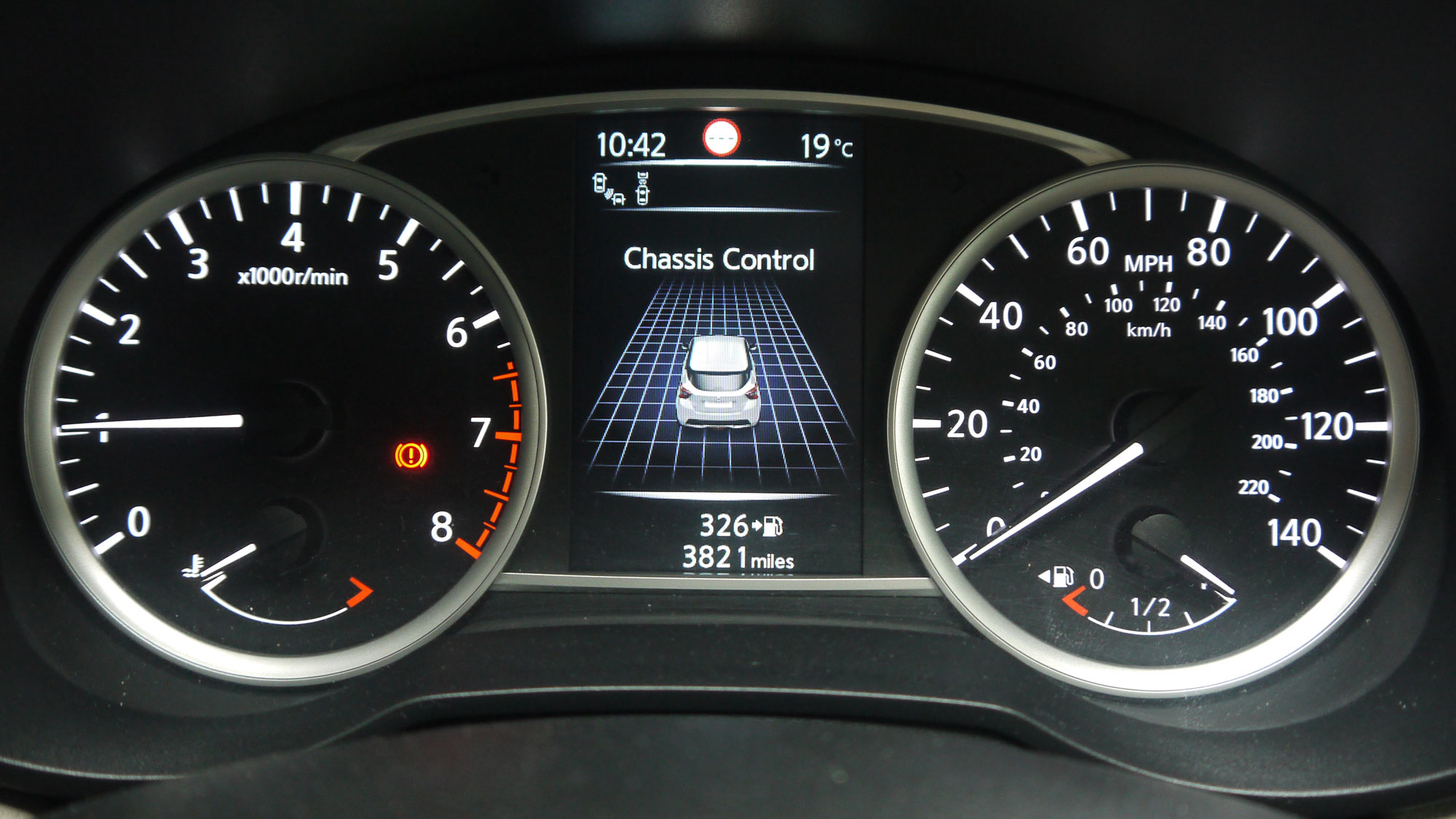
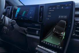
From the mid-range up, the instrument cluster includes a bright, five-inch portrait TFT display between the main analogue dials and a seven-inch landscape touchscreen. When the system starts up, an image of the car spins onto the colourful instrument display as the white-lit needles swing back and forth in an enchanting choreographed welcome (see top image).
The centre touchscreen again is closely related to the equivalent item in larger Nissans such as the Qashqai and X-Trail, with identical on-screen graphics and the same arrangement of buttons and knobs flanking the screen both left and right. The fascia, bezel and button surfaces differ, however, though the finish applied to the Micra looks crisp, clean and uncluttered.
Borrowing instrument, console and HVAC modules from Nissan’s C and D-segment cars was a conscious strategy designed to lift perceived quality of the Micra, according to Nissan, and it seems to have paid off.
![]()
The centre screen sits within a neat, chrome-rimmed housing that floats proud of the dash surface. Happily, night-time illumination of the centre console buttons matches the orange of the steering wheel controls. However, in daylight there’s a marked difference in the lettering contrast between the two sets of buttons.
Few owners are likely to assess the visual weight of button labels, but many may notice the disjointed approach to graphics between the instrument panel and centre screen. Both continually display the time, for example, but in an almost wilfully different way: at top left using a medium-weight, narrow, sans-serif font in the instrument panel versus top right in a bold, wide, serif font in the centre console. Still, at least the pair are synchronised and show the same time.
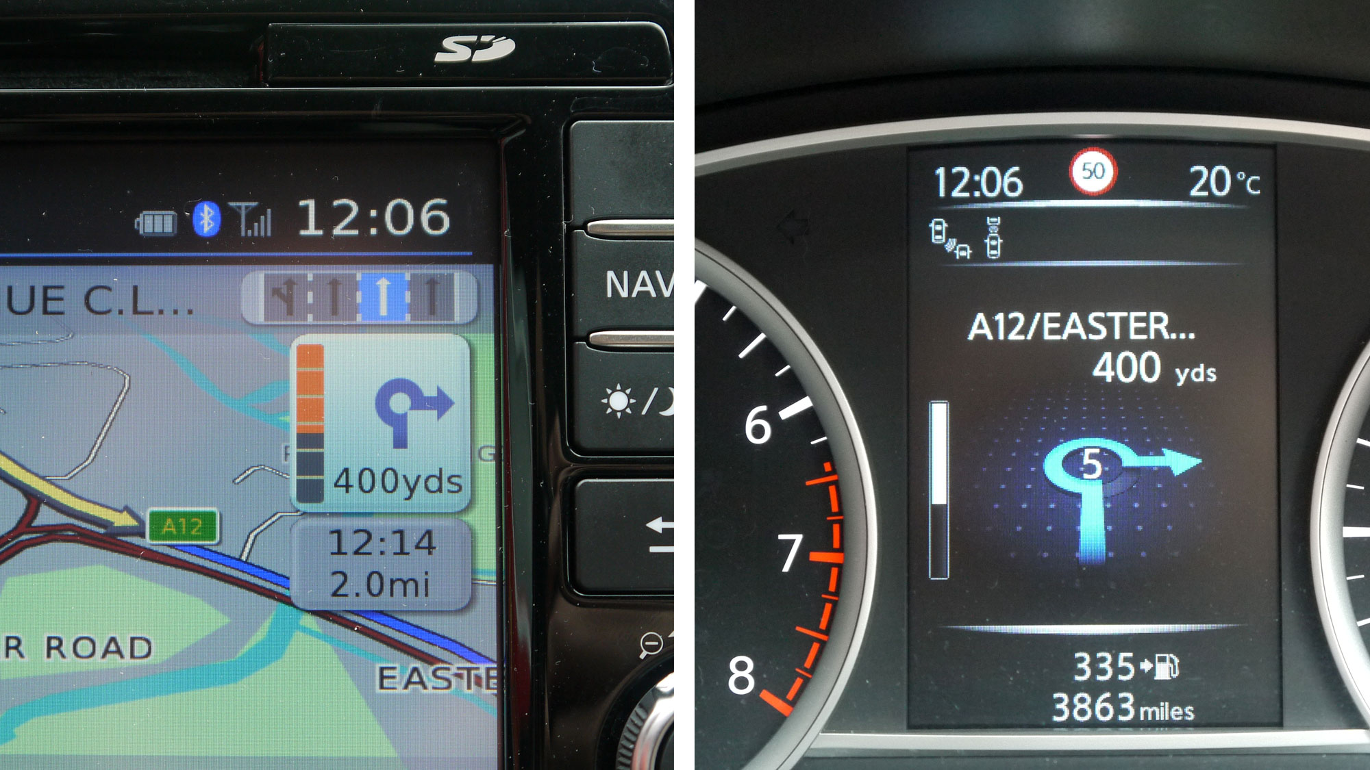
Similarly disjointed presentation is seen when using the navigation software. Approaching a junction, for example, the exit layout is shown in plan view in the centre console, but in perspective between the dials. Both displays count down the distance to the junction with a vertical progress bar, rendered in smooth black and white between the dials, but in segmented orange and grey within the satnav screen.
The lack of consistency doesn’t make the two displays any less useful, but it does harm the impression of quality and care that Nissan presumably would like to project. However, the Micra is not unique in this respect – the freshly updated Qashqai exhibits an identical set of graphical discrepancies.
Disjointed UI
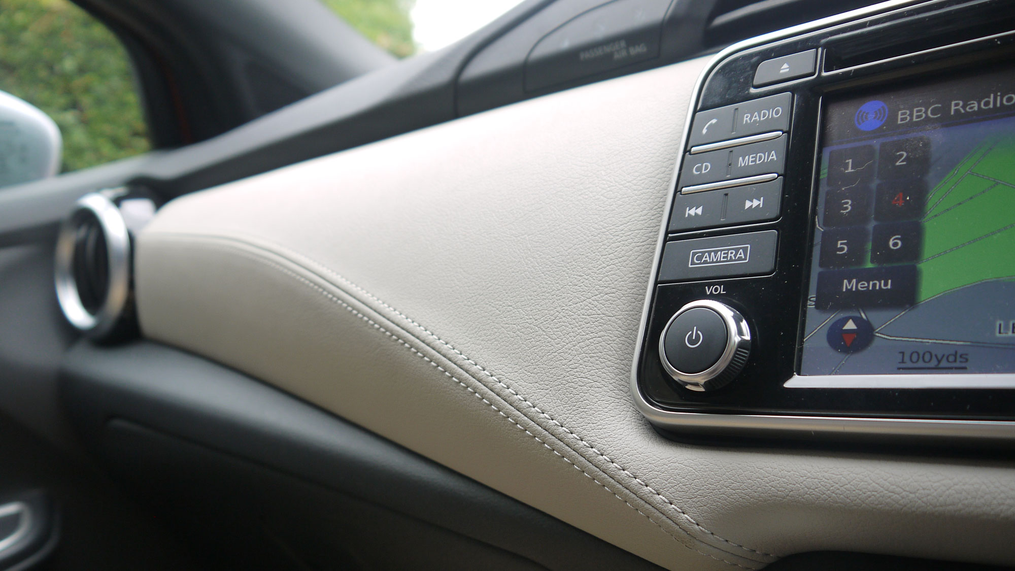
Some other aspects of the centre console UI design seem like very unwise decisions. When you scroll through the app-like icons on the home screen (using the rotary knob controller, as the screen is not swipe or pinch compatible), your selected option will be ringed in gloomy orange while its text label will drop from high-contrast white to low-contrast black. As a visual method of bringing the chosen item into focus, it looks a lot like the option just greyed out.
Overall, the centre screen software feels as if it trails a generation behind the graphical sophistication of the instrument screen. It would not be surprising to learn that the screens were developed by entirely separate teams, perhaps at different suppliers, probably on different continents.
On a happier note, it’s good to see driver assistance features like automatic emergency braking, speed sign recognition and blind spot monitoring filtering down into this generation of Micra. Nissan’s Around View Monitor also makes a welcome appearance on the new car’s options list.
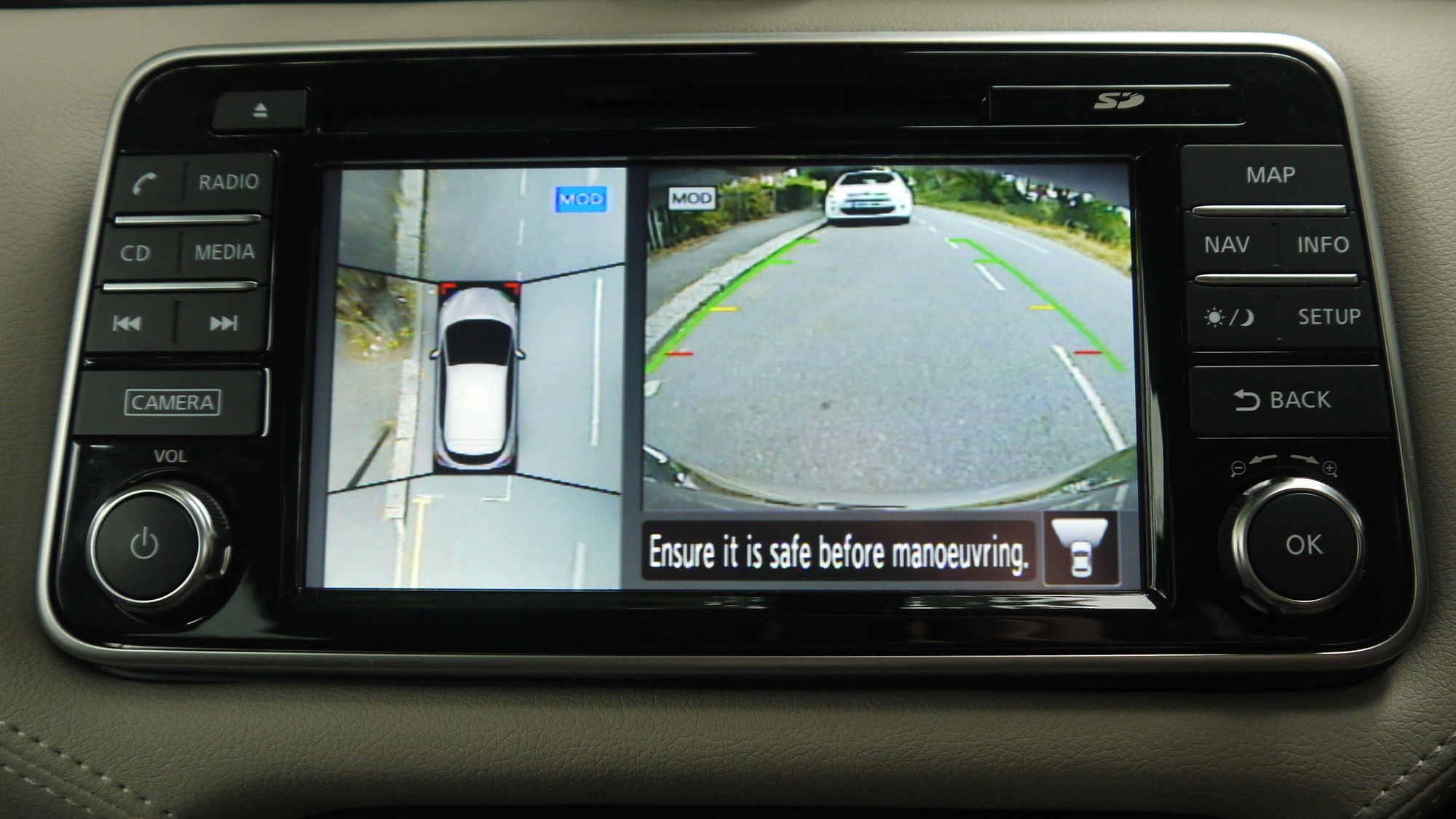
The monitor system adjusts the perspective of images shot by four cameras around the car, providing a very helpful and surprisingly accurate plan view of the car’s surroundings that’s invaluable when manoeuvring in tight spots. It pops on to the screen automatically when reversing or can be called up at any time using the ‘camera’ button. Alerts from the bumper-mounted parking sensors are also overlaid on the surround-view images to provide a belt-and-braces warning.
Upmarket options like these, plus a wide range of colourful personalisation features, ought to help Nissan claw back the cost of building a bigger and better Micra for this fifth-generation supermini. However, it clearly needed to be done.
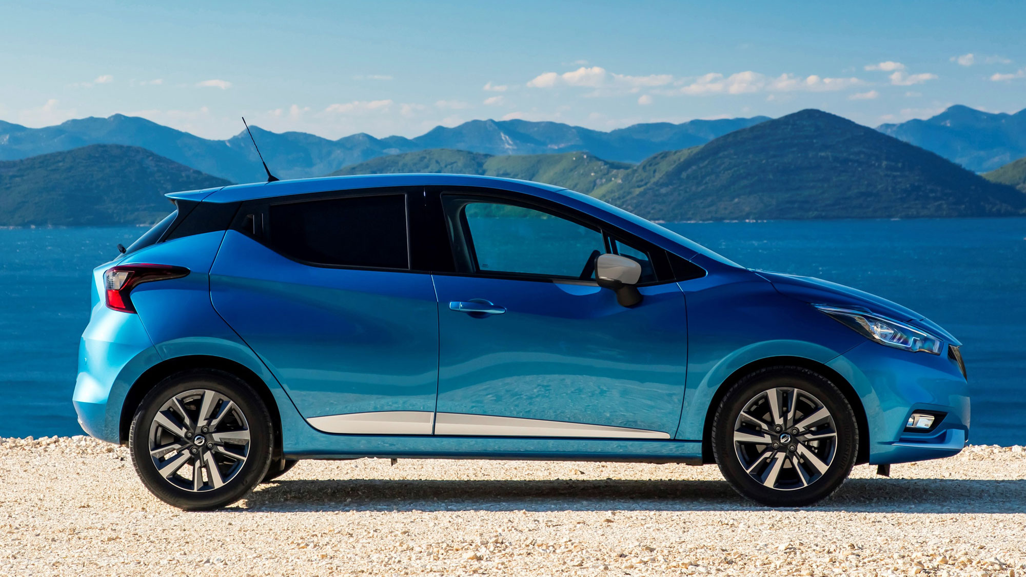
Despite software shortcomings and various other niggles, it’s obvious that the new Micra has taken a dramatic step forward, and upward. With its enlarged, much more inviting cabin and its sharply styled exterior, the Micra once again looks like a car that’s going places.


