Range Rover’s smoothed-down Velar is important to their future – but it’s not without flaws
It was unveiled in a design museum and wowed the crowds in Geneva, but it’s only now that we see the first Range Rover Velars out on the roads. Despite the historical connotations of its name, the Velar feels like a bigger departure from anything that’s come from the brand before.
It’s more car-like, and differs from other Range Rovers in using the same platform as the Jaguar F-Pace. CDN got behind the wheel recently, and came away with a series of key viewpoints, gleaned over a week with the British firm’s newest product.
1: Big Evoque? Or small Sport? Neither
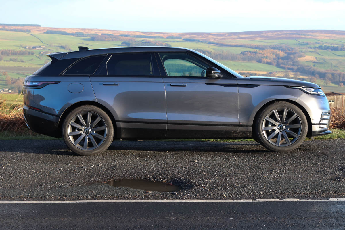
The Velar is unusually positioned. It doesn’t fit the 4.6-metre long D-segment premium SUV template which would see it between the Evoque and Sport, size-wise. At 4.8m long it is far closer to the Sport than the Evoque. Yet in stature, it is only a couple of centimetres taller than the Evoque – and this is the key dimension. It reads low, paving the way for other future Range Rovers that are, quite possibly, little higher than regular cars.
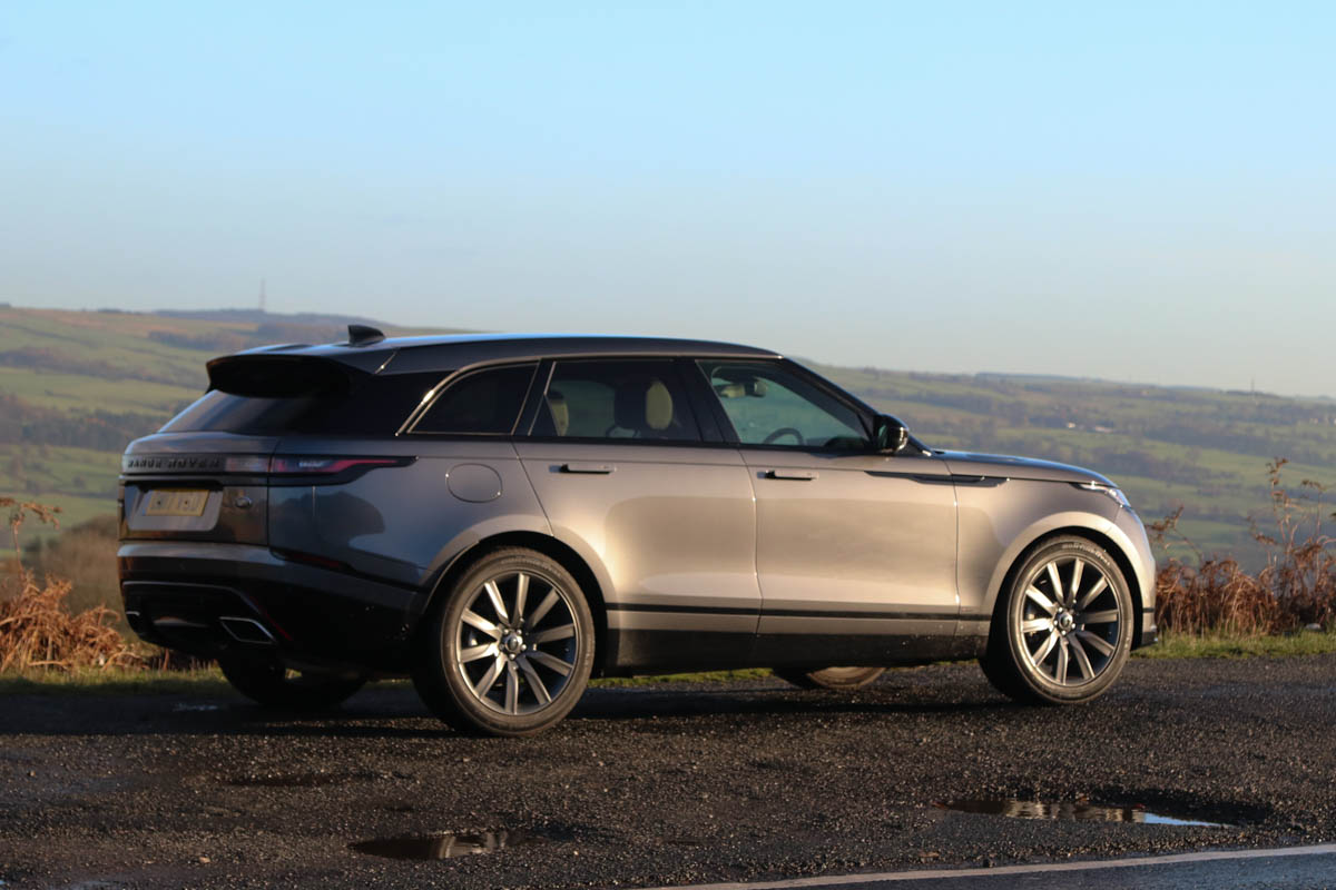
Perhaps its greatest achievement is in feeling like its own thing – neither a larger or smaller version of another car in the range. Maybe that’s why seventy-five percent of sales so far are ‘conquest’ (new customers). The Velar should appeal to people who have never considered a Range Rover before.
2: A clean-shaven face
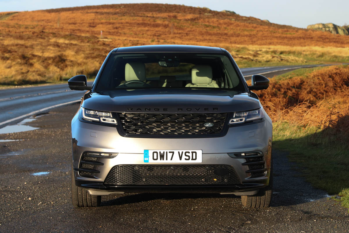
The Velar’s down-road graphic (DRG) is arrestingly different. Despite featuring traditional Range Rover facial graphics, it looks different to the rest of the range.
Much of this comes from the total lack of offset between bonnet shut, grille, lights and bumper – an offset which is there between these elements in most of the other products.
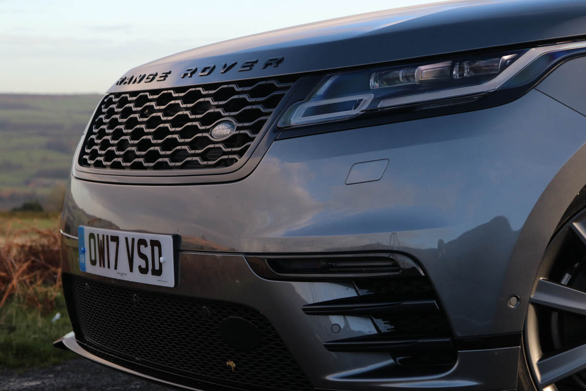
But there is much more plan shape too, as opposed to the distinct corners of other Range Rovers, thus further making the fascia feel integrated rather than built up from various masses.
3: A shoulder defining a car
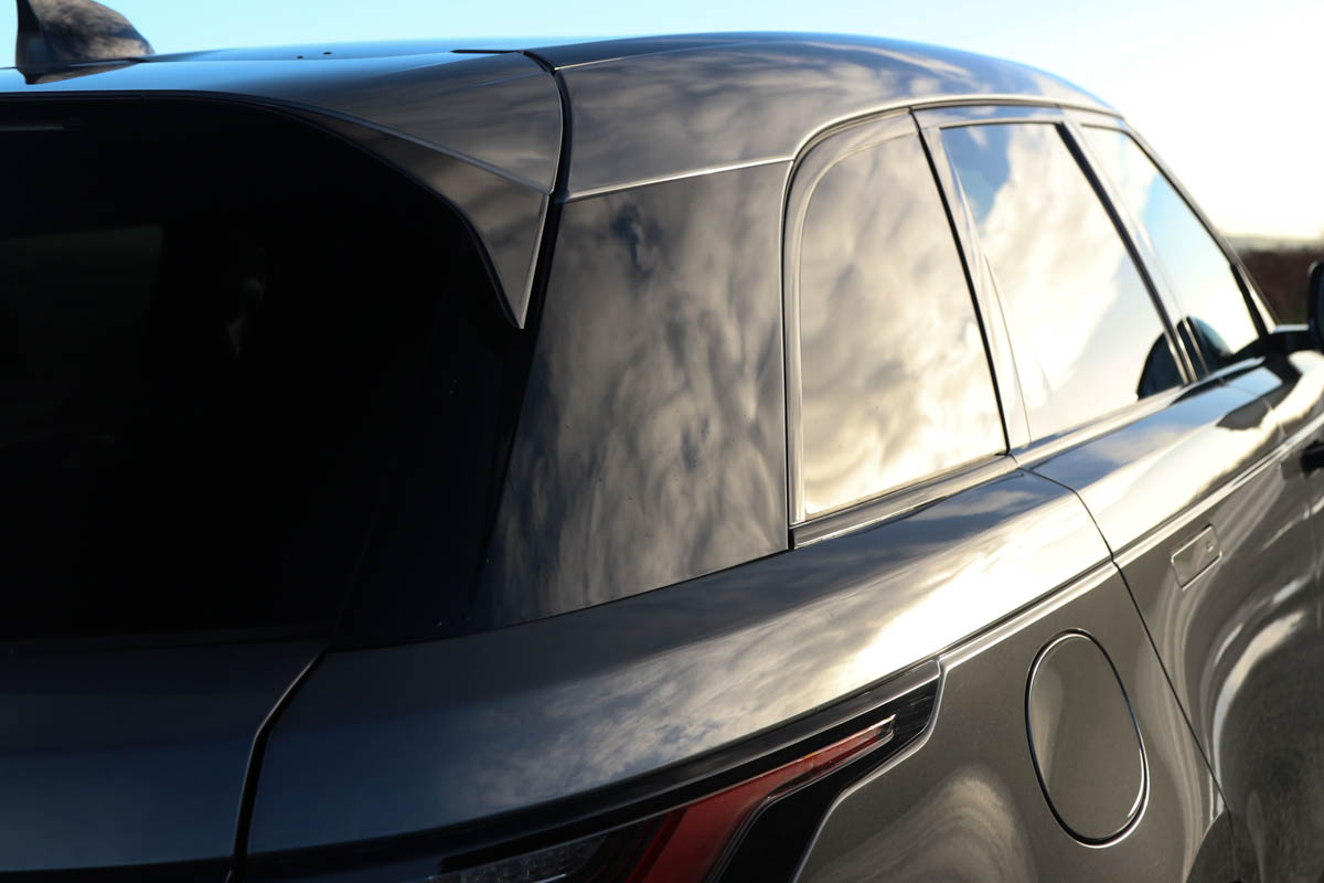
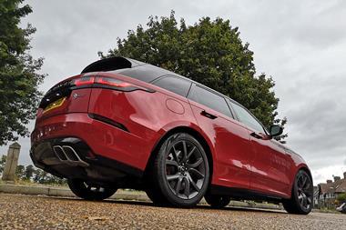
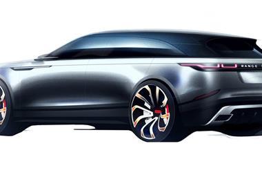
The shoulder – which runs from the bonnet all the way around the rear of car – very much defines the character of the Velar. Sitting the cabin inboard reduces its visual mass.
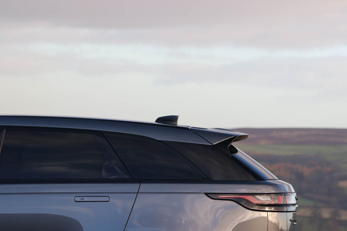
Combined with the flushness of the bodyside, cabin glass and roof, this is another core differentiator for the Velar, compared to what’s gone before for the brand.
A lower-spec Velar
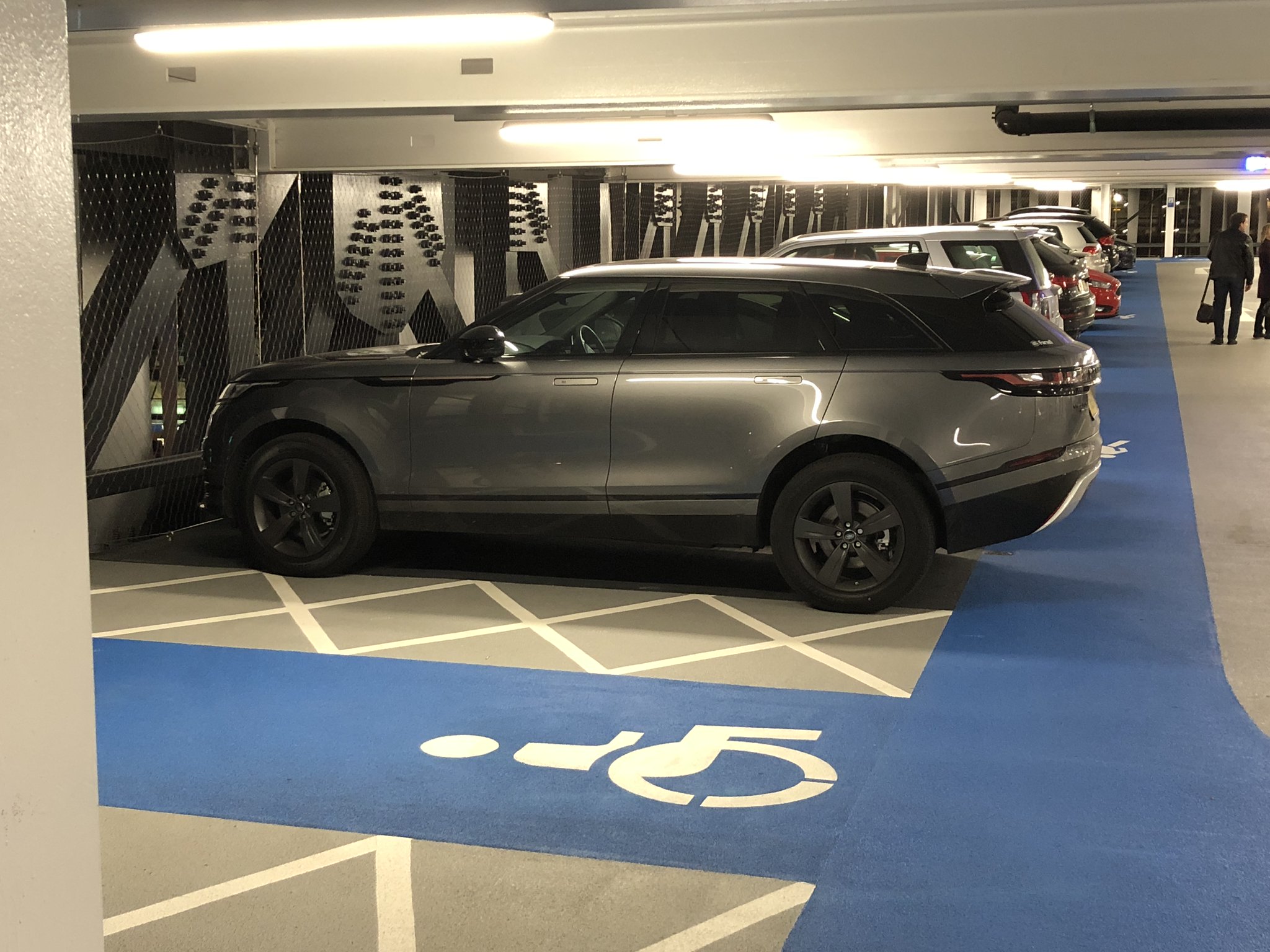
But this feature and the flush-ness (see below) is also partly the reason why the Velar is so spec-sensitive. It works well when the body is rendered in a light colour, the roof in black to integrate the glasshouse, and with large wheels. By contrast, an all-black variant on small wheels looks ill-defined and not very premium.
4: All of a flush
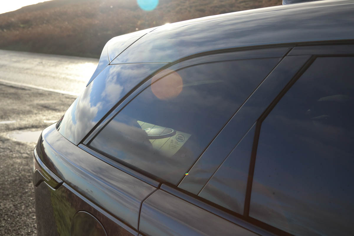
The flushness of the glazing, pillars and roof panel is another significant factor in the ‘Range Rover but different’ visual identity that is projected. It means the Velar has more car-like speed forms than its relatives.
5: Badly badged
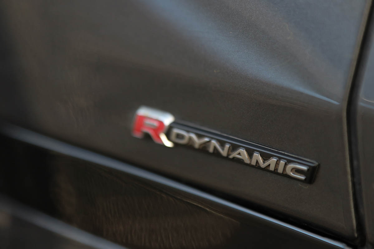
The Velar follows a growing trend (we’ve seen this with Audi and BMW recently, too) for a bewildering amount of badging and sub-brand badging being applied to the exterior. Both Land Rover emblem and Range Rover script sit at the front.
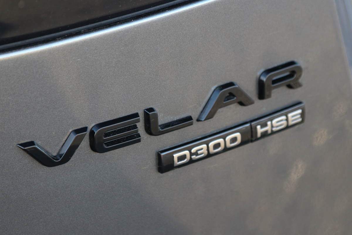
The old repmobile fashion of flashing your trim level is back…
So far so normal, but then our test car also featured ‘R-Dynamic’ (trim branding) in the gap behind the front wheel, while on the back not only is there ‘Velar’ but ‘D300’ (denoting fuel type and power, in PS), and HSE (another part of the trim level).
Is this the subconscious influence of the technology world, and its confused approach to sub-branding and spec identification, seeping into the car world?
6: Door handles – a triumph of aesthetics, and aero, over usability
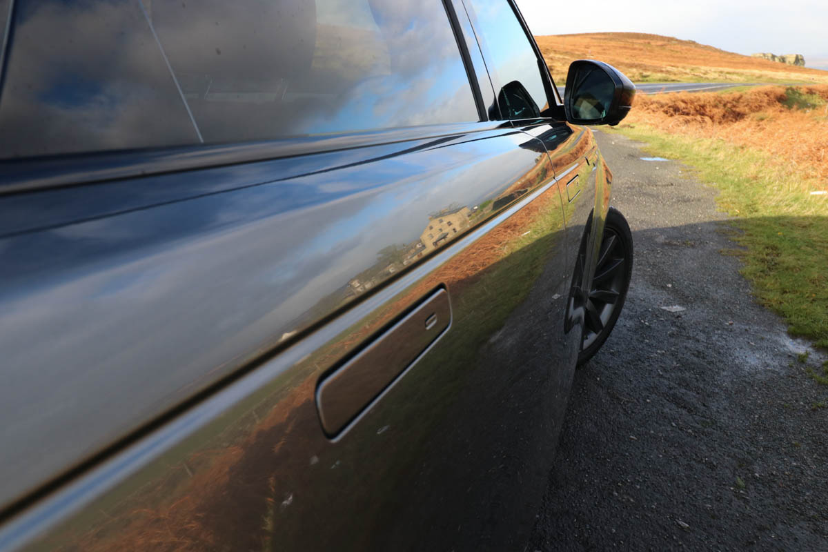
The flush door handles, which retract to sit flush with the bodyside when on the move, have been the subject of significant comment. While they provide great visual (and likely aero) gains, from a usability point of view they ruin a rather good keyless entry system.
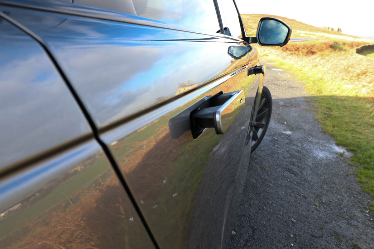
To get the door handles to pop out as you approach the car, you’re forced to get the key out of your pocket and press the unlock button (rather defeating the point of keyless entry altogether).
Or if you prefer to keep the key in your pocket (as you tend to) you’re forced to walk up to the car, press the small button on the handle, wait for the handle to pop out, then clasp it and open the door.
It slows the entry process, creating three steps where one used to suffice.
7: In these Brexit times…
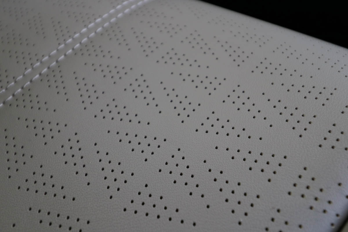
Car brands have been making significant use of their national heritage recently, and Range Rover’s Britishness (it is a brand by Royal appointment after all) is a significant plus factor in many parts of the world.
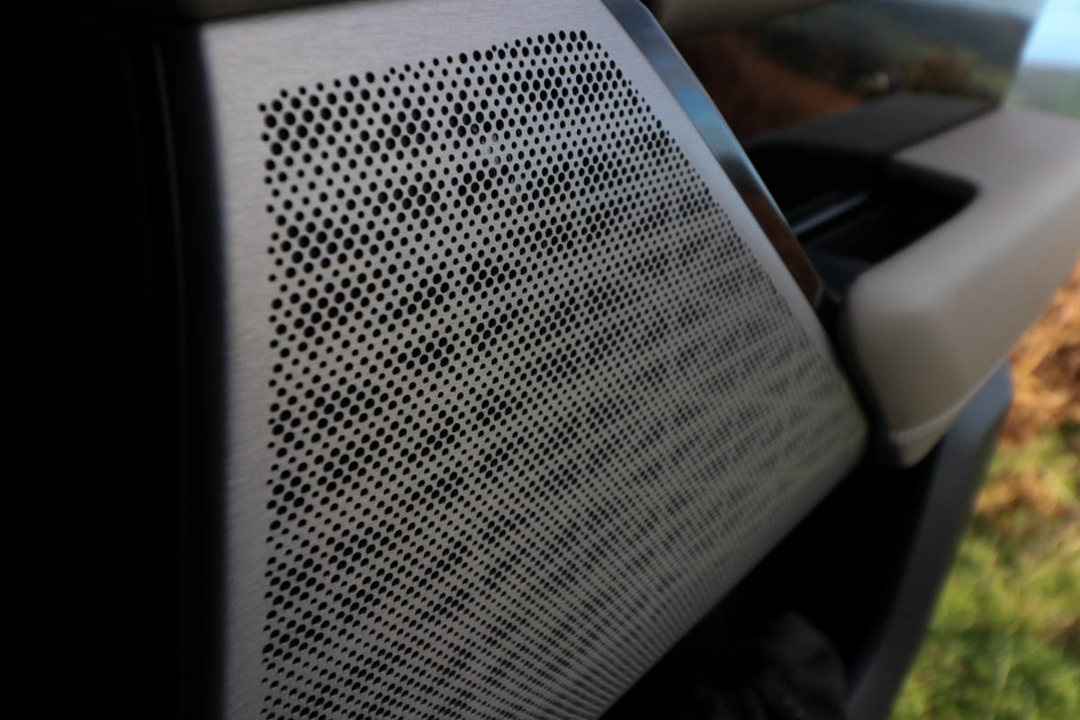
However, the Brexit process isn’t exactly painting Britain’s image in a positive light, particularly in Continental Europe. So, the use of a very subtle Union Flag motif – the speaker grille baffles and leather perforations align themselves as British flags – is smart. It won’t be a reference ‘seen’ by all.
8: Interface wow factor… with a ‘but’
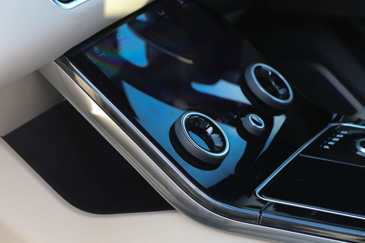
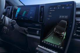
The third, lower console digital screen has an undeniable initial wow factor. Its uniqueness creates a response similar to the one we recall feeling when Volvo first showed off its ‘floating’ centre console. Get past the initial novelty, however, and there are issues.
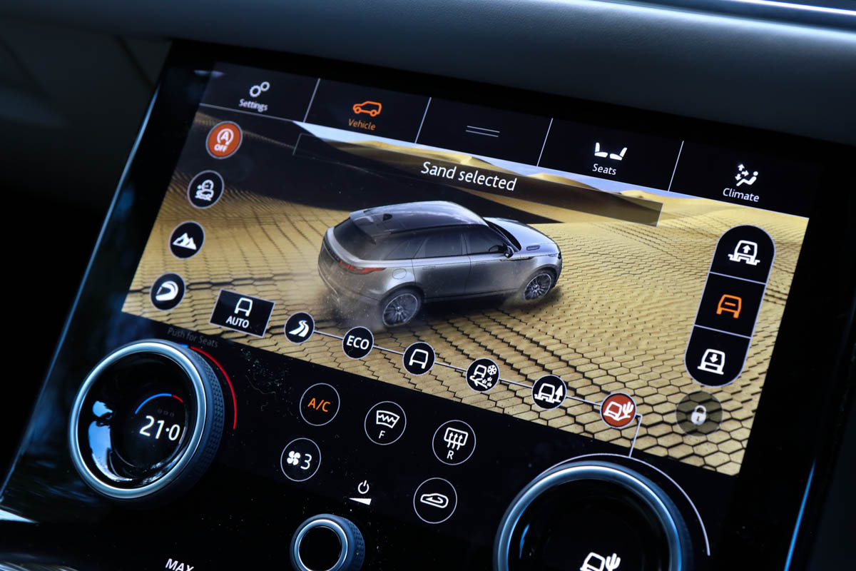
Richly rendered and bright, the lower screen throws significant amounts of white light into the cabin at night in most of the display modes. There is also a significant amount of duplication within the control set up – much of what can be done on the pair of reconfigurable rotary knobs can also be done by touching a button on the screen.
9: Wheel-y clever
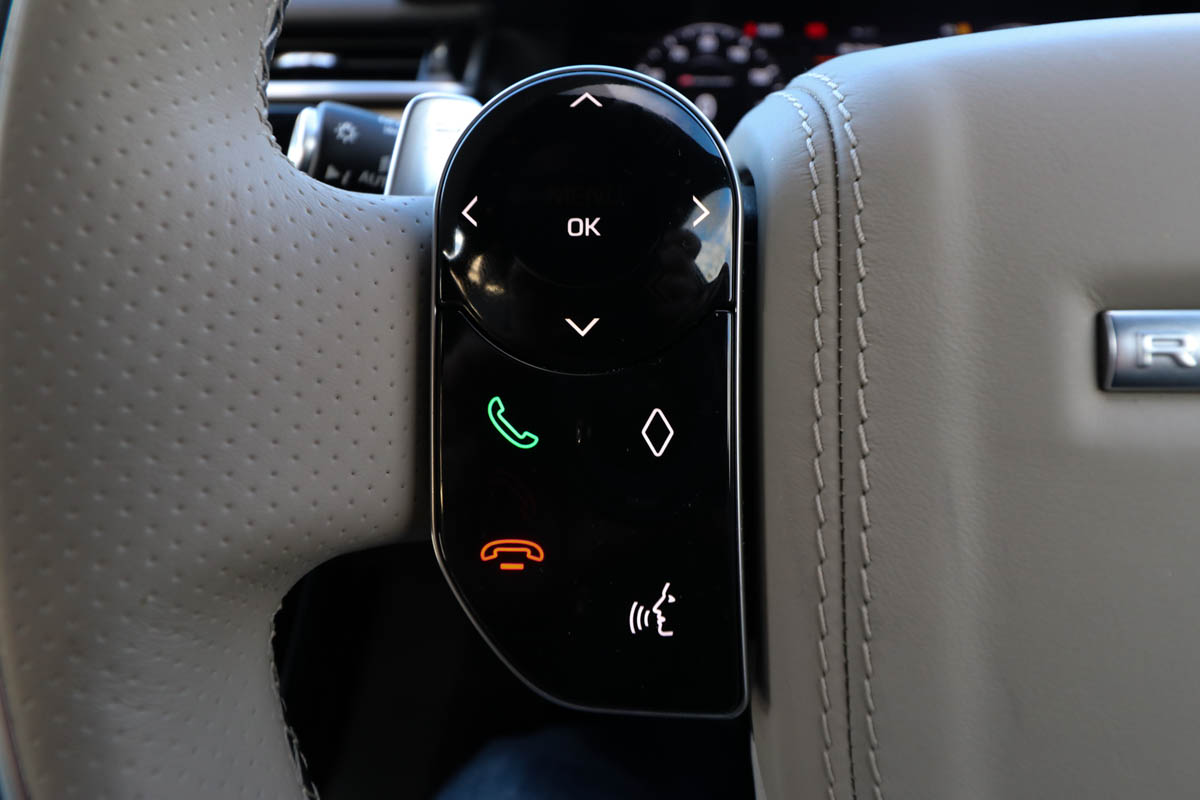
One aspect we hadn’t understood when we saw the car on static display in Geneva was the steering wheel controls. This is a clever aspect of the interface – the units are backlit, meaning what is displayed on them can reconfigure as you dip between the default (volume/scan) use case and the menus in the instrument cluster, or use the phone.
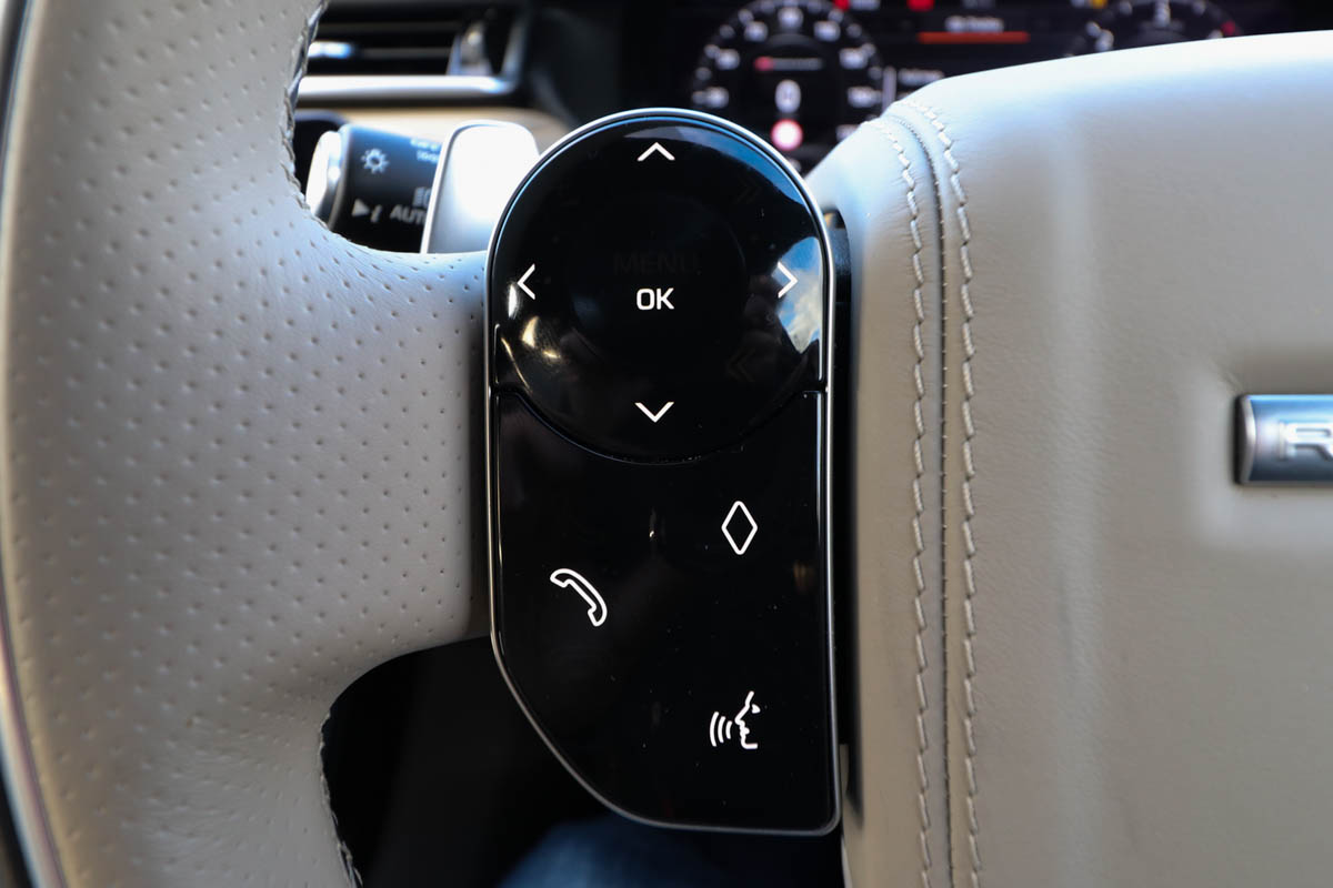
It’s a pity that their response to physical jabs and strokes (the buttons move physically and have capacitive touch functionality) is so inconsistent, though.
10: Put your feet up, not down
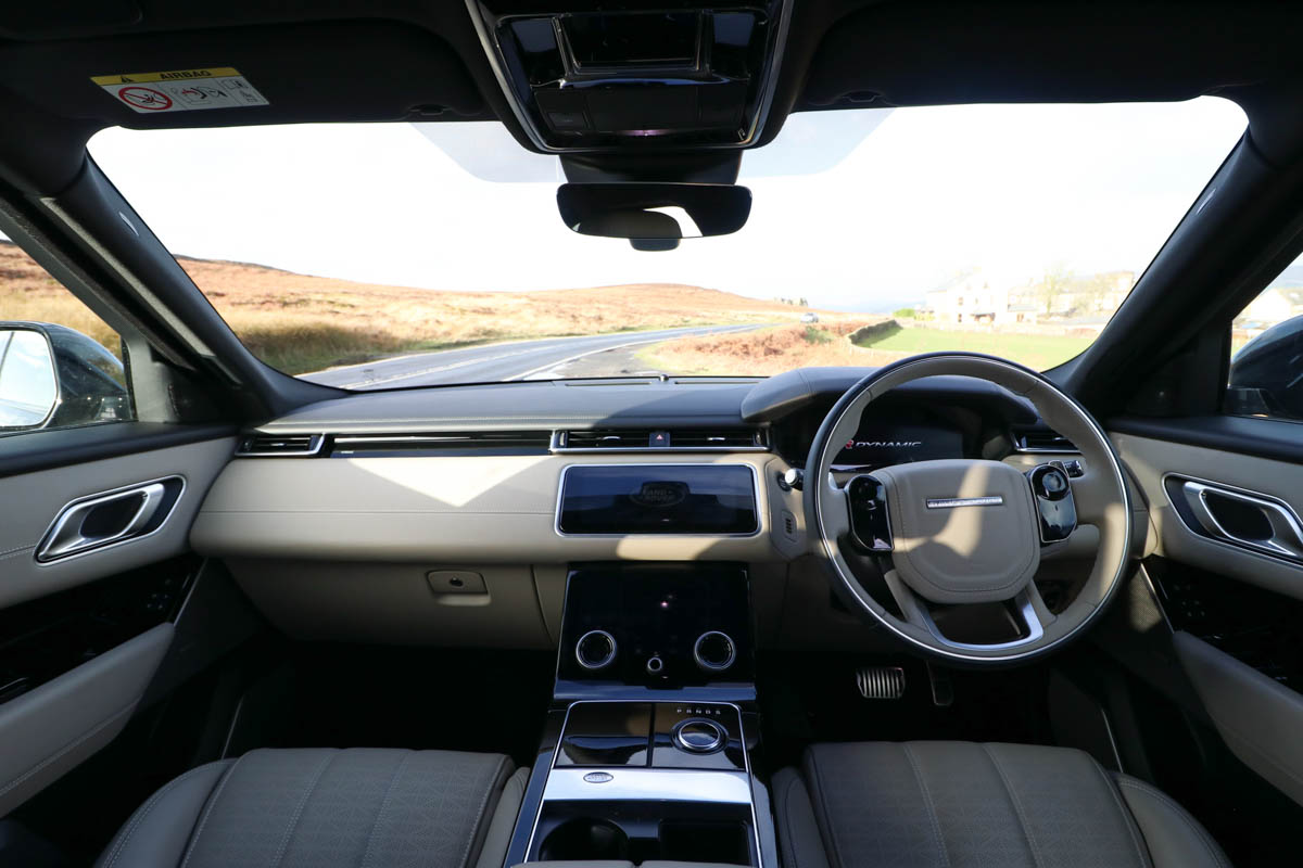
A brief sit in the passenger seat of the Velar revealed an unusual footwell design on the passenger side – the floor is not flat. This forces the passenger to put their feet far forward into the footwell rather than straight down, a factor that more than one passenger commented upon as being odd and uncomfortable.
11: Cluster of confusion
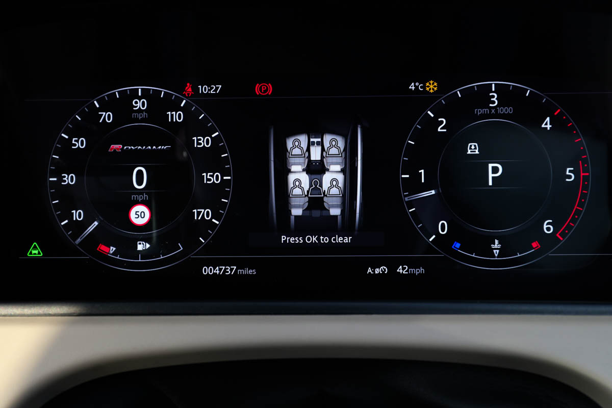
The Velar features one of the most reconfigurable digital clusters we’ve seen in any car. We’ve criticised OEMs for being conservative in their UI ambitions on digital clusters – most sticking to a pair of digital gauges (the Velar’s default display), which seems to defeat the point. Range Rover deserves credit for going further.
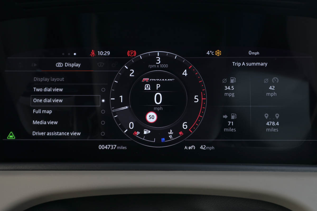
Full map screen takeovers, a media mode, and driver assistance displays are just some of the options on offer. But while it’s nice to get ‘more’, what’s offered would benefit from the love of a good UX and UI design team – the information hierarchy and the cluttered or crunched means of presentation in some of these modes makes them distracting and difficult to read and use on the move.
And finally…
12: Continuation by castellation
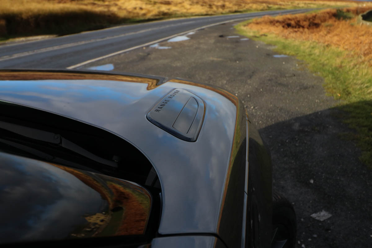
It might represent a new dawn for Range Rover and take the brand into a new space, but while much is different and new about the Velar, drivers will still be reminded in some traditional ways that they could be in nothing but a Range Rover.
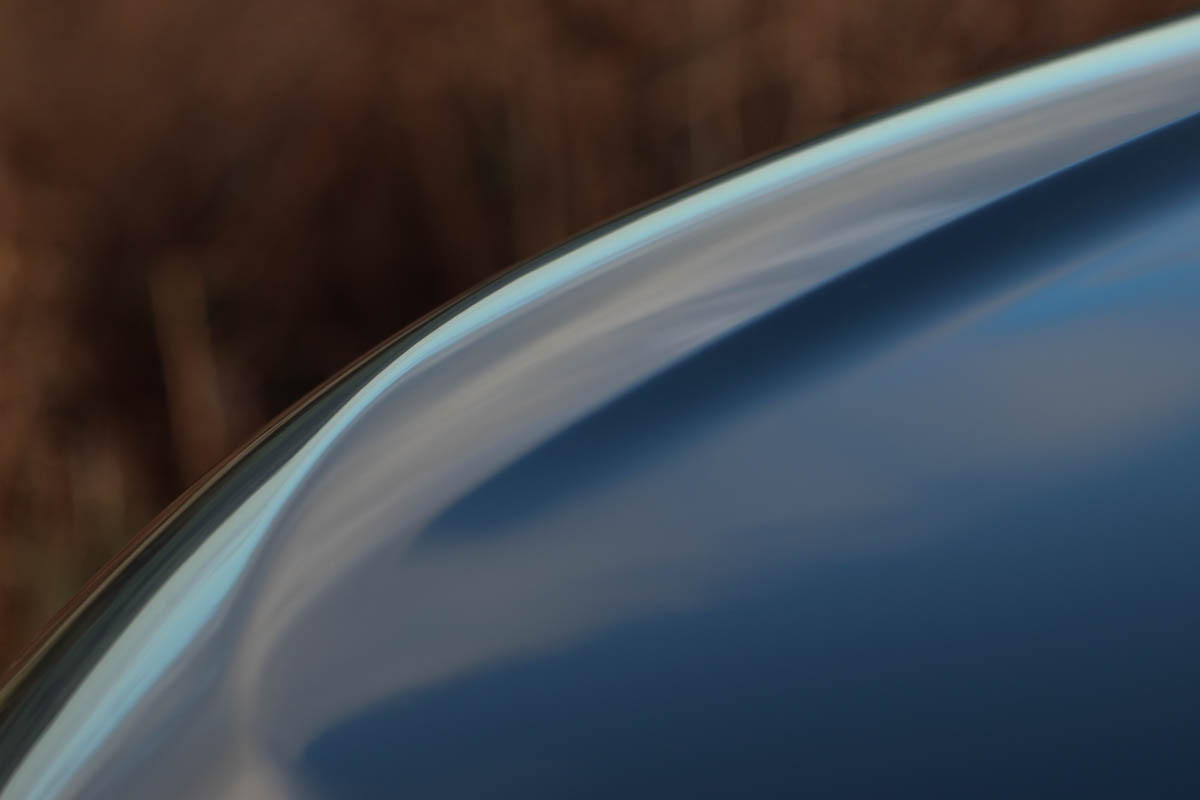
The view ahead is still being framed by a pair of castellations at the leading edge of the hood. They make this lower, sleeker Range Rover as easy to position on the road as any of the brand’s other vehicles and provide visual continuity for those trading up, or down.
Postscript
A week after departure, there is a nagging doubt. There is something of a ‘veneer’ quality to this car, which jars slightly with the brand. Superficially modern, it lacks the feeling of authenticity that larger Range Rovers have, and fails to convey their sense of imperiousness. Just occasionally, it feels contrived.
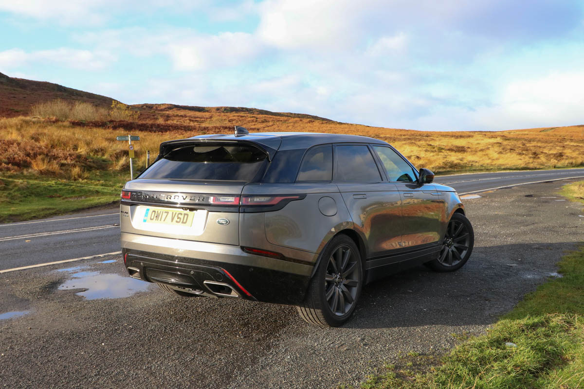
Should Land Rover care? Probably not. The Velar will clearly do well. Its looks alone (at least when specced correctly) will appeal mightily to the Instagram generation. The amount of interest in it seemed enough anecdotal proof of that – every time we parked, someone came up to ask about it. It represents a transitional point in Range Rover’s history.
Media rumours are rife that the brand will be expanded further, with even lower-riding, more car-like models. If that’s true the Velar may ultimately prove to be a neat stepping stone, if nothing else.

