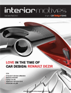
IN THIS ISSUE

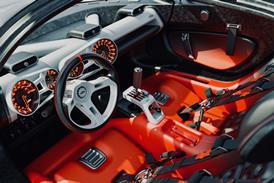
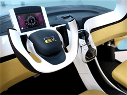
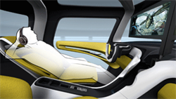
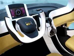
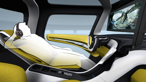
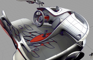
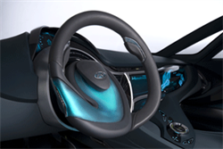
Yanfeng Visteon Q-e

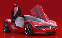
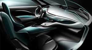
Renault DeZir

Mazda Shinari

Hyundai i-Flow

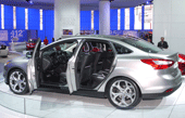
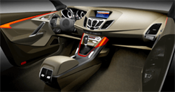
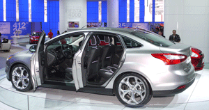
Ford Focus

Buy this issue or subscribe  Apple  Google  Kindle Small


YANFENG VISTEON Q-E

Yangfeng Hompeage
Vehicle type: concept/2-seat city car
Design Director: Shizuki Kajiyama
Chief Designer: Shen Zheng
Lead Interior Designers: Xu Boyu, Yan Lixing
Lead Seat Designer: Zhang Xiao
Colour & trim design: Guan Ying
Project started: August 2009
Project completed: April 2010
Launch: Beijing/April 2010


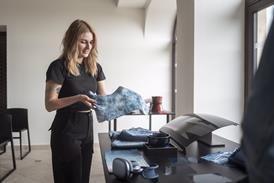
The Q-e design team sought inspiration from a variety of Chinese influences, one of which was architecture. In particular, this focused on the overhanging roofs popular on Chinese houses – something shown here as part of a re-interpretation of a modern Chinese living space. Key to the interior was the ability to see in, and through, the interior from the outside. This photo of Neil Denari’s LA house extension (4) perfectly expresses this desired delineation between interior and exterior.
Chi: the flow of energy through a living space was another key influence on the interior realisation. Q-e’s designers took this quality in both a literal and philosophical sense, the former illustrated by the almost ‘roll-cage’ like form of the interior trim.
Brightly coloured highlights, clean, flowing lines, and a light and airy space. Design Director Shizuki Kajiyama sought to incorporate these themes into a uniquely Chinese design. He led a team that studied closely what the 15-17-year-olds of China today might want in two to three years’ time. Their answer: “something new and exciting, a new product for an internet society that gets bored quickly”

Read the full design review


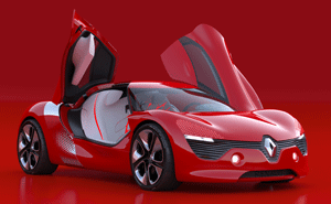
RENAULT DEZIR

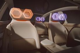
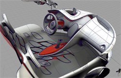
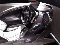
Autumn 2010Unveiled last month at the Paris Motor Show, the 4,225mm long two-seat sports coupe embodies Renault's new vision of 'simple', 'sensuous' and 'warm' designs.  Asymmetric door openings reveal a cloud-like white leather bench seat, which appears to levitate above a similarly trimmed floor. The floating IP flows into the door cards and center arm rest while Renault's 'touch design' philosophy is still in evidence.  
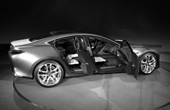
 

The brief for DeZir was to create a vehicle that embodies pure emotion and passion – the first stage of the human life cycle. (Future explorations will proceed, in concept-car form, through the stages of adventure, family, work, leisure and wisdom.) With youthful passion as the theme, interior designer Stéphane Maiore says, “I tried to find shapes and materials where you could relate the two sides – as a couple consists of two people – and to see how those two universes could be mixed.”
 
Early inspiration included the shiny, glossy finish of the Jeff Koons sculpture versus the technical quality of the carbon chair, or the lightness of the lamps and seating made from spun material (4). Both Maiore and exterior designer Yann Jarsalle shared an affinity for fluid, sculptural shapes (6) and for textures (7, 8) that would create surprise and tempt passersby to come closer. “In the beginning I tried to make one side really technical, maybe using carbon or something really hard, compared to a more feminine side,” reveals Maiore. “But it was too extreme; it wasn’t sensual and warm."

Read the full design review


MAZDA SHINARI

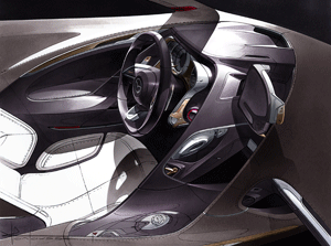
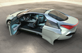
Mazda HomepageMazda recently unveiled the precursor to its next generation design language in the shape of the Shinari concept. A rakish four-door, four-seat vehicle created under the watchful eye of Ikuo Maeda, General Manager of Design, the Shinari showcases the company's new 'Kono' form language, which means 'soul of motion' in the Japanese company's native tongue.
Vehicle type: concept/four-door coupe
General Manager, Design: Ikuo Meada
Interior Chief Designer: Derek Jenkins
Interior Lead Designer: Julien Montousse
Colour & Material Designers: Teresa Spafford; Masahiro Hoshi
Project started: November 2009
Project completed: September 2010
Launch: Milan Design Forum/Sept 2010


“The decision to make a four-door coupe didn’t come either from design or management, but from a general discussion of what would be the best way to show a form language – both exterior and interior – that represents an apparently realistic car… something dramatic and impactful but believable; something that we can relate to production vehicles down the road,” says Mazda North America Design Director, and Chief Interior Designer for the Shinari project, Derek Jenkins.
 
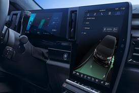
It’s more of a progression of Nagare than a clean break,” insists Jenkins. “We’ve been very conscious of not wanting to seem like we’re jumping from design philosophy to design philosophy, but rather evolving and growing and maturing the design language.” Pic 2 is a digital realisation of the Shinari’s three selectable HMI modes: ‘business’, ‘pleasure’ and ‘sport’.

Read the full design review


HYUNDAI I-FLOW

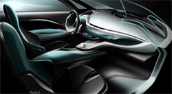
Hyundai HomepageThe i-Flow concept previews a possible future contender in the D-segment from Korean automaker Hyundai. With an overall length of 4780mm, 1850mm width and 1420mm height, the concept has an imposing aesthetic.

Vehicle type: concept/4-door coupe
Chief Designer: Thomas Bürkle
Interior Design Manager: Jochen Werner
Lead interior designer: Nico Munkler
Interior designer: Jörg Maluschka
Colour & trim manager: Tayo Osobu
Colour & trim design: Ivana Hrudkova
Project started: December 2008
Project completed: February 2010
Launch: Geneva/March 2010


“With this project we wanted to meld together engineering, new materials and design,” says Chief Designer Hyundai Motor Europe, Thomas Bürkle, of the HED-7 – the seventh concept to emerge from the company’s European design studio in Rüsselsheim, Germany.
Dubbed ‘i-flow’, it represents the latest interpretation of the company’s ‘fluidic sculpture’ design philosophy, and previews a luxury four-door sedan due in 2011. Aerodynamic flow was a key theme of the exterior design, but the twisted surfacing it inspired also made its way inside the car. The starting point for the interior design, however, was an exploration of advanced materials (2), which led to a trip to BASF’s headquarters in Ludwigshafen.
The main goal in terms of packaging was maximising space for the i-fl ow’s passengers: “Normally in a sedan you feel squeezed in, but it’s very airy inside. The peak of the roof is above the C-pillar which creates a very spacious feeling,” says Bürkle. Another innovation is the hinged design of the rear doors; the aluminium hinge is incorporated into the flowing graphic of the rear door panel (6). “It’s like in modern architecture, where you show the structure of the building,” points out Bürkle.

FORD FOCUS

Ford Focus Homepage

Vehicle type: production/hatch/wagon/sedan
Design Directors: Martin Smith, Stefan Lamm
Interior Design Director: Ernst Reim
Lead Interior Designers: Tiago Diaz, Jörg Stephan Burkhard Dragon
Project started: summer 2008
Project completed: summer 2010
Launch: Paris/September 2010


The third-generation Focus (codenamed CK346) was first shown at the NAIAS in Detroit in January 2010, but was still a pre-production prototype. The final production model made its debut more recently, at the Paris Motor Show. This new ‘global car’ will for the first time will be sold and manufactured simultaneously in both Europe and the USA, and later in Russia and China. Speaking about the design, the Ford designers at Merkenich near Cologne wanted to bring “Kinetic Design into the interior”. As this moodboard reveals, the central ‘cockpit’ theme of the Focus was inspired by such diverse machinery as a 1957 Maserati Formula 1 car and fighter aircraft, and is Ford’s most expressive production design to date.
 
Initial 2D sketches by Tiago Diaz from October/November 2008. “Already here you can see the strong driver-orientated architecture and the design features of Ford’s Kinetic Design, which become much more dominant than for instance in the new Fiesta,” stresses interior design chief Ernst Reim.

Read the full design review


Buy this issue or subscribe  Apple  Google  Kindle Small


Magazine
IM Cover Autumn 2010