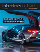
IN THIS ISSUE
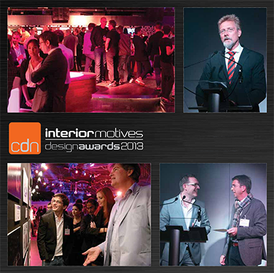
INTERIOR MOTIVES DESIGN AWARDS
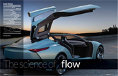 Vehicle type Concept/hybrid-electric coupe
PATAC Chief Designer Min Cao
Advanced Design Senior Manager Nenghua Liu
Design Manager Jin Wang
Design Program Manager Bin Li
Lead Interior Designer Weiping Jia
Interior Designers Leilei Jiao & Chun Saw
Colour & Trim Senior Manager Eden Liang
Colour & Trim Lead Designer Ran Duan
Lead Digital Designer Jiading Chen
Project started March 2012
Project completed March 2013
Launch Shanghai/April 2013
Work began on the Buick Riviera concept in March 2012 at the GM/SAIC PATAC design centre in Shanghai, China. The design team, which was led by PATAC Chief Designer Cao Min, took inspiration from architectural design, aircraft and electronic products, plus luxury items, natural materials and cultural influences including feng shui, water and Chinese calligraphy, as can be seen on this mood board.
The brief was to develop a new identity for Buick while also showcasing the latest technology. “Buick has 110 years of rich history,” explains GM PATAC Chief Designer, Cao Min. “We looked back to classic Buicks and the original Riviera [sold from 1963 to 1993]... Though it was really a start from zero.” Sketching on the interior and exterior began almost simultaneously, at the same location to ensure cross-fertilisation of ideas. A total of 12 designers worked on theme proposals. “For the interior we basically had three major sketches to further [develop], then we began to work on one,” recalls Min. The early sketches emphasise a more horizontal aspect than the final design. “We wanted to carry the elegant, very fl owing [exterior] theme into the interior space, so [we explored] a more horizontal atmosphere,” he continues. “But in the end we didn’t want to emphasise this feeling. We really wanted to create this kind of fl owing area [throughout] the console and IP. Some of these [design sketches] concentrate too much on the driver. We decided to have the interior as a single space instead.”
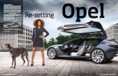 Vehicle type concept/hybrid-electric coupe
Director, advanced design Friedhelm Engler
Chief designer, advanced design Boris Jacob
Interior components/HMI chief Ivo van Hulten
Interior design Borris Ilse, Jong Won Kim & Lionel Santos
Colour & trim design Jeannette Finger
Project started Spring 2012
Project completed July 2013
Launch Frankfurt/September 2013
Efficiency and connectivity are the focal points of the next generation of Opel models, and the Monza concept offers a fascinating preview of these developments – particularly in the field of instrument and infotainment design. The Monza features a complex curved surface with displays projected across the entire width of the IP. The original 1977 Monza coupe’s yellow digital display was also way ahead of its time when it appeared 35 years ago.
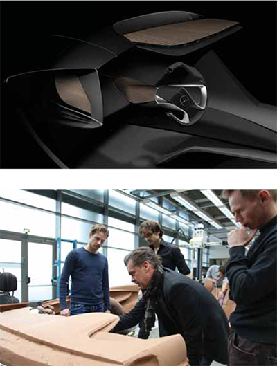
Development renderings by Ivo van Hulten and Jong Won Kim, used at the start of the clay modelling phase. Here, the layered theme becomes reversed, with the wood veneer now on top. The 3D wood veneer is a new process, explains interior chief designer Ivo van Hulten: “We’re using wood here in a more honest way, not just as an appliqué inserted into the door top roll. The wood flows in a truly 3D way and the usage is spread right around the interior, which is unusual. It adds warmth to the cabin, especially when the displays are switched off.”
The design team works on the full-scale clay interior at GM Europe’s design headquarters in Rüsselsheim, Germany. From left to right: Ivo van Hulten, Chief Designer, Interior Components & HMI; Interior Designer, Lionel Silva Santos (background); Boris Jacob, Chief Designer, GME Advanced Design (foreground); David Leary, Assistant Chief Designer, GME Advanced Design.
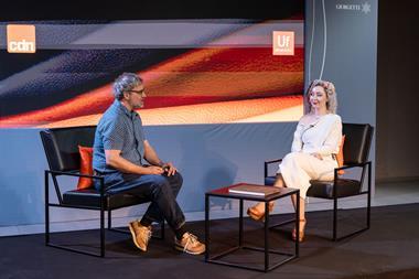
Launched in January and themed ‘The Connected Car’, this year’s contest attracted a record number of entries from 82 colleges located in 32 different countries. The awards ceremony in Frankfurt on 9th September was once again hosted by influential designer Chris Bangle, while the winning entries were chosen by a judging panel comprising some of the biggest names in vehicle design.
<br/ > On the eve of the IAA motor show, the world’s top designers and automotive journalists gathered together at the Moon13 club in Frankfurt to watch sponsors Ford and Volkswagen reveal the 2013 Interior Motives Student Design of the Year: ‘Audi O Concept’ by Nir Siegel, Cherica Haye and Hanchul Lee of London’s Royal College of Art.
 Vehicle type production/electric hatchback
Project leader Adrian van Hooydonk
Head of BMW ‘i’ design Benoit Jacob
Lead interior designer Daniel Starke
Colour & trim designer Kerstin Schmeding
Project started 2008
Project completed 2013
Launch Frankfurt/Sept 2013
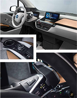
The world of new car launches is often littered with ill-suited superlatives, hyperbole and general 'game-changing' chat, but BMW’s new electric ‘i’ sub-brand stands apart as potentially one of the most exciting developments of the 21st century. Why such high praise? Because its engineers and designers have rethought so much of how these cars will look, feel and function with sustainability at the forefront of each manufacturing aspect, from exposed carbon-fibre chassis to eco-dyed leather seating. As the normally reserved BMW head of design Adrian van Hooydonk puts it: “It’s a unique opportunity in a designer’s life: to design two new cars [i3 and i8] at the same time, to develop a new form language, the whole technology… everything is new from the ground up, we even designed the logo and brand. It was a really interesting project.”
The finished production interior keeps much of the earlier concepts’ airy atmosphere; for a city car measuring less than four metres long, it feels extraordinarily spacious inside. The ribbon graphic of the original concept is still present, with the hanging centre screen evoking the look of a plasma TV perched on a domestic interior wall or an iPod plugged into a docking speaker. The driver screen is similarly shaped, eschewing the industry-standard round dials.
MERCEDES S-CLASS
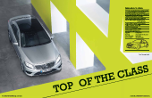 Vehicle type Production/4-door luxury sedan
Vice President, Design Gorden Wagener
Interior Design Manager Hans-Peter Wunderlich
Creative Director, Interior Peter Balko
Head of Interior Design Hartmut Sinkwitz
Colour & Trim Designers Martin Bremer, Verena Brausch
Graphics (HMI & displays) Olaf Göckeritz
Quality & Precision Georg Asal
Project started June 2008
Project completed October 2010
Launch Hamburg/May 2013
The earliest sketch of the new S-class – codename W222 – dates from autumn 2008. According to interior design chief, Hans-Peter Wunderlich, it “already contained all relevant new features like the large displays, the classic wood strip in a lower position – thus creating a second level of decorative trim – the ‘total’ wraparound architecture and four central vents.”
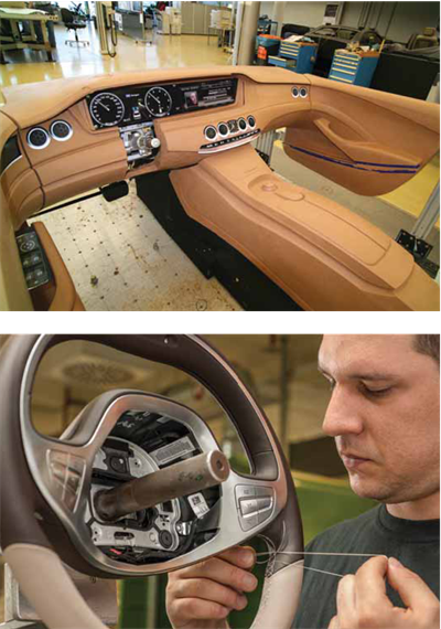
These photos from January 2009 show one of three fullscale clay proposals for the S-Class’s interior. “This one had less fluent shapes and a more angular centre stack,” says Wunderlich. “Also note the shorter downward swing in the doors and the twin air vents on the left, which were inspired by supersonic aircrafts like the Tupolev TU-114 and Concorde.”
In 2007/8, during the early stages of the project, the interior design was strongly influenced by the Mercedes Benz Advanced Design Studio in Como, Italy. Using what they call an ‘appreciation model’, the Como design team was able to give free rein to their imagination and look for ways of translating these ideals into series production features. One of those features is a wooden steering wheel with hand-stitched leather and a ‘galvano’ rim – a metal printed plate created by means of electrolysis – around the lower section, which is reminiscent of the chrome horn rings found on older S-Class models.
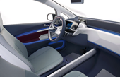 Vehicle type Concept/plug-in electric hatch
Design director Tim Yerdon
Design manager Bertrand Stelandre
Chief designer Simon Harris
Designers Guillaume Becourt, Benjamin Brochot
Project started Summer 2011
Project completed November 2012
Launch CES/January 2013
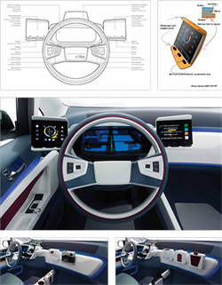
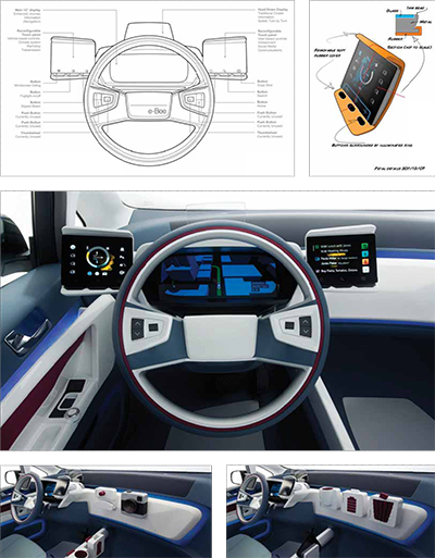
Work on the e-Bee began in the summer of 2011, with a brief to explore a new kind of interior better suited to the needs of drivers in the year 2020, when research shows vehicle renting and sharing will be more common. “People will have to get into cars they don’t know, so it’s useful if they have an interface they’re already comfortable with,” points out Visteon Europe’s chief designer, Simon Harris. The research board shows the futuristic but unloved digital interfaces introduced by Citröen on cars like the ‘70s BX. “We wondered how we could do a similar thing today [introduce a new kind of HMI], but in a way that’s more consumer friendly.” The mood boards show the influence of honeycomb forms (such as the Beijing Expo’s Chinese Pavilion) on the e-Bee’s interior architecture. “This aesthetic – almost like a selectively carved material – offers a very interesting combination of simplicity and intricacy,” says Harris.
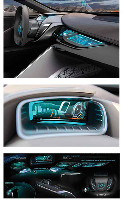
Sketches explaining the functionality of the HMI, shown in operation in the completed showcar below. “In future, an increasing amount of a car’s brand value will be communicated via its virtual interface, giving a lot more flexibility for mid-cycle refreshes,” says Harris. “In the case of the e-Bee it also allows you to define your own control set before you get into the car. If you’re comfortable with a complex control system, you can have one. If not, you can let the car make most of the decisions and focus on the journey. One of our main focal points was making the driving experience less of a technical story and more of a lifestyle one. That’s why we pushed the vehicle controls out to the door area and put the social content [interface] near the centre line.”
Magazine
