IN THIS ISSUE
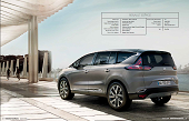 Vehicle type Production / MPV crossover
Overall design director Laurens van den Acker
Design director D/E segment Christophe Dupont
Project leader Robert Ernst
Interior designers Stéphane Maoire, Magali Gouraud-Borgers
Interior components designer Ignasi Cabrisses
Studio chief, colour & trim Dana Popescu
Colour & trim designer Miguel Iranzo-Sanchez
Project started Late 2009
Project completed Jan 2013
Launch Paris /October 2014
Exactly 30 years have passed since Renault introduced the first production multi-purpose vehicle (MPV) back in 1984. But the current mk4 Espace will have been on sale for 12 long years by the time the mk5 version unveiled at the Paris Motorshow in October 2014 – goes on sale, left-hand-drive only, from mid-2015.
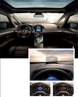
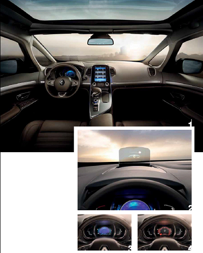
Every production Espace will have the new capacitive centre console and panoramic glass roof as standard, the latter to offset the higher beltline and reduced window glass. The result is an airy but precise space, says Christophe Dupont: “There’s a certain contrast in the interior between a very appeasing overall design language with simple volumes, smooth clean sections and fluid lines - the [vertical] lines of the console and the [horizontal] one running across the main IP and through to the door panels – plus islands of high technology and modernity in the shape of the instrument cluster, centre console and asymmetric gear selector.”
The head-up display is optional, but in keeping with Renault’s desire to offer upmarket and hi-tech kit on its flagship vehicle. The digital driver’s dials now have the ability to change colour and graphic style according to one of five driving modes that alter suspension, gearing and steering feel. The blue-hued version represents ‘comfort’ mode and has a noisecancelling aspect to further enhance that sensation, while the red version – you’ve guessed it already – denotes the sportier mode.
 Vehicle type Production / microcar
Head of design, Daimler AG Gorden Wagener
Head of design, Smart Kai Sieber
Lead interior designer Matthias Gottwald
Lead colour & trim designer Adriana Balko
Lead exterior designer Michael Gebhardt
Project started Late 2010
Launch July 2014
Early sketches of the dashboard reveal a 'loop' motif, consisting of a rounded outer section and a concave inner space that includes the main instrument and the 'floating' infotainment centre.This motif is mirrored in the door trim. "Obviously, we wanted to capture the DNA of the first-generation smart," says Daimler chief designer Gorden Wagener, who recognises that the current model is considered to be too stark and Mercedes-like by many potential customers.
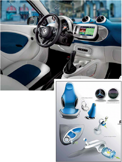
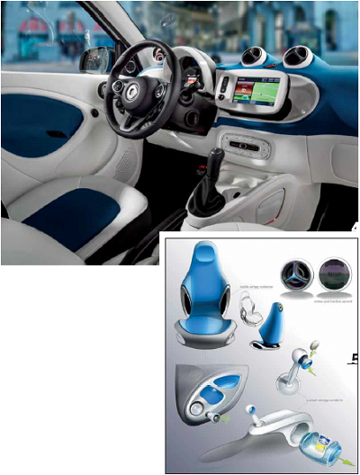
The soft shapes of the smart interior pick up where the first smart left off and are mirrored, to a lesser extent, in vehicles such as Fiat's Panda and Cinquecento, the Kia Soul and, of course, the Renault Twingo which was developed in close cooperation with Daimler's new microcar. However they are most radically expressed in the new smart. This particular shot highlights the playing with contrasting colours, executed here in white and blue - the latter which is finally returning to car interiors. Note the perforated lower door trim and the triangle in front of the door mirrors hiding the loudspeakers and tweeters. Their honeycomb pattern mirrors the exterior grille and air intakes.
More ideas generated during the design process. The integrated front seat has made it into series production; the highlighted air bag containers have not. The clever speakers in the lower door panel are there in the final product, hidden beneath covers as mentioned above. The centre storage is there, but the coin holder in the gear selector isn't. The motif for the air vents has carried over, albeit in a simplified, more cost-effective form. The designers obviously had fun with the project: the 'Remmi Demmi' written in the speaker means 'havoc', while 'Capri Sonne' is a cult 1970s fruit drink.
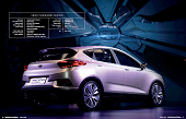 Vehicle type Concept hybrid crossover
Vice-president design Peter Horbury
Design directors Ken Ma & Guy Burgoyne
Exterior design chief Brett Patterson
Exterior design Steve Harper, James/Wang Zheng, Fisher/Yu Zhongqing
Interior design chief Guy Burgoyne
Lead interior designer Justin Scully
Interior designers Ricky/Liu Yi, Nate/Hou Xuan, Gary/Zhang Guorui, Tim/Zhou Pengcheng
Colour & trim Joan/Zhou Feng
Project manager Justin/Cheng Jia
Project started June 2013
Project completed March 2014
Launch Beijing show, April 2014
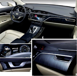
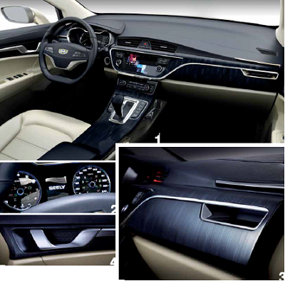
Work began on the Geely Emgrand Cross concept at Geely Group’s new Shanghai Design Centre in China, in June 2013. The hybrid concept crossover previews a forthcoming crossover and represents a deliberate move upmarket for Geely’s Emgrand brand. “It’s [for] a progressive, sophisticated customer who’s used to more European products,” explains Geely design director Guy Burgoyne. “From a whole brand point of view for Geely, everything’s aimed towards lifting the [Emgrand] brand.” The exterior and interior design teams worked in tandem, lending a holistic quality to the design. “Some twisting metal elements quickly [came] together and... were developed in similar ways on both the interior and exterior,” says Burgoyne. Exterior design chief Brett Patterson adds: “One of the major ideas with the concept... is the contemporary Shanghai theme. This drove the exterior colour and the texture for the exterior and the interior.”
Clear to see in these photographs of the completed show car interior is the upright printed pattern inspired by the Shanghai skyline, which covers the lower part of the full-width, Hangzhou Bay Bridge-inspired IP. "We definitely like [this material] and it's going to influence what's coming in the near future," explains Guy Burgoyne. "You can achieve a very high quality finish [and it's] something which is nice and different from seeing chrome and wood. It definitely has a very premium, fresh feel to it."
A close-up of the instrument binnacle, whose design apes that of the forthcoming production Emgrand C-segment hatchback.
The twisting door opener references the exterior grille. “It’s a bit like the calligraphy again," says Burgoyne. "It's a flowing line that changes in weight as it goes around." Inside the recess is a subtle mesh pattern repeated on the speaker grilles.
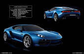 Vehicle type Concept / plug-in hybrid supercar
Director of Lamborghini design Filippo Perini
Design project managers Alessandro Serra, Alessandro Salvagnin, Michele Tinazzo
Exterior designers Marc Senan Fernandez, Nelson Simoes
Interior designers Facundo Elias, Andres Pinilla, Daniel Soriano
Digital modellers Biagio De Pascali, Diego Losardo
Colour & trim designers Luca Reggiani, Lina Ginkute
Project started Spring 2014
Project completed Autumn 2014
Launch Paris motor show / October 2014
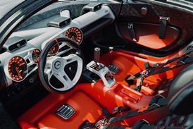
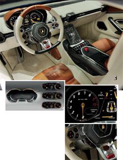
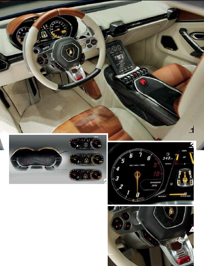
The design team at Lamborghini Centro Stile began working on the Asterion LPI 910-4 concept plug-in hybrid supercar in spring 2014. The aim was to create a design that was recognisably a Lamborghini, but which also reflected the car's advanced hybrid performance. “The idea was to show the world how Lamborghini can evolve... with a totally new car like Asterion and a totally new design language,” says design project manager Michele Tinazzo. Interior and exterior sketching began in parallel. These early sketches, from the mood and 'concept research 1' phase, show the twin binnacle – an early idea inspired by iconic cars including the Lamborghini Miura – and a solid centre console which was dropped in favour of a floating console in the final show car.
The three-spoke steering wheel is a Lamborghini heritage feature, recalling classic models such as the Miura. “We played with these kind of details throughout,” says Michele Tinazzo. "It [the wheel design] is present in the final car and also in the initial sketches, but instead of [just] having three spokes – which were made for being lightweight [originally] – we added buttons [to] operate the hybrid powertrain in the most reachable and logical position possible. Here the driver can have complete control of the hybrid system – electric, hybrid or combustion engine.”
This drawing shows how the instrumentatiion display changes according to the mode that the car is being driven in – ‘Zero’ for zero-emissions/full electric; ‘I’ for Ibrido (hybrid); and ‘T’ for Termico (thermal) power.
The final steering wheel, crafted from titanium and incorporating the driver control switches. “The red switch on the bottom of the steering wheel was one of the most complicated parts,” says Tinazzo. “Here you have the choice to switch the setting of the traditional [combustion] engine: Strada (Road), Sport and Corsa (Race). With the pushing of the three positions you can access the soul of the car. This changes the engine response hugely.” The starter button in the centre console is also red, under a red flap, like the one in the Aventador.
Senior VP product design, Chrysler Group Ralph Gilles
Head of Jeep design Mark Allen
Chief designer, Jeep exteriors Brian Nielander
VP interior design, Chrysler Group Klaus Busse
Chief designer, Jeep Interiors Robert Walker
Lead interior designer Ian Hedge
Chief designer, colour & trim La Shirl Turner
Project started October 2010
Launch Geneva / March 2014
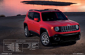
“When we started the interior design we took the same approach we used for the exterior studio,” recalls Klaus Busse, vice-president interior design, Chrysler Group. “I took one of my youngest designers and let him have some fun, and he explored a wide range of sketches.” The cutaway drawing gives a general idea of where the Jeep designers were heading for. “It shows how we married the interior with the exterior, but also the inherent uniqueness of the Jeep shape and the upright feeling,” stresses Jeep’s chief interior designer, Robert Walker. “Also the capacity of the rear compartment is good for the small SUV segment.” The briefing for the design team comprised four key principles: to make an emotional impact with the design; to use high-quality materials with an inspired colour and material story; to integrate the latest state-of-the-art technologies; and to develop clever storage, making intelligent use of space. The team were given the freedom to start with a clean sheet of paper and create a small SUV they would aspire to own themselves.”
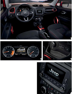
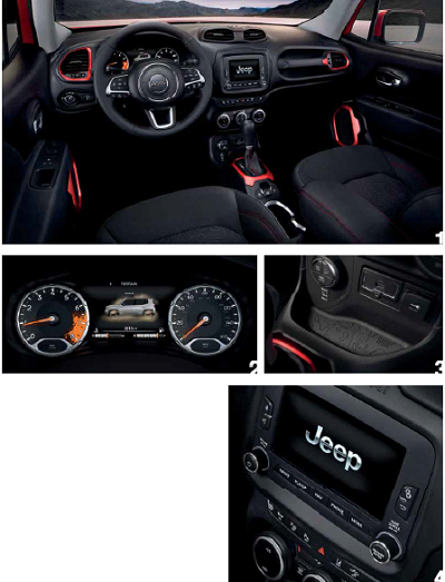
Jeep defined a fresh form language for the Renegade 'Tek-tonic'. Insipration came from contemporary extreme sports gear and lifestyles. The theme is defined by the intersections of soft and tactile forms with rugged and functional details. Major surfaces, such as the sculpted soft-touch IP, are intersected with functional elements like the passenger grab handle – borrowed from its big brother, the Wrangler. “Back in the studio, we called it the ‘oh-shit! handle’,” jokes Klaus Busse. In the Trailhawk, pictured here, the colour theme is black with anodised ruby-red accents, stitching and trailmap textures on the seats.
A classic analogue speedometer and tachometer separated by a colour TFT screen. The revcounter features a red ‘mud-splatter’ graphic inspired by one of the Jeep design team’s weekend paintball adventures, which references the moment when the paint explodes upon contact. The rubberised tray in the lower centre stack is moulded with a topographical map of the Fins and Things trail in Utah’s Moab desert – a famous off-road spot for Jeep enthusiasts. This is one of many so-called 'Easter eggs': visible and hidden design motifs dotted around the vehicle, which also include an image of a small spider in the glovebox. "We leave them as a challenge for Renegade oweners to find," says Busse
Magazine
