IN THIS ISSUE
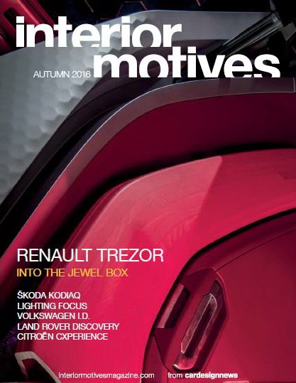
RENAULT TREZOR
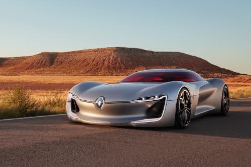
“No-one knows which way automotive interiors will really go in the next few years, so our second round of concepts need to punch above their weight in this area. It’s the new battleground,” says Laurens van den Acker, Renault’s design director. To recap, van den Acker conceived his first seres of concepts to mirror a human lifecycle, from first love as represented by the DeZir (2010), through exploration (Captur, 2011), work (Frendzy, 2011) and play (Twin’Run and Twin’Z, 2013), to settling down and needing space for a family (R-Space, 2011, and Initiale, 2013).
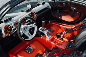
The Trezor returns again to the theme of love, this time not just the initial infatuation phase but a more mature love that could perhaps result in a marriage proposal. Van den Acker calls this “a jewellery box moment, when you might pop the question” – conceptually translated into the car’s dramatically-opening one-piece clamshell lid, which reveals the interior treasure (‘trésor’, in French) beneath.
ŠKODA KODIAQ
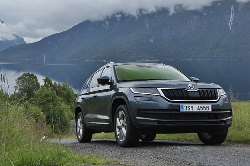
“What we are now entering is the future of the brand, one of the most important pillars,” says Škoda head of design Jozef Kaban. “We knew that whatever we do here, we cannot risk not hitting the target.” For the Kodiaq is more than just an addition to Škoda’s product portfolio: this large SUV, based on the Volkswagen Group’s MQB platform, has been developed with a view to expanding the Czech brand’s reach into new global markets.
The brief was flexible, says Kaban, but “we all knew that we needed a car which has a certain charisma, a certain character, which will be recognised as the brand. We knew from the beginning that the car would need to be a true Škoda, therefore it needed to have certain attributes of functionality. We are looking for a very strong balance between the rationality, between the function and the aesthetic: this is something that is a major key element for the brand. We dream about the fact that it is not only your heart, but your brain, that makes the [purchase] decision.”
FOCUS INTERIOR LIGHTING
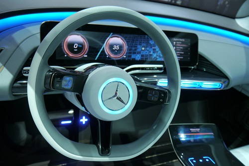
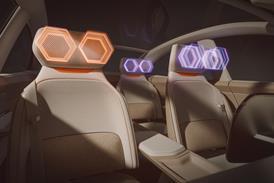
Until now, interior lighting has often been used relatively conservatively. However, this is set to change. New technologies are coming to market, designers are looking for more daring differentiation of their products and autonomous vehicles are transforming the driver-car interaction. Lighting will have an ever more vital role to lay in this. John Challen, Farah Alkhalisi and Tom Phillips investigate
VOLKSWAGEN I.D.
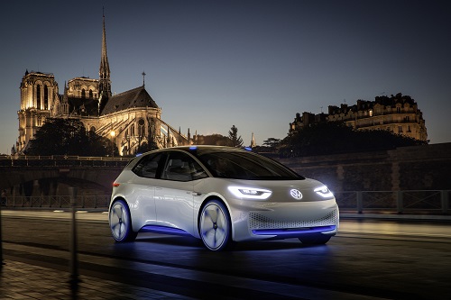
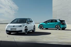
Previewing the first model from Volkswagen’s new ‘family’ of electric vehicles, and the first Volkswagen to be capable of fully-autonomous driving, the I.D. concept comes with an expectation of cross-cultural, international appeal and mass-market sales, not to mention its symbolic role in rehabilitating the company’s reputation post-Dieselgate. No wonder it was unveiled to claims that it is Volkswagen’s biggest game-changer since the original Beetle and Golf – it really is that important for the brand.
In the I.D.’s roomy interior – promising space on a par with the Passat despite Golf-like exterior dimensions – it certainly does display a distinct departure in thinking. Gone are the typical dark colours and all-too-familiar structures, architectures and switchgear layouts: this is the new (inter)face of Volkswagen. And given the aim to put the I.D. into production little-changed in 2020, with a view to VW selling a million electric cars a year by 2025, we’d better get used to seeing it.
LAND ROVER DISCOVERY
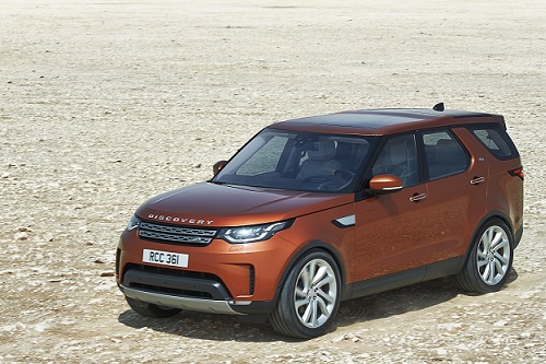
“This is the second Disco I’ve been involved in,” says Mark Butler, Land Rover’s creative director, interior design. “I get plenty of feedback from my children, especially when they are sitting right at the back, when I get plenty of ‘Dad, can we do this?’. It’s all about the experience for everyone in the car.” Thus the fifth-generation Discovery is claimed to have new levels of versatility as well as refinement.
Replacing the body-on-frame architecture of the outgoing model with a monocoque construction has saved 350kg in the body; the Discovery 5 is slightly longer and wider than its predecessor, with 38mm extra in its wheelbase, though a little lower in height. Reflecting the styling theme of the smaller Discovery Sport, this now 27-year-old best-selling SUV has a newly-established design language and has fully entered the digital age.
CITROЁN CXPERIENCE
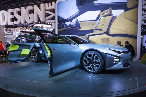
About three years ago, the Citroën design team gathered in the company museum at Aulnay-sous-Bois, north-east of Paris: the goal of this meeting was to re-establish Citroën’s brand values. Serenity was one of the key attributes mentioned in that discussion, recalls Frédéric Duvernier, head of concept cars. “Floating along the street, comfortably, moving very fast but you don’t notice the effort: this is very Citroën,” he says.
Such swan-like tranquillity is clearly apparent in the CXperience. While the exterior’s rounded muscular forms, low roof and oversized wheels project power and athleticism, its horizontal beltline, long wheelbase and unfussy surfacing soothes any aggression, as does the aquatic blue-green paint finish. “We found this ‘mizuiro’ colour,” explains Duvernier. “It’s a Japanese name relating to lakes and the mountains, very quiet, the blue of the water. To me it’s pure, it’s plain, and it’s quite neutral.” Yet the opposite is true of the interior, dominated by zesty lemon-yellow upholstery. The high contrast is deliberate, of course. “We really wanted to have a surprise when you open the door,” Duvernier grins.
Magazine
