IN THIS ISSUE
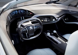
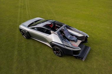
The rest of the interior uses muted hues and a mix of leather and satin and gloss finish high quality plastic and nickel plated surfaces. And there's more: the center console slides forwards to provide additional legroom for the single rear seat occupant, and a safe is hidden behind the display screen to store valuables - like the archetypal safe behind the antique picture frame. This safe also houses the bespoke Bell and Ross-designed watch that doubles as an in-car timepiece when viewed through its glass cover.
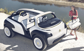
Vehicle type: concept/4-seat open buggy
Design Director: Thierry Metroz
Interior Designer: Nicholas Gonzales
Colour & Trim Designers: Vincent Lobry
Muriel Predault
Project started: November 2009
Project completed: August 2010
Launch: Paris/September 2010
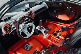
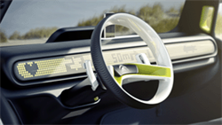
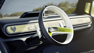
The two-spoke dished steering wheel will be recognised by anyone familiar with Citroën’s classic Ami or 2CV. “Note the rubber tyre motif on the steering wheel and the paddle shifters behind it. They control all the main functions including gearshift, lights and entertainment, and really exemplify the ‘simplifi cation and purifi cation’ philosophy behind the whole car,” says Gonzales.
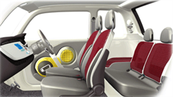
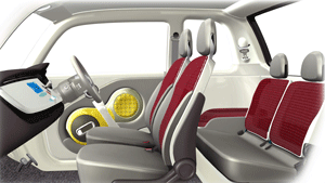
The seatbelt anchorage points have ‘necklines’ , while the white cotton seat covers feature the familiar petit piquet weave used by Lacoste on its polo shirts.
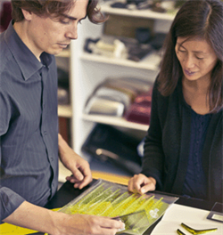
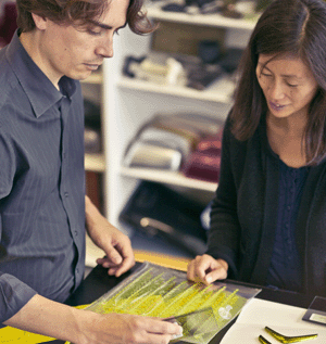
Colour and trim designers Vincent Lobry and Muriel Predault worked closely with Lacoste’s designers to select new materials and fi nishes for the project.
When passengers board, the steering wheel can be fl ipped up against the upper dashboard – an ingenious way of optimising access to the front bench seat. The dark blue seat bases use a robust ribbed cotton weave finish.
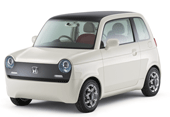
Kanna Sumiyoshi, the young Japanese designer, wanted the concept to be light and small, but also enjoyable to sit in and drive, and to have universal appeal: “What we wanted to make was a day- to-day car that everyone would like to look at – like Converse sneakers or white shirts.”
At 2,860mm long, the EV-N is even shorter and narrower than the ‘three-plus-one’ seat Toyota iQ, if a little taller. Sumiyoshi doesn’t see size as a barrier to enjoyment, however: “Wouldn’t people want a car even smaller than a mini-car if its interior were sufficiently large and felt just right…? Wouldn’t such a small and cute partner be appealing?”
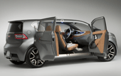
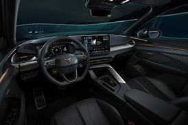
The influence of Bell & Ross and other watch brands is most visible in the instrument cluster and steering wheel. The speedometer protrudes from the IP like the face of a watch and features a compass on its outer ring, mixing digital and analogue to great effect. Instead of a single HMI screen, information is divided into three ‘zones’ or displays: “Our customers want direct access to this information. They don’t want to waste time with menus, they want to use their time for leisure,” says Buzyn.

Launch: Art Basel Miami/ Nov 2009
put forward by Jens Sieber won out because, according to Rothfuss, “it offered the best combination of luxury, lightness and sporty elegance.”
as “not simple applications, but materialised surfaces“ – a characteristic very visible on the centre tunnel with its open-pore wood veneer.

Chief Interior Designer: Stefan Arndt
Assistant Chief Interior Designer: Kurt Beyer
Colour & Trim Designer: Belinda Muller
Project started: Winter 2004
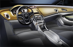
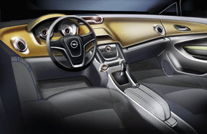
“While we were playing around with the mechanical component sets we asked ourselves: ‘Why not use this space between the seats, throw out all this scrap metal and take the mechanical parking brake out?’” recalls Arndt. “Suddenly we had this giant area to play with: not just theusual little container or closed compartment, but something really functional where you can put your bag of shopping or a ladies’ handbag.” FlexRail comprises two aluminium rails that allow modular items to be moved from front to rear. The system works on three levels: the upper part of the removable armrest comprising CD storage; within that storage for handbags and laptops; and below that a floor system with cupholders and 12V/USB charging points.
Magazine
