IN THIS ISSUE

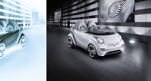
Smart forspeed

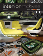
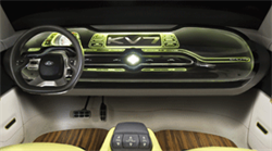
KIA KV7

Chrysler 300

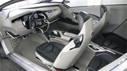
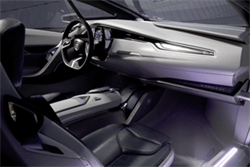
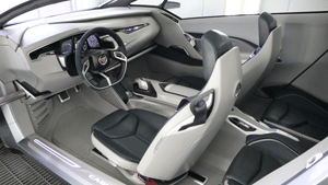
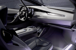
Cadillac Urban Luxury Concept

BMW Vision ConnectedDrive

Buy this issue or subscribe  Apple  Google  Kindle Small


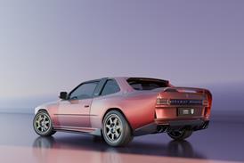
SMART FORSPEED

Smart Homepage Spring11
Vehicle type: concept/3-door supermini
Design director: Frank Saucedo
Interior design manager: Gael Buzyn
Interior creative designer: Charles Lefranc
Colour & trim leader: Humberto Ortiz
Colour & trim design: Alexandra Dymowska; Christine Ebner
Project started: May 2010
Project completed: November 2010
Launch: Los Angeles/ November 2010


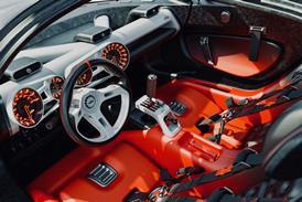
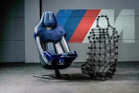
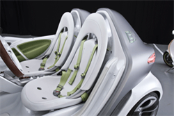
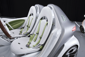
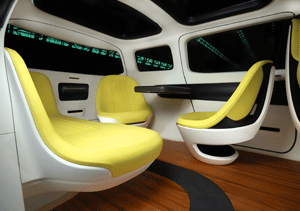
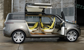
This show car is the high-end story, and the next Smart will simply be more valuable and fantastic with more precious parts. However, despite this push towards ‘downsized premium’, we will still keep stripped-out versions to retain the idea that Smart is a car for the people, but never cheap in execution and technology. It’s part of our ‘plastic fantastic’ philosophy.” The forspeed illustrates its electric charging system via a block of ten LED lights in the middle of the instrument panel. They shine through the translucent paint when the car is started but cannot be seen when it is switched off. The seats are simple single-shell designs with waterproof leather pads and pale green racing harness-style seatbelts to suggest the car’s eco-friendly but sporty credentials.
 
The honeycomb pattern on the single central vent above the gear lever at the top of the central transmission refers to its functional and connected counterparts on the exterior: the 3D honeycomb air intake at the car’s front, and the solar panels around the base of the windscreen. This natural motif also reflects the car’s environmental positioning: “The honeycomb grille is a very seductive style to open gates for cooling air. 

Read the full design review


KIA KV7

Kia KV7 ExtVehicle type: concept/seven-seat minivan
Design director: Thomas Kearns
Interior design manager: Enrique Giner
Lead Interior designer: Brian White
Colour & trim design: Mollie Engel
Project started: March 2010
Project completed: December 2010
Launch: NAIAS Detroit/ January 2011


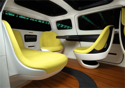
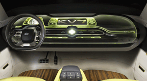
The rear cabin orientates passengers around a touch-sensitive tablet/table. “With the lime-green seating, the idea was that this was more of a self-skinning form, that would all be moulded in, almost like a motorcycle seat,” says White. Behind each seat is a storage area (coloured grey) and the bench lifts up to provide the kind of stowage you find in a children’s playroom. This helps create an architectural, loft-like interior that is distinctly un-minivan-like.
 

The design team originally experimented with stacking seat systems, and more conventional minivan-style seats-on-tracks in the floor. These ideas were dropped, says Giner, because “we didn’t think it was necessary to make it a big design feature”.“It’s not a large van, but we wanted it to feel very voluminous with plenty of space to move around,” says White. “If we had got very sculptural in the door trims and floor areas, it would not have had that sense of space that we were looking for.” Simple armrest handles are set into the upper grey section finished in vinyl.
Read the full design review


CHRYSLER 300

Chrysler Hompage Spring11
Vehicle type: production/4-door sedan
Head of Interior Design: Klaus Busse
Interior Design Manager: Jon Gaudreau
Component Designer: John Matthews
Colour & Trim Manager: Kim Roycraft
Project started: autumn 2006
Project completed: winter 2009
Launch: NAIAS Detroit/ January 2011


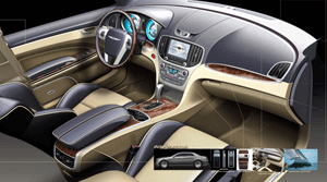
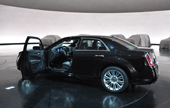
The exterior and interior of the all-new 300 sedan were developed in parallel at Chrysler’s design studio in Auburn Hills, Michigan. The teams also referenced the same mood board, which focused on ‘provocative forms’, ‘fluid surfaces’, ‘sensual lines’, ‘soulful presence’ and ‘serene palettes’. “If you look you will see a picture of a snowdrift. That inspired the surface treatment of the IP,” reveals 300 Interior Design Manager Jon Gaudreau. “[On the IP] there are soft, fl owing sections that flow into hard crease lines, which is very much like what happens naturally in a snowdrift.” “Step one was getting the fundamentals right,: the quality, the materials, the amenities,” says Head of Interior Design, Klaus Busse. “The predecessor to this vehicle had a soft instrument panel, so it already had some of the materials right. But the design wasn’t very inspiring; the car sold from the outside, not so much from the inside.”
Read the full design review


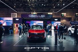
CADILLAC URBAN LUXURY CONCEPT

Cadillac Homepage Spring11 Vehicle type   Concept / fuel cell crossover
Chief design officer   Peter Schreyer
Chief designer Europe   Thomas Bürkle
General manager    Raphael Bretecher
Design manager, interior    Jochen Werner
Lead exterior designer   Roberto Kühn
Lead interior designer    Nico Munkler
Interior designer    Michel Glenisson
Manager, colour and trim    Tayo Osobu
Manager, studio engineering    Günter Roos Senior engineer/frame development    Sven Wittke
Project started    January 2013
Project completed    February 2014
Launch    Geneva / March 2014  
 

Of the colour and trim themes proposed, two referenced fashion brand Prada with its autumnal shades and dark metallics. The chosen theme, however, was inspired by Hugo Boss and featured more dark purple tones plus geometric graphics, perforation, pleating, matte black ceramic and low-gloss aluminium.
 
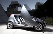
Development of the ULC took place between May and November 2010, but started conceptually in 2008 through the work of Niki Smart (exterior) and Gael Buzyn (interior) on a vehicle called ‘Minislade’. This theme board shows the attention taken over interior functionality for its target market: a small urban family with one or two kids. Note the middle ‘1 parent + baby’ plan view where the baby is staggered at a midway point between front and rear, with the child seat mounted on the back of the folded front seat. As Buzyn points out, “You don’t want your baby in the back, you want to be able to see it”.

BMW VISION CONNECTEDDRIVE

BMW Homepage Spring11
Vehicle type: concept/two-seat roadster
BMW design director: Adrian van Hooydonk
Head of Interior Design: Marc Girard
Interior Designers: Oliver Heilmer;
Robert Hlinovsky
Head of Interface Design: Jürgen Schröder
Interface Design: André Luis & Pia Karasz
Launch: Geneva/ March 2011


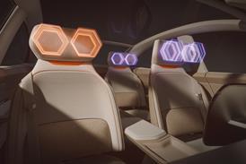
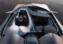
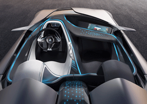
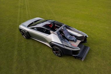
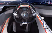
“The goal was to make an object which put together those three elements [safety, infotainment and convenience] in an aesthetic way,” says Girard. The overhead photo (top) shows the fi bre-optic lighting in ‘infotainment’ mode. Data from the cloud is received via the antenna, which has been integrated into the perspex section of centre tunnel that runs between the seat backs. From here, data then flows to both the driver and passenger interfaces.
 
Each lighting mode signifies a different flow of information. In the convenience (green) sketch, information and light is shown flowing between the car and its physical environment, via the mirrors, lights and so on. The orange ‘safety’ mode uses BMW’s signature interior lighting colour to define the driver’s environment, and funnels information to a ‘cone of vision’ ahead of the driver. “You have three spheres,” says Girard, “the driver, which is mostly about safety features. Then you have a second sphere, which is the connection between driver and passenger – the infotainment.
 
 
Finally, the rest of the car is about convenience. This is now not only a driver-orientated BMW, it’s about the passenger and the environment that the car operates in as well."

Read the full design review


Buy this issue or subscribe  Apple  Google  Kindle Small


Magazine
Imspring11 Cover