IN THIS ISSUE
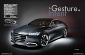 Vehicle type concept/large premium sedan
Chief designer Chris Chapman
Project manager Roger Flores
Interior design manager Chris Zarlenga
Interior designer Mark Barbush
Colour & trim designer Ashlee Harper
Project started January 2012
Project completed January 2013
Launch NAIAS Detroit/January 2013
Hyundai’s HCD-14 concept impressed many at 2013’s Detroit auto show with its quality of execution. So much so, in fact, that hard-to-impress showgoers were overheard asking “Is that a Hyundai?” Hyundai California Design’s chief designer, Chris Chapman, says: “There’s more of a story, technologically, on the interior. The outside is a design and form expression, but the philosophical approach to driver safety and connectivity is the real juicy bit.” The brown-seated interior plan view in this photo was one of the key sketches, as its creator Mike Barbush explains: “This [sketch] was very free-form, I only had a few inspirational images [to work from]. It features a driver-oriented centre stack and binnacle, but I also wanted to create an executive experience for everyone else [in the car].”
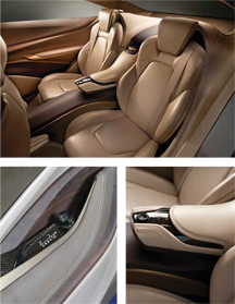
These photos of the finished show car interior convey the business-class, aircraft-style ambiance that Hyundai California Design was going for during the development process. The wood spine and door card details are constructed from solid dark mahogany. “We bought a whole tree and then cut it into two-inch planks,” reveals design manager Chris Zarlenga. “Then we glued them together and milled out the sections we needed”. The components are finished in a dull matt lacquer and stained so that they are lighter-coloured at the front and darker at the rear for a modern, sophisticated appearance.
The unusually sculptural fixed armrest between the HCD-14’s rear seats contains aircon controls that are covered in carbon-fibre and neatly inset into leather. The door-mounted window controls and locking switches sit snugly against the aforementioned matt wood interior door surface.
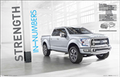 Vehicle type concept/SUV pickup
Exterior design manager Brad Richards
Interior design manager Ryan Niemiec
Interior designers Hannah Kang, Juaquin Bryant, Anthony Prozzi, Thomas Marminc
Colour and materials Aileen Barraza
Project started January 2012
Project completed November 2012
Launch NAIAS Detroit/January 2013
Work began on the Ford Atlas SUV/pickup concept in January 2012 and finished in November 2012 – well before its debut at the NAIAS the following January. This image from April 2012 shows the final hand-drawn interior sketch. The brief was to carry the rugged, utilitarian exterior form language into the interior, as interior design manager Ryan Niemiec explains: “Functional exterior elements like the chin spoiler that drops down and the wheels that close up air flow… [we took] that form language and the way that the exterior materials are used, then worked that into the interior. [We kept] that metallic, structural theme going, but then – because we’re also dealing with humans – the interior [has] soft interfacings, including beautiful black leather with an active stitch to it.”
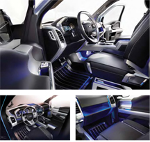
The photo shows the contrast between the interior’s structural elements and soft-but-durable trim. “Luxury and utility go hand in hand with trucks; we joke that it’s not just 9-to-5, but also a 5-to-9 lifestyle,” says Niemiec. “The door feels comfortable, but at the same time it’s durable. So you definitely get that duality between the structural metal and the softer leather.”
The upper glovebox area (illuminated blue) appears to fl oat. “There’s a lip on the glovebox door that holds stuff back,” says Niemiec. “Quick, open storage is always key in these vehicles – just as important as hideaway storage, in fact. Underneath the centre console bridge is a rubber mat [in that cubby], so things can be stored there easily and be accessible too.”
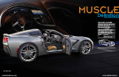 Vehicle type production/2-seat sports car
Interior director Helen Emsley
Design managers Ryan Vaughan, Craig Sass
Design project manager Perry Vesprini
Studio sculpting manager Sam Vitale
Launch NAIAS Detroit/January 2013
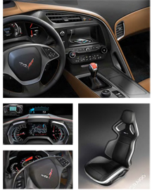
The chosen design theme by Ryan Vaughan, lead interior designer on the new Corvette C7 project, starts to take shape. Helen Emsley, interior director, recalls the atmosphere at the beginning of the project: “We wanted to think outside the box. Everyone had an opinion on what it should be.” As Vaughan correctly sums up, whatever direction its design took, the Corvette is a car that’s truly “part of GM”.
The screen in the centre stack also features touch-screen control with gesture recognition and can be lowered to reveal a hidden storage that includes a USB input.
An early sketch by Vaughan shows the fully configurable instrument cluster in racetrack mode, which he says was inspired by the Corvette C6.R’s display. The production cluster features three modes, with the type of information and colours adapting to suit, supplemented by a head-up display in the windscreen. “The tacho is the most important, it’s always there,” adds Vaughan.
 Vehicle type Prototype/minivan-SUV x-over
Sr. design executive Franz von Holzhausen
Design manager (ext & int) David Imai
Lead exterior designer Bernard Lee
Lead interior designer Andre Franco
Lead colour & trim designer Sue Neuhauser
Project started March 2011
Project completed February 2012
Launch NAIAS Detroit/January 2013
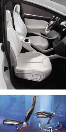
Work on the electric, all-wheel-drive Model X MPV/SUV crossover began in Spring 2011 and finished February 2012, in time for a preview event at the company’s HQ in Los Angeles. “When we spoke to minivan owners, though they loved the interior volume and the easy access, they felt they had a stodgy image. And when we talked to SUV owners, they thought access to the third row was compromised,” says lead exterior designer Bernard Lee. “With the Model X we set out to address these problems in a single product by providing better access to the third row and a bigger opening. This is where the concept of the Falcon doors came from,” he explains. The interior was designed along a contrast theme to enhance visual lightness, as this early mood board shows.
A studio photograph of the finished prototype interior. When you open the Falcon doors, the middle-row seats are revealed in black, which is unexpected. All the seats were fabricated from template moulds taken from the clay and were fully cushioned and trimmed in leather.
The early sketches from 2011 show the clamshell-style folding mechanism of the Model X’s second row of seats in use.
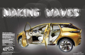 Vehicle type concept/hybrid crossover SUV
SVP & chief creative officer Shiro Nakamura
Design director Mamoru Aoki
Interior designer Toshiya Matsuo
Colour design managers Francois Farion & Gunda Matsumoto
Project started Winter 2011
Project completed December 2012
Launch NAIAS Detroit/January 2013
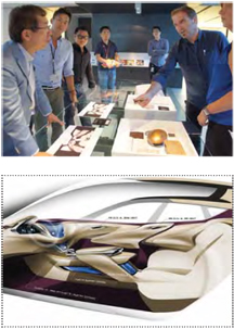
Rumours that the Resonance hybrid SUV crossover concept shown at the NAIAS Detroit show in January 2013 was designed to preview the look and powertrain of the next Murano production car gain added credence when you compare its dimensions with the current vehicle. The concept is just 18mm longer, 2mm lower and 16mm wider than the existing Murano, with a wheelbase stretched by 51mm. Thematically, the Resonance concept employs a variation of Nissan’s now familiar ‘seagull flow’ instrument panel design, as can be seen in this key sketch from early in the design phase. As on other recent vehicles, the IP extends outwards on either side into the door cards and swoops down dramatically into the central transmission tunnel. “The TeRRA was more conceptual, while the Resonance is more realistic,” reveals design director Mamoru Aoki. “But we still wanted to reduce the switch and button count and show off the materials and design.”
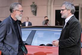
In the photo, colour design manager Francois Farion (in the blue shirt on the right), discusses the colour and trim options with SVP & chief creative officer Shiro Nakamura (far left) while various exterior designers look on.
The sketch shows the cabin without the front seats to illustrate more clearly how the interior layout of the Resonance transitions from front to rear. Note the position of the vents, the sliding console design and the layered, see-through console.
Magazine
