IN THIS ISSUE
SVP & chief creative officer Shiro Nakamura
Exexutive design director Mamoru Aoki
Interior creative team leader Masato Ishikawa
Colour design manager Hideshi Saiki
Project started November 2011
Project completed September 2013
Launch Tokyo / November 2013
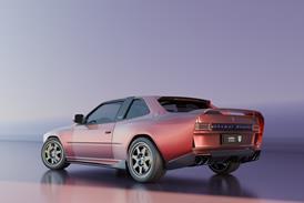
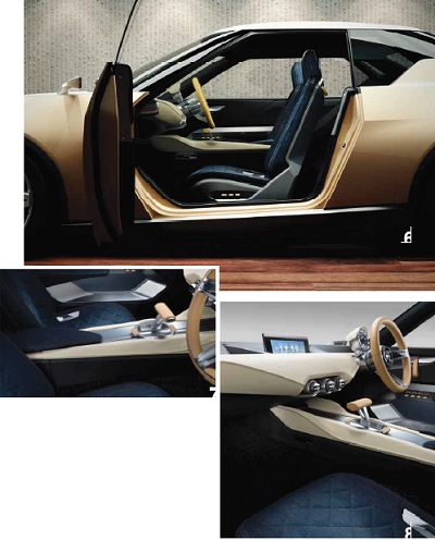
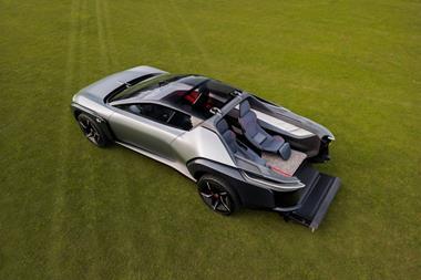
As surprising as they were unusual, the IDx Freeflow and Nismo concepts arrived on stage at the 2013 Tokyo show on the morning of November 20, without preview. Representing the yin and yang of motoring as well as Nissan’s diverse range, the concepts, share an unusual sawn-off, three-box silhouette and broad proportions, but have very different exterior and interior treatments.
The thick, cream leather wrapping around the steering wheel, IP and centre transmission tunnel - with exposed stitching at its pinched seams – quietly asserts the idea of well-made craftsmanship. Aoki says the design team were aiming for “a simple quality, something like the fashion of Jill Sander”. Sitting in the colour spectrum between the white of the roof and the beige exterior body shade, it works perfectly as an associated interior accent among all the denim and dark grey.
The thick shag-pile carpet and air-conditioning knobs take their cues from domestic housing interiors rather than automotive cabins. Even the fonts on the centre screen display have been carefully differentiated; rendered rounder lighter and softer for the Freeflow, compared to bright red and more overtly digital-looking on the Nismo (see overleaf).
 Vehicle type Production/sports coupe
Interior design director Scott Strong
Chief designer global interiors Doyle Letson
Interior design managers Bill Mangan, Nicolas Thetard, Robert Gelardi, John Acciaioli
Interior designers Sewon Chun, Michael Thomson & Evan Wilson
C&T design manager Susan Sage
C&T designer Carrie Bommarito
Project started Spring 2011
Design frozen June 2012
Launch NAIAS Detroit / Jan 2014
another big wish that we’ve heard time and time again from customers, which is honest, premium materials.”
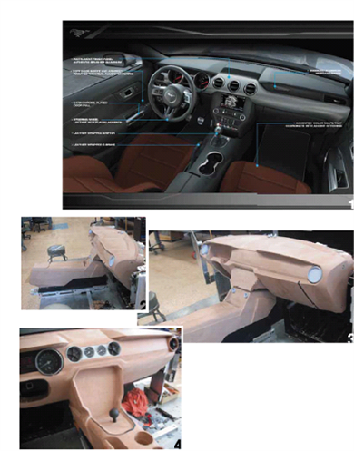
This diagram breaks down the finished car’s key material choices: brushed aluminium IP, leather-wrapped shifter and e-brake, an anodised aluminium Mustang badge, satin chrome door pulls, leather steering wheel and accented stitching.
The photos show ‘Theme A’ undergoing full-scale clay model development prior to the to the merging of the two themes. “We built complete glamour models for each of the themes, then we picked one, developed the surfaces and got into the fine detail needed to develop the programme. It was really tough to choose,” recalls Doyle Letson. “We built them, scanned them, came in and out of digital as needed,” adds Bill Mangan. “You can’t discount the value of working in physical forms. When a human hand touches the model, touches clay, touches aluminum, the differences and subtleties that you find are very important.”
“With an interior, there are a million decisions to make, a million different requirements
that you have to meet; knee clearance zones, down vision zones… everything is compounded,” says Letson. “We don’t want to be working on a clay model that’s totally off package, so each of the guys, as they’re doing sketches, will sometimes build a quick core in data of what we’re really after. If we have to go back in once we’ve sold the theme and completely change the proportions, it’s a big problem.”
 Vehicle type: Concept/2+2 sports coupe
Chief design officer, KIA: Peter Schreyer
Chief designer, KIA America: Thomas Kearns
Exterior design manager, KIA America: Kurt Kahl
Senior designer, KIA America: Christopher Coutts
Interior lead designer: Brian White
Colour and materials manager: Mollie Engel
Project started: Spring 2013
Project completed: November 2013
Launch: NAIAS Detroit / January 2014
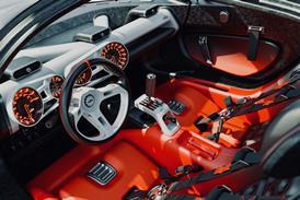
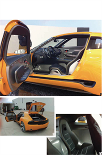
These open-door shots of the final concept car clearly show the floating armrest within the plain sheet metal of the door and the red accent elements, including the door pull.
The rear ‘+2’ seats. “The rear seat is really a recreation of the front seat,” says White, “but what I wanted to do was melt it into the sheet metal around it. It adds to the simplicity.”
 Vehicle type Production/executive sedan
Head of exterior design Brandon Faurote
Head of interior design Klaus Busse
Design manager Jon Gaudreau
Exterior designer Jeff Hammoud
Interior designer Cristian Farcas
Head of colour & trim LaShirl Turner
Colour & trim designer Kasia Lys
Interface designer Eric Chapman
Project started Winter 2011/Spring 2012
Project completed Winter 2013
Launch NAIAS Detroit/Jan 2014
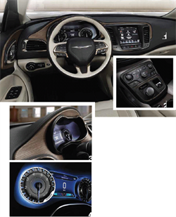
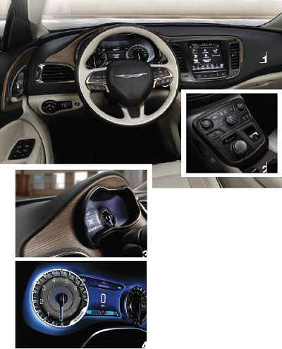
The clay model’s piano black centre console had to change because “before we knew it, it was literally full of .. ngerprints”, says Klaus Busse. “Rather than forcing our customers to clean that piano black trim every other day, in an area that is loaded with switches, we decided to walk away from it. We went to a matt finish. The controls are more organised. We wanted to calm that area down.”
The car was unveiled at the Detroit show in January 2014. The use of wood in the final production vehicle represents American luxury. “It shows how well executed it was, with that amount of shape and the exposed edge,” says Busse.
The final instrument cluster. “I think it is very entertaining with the blue gems and
the font we used. It’s a Chrysler-only colour,” says Busse.
Vehicle type: Concept/sports coupe
President, Toyota Calty: Kevin Hunter
Studio chief designer: Alex Shen
Project design manager: William Chergosky
Project started: Late 2012
Project completed: Late 2013
Launch: NAIAS Detroit / Jan 2014
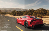
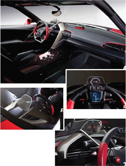
Research showed that, at speeds, drivers enter into a zone where their focus is almost tunnel-like. What project design manager William Chergosky terms a “slingshot architecture” was created in order to make the driver integral to this zone.
The three displays – heads-up meter, dock (the screen behind the wheel) and F1-style display on the wheel – work in harmony. “When you’re working through the heads-up meter on the top, you choose navi; then when you’re in the space you want, you press the middle button on the steering wheel – the dock – and you place that into the central screen. Then, in your peripheral vision, you can see yourself running through the race circuit,” explains Chergosky.
A pet perspective of Chergosky’s is this view of the ‘slingshot’ architecture. “Every interior I do, I try to put some kind of signature in, to make you go back and look. So when we’re doing the CAD, I’m always asking to see what it looks like from outside, because what we’re trying to show you from the outside is that we’ve this great signature architecture inside.”
Project director: Ken Melville
Interior designers: Laurent Negroni, Nicky Kwee
HMI designer: Vincent Ciccone
Colour & trim designers: Nathalie Granger, Sidonie Camplan
Project started: End 2010
Project completed: Mid 2013
Launch: Geneva / March 2014
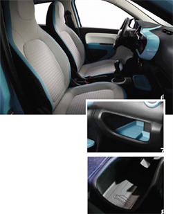
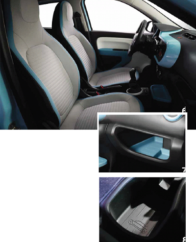
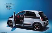
New Twingo gives buyers the choice of three different themes for the seat fabric and armrests: light blue, grey or red, with contrasting accent colours to the edges of the
seats. Also available is a sportier trim which features a black environment colour combined with red highlights and mixed fabric upholstery. The higher grade version shown here has automatic climate control and R-Link colour touchscreen with a zooming and scrolling capability and DAB radio.
New Twingo can be equipped with a range of special stowage features known as Flexicase, depending on the different types of use to which it is to be put. These include a floor console with cupholders and power sockets, a removable bin with coloured lid in front of the gearshift and a choice of glovebox inserts.
Magazine
