IN THIS ISSUE
Design Director: Michael Robinson
Interior designers: Stefano De Simone & Teresa Mendicino
Colour & Trim: Guilia Cinti
Project started: November 2009
Project completed: February 2010
Launch: Geneva Motor Show 2010
opportunity to get away from the retro-oriented Alfa-Romeo-isms that have been going on for too long.” The guiding idea for the project was the curious paradox that the team detected within the Alfa Romeo logo: “On the left-hand side there’s the heraldic cross of Milan, which is the mechanical, engineering, performance side — everything that’s rational. On the right is a snake; and that, to us, was the sensuous part: beauty and aesthetics and emotion.” The designers set out to create a dynamic mix between the two by playing with the relationship between the car’s skin and its frame (‘telaio’ in Italian). One exploratory sketch (4) applied the design of Herzog and de Meuron’s ‘bird’s nest’ Olympic soccer stadium in Beijing to the outside of the car, as an exoskeleton.
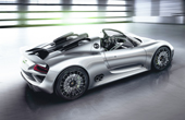
Design Director: Michael Mauer
Interior Design Director: Thorsten Klein
Colour & Trim designer: Cornelia Rosenbohm
Project started: September 2009
Project completed: March 2010
Launch: Geneva Motor Show 2010
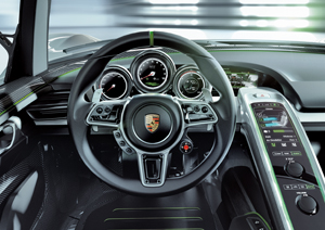
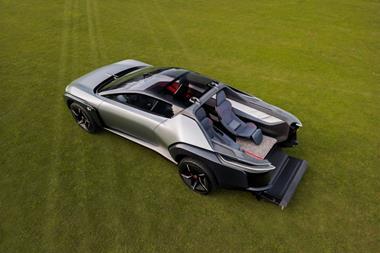
Like the open cockpit of the Porsche 917 PA that Jo Siffert drove in the CANAM series of 1969, the 918’s interior features an asymmetrical cut with an indentation towards the passenger side (as indicated by the red line visible in this sketch). Mauer: “Thus we wanted to stress the driverorientated architecture of the interior".
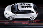 Vehicle type: concept/5-door hatchback
Design Director: Anthony Williams-Kenny
Project leader: Ramesh Bassi
Colour and Trim Designer: Becci Tee
Project started: winter 2009
Project completed: spring 2010
Launch: Beijing/April 2010
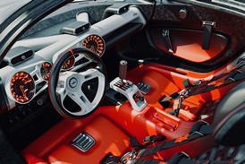
Project Zero was developed in just three months, and was designed in the UK and built by Sivax in Japan.
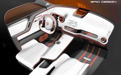
The Zero is the first proper MG concept for 25 years – the last one was the 1985 EX-E, with an exterior penned by a young Gerry McGovern – and heralds a newfound design confi dence under design director Anthony (Tony) Williams-Kenny. Unveiled at Beijing’s Auto China Expo in April 2010, the Zero gives a strong indication of the forthcoming production MG supermini due later this year in China, and in other markets from late 2011. Size-wise it’s some 80mm longer and 24mm taller than a Ford Fiesta. The smart exterior by Rob Battams should stay largely intact for production, but it is the more future-facing interior that is the greater revelation, showcasing how a 21st Century MG might look.
The Zero’s white interior scheme is not supposed to reflect future colour intentions, as project leader Bassi explains: “White is a modern colour, but it gets dirty in production. What we are trying to push more is the idea of contrast. On the production car we’d probably go for a grey against a darker grey, but the other thing we also wanted to push was the bright orangey red – looking at the heritage of MG we found this colour used often."
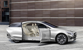
Studio Director: Michele Jauch-Paganetti
Senior Designer: Frederic Latino
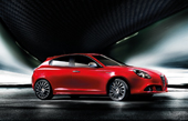 Vehicle type: production/5-door hatchback
Fiat Group Design Director: Lorenzo Ramaciotti
Chief Interior Designer: Ramon Ginah
Senior Interior Designers: Daniele Calonaci & Gianni Gariglio
Colour & trim manager: Rossella Guasco
Graphic design manager: Davide Crepaldi
Project started: summer 2005
Project completed: April 2008
Launch: Geneva/March 2010
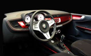
Project 904 – the internal codename for the Giulietta – had a very difficult birth; work began at Alfa Romeo’s Centro Stile in 2005, with designers competing with sketch proposals. Outside consultancies such as Bertone were then brought in to add their ideas in 2006/7, resulting in a full-scale clay model that was later presented to newly appointed Fiat CEO Sergio Marchionne. He rejected the design, and the Centro Stile team was asked to create a completely new proposal – exterior
and interior – from scratch. The interior sketching process began a new in November 2007 – just a few weeks prior to the exterior design freeze, and some six months before the interior was frozen (in April 2008). “The brief was for something simple, emotional, ergonomic and spacious,” recalls Chief Interior Designer, Ramon Ginah. “In terms of emotion, one of things we started to look at was the original Giulietta and Giullietta Sprint, at this horizontal architecture they had, to try and use this as inspiration. A horizontal architecture helps in creating an ergonomic feel, because it allows you to divide the functions into zones.”
Magazine
