IN THIS ISSUE
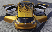
Design Director: Laurens van den Acker
Director of Concept Cars: Alex Breun
Interior Designer: Alexandre Gommier
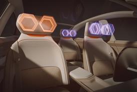
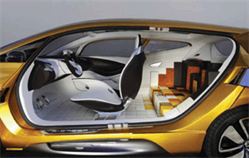
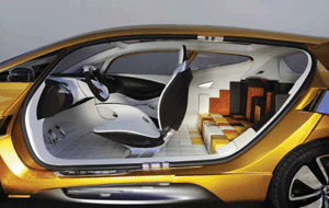
“We wanted to communicate the idea of an area that is multifunctional – it could be cubed, it could be circular, it could be anything. The first position is a flat bench-like area, so you can seat three people. The second position has a centre armrest, which makes it comfortable on long journeys. And the third one is an asymmetric layout that provides a booster seat for a child,” explains Gommier. The only setting not shown is the final one, in which the motors are disengaged to allow the blocks to be moved around by hand. “In this confi guration the child can go in the back and crawl around on the floor like a real playground, making up his own universe,” says Gommier. The seat presets are controlled via a small touchscreen inset into one of the white blocks.
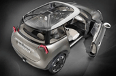
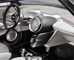
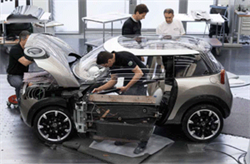
The Rocketman nears completion in the run-up to its debut in Milan. Sieghart says that integrating a premium/luxury quality was the biggest challenge: “We didn’t want to a make a cheap, small car; we wanted to understand future materials, and to use clever functionality to use the space in the best way. Space is luxury in this class.” Searching for this ‘luxury’ also meant close attention to detail and a focus on craftsmanship. “On the one hand it’s about using these lightweight materials and getting the most space, and on the other it’s playing with them in a MINI way – revealing things where you don’t expect.”
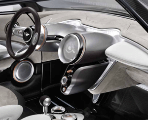
The fi nished Rocketman interior features a broad selection of materials: “We’ve used classic nubuck leather, modern motorsport materials like carbon-fibre, and sustainable materials such as paper. The IP is divided into two layers: nubuck coating for the top, and the lower area visibly the structure of the car”. MINI has made a feature of the carbon-fi bre chassis construction inside, and understandably so.
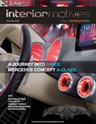
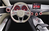 Many of the A-Class’s interior elements were inspired by aircraft engineering, ranging from the afterburners of the Grumman F14 Tomcat to the jet engines of an Airbus A340. At the same time the concept refl ects the bionic ideas from the futuristic Mercedes Aesthetics No.2 sculpture shown at NAIAS 2011. Gorden Wagener, head of design of M-B, smart and Maybach: “We wanted to transfer the main principles from the sculpture into the show car. A skeleton structure covered with textiles creates the volumes of the instrument panel and the middle console to bring a new sense of lightness into the cockpit. Our message is: Here comes a new generation of M-B interiors, in this case a very fresh, sporty and young design for the forthcoming A-Class.” The production car will not appear until 2012 however, and will be beaten to market by the new B-Class, which makes its debut at Frankfurt in September.
Vehicle type: concept/four-seat coupe
Colour & trim design: Nicola Ehrenberg-Uhlig, Bozhena Lalova
Project completed: November 2010
Titanium and silver tones are combined with a light, elegant beige, while Magenta is used to produce highlights that contrast with the silver paint fi nish of the car’s exterior. The dashboard has a translucent, stretchable textile lining which is vapour-coated with chrome particles, and makes visible the skeletal structure of the dash. On the passenger side of the center tunnel there is a slot for an iPhone which, when inserted, automatically synchronises with the multimedia system. All functions, including Internet radio, email and social networks, are shown as apps on the display and are operated via the rotary/push control.
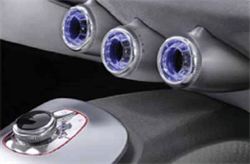
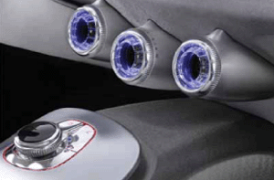
The backlit airvents change colour depending on temperature – blue for cool, red for hot. “Our climate experts love the central vent since it leads fresh air directly to the rear compartment,” says Sinkwitz. The rotary/push control sits on a concave brushed aluminium panel that he compares to a gearbox bell housing.

Graphic Design: Billy Galliano
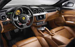
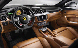
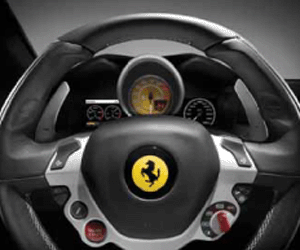
approach taken with the 458 Italia, where the obvious use of
authentic aluminium castings and carbon-fi bre sets it apart
from other luxury cabins to give a more ‘premium functional’
feel. Three centre vents jut out like gun barrels, with two
supporting vents at each end of the IP. Note the extensive use
of contrasting double stitching, including on the sun visors and
headliner. The QuantumLogic infotainment, surround sound and
nav systems were developed by Harman specifi cally for the FF.
Chief Designer: Adrian Griffiths
Project Design Manager: Lee Perry
selector, and features a laptop-style trackpad interface on the top.

Infiniti Design Director: Takashi Nakajima
Project started: November 2009
Magazine
