IN THIS ISSUE
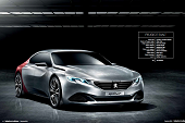 Vehicle type Concept / compact fastback
Director of Peugeot design Gilles Vidal
Design project manager Pierre Paul Mattei
Exterior designer Romain Saquet
Interior designers Alessandro Riga
Colour & trim designer Sophie Gazeau
Digital modeler Samuel Guinefoleau
Project started Winter 2012
Project completed Spring 2014
Launch Beijing / April 2014
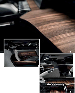
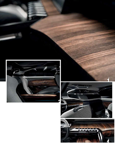
The Exalt evolves the ‘i-cockpit’ architecture first seen on the 208 and now rolling out across all Peugeots with the 2008 and 308. “In future, we will push it further,” says director of Peugeot design Gilles Vidal.
A close-up of the passenger-side IP. “The wood is a derivative of ebony, from the tropical forests of south-east Asia – somewhere close to China. It had to be sourced as close as possible to China so that it doesn’t travel too far, to keep the global CO2 score low,” says Gilles Vidal. “We also picked this wood because it has a linear thread, or grain, and very few imperfections; we want to emphasise stretching and length in the cockpit and these parallel lines in the wood help achieve that.”
Photos of the rear seats and a close-up of the back of the front headrest. “The Shiny black is proper lacquer,” says Vidal. “We liked the contrast of the visual finish, but also showing the know-how of the craftsmanship – it means something stronger and deeper than just being cool,” he says. “Society is in this crazy race for hi-tech and this creates a throwaway culture. Clearly, in cars we will be more hi-tech too, but the natural materials we will still have in cars – wood, leather etc – should be as raw and true as possible to contrast against the race for technology. We want you to be able to rest, to look, touch and appreciate timeless materials.”
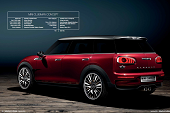 Vehicle type Concept / compact tourer
Head of MINI design Anders Warming
Head of exterior design Christopher Weil
Head of interior design Oliver Sieghart
Head of colour & trim Annette Baumeister
Exterior designers Alexander Schneider, Stephan Goeppel
Interior designers Jonathan Cornu, Thomas Wu & Theo Cho-Choi
Colour & trim designers Anna Diermeier, Wesselka Mandowa
Interface designers Benjamin Brück, Björn Bertrand
Project started April 2013
Launch Geneva / March 2014
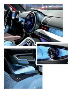
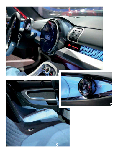
Such was the volume of new cars vying for attention at the Geneva show in March that it’s perhaps understandable that so many journalists and designers dismissed the Clubman Concept as little more than a production MINI with fancy materials and coach-style rear doors. Only when invited by head of interior design Oliver Sieghert to step inside the security barrier did we come to understand that it departs from the brand’s previous one-layout-fits-all approach to interior design and explores a completely new cabin architecture. The catalyst for this, says Sieghart, was the decision to widen the production hatchback’s chassis by 117mm in the early stages of the project: “This is the first time we’ve had this extra volume. For us it’s showing the path for how MINI could be, creating a new class of car… spacious, roomy and [with[ its own style.” The key elements of this are a greater focus on the circular centre instrument and a more open, layered IP architecture.
The focal point of the interior – even more so than in any previous MINI – is the circular centre display. The dark-leather-covered upper IP appears to hover above the white porcelein lower section on a band of rhomboid-patterned blue light. Below the vents on either side of the centre instrument are Black Chrome surfaces that can be used to display information such as HVAC settings. Just visible at the bottom of this pic is the Berry Red patent leather that clads the bottom of the IP – another nod to contemporary fashion.
“Here we have a new interpretation of the well-known MINI elliptical door handles, which float free and act as grab handles when you’re closing the doors.” – Sieghart
A photograph of the Clubman’s heavily countoured, partially quilted rear seats. At 17cm wider and 26cm longer than the existing Clubman, the concept is a genuine-four seater with a high degree of practicality. “With this classic race seat theme we had to thoroughly check the ergonomics, if it’s possible to get in and out of the car easily enough,” adds Sieghart.
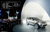 Vehicle type Concept / mid-size SUV
Design director Gerry McGovern
Overall team leader Richard Woolley
Chief interior designer Dave Saddington
Interior design director Interior designers Joanne Keatley, Amy Frascella, Isabel Diaz
Colour & trim design Nigel Thomas & Karandeep Singh Bhogal
Project managers Samuel Guinefoleau
Project started November 2013
Project completed April 2014
Launch NYC Motor Show / April 2014
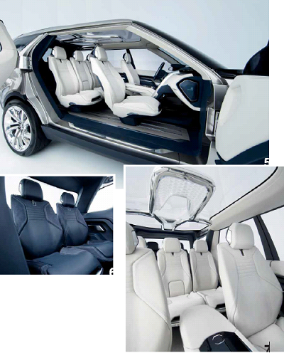
Land Rover concept unveils are rare and special occasions, often hinting strongly at cars to come – the LRX turned into the 2012 Evoque with little exterior change and the 2004 Range Stormer morphed into the 2005 Range Rover Sport. The Vision Discovery concept was revealed alongside the Virgin Galactic spacecraft at a glitzy event onboard the US aircraft carrier Intrepid, in New York, Land Rover having just announced a sponsorship tie-up with the commercial space venture to ferry astronauts and customers to and from its desert launch pad. Design director Gerry McGovern promised “an abundance of ideas which will inform our vehicles of the future”, including under-car cameras that relay images to driver screens, rendering the hood ‘see-through’ while off-roading. However, the Discovery Vision concept’s interior is not overtly space-aged or radical. Rather, it’s a modern, feasible idea of what a new generation of Discoverys could look like, starting with the Freelander/LR2 replacement due in mid-to-late 2015, re-badged as the Discovery Sport.
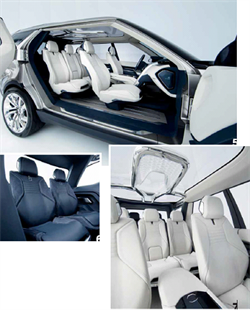
The white leather trim on the front two rows might seem a little impractical for a Discovery, but while Amy Frascella concedes its lightness does make it clearly conceptual, she argues that its special coating makes it more versatile than at first it might appear. Supplied by Foglizzo and used on yachts, the specially treated leather is washable, allows water to pass through it without altering its characteristics, and resists mildew and mould even in damp, humid environments. The nubuck leather bolsters have a different treatment to repel and protect against oil and water spillages, thereby making the vehicle “premium but not too precious”, says Land Rover. This different treatment is most visible in the close-up of the third row of seats.
 Vehicle type Concept / fuel cell crossover
Chief design officer Peter Schreyer
Chief designer Europe Thomas Bürkle
General manager Raphael Bretecher
Design manager, interior Jochen Werner
Lead exterior designer Roberto Kühn
Lead interior designer Nico Munkler
Interior designer Michel Glenisson
Manager, colour and trim Tayo Osobu
Manager, studio engineering Günter Roos Senior engineer/frame development Sven Wittke
Project started January 2013
Project completed February 2014
Launch Geneva / March 2014
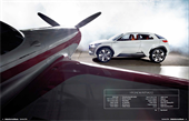
The Intrado is the first Hyundai concept to be unveiled since Peter Schreyer became chief design officer for the South Korean brand, but he wasn’t there at the start of the process. The project – to develop a small crossover around a new kind of carbon frame – was led by the chief designer of the European studio, Thomas Bürkle, and general manager Raphael Bretecher. Early themes by Michel Glenisson – made before Schreyer took over – included a radical-looking interior featuring bucket seat bases with separate seatbacks suspended from the central spine of this potential new frame. All the major elements are attached by what look like taut carbon belts which allude to the design team being influenced by outdoor sports equipment. “We were inspired by kite surfing, and, in this case, the IP is the kite,” confirms interior design manager Jochen Werner.
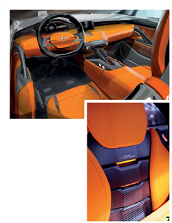
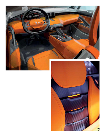
This later rendering shows how the interior evolved into a much cleaner environment than proposed by the initial themes. “Peter Schreyer definitely had a big impact,” enthuses Munkler, the rendering’s creator. “Simplicity became an even bigger thing after his arrival and he was helpful in getting this clean feeling to the functionality. It was an interesting phase to work out what he likes for future projects too. He sometimes just sits in front of the steering wheel and asks ‘Why?’”
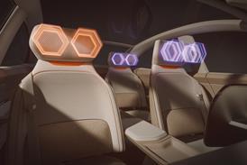
This close-up photo of the back of the finished seat reveals the real carbon fibre exoskeleton of the seat peeking through from the clamped-on padding wrapped in orange fabric, which, according to colour and trim manager Tayo Osobu, was inspired by the sort of lightweight waterproof material used in windbreakers and other outdoor sports jackets. The glowing lights in between point to a notional ‘polymer damping system’ to allow variable seat curvature, “like on a skateboard, or the cartilage between human vertebrae”, adds Werner.
Magazine
