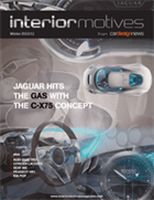
IN THIS ISSUE

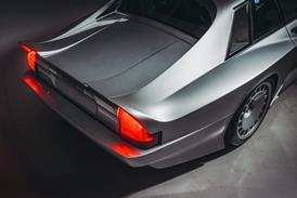
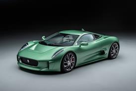
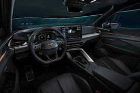
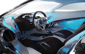
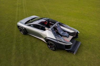
Jaguar C-X75

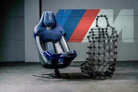
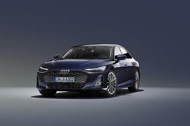
Audi Quattro

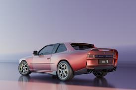
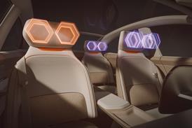
Seat IBE

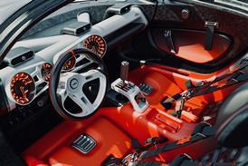
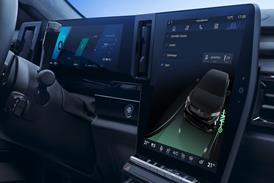
Peugeot HR1

Buy this issue or subscribe  Apple  Google  Kindle Small


JAGUAR C-X75

Winter 2010 11
Vehicle type: concept/2-seat coupe
Design director: Ian Callum
Interior design manager: Alister Whelan
Senior interior designer: Hugo Nightingale
Interior designer: Pierre Sabas
Colour & trim design: Siobhan Hughes
Project started: February 2010
Project completed: August 2010
Launch: Paris/September 2010


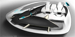
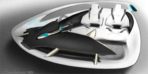
“From the word go, this advanced design project was all about getting our young designers involved,” says Whelan. “Working in tandem with advanced engineering, we called it ‘art and engineering’.” Royal College of Art graduate and 2008 Interior Motives Student Designer of the Year Pierre Sabas was tasked with the overall theme generation, the instrument panel, fl oor, seats and steering wheel. His two sketches highlight different seat and IP interpretations.
 
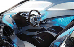
The car’s dramatic swan doors are aesthetically beautiful but also hide technological secrets within their structures. Jaguar already has a relationship with sound and speaker specialist Bowers & Wilkins on its production models, but for this project the design team wanted to work on something more conceptual. Behind the chemically etched aluminium micromesh speaker panels are blue-lit honeycomb structures made up of individual nano speaker panels attached to a base plate. “We wanted the interior to look very simple with the technology hidden away, so you only really view it when you need it,” says Nightingale. “This technology takes a second or third read to see. It’s also in the bulkhead structure, and is a design that B&W is looking into – concept speaker technology to go with concept car technology.”

The rear window of the C-X75 acts as showcase for the mid-mounted, twin micro gas turbines that combine with the four electric motors to power the concept. Blue backlighting helps to provide a psychological link between the powertrain and the rest of the cabin.
Read the full design review


AUDI QUATTRO

Audi Quattro 1Vehicle type: concept/2-seat coupe
Head of Audi Group Design: Wolfgang Egger
Interior Design Director: Carsten Monnerjan
Lead interior designer: Florian Flatau
Colour & Trim Director: Simona Falcinella
Project started: June 2010
Project completed: September 2010
Launch: 
Paris/September 2010 


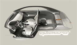
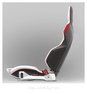
Work initially began on the quattro project in December 2008, but was stopped at the quarterscale model stage while the team prepared the e-tron concept for its launch at the NAIAS Detroit auto show in January 2010. Work recommenced almost entirely from scratch in May 2010 with a new theme sketching phase at the Munich studio. This sketch by Florian Flatau (right) was selected by Egger for development. The entire design process took just seventeen weeks, and saw the fully driveable prototype completed narrowly in time for the Paris show in September 2010.
 
“We have a very compact way of working here in the studio,” says Head of Audi Concept Design Munich, Carsten Monnerjan. “While we sketch there are CAD modellers sitting next to us, which gives us the opportunity to see the basic volumes onscreen.” A total of six weeks was spent at the Munich studio – including milling the interior surfaces in clay – before the team shifted to Italdesign in Turin, Italy, for the prototype build. “While we were there we had four more weeks of CAD modelling, printing out high-density foam details from the data to show critical areas and volumes; for example, where leather and carbon-fi bre meet.” The car sits on an RS5 wheelbase that’s been shortened – just as the original Ur-quattro’s was to create the ‘Short Sport’ – by 150mm.

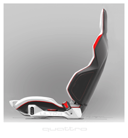
There is no plastic inside the quattro concept – even the door panels are crafted from carbon-fi bre. The design of the seats, like the rest of the interior, focussed on minimising weight. “An Italian competitor has chairs that are 18 kilos, so we thought it would be fun to try and match or beat that,” says Monnerjan. The seats are
made by Sparco and weigh a shade over 18kg each.
Read the full design review


SEAT IBE

SEATIBE 1Vehicle type: concept/2+2-seat coupe
Design Director: Luc Donckerwolke
Interior Project Leader: Marc Franch Ventura
Workshop Interior Design Chief: Paco Siguenza
Interior designers:Michele Conti &
Carlos Bartolomé

Interface designer: Ruben Rodriguez
C & T Project Leader: Annabell Herbst
Project started: March 2010
Project completed: September 2010
Launch: 
Paris/September 2010


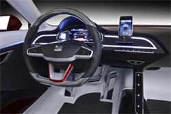
The 2+2-seat coupe was created both to signpost the future design direction of the Spanish brand and as a response to Design Director Luc Donckerwolke’s rhetorical question: “Why can’t we have a responsible city car that looks fun – and is fun?” Right from the word go, the IBE interior was envisaged as a simple, driver-focused environment. As Donckerwolke says: “You don’t need a lot of info to drive in the city. It’s a purist driving experience.” This key theme sketch was the one chosen for development by the SEAT design team at its Global Design Center in Martorell, Spain.
 
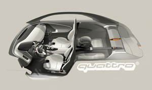
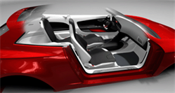
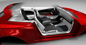
The IBE was always envisaged as a “scooter on four wheels” – a fun mode of transport for urban environments. Given the car’s target market of young buyers, the team felt that four seats were crucial to satisfy their ‘tribal instincts’, as well as the needs of young mothers with children. Although the IBE is around 40cm shorter than an Audi TT, the clever use of materials and careful packaging of components means there’s a lot more room inside, as this 3D cutaway rendering of the interior shows. Only rear headroom was compromised in the name of style.

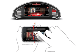
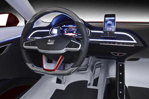
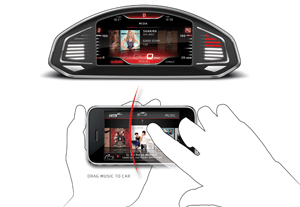
“The whole car started – interior and exterior – with an icon in mind, and that was the iPhone,” says Donckerwolke. As a self-confessed gadget and Apple fan, he expresses frustration at the constant need to learn and switch between different operating systems: “Why does he (the consumer) want to adapt to something else? The driver comes into the car with his iPhone, and we get rid of all the other stuff and build the interface between the car and the phone.” As illustrated in this sketch by interface designer Ruben Rodriguez (right middle), an unoffi cial iPhone app allows the driver to select music or information on their mobile phone and send it with a fl ick of a fi nger to the main vehicle display. The device can also be connected directly to the HMI through a docking station that slides out of the centre of the dashboard (right bottom).

Read the full design review


PEUGEOT HR1

Peugeot HR1 1Vehicle type: concept/2+2 seat crossover
Design Director: Gilles Vidal
Interior Design Director: Amko Leenarts
Colour & Trim Designer: Hélène Veilleux
Interior designer: Frédéric Antecki
Project started: January 2010
Project completed: July 2010
Launch: 
Paris/October 2010


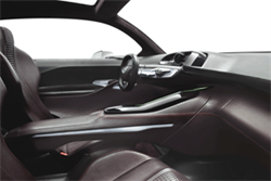
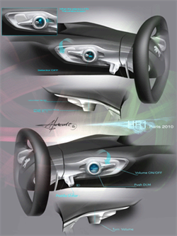
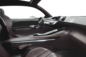
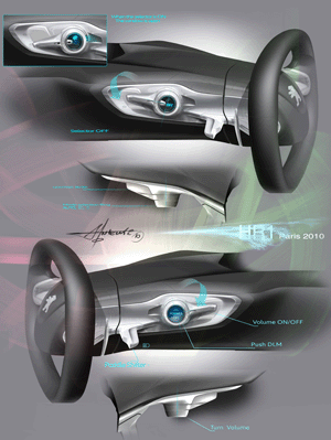
Visible in these final sketches by interior designer Frédéric Antecki is the HR1’s unusual ‘double dashboard’ design. “That is something that I really like, and that I want to continue because it gives you a lot of opportunities to do 3D in terms of section,” says Leenarts. Note also how the red leather on the lower dashboard visually links it to the centre console, front seats and lower door panels. The rear chairs – trimmed in black leather – are suspended from a rail inside the centre tunnel in the fl oor and slide forwards electrically to ‘mate’ with the front chairs when not in use (1), taking on the appearance of structural frames in the rocess.
 
“You have a lower dash and a higher one, which is almost identical to the SR1’s, sort of fl oating on top of it,” points out Leenarts. “This means we can have a high base of the windscreen and the concept still works; one of the problems we have here at PSA is that our windscreen base is a lot higher than VW’s or Audi’s, for instance, because of the technology underneath it.” The lower dashboard was required for storage as well as aesthetic reasons, but again Leenarts and his team turned that compromise to their advantage: “We linked the lower console to the glovebox, and that became this horizontal landscape. I always joke with the team by saying that if you put a little gnome on the interior then he would have to be able to walk over it – that means that the surfacing is more horizontal than vertical.”

Read the full design review


Buy this issue or subscribe  Apple  Google  Kindle Small


Magazine
IM 2010 Winter Cover