IN THIS ISSUE
Porsche Panamera Sport Tourismo
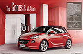 Vehicle type production/3-door hatchback
Interior Design Director Liz Wetzel
Interior Chief Designer Stefan Arndt
Assistant Chief Designer Daniel Schmitt
Designers Eun Seok Lee, Tom Friar
C&T Assistant Chief Designer Sonja Vandenberk
C&T designer Johanna Pietrzyk
Project started summer 2009
Project completed April 2011
Launch October 2012
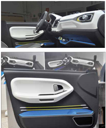
The Adam differs from cars such as the Mini and Fiat 500 by deliberately avoiding the retro route. “First of all, it had to be an Opel,” says Interior Design Director, Liz Wetzel. “Then we said it needed to be made for individualization, so the design had to have a certain modularity so that customers could create their own style. We looked to integrate tech in fun new ways. And finally, we really wanted to bring quality to this interior. Even though it’s a fun car, it’s all done with high levels of quality execution.” Chief Interior Designer for the Adam, Stefan Arndt, adds: “Our motto throughout the project was ‘downsize it but don’t downgrade it’.”
The decision to separate the different elements on the IP happened quite early in the process. “To go for this large touchscreen/radio surface demanded a certain width of centre console that sits below the main horizontal section of the IP,” remarks Arndt. “Then we thought the HVAC should just be something floating between.” In conceiving such a modular, reduced design the team also responded to a criticism of recent Opel/Vauxhall designs that they feature too many switches.
 Vehicle type concept/compact FCV/SUV
SVP & chief creative officer Shiro Nakamura
Design director Mamoru Aoki
Interior designer Takuga Karasawa
Colour design manager Hideshi Saiki
Project started Mid-2011 Project completed August 2012
Launch Paris/September 2012
Making an impact at the Paris motor show among 270 brands exhibiting some 100 international unveils can be hard, but while the eyes of many were on shiny new McLaren, Range Rover and Jaguar models, Nissan quietly revealed a svelte new fuel cell SUV concept with a rather special interior. Given its fuel cell package – with an electric motor powering the front wheels under the bonnet and in-wheel motors turning the rear wheels as required – no drive shaft to the rear was needed and so a new seating layout was possible. This plan-view sketch shows the starting point for the concept’s interior with its unusual diamond-formation seating layout and great sight lines, as design director Mamoru Aoki explains: “Good visibility is important for an SUV, so sitting more towards the middle is key. This layout also creates better legroom for everyone in a way not possible with most gasoline cars.”
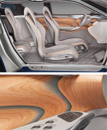
The finished interior features a practical PVC floor with a unique pattern developed for Nissan that’s reminiscent of a metal flooring found in industrial buildings called ‘five-bar tread plate’.
The close-up of the Tendo wood and acrylic door panel shows the refinement of the finish well, and also reveals where Aoki found space for the aircon controls: at the front of the driver’s side armrest.
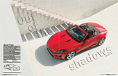 Vehicle type Production/2-seat sports car
Jaguar Design Director Ian Callum
Advanced Design Director Julian Thomson
Chief Designer Alister Whelan
Interior Design Manager Jonathan Sandys
Production Studio Director Wayne Burgess
Project started Summer 2007
Project completed Winter 2011
Launch Paris/September 2012
Work on the interior of the F-Type began in Summer 2007, at almost the same time as the exterior. “We set out to create an interior that really reflected how great the car handles and performs; that’s where the one-plus-one architecture of the dashboard came from,” reveals Alister Whelan, Chief Designer of both the exterior and interior of Jaguar’s F-Type sports car. “We didn’t want the interior to look and feel like an open, horizontal and symmetrical GT – completely the opposite… low dashboard… cocooning… above all we wanted it to feel very engaging as a cockpit. So all the lines on the F-Type right from the first sketch go longitudinally down the car and split the cockpit into two, which is where the grab handle comes from.”
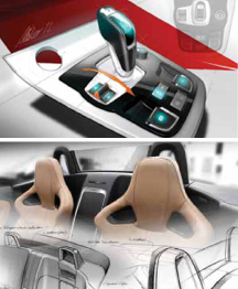
The design of the centre console and gear shifter was inspired by aircraft: “A mix of Bang & Olufsen and Eurofighter,” says Whelan. “The toggle switches are a bit of a nod to the E-Type but also to jet fighters as well, while the gear shifter was a deliberate attempt to do something that felt more like a fighter joystick. In terms of the ergonomics of the interior, we were always keen to make sure all the switches were easy to use, easy to find; there’s nothing daunting about F-Type. There are kind of three main sets of controls: the navigation screen, the HVAC controls and the driver controls. If you split it up into those three sections, everything is easy to find.”
 Vehicle type concept/three-door SUV
Design Director Stefan Sielaff
Lead Interior Designer Romulus Rost
Interior designer Christian Grajewski
Colour & trim lead designer Verena Thomas
Colour & trim designer Andrea Jensen
Project started March 2012
Project completed September 2012
Launch Sao Paolo/October 2011
The job of designing the Taigun concept in time for its debut at the Sao Paolo motor show in October 2012 fell to VW’s Potsdam Design Center. The brief from management was for a “baby Tiguan” with four seats – a future SUV of the A00-segment. Spearheading the interior concept was Romulus Rost, former Audi designer and interior design chief at VW’s Potsdam studio since 2005. At this early stage seen in Grajewski’s sketch, the cabin featured a compass on top of the centre stack and smartphone integration with a rubber skin designed to be taken out via a recessed (moulded) grip from the side.
Youthful colours and material combinations highlight the off-road character of the (albeit front-wheel-drive) Taigun concept. This sketch is based on the final package of the vehicle and already shows all the main design themes. Note the unusual orange/white colour combination, the three “teeth”-like indentations on the transition between the white and grey surfaces of the upper IP, the main control button for the infotainment system still located to the left of the central screen and the common hood for the newly introduced auxiliary instruments. “The decision to go ahead with the concept for Sao Paulo was taken in mid-March,” recalls Rost. “Everything went pretty fast, we knew exactly what we wanted and there were no other studios involved. After only four weeks we milled a first clay model – we even did a full clay seating buck. We checked the proportions and then after a first approval in mid-June we went on with a hard model in colour. It was finally approved by Walter de Silva, Dr. Ulrich Hackenberg, Klaus Bischoff and Stefan Sielaff in late August, and on October 10th the car was shipped to Brazil.”
BMW ACTIVE TOURER
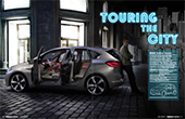 Vehicle type concept/five-door MPV
Interior design director Marc Girard
Lead interior designer Max Rathmann
Interior designers Thilo Heissler, Julian Flohr
Colour & trim lead designer Corona Döring
Colour & trim design Julia Franke, Sandra Hermanns & Barbara Schmid
Interface design Stefanie Wermbter & Georg Friedrich
Project started June 2011
Project completed June 2012
Launch Paris/September 2012
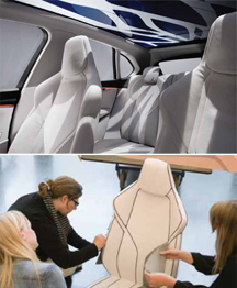
As the Concept Active Tourer’s interior designer, Max Rathmann puts it, “The main task was to bring the typical BMW proportions to a new kind of package. What happens if the car gets higher, and wider – how will it look?” It’s a new kind of car for BMW, one which raises questions that the design team hasn’t had to tackle before.
Unusual reflections cast down on the interior of the Concept Active Tourer – the result of some poetic thinking by Rathmann and the team. Trying to alleviate the drudgery of a long journey, he was inspired, he says, by “the sunshining through the moving leaves and branches of a tree, as you sit beneath it”. To bring that calmness into the cabin, the team incorporated an electromagnetic roof into the design. It has four settings: clear, patterned, reverse-patterned and dark.
PORSCHE PANAMERA SPORT TURISMO
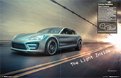 Vehicle type concept/shooting brake
Director Style Porsche Michael Mauer
General Manager Interior Franz-Josef Siegert
Manager Interior Design Romuald Juraschek
Lead Interior Designer Carsten Tilscher
Colour & trim design Joachim Petzel & team
Project started December 2011
Project completed September 2012
Launch Paris/September 2012
One of the first sketches dated January 2012 for project GP 12 (“G” for the Panamera range, “P” for Paris and “12” for 2012). The basic architecture of the interior was already fixed, but the central touchpad looks a bit different with the supportive handpad of the final version missing. Already in place are the beautiful aluminum struts that flow from the ascending tunnel console into both sides of the dash and which – at their respective ends – accommodate fi nely executed airvent slots. The only major components of this design that didn’t make the final model are the five conventional Porsche tube-shaped gauges visible in this sketch. “Halfway through the project we went in favour of a fully digitisable instrument cluster which points a few more years further into the future,” reveals lead interior designer Carsten Tilscher. None other than Ferdinand Piëch, the VW Group patron himself, pushed for this bolder solution, says Tilscher.
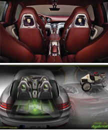
Screens for the rear-seat entertainment system are integrated into the slightly triangular recesses of the front-seat backrests. They sit flush with high-gloss polished frames milled from billet aluminum. Also visible in this photo is the separate control unit for rear-seat passengers.
Magazine
