IN THIS ISSUE
Design director Thierry Metroz
Exterior design chief Frederic Soubirou
Exterior design Damien Fressard
Interior design chief Christophe Cayrol
Lead interior designer Peng Hao
Interior designers Pascal Grappey, Alexis Icikowics
Colour & trim Vincent Lobry
Project manager Bertrand Dantec
Project engineers Patrick Arnaud, Thomas Bouveret
Leather trim supplier GST Autoleather
Project started October 2013
Project completed July 2014
Launch Paris / October 2014
The Divine DS is the first concept to have been developed under DS as a seperate entity within PSA – distinct, as a brand, from Citroën.
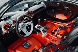
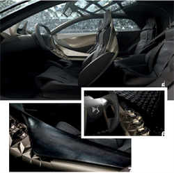
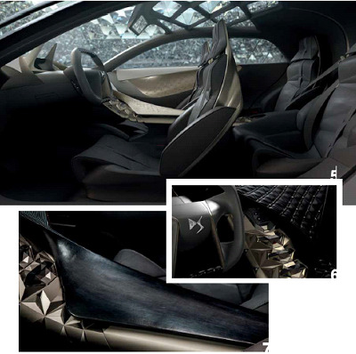
In this overhead view the complexity of the centre console and tunnel is revealed – dressed here in ‘Fatale Punk’. “The key points on the centre console were this watch, which we twisted into a mix of carbon-like material and digital screens, with some
prims on top," says Cayrol. "As you travel down, you find the push start-stop button-this configuration has been used on DS5 already - then toggle switches, which are becoming as famous as the seats on the DS5 and which we used as they key point of this centre console.”
Even dressed in the light, bright silk of ‘Parisienne Chic’, this image clearly shows the delineation between the rear quarters and the front seats. “Notice here the way we go from total darkness on the second row to a lighter structure at the front – this was a way for us to create a very specific ambience, particlulary for the second row." says Cayrol. "We intend to continue to define and dedicate a specific ambience to our rear passengers. There is a big difference between the front passenger and the rear passenger – a difference in travel expectation. I really like the Chinese approach because it’s a practical way to consider things. In a business car, they use the
second row; that's the point of the second row, to be used. In Europe or the US we are still using a car in the same way we ride a horse! It’s super-interesting for designers; finally we have a new area to work on, new customers.
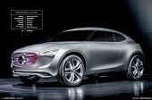 Vehicle type Concept / SUV crossover
Vice-president, design Gorden Wagener
Project leader Steffen Köhl
Project manager Olivier Boulay
Realisation Kelvin Chen
Project started Autumn 2013
Project completed Autumn 2014
Launch Beijing / November 2014
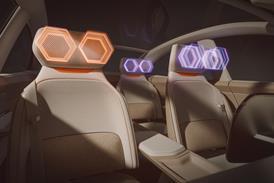
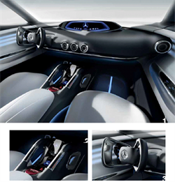
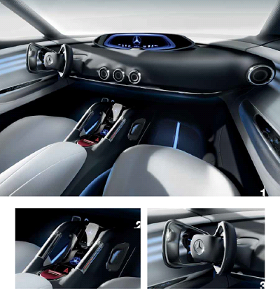
These renderings illustrate the lighting and materials concepts. "The ambient lighting around the dashboard reflects the driving mode, as well as the driving style, and thus provides instant feedback to occupants," says Steffen Köhl. The G-Code's interior lighting corresponds with the pulsating light show on its front grille.
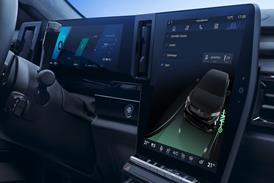
Shown here in its docking station, the smartphone is an integral part of the G-Code’s user interface, functioning as an entertainment and telematics device. G-Code owners could potentially get a specific smartphone loaded with a plethora of vehicle-relevant functions.
The G-Code’s retractable wheel design hints at a drive-by-wire steering system – a technology that has featured in Mercedes-Benz concept cars for almost 20 years and is currently being perfected by
Daimler's technical partner, Infiniti.
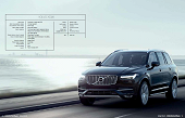 Vehicle type Production / seven-seat SUV
Senior vice-president, design Thomas Ingenlath
Vice-president, interior design Robin Page
Interior design manager Sven-Olof Persson
Interior designers Todd Levy (lead interior designer), Marcus Nilsson, Eric Gunnarsson, Axel Ernstsson, Juan Pablo Bernal
Design director, colour & material Ebba-Maria Thunberg
Colour & material designers Maria Uggla, Boel Hermansson, Tony Baho, Frida Torgeby
Interaction designer Mikael Gordh
Project design manager Andy Dale
Project Started 2011
Project Completed 2013
Launch Paris / October 2014
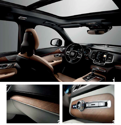
The core of the new XC90 range will be the Momentum model. Above this sit two separate branches: for a sports-inspired look and feel, the R-Design offers exclusive features including Contour sports seats, a perforated leather steering wheel and gearshift knob, plus special R-Design details such as brushed or 'tech' metal finishes and illuminated tread plates. Meanwhile, for an elegant and more luxurious experience, customers can opt for the richly equipped Inscription model. Note the frameless rear view mirror;'First Edition' models also have a compass integrated into the mirror.
An open-pored natural walnut is one of the finishes offered, with crafted marquetry that is mirrored from the car centreline and neat use of metal framing of
components. Other finishes include a dark flame birch wood, cross-brushed aluminium, technical metal mesh and carbon fibre
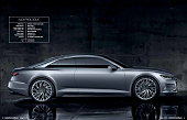 Vehicle type Concept / 2-door luxury coupe
Design director Marc Lichte
Exterior design chief Andreas Mindt
Interior design chief Karl-Heinz ‘Enzo’ Rothfuss
Colour & trim Simona Falcinella
Project started February 2014
Project completed November 2014
Launched Los Angeles / November 2014
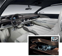
evolutionary theme that would be at the same time “sporty, premium and progressive”. Under the guidance of interior design chief Karl-Heinz ‘Enzo’
Rothfuss, the team aimed to emphasise a horizontal look, with a strong component of driver orientation executed on the lower part of the dashboard.
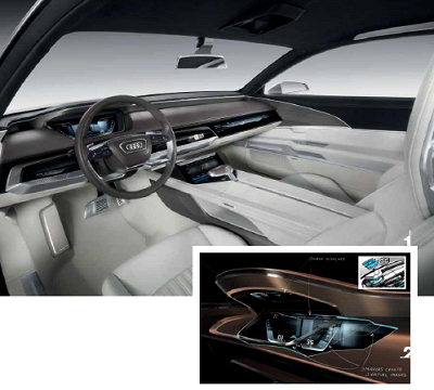
The high-gloss area in front of the passenger is the 4K touch-sensitive display; when not in use, it resembles piano black decor, but it can be enhanced with a moving light wave or a ‘quattro’ logo.
The technology behind the instrument cluster – a new interpretation of the ‘virtual cockpit’. It does not just simulate a 3D effect, like the current TT, but features actual three-dimensional elements. Images are projected downwards from a source in the top
of the binnacle and reflect through a trio of angled floating mirrors - positioned about 2cm apart – thereby adding visual depth.
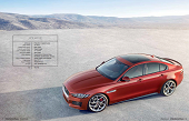
Design director Ian Callum
Creative exterior director Adam Hatton
Production studio director Wayne Burgess
Colour & materials manager Kim Challinor
Lead interior designer Mark Phillips
Interior designers Claudia Schmidt, Malcolm Whyte, Alex Watkin, Ed Willis (seats), Joe Buck
Colour & materials designers Siobhan Hughes, Steve Stanforth
Project started March 2011
Project completed September 2013
Launched Paris / September 2014
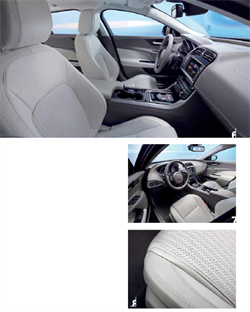
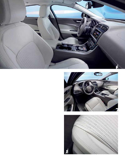
The interior was a challenging part of the design, with an entirely different cost base to that of the larger XF. “I was keen to improve the seats, however,” says design director Ian Callum, “to take the mass out and give them a very chiselled,
tailored look.” Two designs were developed: a mainstream comfort seat and a Sports seat for R-Sport and S versions with more bolstered foams for the squab and cushion, and integrated headrests. Shown here is the Light Oyster Windsor
Grain leather seat with Herringbone perforations and Light Oyster tonal stitch.
A key feature of the interior is the satin chrome chunk on the edge of the air vents that give a sense of occasion when you open the door to reveal their side profile. Jaguar has a philosophy of adding drama and animation to its interiors too, and here it is provided by vents that are illuminated from the rear at night as well as ambient illumination to pick out individual features - an industry first.
Vehicle type Concept / hybrid supermini
Senior vice-president design Laurens van den Acker
Concept car director Axel Breun
Project leader Patrick Lecharpy
Design project manager Nathalie Gaittet
Interior designers Maxime Pinol (concept), Udo Hischke (prototype)
Colour & trim designer Mathilde Bancon
Project started January 2013
Project completed Autumn 2014
Launched Paris / October 2014
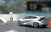
“The Eolab was not a usual concept car development,” declares project leader Patrick Lecharpy. Indeed, with a design based on a challenge laid down by the French government to all of its domestic carmakers to make production cars capable of consuming only two litres of fuel per 100
kilometres (141mpg) by 2020, Renault decided to go one step further. By optimising lightweight materials, aerodynamics and hybrid powertrains, the
Eolab petrol/electric hybrid prototype emits only 22g/km from its tailpipe and sips just one litre of fuel every 100 kilometres (282mpg). But with an eye on making cars with such technology showroom-ready and – crucially – affordable by 2020, the project was also a very real-world one.
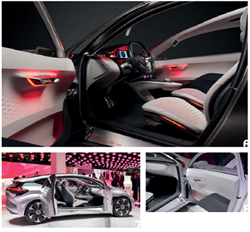
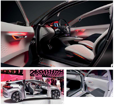
The prototype car has two regular doors on each side, while the concept car features a pair of ‘suicide’ doors on one side and a single door on the other. The insides of all those door cards feature carvedout patterns to graphically connect with the exterior front grille. This design also serves a function, says Lecharpy: “The plastic parts we’ve used are thinner than usual to reduce weight, so to keep the required rigidity in the door panels we’ve added some sculpture to the volumes.” A press release on the subject gives sound reasons for Renualt producing an engineering prototype as well as a dramatic concept car, quietly asserting the importance of aesthetics as well as performance: “All the fundamentals of the prototype are maintained in aerodynamics, proportions and interior space with the features expected of a B-segment car,” it reads. “But even when subject to strict design constraints in pursuit of very low
consumption, concept cars must still capture the imagination.” Quite so.
Magazine
