A deep dive into the design of Nissan’s IMk concept, exploring concepts like ‘Timeless Japanese Futurism’ and minimalism
Nissan is confronting the challenge of new technologies, powertrains and business models on multiple fronts with its Nissan Intelligent Mobility initiative: and a constituent part of this is establishing a new design language. ‘Timeless Japanese Futurism’ embodies traditional Japanese design sensibilities, and is combined with a view toward emerging technologies that will influence design in the coming decade.
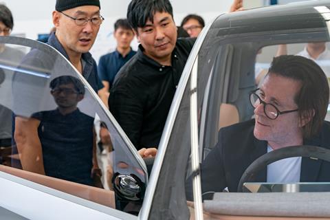
Executive design director Satoru Tai explains: “Nissan’s new design philosophy centres on a Japanese minimal approach, to accent advanced technology that blends seamlessly into our cars and a customer’s lifestyle. These serve as key elements in what we call ‘Timeless Japanese Futurism.’ A minimal approach mainly refers to the physical form – such as our concept’s simple, yet striking exterior shape. These seamless expressions display the potential of electric vehicles and future driving technology in a distinctly Japanese way.”
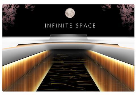
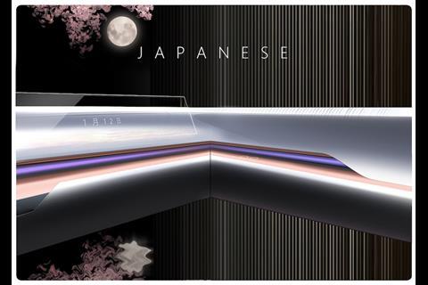
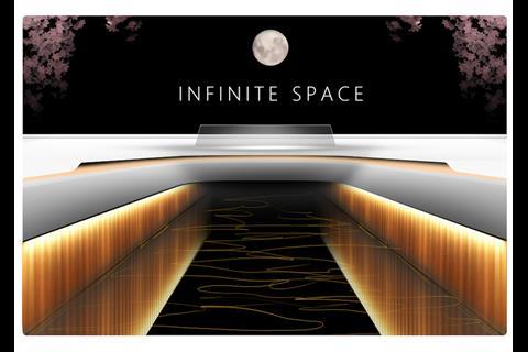
Fundamental to Nissan’s new design language are the concepts of Iki and Ma. Ma is an ancient Japanese concept that denotes space but also time; it has no direct Western equivalent, and multiple meanings at technical, artistic, and cultural levels. The word is sometimes translated as emptiness; not in the sense of a lack, or poverty, but rather as potential and scope for opportunity.
Iki is a more recent construct which arose with the Japanese merchant class: it connotes a sort of effortless style that is worldly, but not obsessively materialistic. Mitsuki Nishikawa, design manager at Nissan’s Creative Box satellite studio in Tokyo’s Fashion District, defines Iki as “cutting edge without complexity, yet being concise, with the expression to bring newness.”
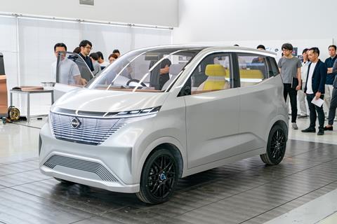
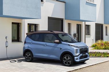
Both these concepts feed into the idea of ‘Timeless Japanese Futurism’, and the first automotive expression of this is the IMk, a re-imagined kei car. The kei (short for keijidoshi, or ‘light automobile’) is a class of car unique to Japan, originally created by its government in 1949 to help the country transition from motorcycles to cars, and rebuild post-war. Over the years since, efficient kei cars – strictly limited in size and engine power – have been remarkable platforms for innovation.
“We needed to reset how we design, because the way these vehicles are powered and used have changed,” says Satoru Tai, executive design director. “EV [electric vehicle] technology is here, and the entire mindset – architecture to noise – is quite different than for a traditional internal combustion engine vehicle.
“EVs are quiet and powerful, so we wanted to reflect that with a design language that’s clean and minimal, yet still emotional, powerful, attractive and sleek. It’s not easy to represent an entirely new automotive movement with something that’s visually simple.”
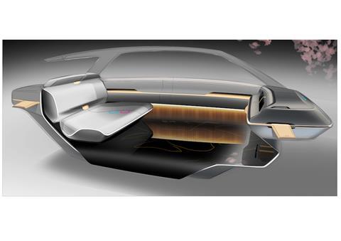
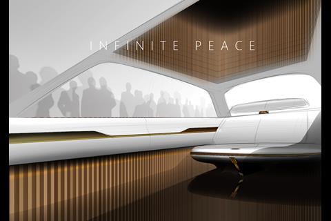
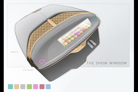
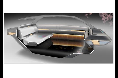
“The IMk concept is a new type of ‘room’, one that exudes the nature of a café or lounge,” says Mitsuki Nishikawa. “It is [also] designed to be a private space with social functions, so it may be closer to a living room than a public space, where you have your own taste and character; in this case, a chic and elegant interior enjoyable with others with great hospitality.”
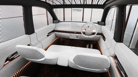
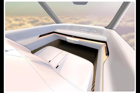
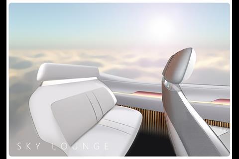
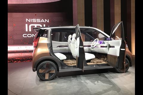
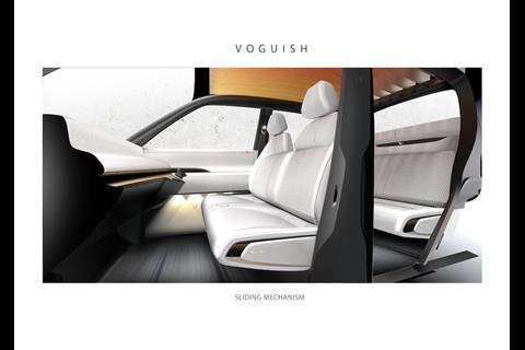
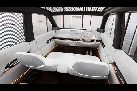
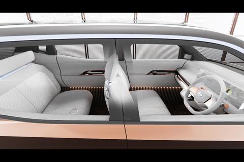
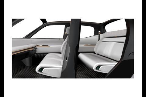
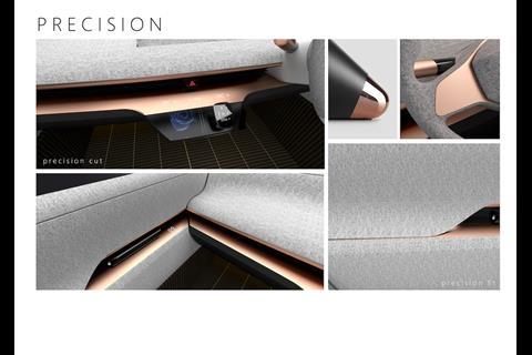
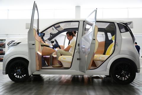
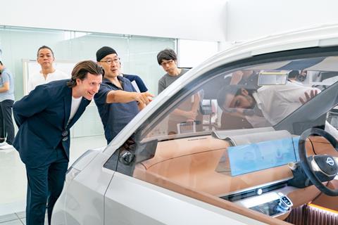
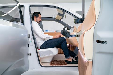
“The IMk’s cabin possesses a feeling of openness,” adds Satoru Tai. “The shapes and colour details are designed to suggest an uplifting space. We wanted the IMk to be chic, so we gave it a bench seat to create the same welcoming feeling as a lounge or café. We also wanted to keep some richness in the section of the doors, the instrument panel and even the seats, by giving them the right texture through their materials.”
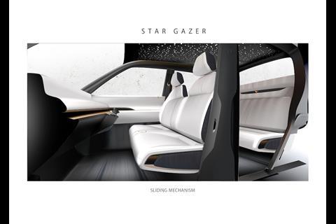
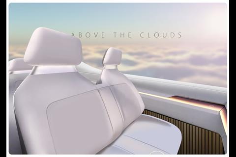
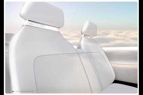
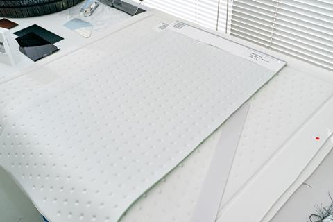
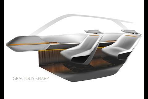
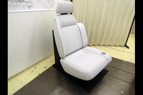
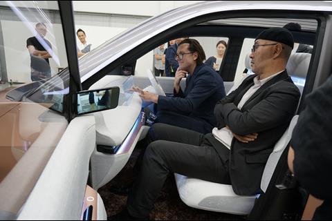
Both front and rear seats are meant to convey the appearance of a banquette that one might find in a lounge or a club, though the front seat is actually a half-bench with the driver’s seat as a separate element. This gives “a visually wide appearance with a sense of individuality, while allowing more openness to the rear passengers,” says Nishikawa, who adds: “The seats covered with leather and fabric in three different brightnesses suggest a welcoming and relaxing space, that gives the impression of sitting on a floating cloud by creating necessary tone differences.” The thin frames of the seats are good both for saving space and ensuring a good view for all passengers.
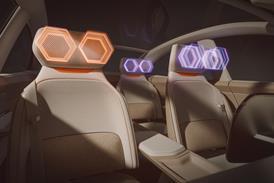
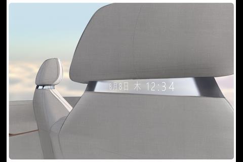
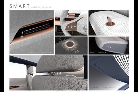
At the top of the seat between the back and headrest is a clear-bezeled light that illuminates the interior at head height. This helps to present the seats as a complete unified element in the interior, while replacing the traditional dome light in an artistic way, and also conveying information to the rear. In its transparency, it also relates to the dramatic bezel-less prism on the instrument panel.
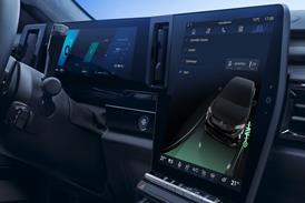
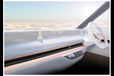
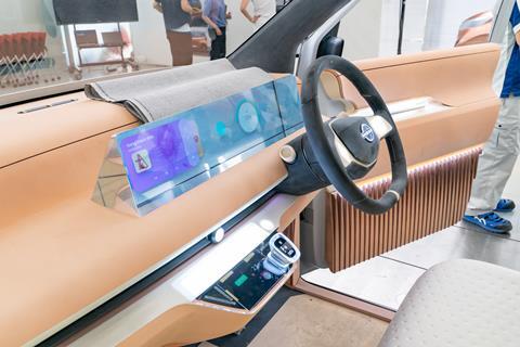
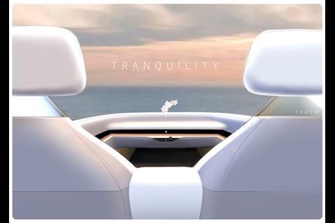
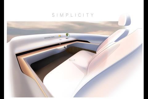
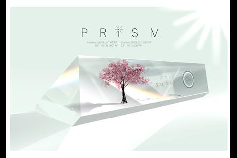
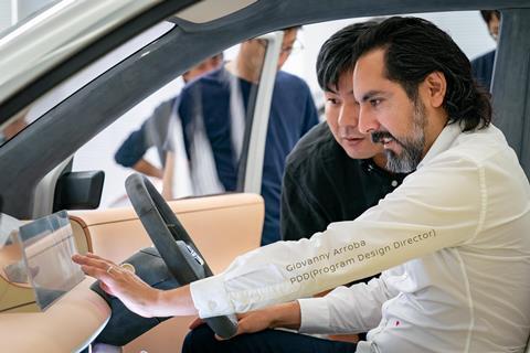
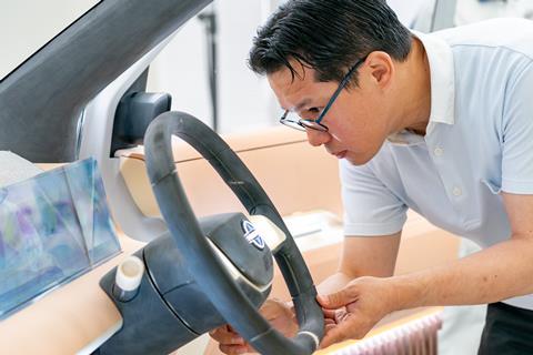
This prominent IP feature houses the instrumentation and mapping functions. A clear touchscreen with holographic information symbols that seem to float within its triangular volume, the display projects delicate shadows that change throughout the day. “The actual screen is a prism which is completely see-through, so it is really cool when you get in the car,” says Nicole Fonseca, senior colour manager. “You can see all the fabric through the prism, so you feel this really nice flowing horizontal movement and the big screen does not block any of the lines in the car; it feels like the whole thing flows and it is like this continuous beautiful line.”
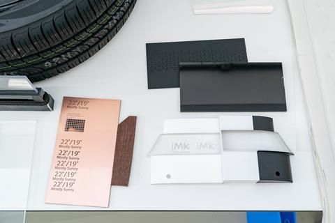
The flat floor is carpeted with a copper-colored shagpile with metallic fibres woven in. Its colour looks different at different times of the day and from different angles; sometimes like wild rice, other times copper, and other times coffee-coloured. At certain angles, it appears as a forest floor, in others, an autumn field, and its heavy texture lends a certain earthy presence that grounds the composition of the lighter-coloured elements above; this carpet coordinates with the pink-toned copper exterior colour to open the dialogue between inside and out.
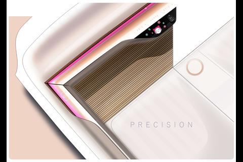
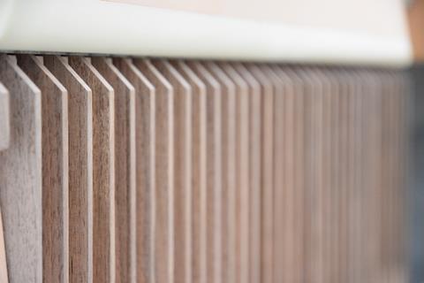
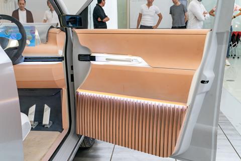
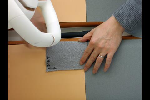
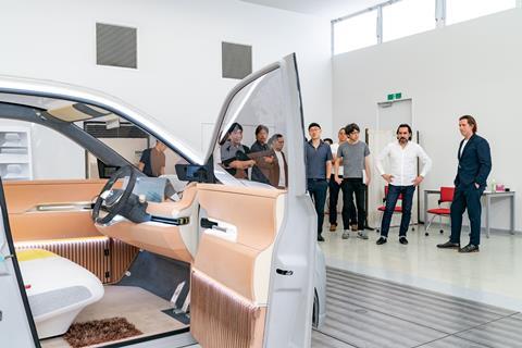
The doors are an interesting juxtaposition of vertical and horizontal elements, inspired by Japanese kigumi carpentry and woodworking. At the lower door, a series of vertical slats suggests a fence or an abstract forest that rises from the carpet below. Above this is a horizontal copper trim and door handle, and finally above this, the tightly woven grey fabric that wraps around much of the interior.
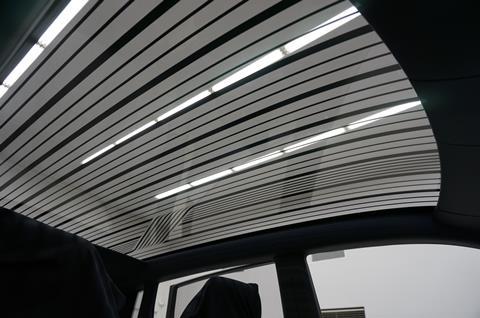
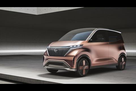
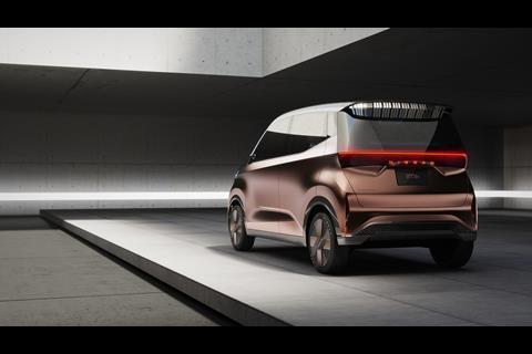
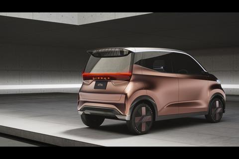
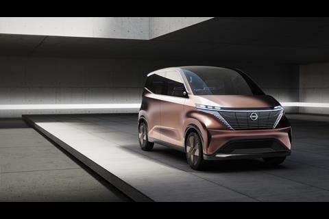
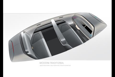
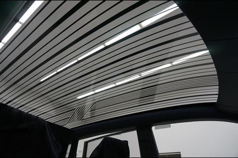
The roof is glazed to open the interior to the sky, and to the view – for urban journeys, upward into the city’s vertical landscape. To modulate the light, Nissan coated the glass in a lattice pattern inspired by mizuhiki, a traditional and delicate rice paper twine decoration, that modulates the light throughout the interior. This motif is reflected again in the graphics of the front shield grille, on the fenders, windows, rear spoiler, and on the wheels.
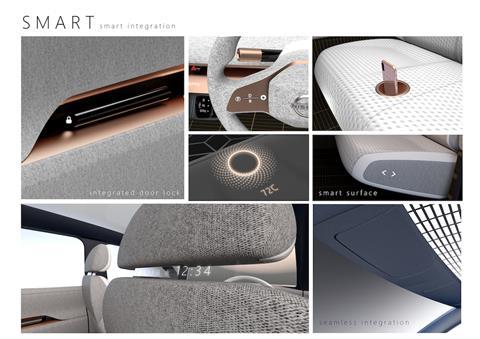
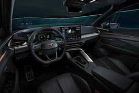
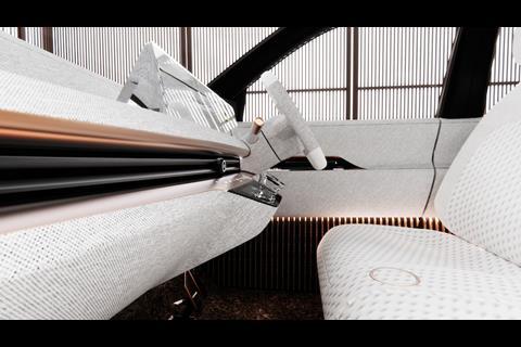
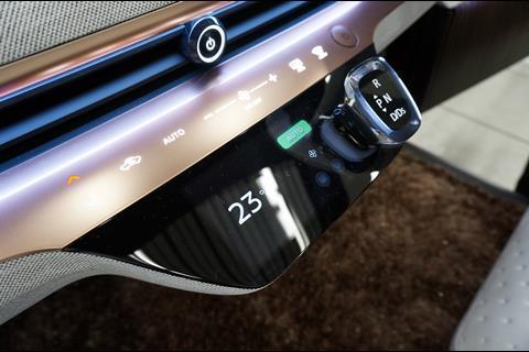
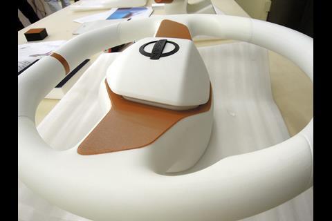
The instrument panel is a simple minimalist design with horizontal elements spanning across its surface to draw the eye across the cabin. Minimal controls and shifter are placed at that panel that projects out from the IP; the only buttons are for the climate control and keyless start, while the 12.3-in display is controlled by a rotary dial. At the corners where the A-pillar meets the dash, two screens project the rear view from the cameras that are mounted on the exterior of the car.
The clear screen with holographic imagery is a strong, elegant counterpoint to the proliferation of black screens in contemporary vehicles. The appearance and disappearance of floating information as necessary ties in with Japanese reverence for the cycles of nature and the transience of beauty, the colourful images fading away after they are needed. Graphics – flowers, birds – appear in response to use of the touch-sensitive controls.

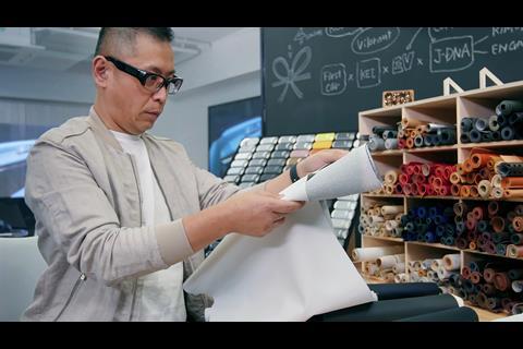
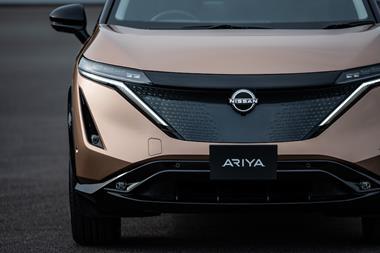
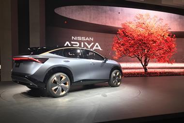
At the Tokyo motor show, the IMk was displayed alongside the nearer-production Ariya sedan-crossover – and both cars had a co-ordinating bag, designed with an urban couple in mind. “We thought that they were a couple living in Tokyo, and that we really wanted them to ‘own’ the city and feel really confident,” explains Nicole Fonseca. “We wanted to create a man-bag and also a handbag to go in this one [the IMk] that match all the materials.” She emphasises the importance of keeping the interior “very light, very fresh, because we know this car is lightweight, it is an EV. We don’t use any leather; we didn’t want it to feel heavy, we wanted it to feel lightweight and cleanable, but functional.”
Satoru Tai concludes: “The IMk is a car for people who’ve never before considered buying a vehicle of this size. The electrification of this urban commuter, and the EV platform, elevate the genre to a completely new level. It will capture a new marketplace, such as luxury-car owners in Tokyo who want stylish exclusivity and great performance, yet still want to be able to find a place to park. The level of sophistication and chic textures is unmatched in the segment.”
Our view:
With the most dramatic stand at the Tokyo show, Nissan drew us into their electric future. Sitting between the Ariya and the IMk was a digital tree with autumn leaves falling and drifting in the eddies of a virtual wind: a sophisticated use of technology and presentation which appreciated the way Japanese culture is irrevocably intertwined with the natural world. This was a powerful visual tool to communicate the important elements of Nissan’s new EV design language. Digital graphics are also seen in the randomly-generated cherry-blossom pattern in the grille.
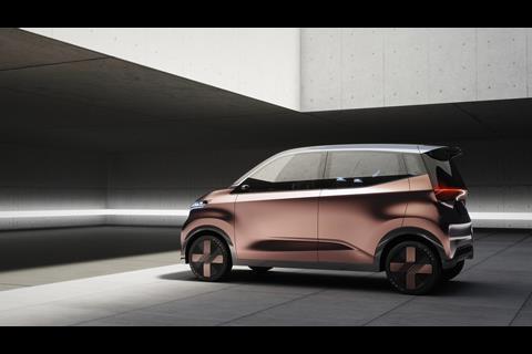
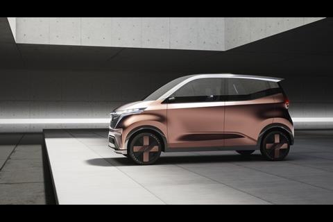
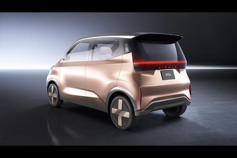
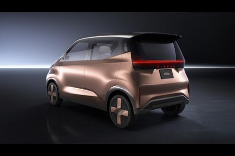
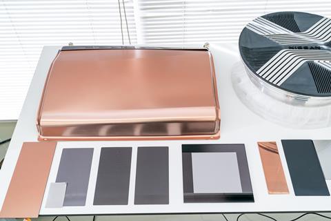
The liquid, multi-layered, two-tone akagane copper paint of the body references Japanese metalworking, and lends highlights and lowlights to the surfacing. While the classic kei car is a very boxy, architectural affair, the IMk is sculpted in a more dynamic composition within its tiny footprint. Its character lines are more angular and flowing, suggesting movement and, combined with the more sculptural massing, creates new possibilities in the kei segment.
Nissan IMk
Vehicle type Concept / city car
Senior VP, Nissan global design Alfonso Albaisa
Executive design director Satoru Tai
IMk programme design director Giovanny Arroba
Senior colour manager Nicole Fonseca
Interior colour designer Shinji Hirosawa
General manager, UI/UX design Taro Ueda
Creative design manager, Nissan Creative Box Mitsuki Nishikawa
Interior designer, Nissan Creative Box Masayasu Sugitani
Designer, Nissan Creative Box Jung Hoon Rhee
Launch Tokyo / October 2019


















No comments yet