The best reveals the Big Apple show had to offer in 2019
No. We didn’t forget, rather this year CDN ran our live coverage from Shanghai instead of New York. But that doesn’t mean we weren’t paying attention. Here’s a round-up of what we think is interesting from this year’s world debuts, production and concept cars shown at the US show explained by the senior designers in charge of the projects.
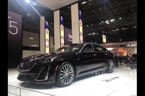
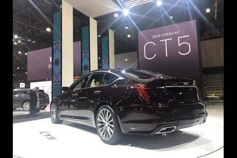
Cadillac CT5
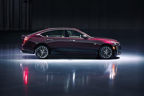
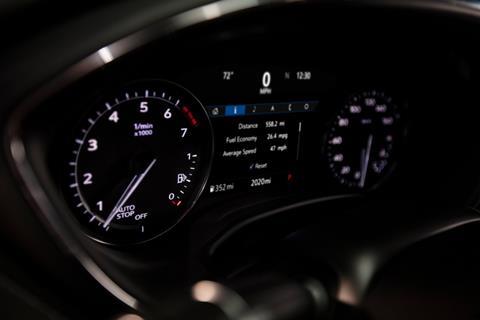
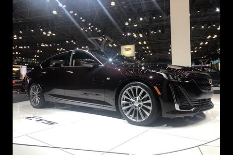
The new compact sedan replaces the soon-to-be defunct CTS and ATS models, and showcases the continued evolution of the brand’s Art and Science design language. “It’s much softer,” Andrew Smith, Cadillac’s Director of Design, tells CDN. “The important thing for Cadillac has been the progression of form from ATS to this vehicle; maintaining the structure but adding more athleticism.”
The CT5 is shorter than the CTS but rides on a longer wheelbase, with an aggressive stance and short overhangs. “It was a cool project because we got everything we asked for. It was one of the most collaborative in terms of working with engineering. We wanted the biggest track and the biggest tyre, and we got it.”
Cadillac is trying to differentiate between models, giving each a unique look. “We want people to recognise not only that it’s a Cadillac, but which Cadillac,” Smith says. On the CT5, this was achieved in part by a fastback silhouette that creates an athletic look. “It’s a testament to how strong our design is, the amount of controversy the C-pillar has caused,” Smith says. He also points out the strong grille and “proud face,” inspired by the Escala concept. To keep it familiar, the car keeps Cadillac’s signature vertical lighting graphics on the DRLs and tail lamps.
On the CT5, Cadillac continues the two-pronged design approach seen on the XT4 and XT5 crossovers with two distinct trim levels: Premium Luxury and Sport. Premium Luxury models make extensive use of bright work around the DLO, on door handles, and on the front grille.
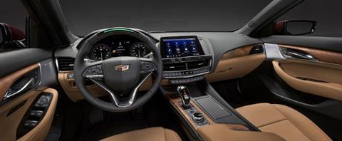
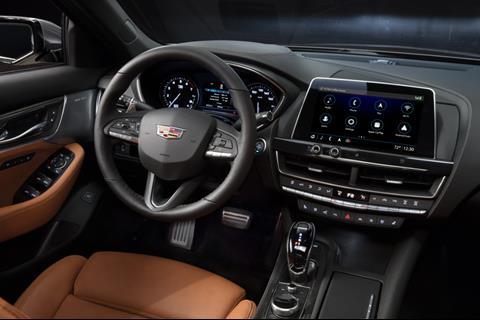
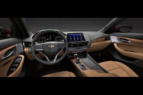
The interior makes use of leathers and open-pore wood trim. Sport models have blacked-out mesh on the front grille and air intakes, unique side rocker treatment, more aggressive rear lip spoiler, and a black tail lamp. “It’s really quite sinister,” Smith says of the latter. The interior gets a carbonfibre trim with a subtle red thread woven through, which matches red contrast stitching on the door.
The CT5 also gets a new version of Cadillac’s CUE interface, which has been greatly simplified and can now also be controlled by a rotary knob on the centre console, as well as touch controls on the screen or voice activation. Crystal Windham, Director of Interior Design, says, “We wanted to make sure we have the right proportions, that the layout and spaciousness is under control.”
Windham says although the cockpit is driver-focused, “we didn’t want to close off the passenger, so they are still part of the experience.” Embellished details include perforation patterns in the leather seats that mimic that of the speaker mesh. Ultimately, Smith says that “getting the message of materials reinforced and getting a curated experience for each model” is one of Cadillac’s main goals moving forward.
Genesis Mint Concept
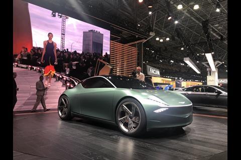
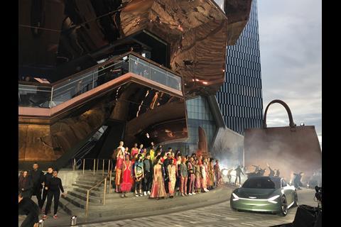
After showing their grand Essentia GT concept at last year’s show, Genesis opted for a very different concept this time around, showing off the brand’s idea for a small but luxurious electric urban vehicle. “Traditionally, size matters in luxury, but in the big city, all the cars are packed so tightly together” said SangYup Lee, who moved up to head of Genesis and Hyundai design late last year. “This is the brand ambition, where nobody else is doing a small car.”
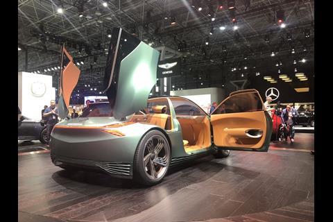
Lee points out that A-segment cars, such as the Mini, typically use a two-box design, but the Mint concept instead employs a three-box design, which allows for a sportier profile.
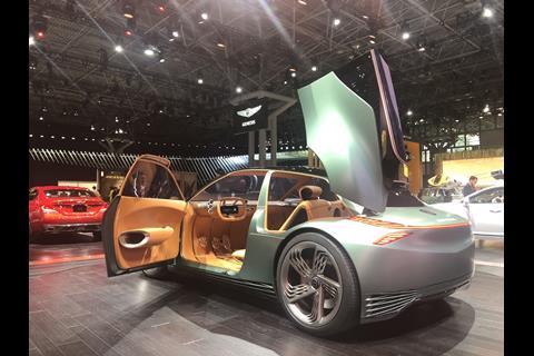
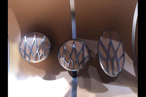
Design elements such as the crest front grille, quad headlamps, and textured “G-Matrix” pattern on the wheels and along the lower side body carry over from the Essentia. The rear hatch scissor doors allow side access to cargo, eliminating the need for rear space to open a liftgate. The colour combination of caramel and matte green was deliberately borrowed from classic luxury and GT cars. “It’s a combination you’d find like in an Aston or a Bentley, but when you do it in a smaller car, it has a different feel to it.”
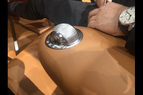
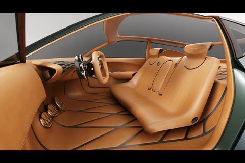
As with the Essentia, the Mint concept was developed digitally and collaboratively with all three studios (California, Korea, and Germany), without ever milling a clay model. The EV packages its batteries along the floor pan and is designed for level 3 or 4 autonomy. “Not level 5,” Lee makes clear, “so the driver still has to focus on driving.” Despite its small size, the interior feels spacious and open. The G-matrix pattern from the exterior is echoed on the pedals and the IP, while a bench seat swivels toward the driver for easier ingress.
“A bucket seat is no longer relevant (in city driving), so we wanted to make it more like a lounge,” Lee says, explaining that the car is a place of refuge after a long day of work. Extensive use of glass adds to the feeling of openness and helps its occupants enjoy the city view.
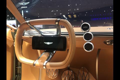
At a time when most UX design includes multiple large screens, the Mint opts only for a single display on the steering wheel. “Right now a big screen is mainstream, but some people in the city are looking at a big screen all day, and we ask is that really a pleasant feeling? For us it’s not necessary, and voice activation is well enough developed now.”
Hyundai Venue
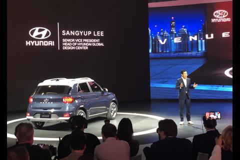
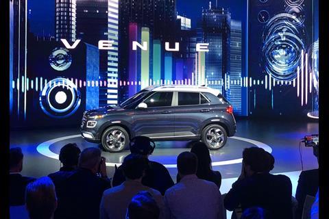
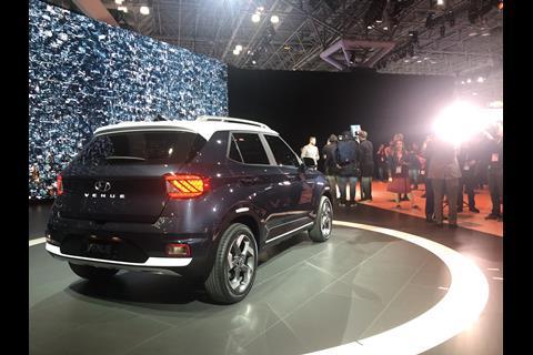
Meanwhile, SangYup Lee was doing double duty in New York at the Hyundai stand, showing off the new sub-compact Venue crossover, an entry-level SUV that’s five inches shorter than the Hyundai Kona. Lee says the company decided on an A-segment SUV because “there is almost no direct competition and the B-segment is really crowded.”
Aimed at customers always on the go, the Venue uses signature Hyundai design cues including cube-shaped headlamps and composite LED tail lamps. But, as with some other studios, Lee’s team is abandoning the “same sausage, different length” philosophy in favour of giving each model different design characteristics. Lee says the Venue exhibits small but confident body forms, with a full volume wheel arch and strong character line.
“The proportion is very boxy,” Lee tells us. “We can see the Hyundai look in Venue, but there is a unique quality that will appeal to individual customer’s tastes and preferences in a way that sets it apart from the other SUVs in our lineup.” One way that’s achieved is through the bold, cascading front grille, which was met with mixed reviews during press days. (One journalist likened it to a set of braces; a designer from a competing brand proclaimed, “The grille has a grille!”)
Lee’s response? “It’s intentional. We wanted to have a little bit of controversy because I don’t want this car to get intimidated.”
Kia HabaNiro Concept
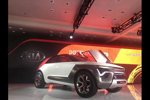
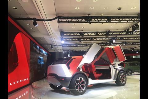
Meanwhile over at sister company Kia, that brand unveiled the HabaNiro concept, an EV based on the Niro production car that envisions what a fully autonomous, level 5 EV could look like. Peter Schreyer, who remains president of Hyundai Motor Group’s three brands, was in New York basking in the glow of the car’s warm reception. “It has this clear structure of how a Kia should be, it’s a nice continuation of the Kia design philosophy that we have been building up,” Schreyer said.
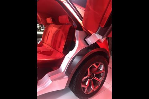
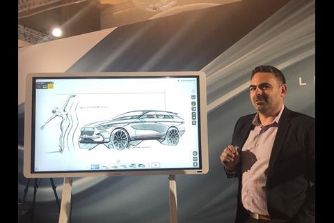
During a walkaround, Kia Senior Design Manager Kurt Kahl says that when building the car, the team kept mostly true to the original sketch. “It’s a real contrast of elements. It’s EV, so we need efficiency, but you can take it to a campsite, you can go explore. You can do level 5, but you can still drive,” Kahl told us. “We went with 20-inch wheels because we did want to keep a lot of sidewall to show it’s able to do off-roading.”
Other details that hint at the car’s rugged nature include protective cladding, strong skid plate, and tow hooks. Kahl also noted the new version of the signature nose, done in negative space, with a sharp “attack” front. “It looks like it’s poised to take off,” he says. The signature DRL pulses like a heartbeat, and can also be used as a turn signal. “We are trying to find new ways to use the front end. For lighting we are playing up the DRL more than the actual headlight,” he says. Laser headlights are tucked into the thin front grille area, which also facilitates cooling.
The butterfly doors were a particularly challenging – and rewarding – element of doing the car. “I really wanted both doors to have a symmetrical feeling, getting the doors the right height was a lot of work.”
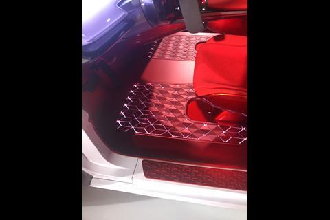
The minimalistic interior features seats covered in bouclé and a red floor panel that lights up. “I love how the lighting on the floor reflects in the glossy parts on the bottom of the seats,” Kahl muses. Instead of traditional screens, vehicle information is projected on the windshield via a full-size head-up display. It’s controlled by a concave acrylic instrument panel that is a large interactive touchpad display with Sensory Light Feedback (SLF).
Even though the Habaniro is a show car, Kahl reassures us that it’s not merely a vanity project. “We don’t do concept cars as just exercises,” he says.
Lincoln Corsair
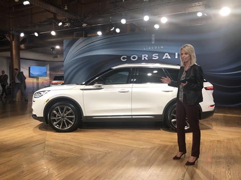
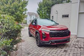
Lincoln adds a small SUV to its lineup, built on the Ford Escape platform. David Woodhouse, Lincoln’s Design Director, says his team wanted to apply its “Quiet Flight” philosophy in a younger, more dynamic package. “It’s our most dramatic expression of Quiet Flight,” he says, noting that it will be one of the lowest and widest SUVs on the market.
Woodhouse explains that the Corsair’s fast-falling roofline and tail-down silhouette are crucial elements of Lincoln’s design language. “I always felt absolutely confident that the gestures that we talk about, pulling down the tail, anti-wedge, were the right things to do for American design,” he told us. On the doors, sculpted S-shaped curves create light play and movement. “It’s the deepest body side we’ve ever generated.”
As with Lincoln’s larger models, the interior uses wide horizontal lines with layering of materials to break up volume and create a sense of calm, warmth, and equilibrium. Woodhouse says his team was able to make the car they wanted without too many sacrifices. “The easiest job in the world is to make a super luxury car. The hardest job in the world is doing a price-conscious product. We tried to give (the Corsair) all the same design attention as a Navigator or Aviator, but the price point is really sensitive and all about making the right choices.”
“The fact that we got some of these elements, like the cantilevered console, or the way we’ve highlighted half of the air registers to play down the volume, or where the material is highlighted around the steering wheel. It’s considering the IP like a theatre design, the upper portions are done in layers and below everything is blacked out, so it looks like the upper part of the dash is floating.”
Woodhouse says the “star” of the Corsair is in Flight Blue. As for what’s next? “The next generation should go well beyond this to exuberance and panache in the proportions and architecture, so hopefully our flexible architecture will keep being developed in the right way.”

