Having established the bones, it’s time to add the muscles to your car. Carefully…
Designers talk of “having an eye for design”, an intuitive sense of what’s harmonious and what is undesirable, but what exactly are the components of the criteria that they’re using? Essentially, it breaks down into three steps, which can be termed ‘Bones, Muscles and Graphics’. In this article we examine the second element of evaluating automotive design – Muscles.
Step 2: Muscles
“After the proportions, the next layer is the surfacing” explains Max Missoni, Volvo’s vice president of exterior design. “Maybe just two or three lines structure the whole body, and the rest is sculpture, highlighting and making sure the surfaces have the quality they deserve. If a car has good proportions, you can rely on just those couple of lines to give you a structure to work with.”
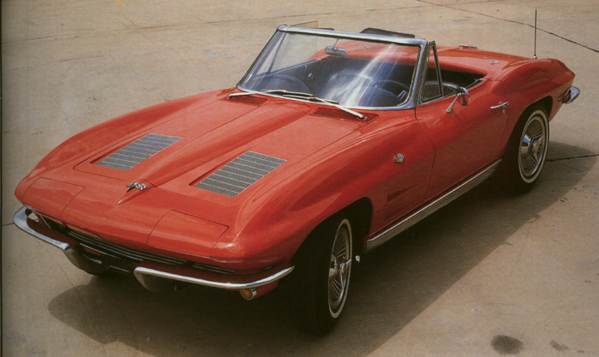
Corvette Stingray was a literal interpretation of ‘muscles’ being added to the basic underlying form of the fenders
Surfaces are the second element in creating and evaluating a car design. Just as muscles define the 3D form on top the bones of an animal, the surface language of a car is vital in defining its character. Understanding how surfaces are generated is a core skill for a designer, in the same way that a decent artist needs to understand bone and muscle structure to create a vivacious portrait of a person.
Form Language
Having established the basic bones of the design, we can apply any number of form languages available to us: soft, hard, geometric, angular, organic, product-like, sheer, flame etc. Between any two lines it is possible to generate a vast number of potential surfaces.
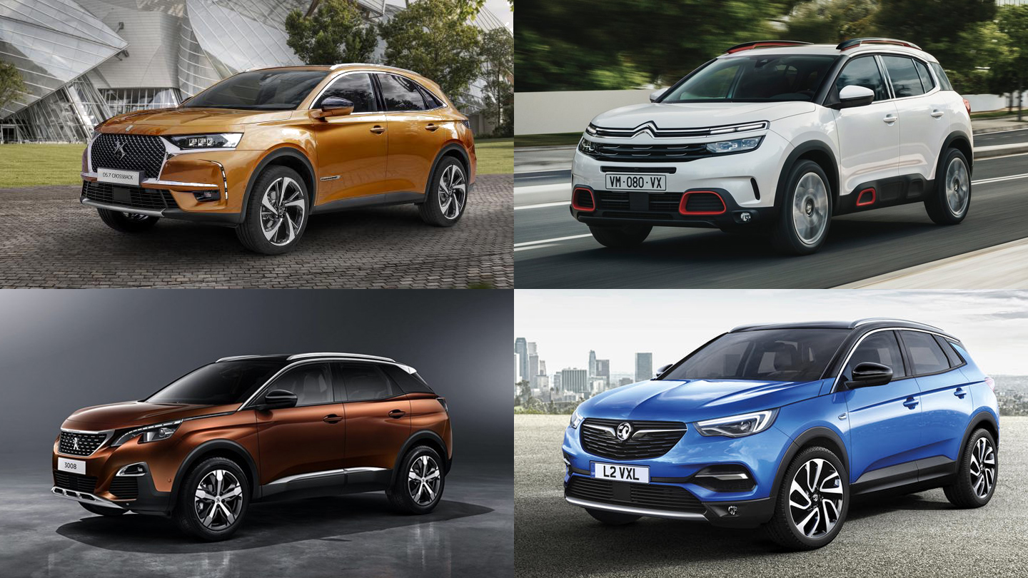
Same platform and proportions, different form languages. C5 Aircross uses the softest form language, the Grandland X is harder, more linear
“Stance and proportion are key. Once you have that you can apply any style you like” says PSA’s design chief, Jean-Pierre Ploué. PSA has been a master at clothing the same underlying platform with different styles, such as the EMP2 platform that underpins the Peugeot 3008, Citroën C5 Aircross, DS7 Crossback and Opel Grandland X.
Indeed, within mainstream segments today, the foremost difference in design is typically the surface language employed. As packages are optimised and segment benchmarking becomes standard practice, the difference in basic volumes and proportions is often quite small, with all the character of the brand and model being wrought through surface language and applied graphics (the latter of which we’ll cover in the final part of this series).
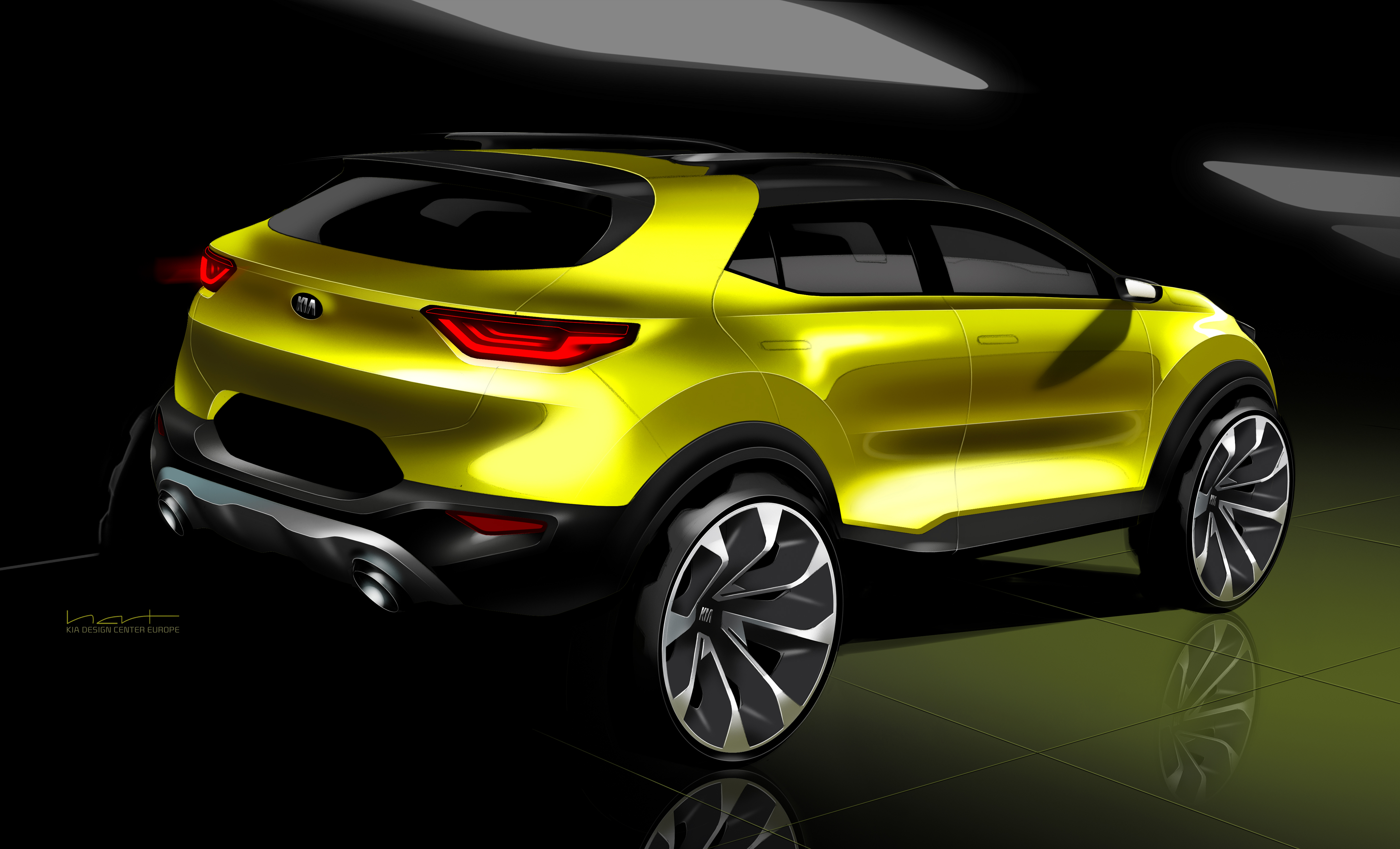
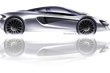
Sketch renders are expected to convey 3D surfaces, despite being 2D
Refining those surfaces and controlling light lines across the body surface is one of most important tasks for an exterior design team. This stage is largely carried out in 3D, of course, and constitutes the biggest chunk of the design process in the studio.
Representing complex surfaces in a 2D Photoshop rendering is one of the key talents that is sought for car designers, but the actual development will always take place in 3D, whether digitally or as a 1:1 clay on the plate.
Body sections
The bodyside section is the main surface that gives character to a car design. Creating fascinating new surfaces and controlling highlights and shadows is complex, and the main reason why clay modelling is still used so extensively. Likewise, Class-A surfacing is demanding and requires years of experience to become proficient in achieving.
Other large areas that allow design character to be expressed include the bonnet panel, bumpers and roof (although the latter is rarely seen from a normal eyepoint).
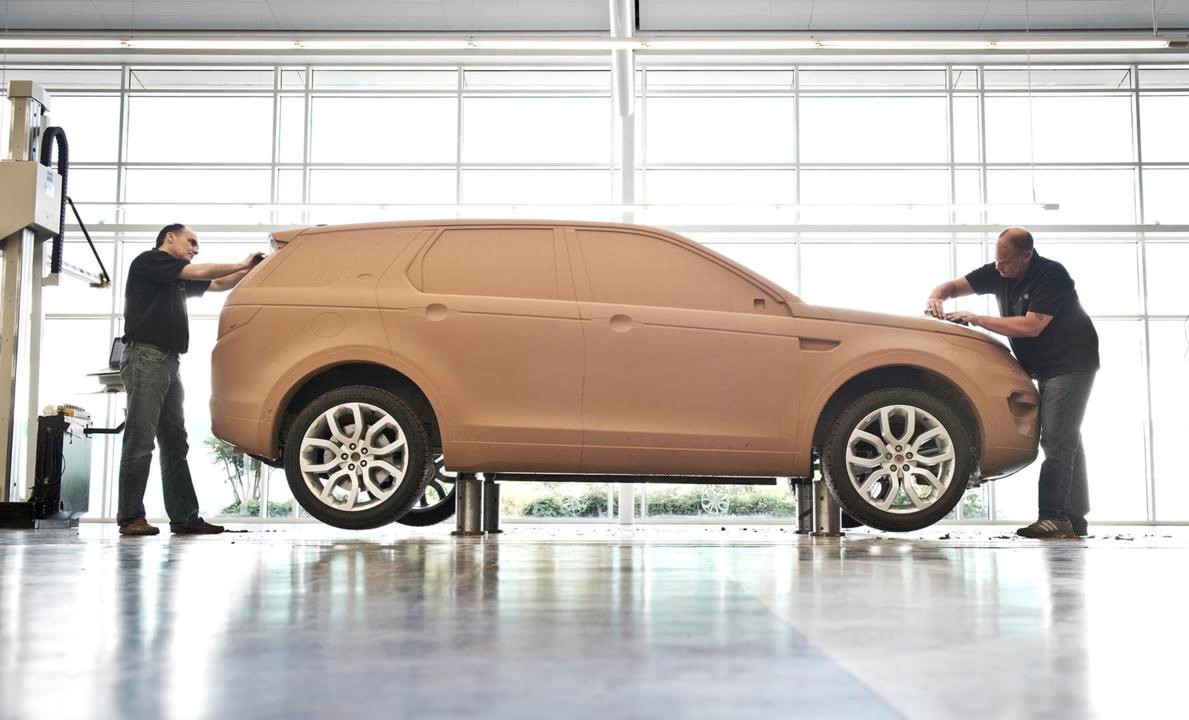
The whole clay modelling stage is devoted to refining the surfacing. Surfacing is often underestimated and misunderstood by other design professions
How many feature lines do we need on this panel? Do we need a shoulder line? What character should this feature line take – a bone line, an undercut, or a scribed section? How crisp should each radius or fillet be? Do we introduce a light catcher? How should we blend this convex and concave surface together? How much can I twist this surface and still control the light lines?
All these are questions that need to be resolved by the designers.
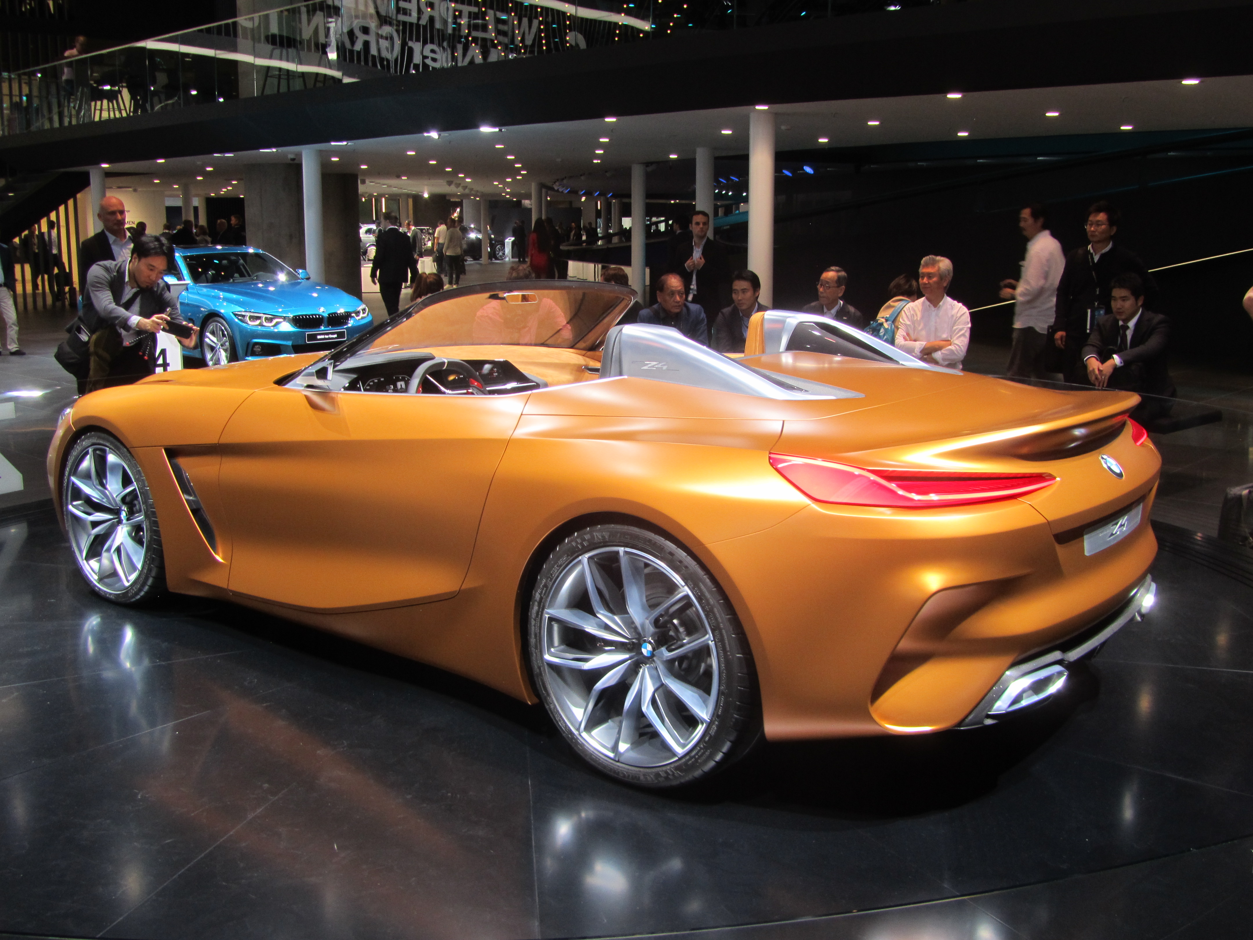
Creating fascinating surfaces and controlling highlights is complex process (BMW Z4 concept)
“I hate the term ‘surface entertainment’ and I think there is a war out there to invent new bodyside features” says Thomas Ingenlath, Chief Design Officer, Volvo. “My whole education was about proportions, and sometimes the car does not need another little something here or there – but it does need the cabin to be 5mm lower!”
A car is not, of course, a purely static object, and as the car or the observer moves, both the light lines and the highlights will travel around and along its highly-reflective surfaces.
Organising this flow around a complex 3D form so it works from all angles is hugely challenging, and requires great sculptural feel and experience. This part of the design process is where automotive design is uniquely different from product design or architecture – even other areas of transport design such as motorcycles.
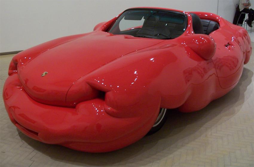
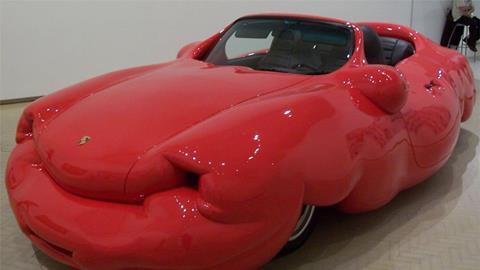
Erwin Wurm’s sculpture deliberately challenges our preconceptions of form language in cars
Erwin Wurm’s ‘Fat Red Porsche’ is a good example of non-automotive surfaces: it deliberately introduces human-like muscle and fat onto the underlying structure (bones) to produce an absurd caricature of a sports car. It always produces a laugh when shown to students but is quite effective in demonstrating how our references and range of automotive surfaces are fairly tightly informed.
Ideas of ‘truth to form’, limitations of metal pressing and a desire for dynamic surfaces that look sleek are largely taken for granted, and rarely questioned. The stereotype of controlled, linear surfaces is deeply embedded in our psyche when it comes to cars.
Wheelarches
The wheelarch is another key area to express character in a car design. A lot of the power and muscularity of the car can be expressed via the wheelarches.
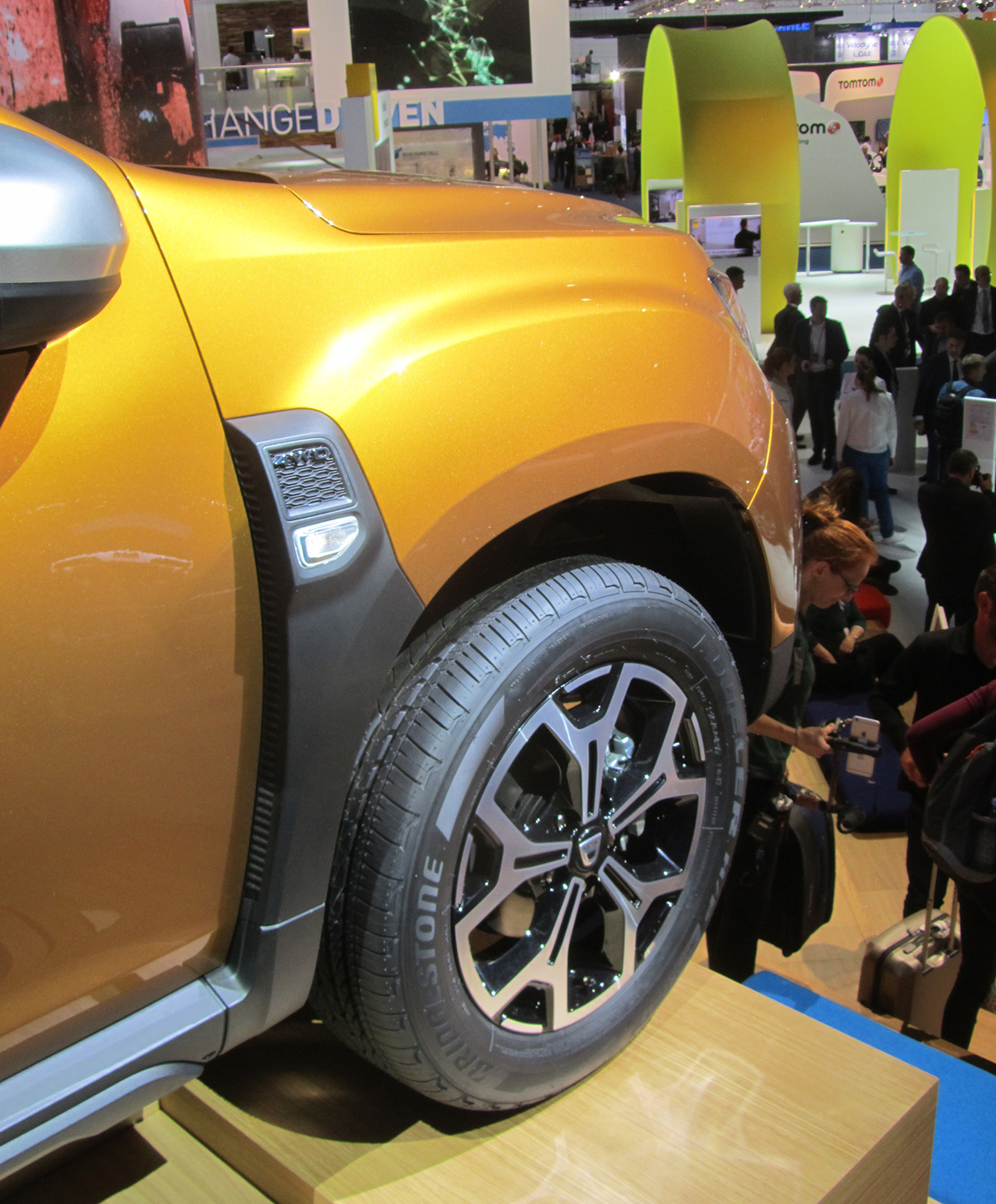
Dacia uses a ‘blown’ wheelarch construction
Although the wheelarch lip is typically a simple, flat section to underscore the wheelarch opening and give strength to the panel pressing, the section leading into the lip can be varied tremendously to enhance the personality. A lightly convex section suggests confidence, a ‘blown’ surface suggests underlying power, a concave section is more classical – it can suggest elegance or delicacy.
‘Blister’ or ‘box-flare’ wheelarches were fashionable in the 1980s after being introduced on the Audi Quattro, but are largely confined to history now, except on Audi RS models. We could go on.
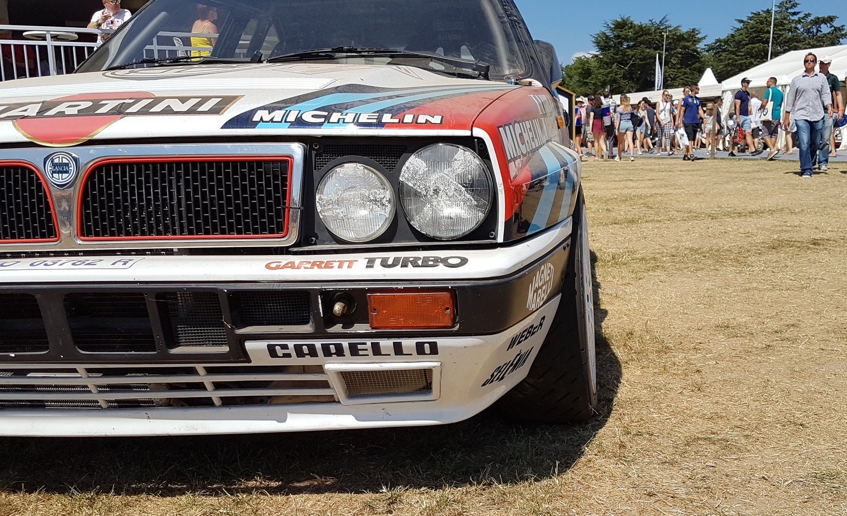
Flared arches come with motorsport connotations, and thus suggest heightened performance
Making the wheelarch physically wider clearly indicates more power, such as on a Honda Civic Type-R, but coming up with a fresh wheelarch design for a vehicle with tight width restrictions (such as a Japanese kei car or a van) is real test of design skill.
We will continue this series next time with a discussion on Graphics – the final element of evaluating automotive design.
Car Design Essentials Part 1: Bones
- 1
- 2
 Currently reading
Car Design Essentials Part 2: Muscles
- 3

