We’re all familiar with the archetypal image of ‘the designer,’ presented with a pen in their hand, sketching on paper. But while this analogue scene is recognisable, it represents just one step of many before the sketch can make the leap from the page into three dimensions.
What if you rethought this process, and skipped straight to 3D, your ideas fully realised in three dimensions right from the first gesture? That’s the idea behind Gravity Sketch, a powerful, intuitive 3D creation application that allows users to take the sketch phase straight into three dimensions just by putting on a headset and picking up a pair of motion-tracking controllers.

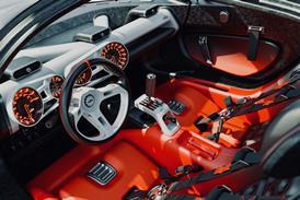
Line work in Gravity Sketch skipping sketching in Photoshop
“Gravity Sketch is built to unleash the designer’s creativity,” explains Gravity Sketch CEO, Oluwaseyi Sosanya. “We’ve streamlined the process of designing in 3D, so what you see in your mind’s eye is what you get. The model has the aesthetics of a pen and paper sketch, but instead of sitting on a page, it’s now a clear communication of your idea.”
Key to the success of Gravity Sketch is its user-centricity. Instead of creating a suite of software tools to sell to its clients that very much dictates how it should be used, Gravity Sketch has evolved in very close collaboration with end users.
In order to understand just what, exactly, the real-world benefits of using Gravity Sketch are, we spoke with Concept Designer at Audi AG, and Gravity Sketch user, Nikolai Proskurin.

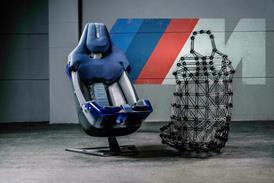
Surfaces in Gravity, skipping early model in Maya
What was your initial draw to Gravity Sketch?
Last year I met [concept artists and illustrator] Jama Jurabaev in London. He was a guest speaker at the Industry Workshops event and his presentation was all about the benefits of VR design. He was crazy into a program that was called Gravity Sketch, and presented it really well.
At that point, I’d tried out many VR apps but there was nothing that felt quite right, so when I saw Jama standing on the stage sketching knights on a castle with a flow I’ve never seen before, I was like ‘Bam! That’s it! That’s the tool I didn’t know I needed, but that could be my Photoshop but in VR.’

Line work and surfaces rendered in Maya with Octane
How has it influenced your design workflow?
It’s made me way faster! It gave me the ability to create much more efficiently than I could have ever imagined. Before Gravity Sketch, I’d sketch something, mock it up in Maya, sketch on top of it, refine it again – first iteration done. Now it’s simply Gravity Sketch, Photoshop, and refining in Maya.

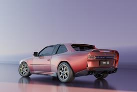
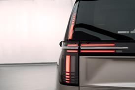
Surfaces without lines rendered in Maya with Octane
What’s the best Gravity Sketch feature?
I like INK and SKINS because they’re like the more intuitive version of pen and paper. And the possibility you can export your work into .OBJ and .IGES afterwards so you get proper curves and surfaces in Alias or Maya.
Do you feel like there is something in Gravity Sketch for everyone?
It just has this super intuitive way it’s set up. It’s super easy to understand and most tools are self-explanatory, so even a user with no clue about design can make something and express their ideas straight away.

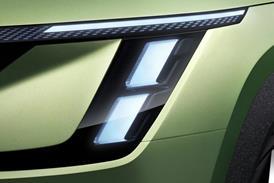
Photoshop overpaint of the Octane rendering
The design process, be it virtual or real, is in a constant state of evolution and development. However, as shown in the example here, it’s rare for a product to come along that truly has the power to disrupt design workflows in the way that Gravity Sketch can. We’ll watch with interest how this software is adopted, and its influence realised.
Also, keep an eye out for a Gravity Sketch and Unity webinar on Car Design News coming soon, where you’ll get to see the product’s benefits demonstrated in real time.

