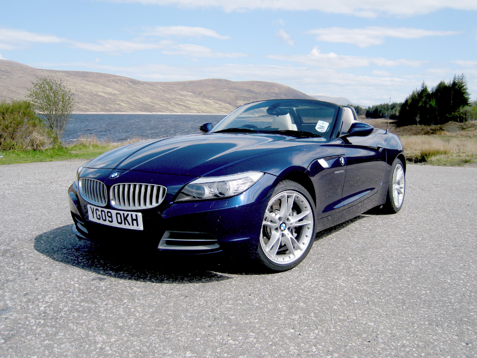
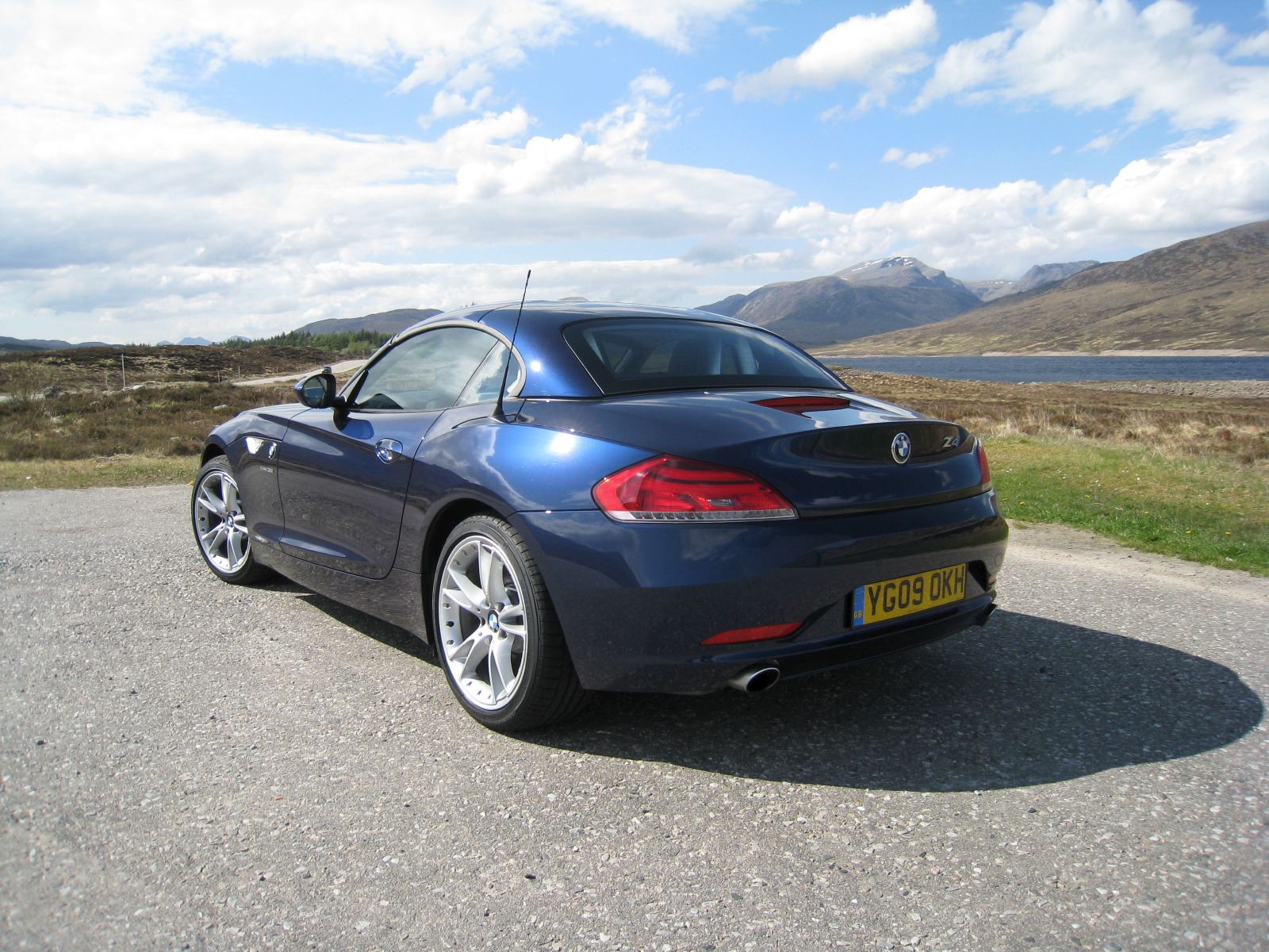

Loved as it may be by its loyal fanbase, the outgoing Z4 was always something of a mixed bag in terms of design. While the car's classic long-bonnet, cab-back profile and short overhangs should have pleased the eye, the BMW's sheer frontal mass made its proportions seem out of balance. The application of the company's then-new ‘flame surfacing' form language also generated a visual business that seemed out of place on something as conceptually simple as a roadster. In the 2009 Z4, however, BMW has created a design that addresses all of these shortcomings - and has dramatically changed the character of the car in the process.
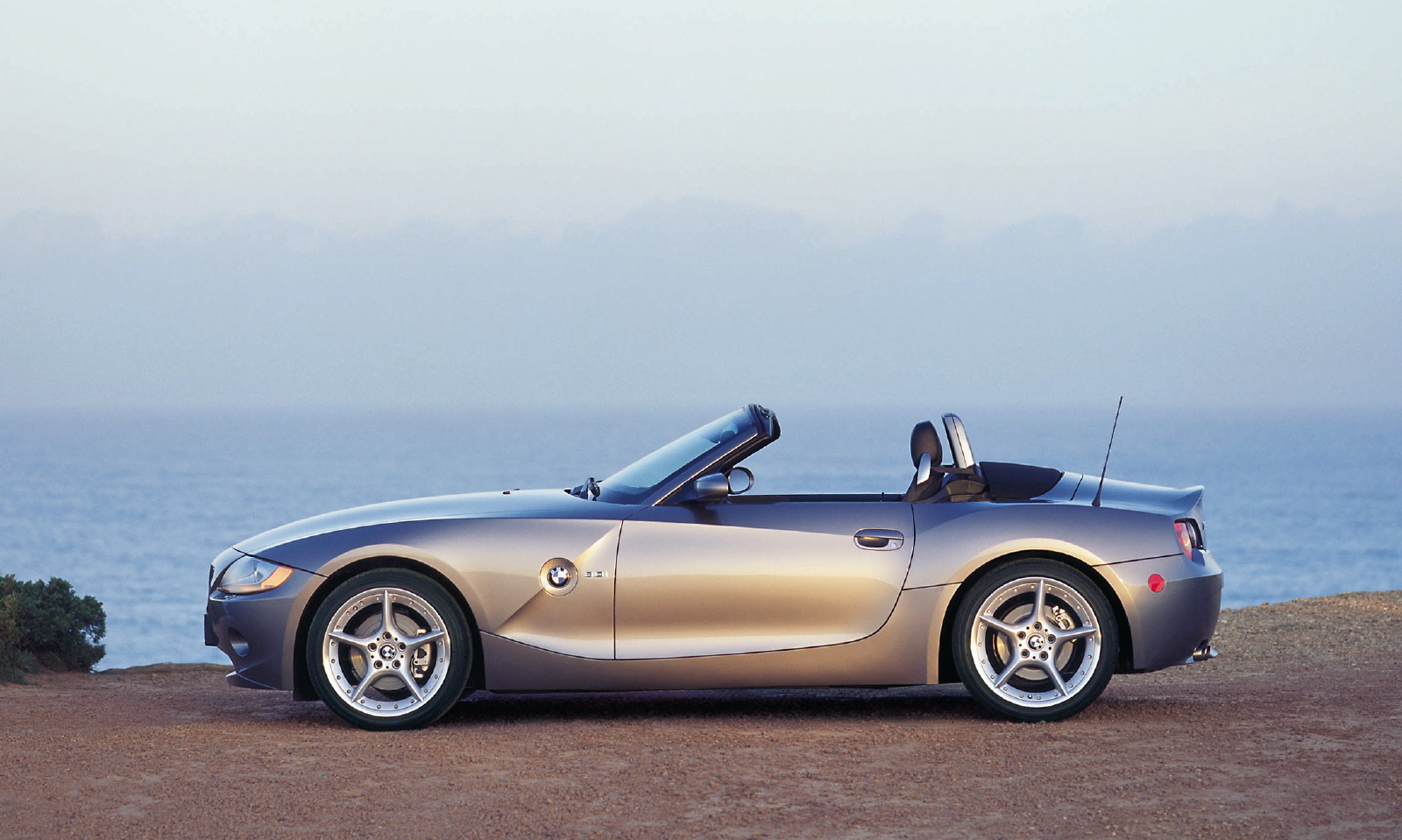
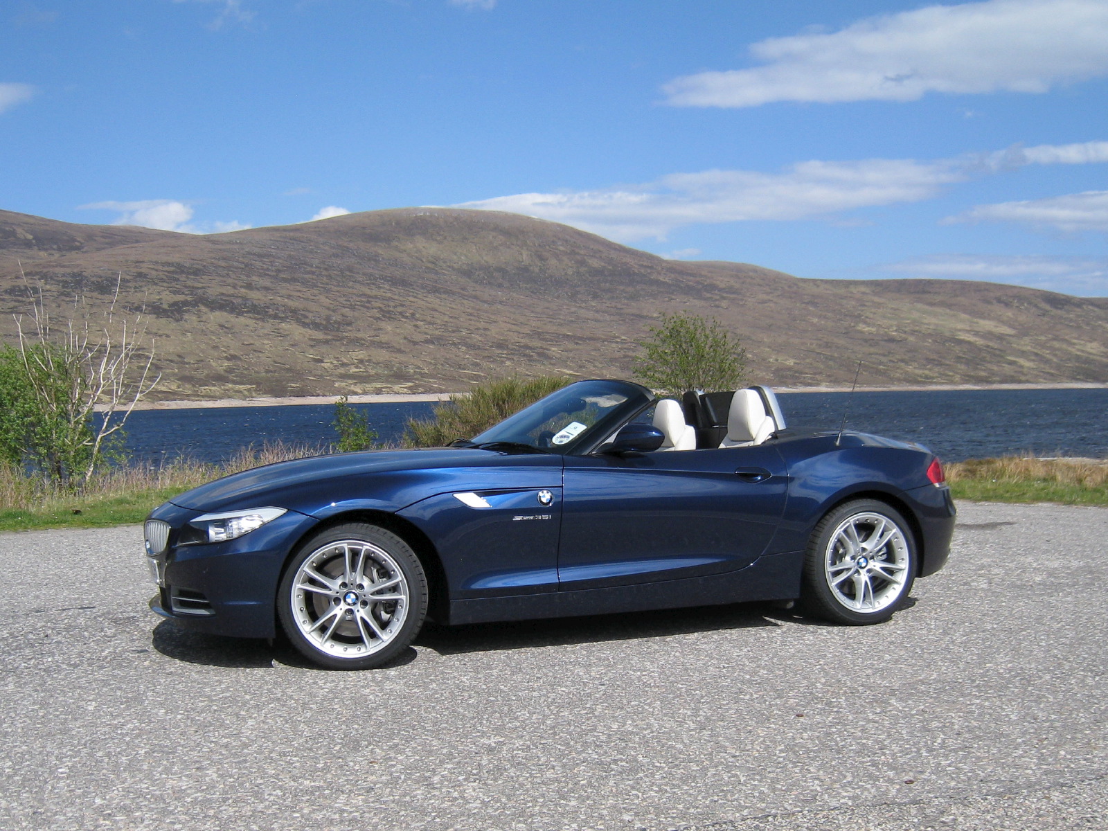
The fundamentals of the car's design appear largely unchanged at first glance - there's no mistaking that this is a Z4. As before, a long, arcing hood extends back to a raked-back windscreen, and the character line sweeps rearwards from the inner edges of the headlamps, forming the lower edge of the shoulder and plunging downwards (in a manner slightly reminiscent of the Kaiser Darrin's famous ‘Darrin's dip') to the point at which the bone line above the rear wheelarch fades into the rear door cut. Here though, the shoulders run back in a pair of defined bands that rise up from the hood, creating a muscular appearance.
Instead of kicking up fore of the leading edge of the door to meet the headlamps, the car's other defining bodyside line continues in a gentle but consistent arc from the front lower air intakes to the center of the rear bumper. Together with the loss of the diagonal cut that used to follow the angle of the windscreen down to the front wheelarch, it makes for a more traditional, less sculptural surface treatment that's very much in keeping with recent revisions to the 7 Series sedan.
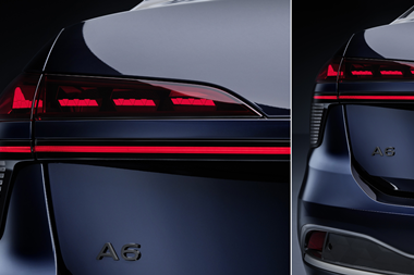
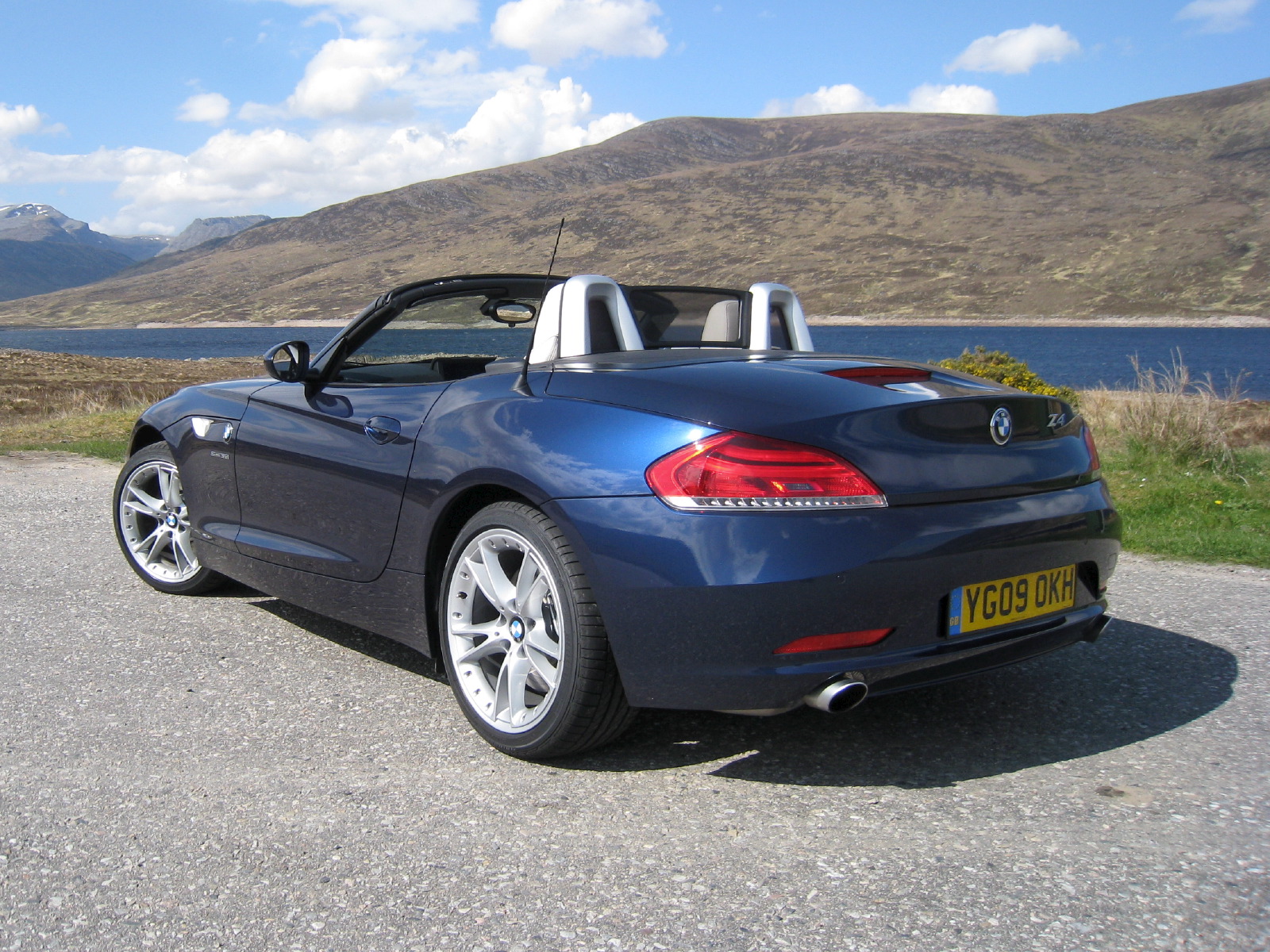
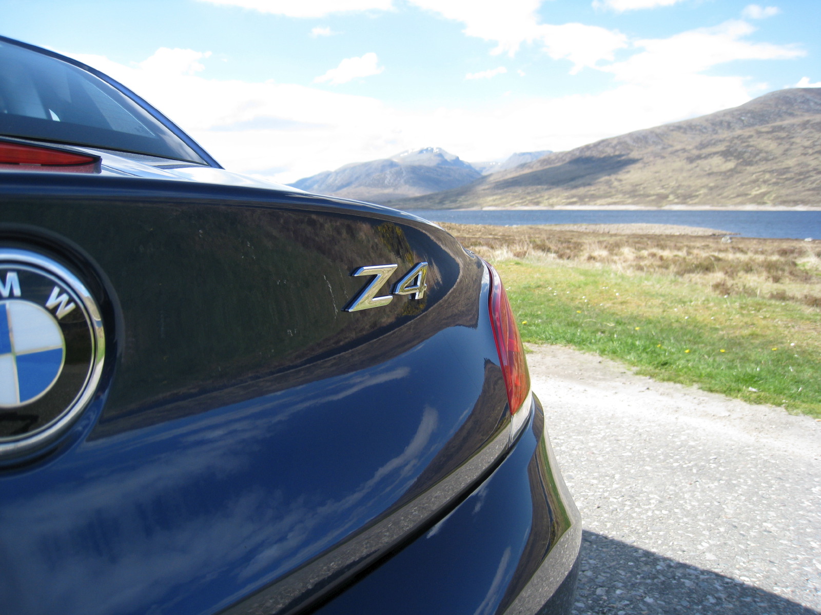
Keeping it in the familyThe Z4's prow-forward grille treatment also keeps it in line with other members of the BMW range, as do the adoption of 5 Series-style upswept headlamps. The rear, meanwhile, with its taillamps tucked under the trunk lid, calls the 6 Series to mind. This is no clumsy mishmash of corporate cues and classic roadster proportions, though - the Z4 is a very handsome car indeed, offering more visual drama than its predecessor while benefiting from more balanced proportions. While some will miss the ducktail look of the old car, the longer rear overhang (this car is 148mm longer than the old one) and less pronounced tonneau ‘hump' create much-needed visual harmony.
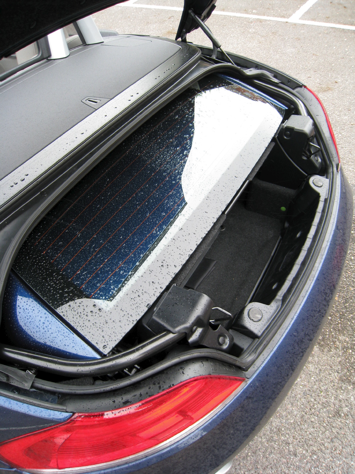
It has also liberated enough space to accommodate the Z4's party trick: its two-piece folding metal hardtop. At the press of a button the curved rear canopy section cantilevers above the main panel to form a sandwich, which glides down to fit in a special upper compartment in the trunk. With this in place the car can carry 180 liters of luggage, which proved sufficient to hold a couple of pairs of soft weekend bags on our trip down from Inverness in Scotland to London. With the roof up this increases to 310 liters, enough to hold a golfbag.
A car for all seasons
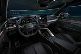
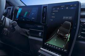
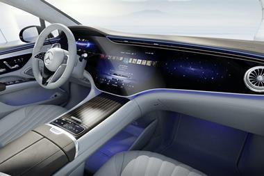
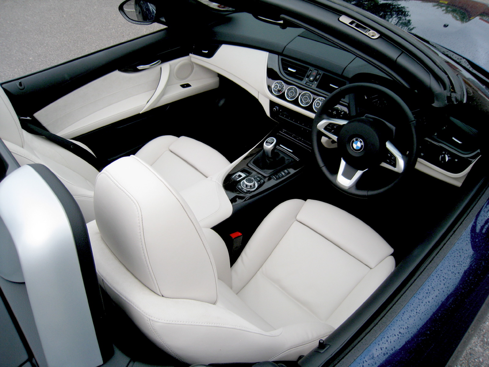
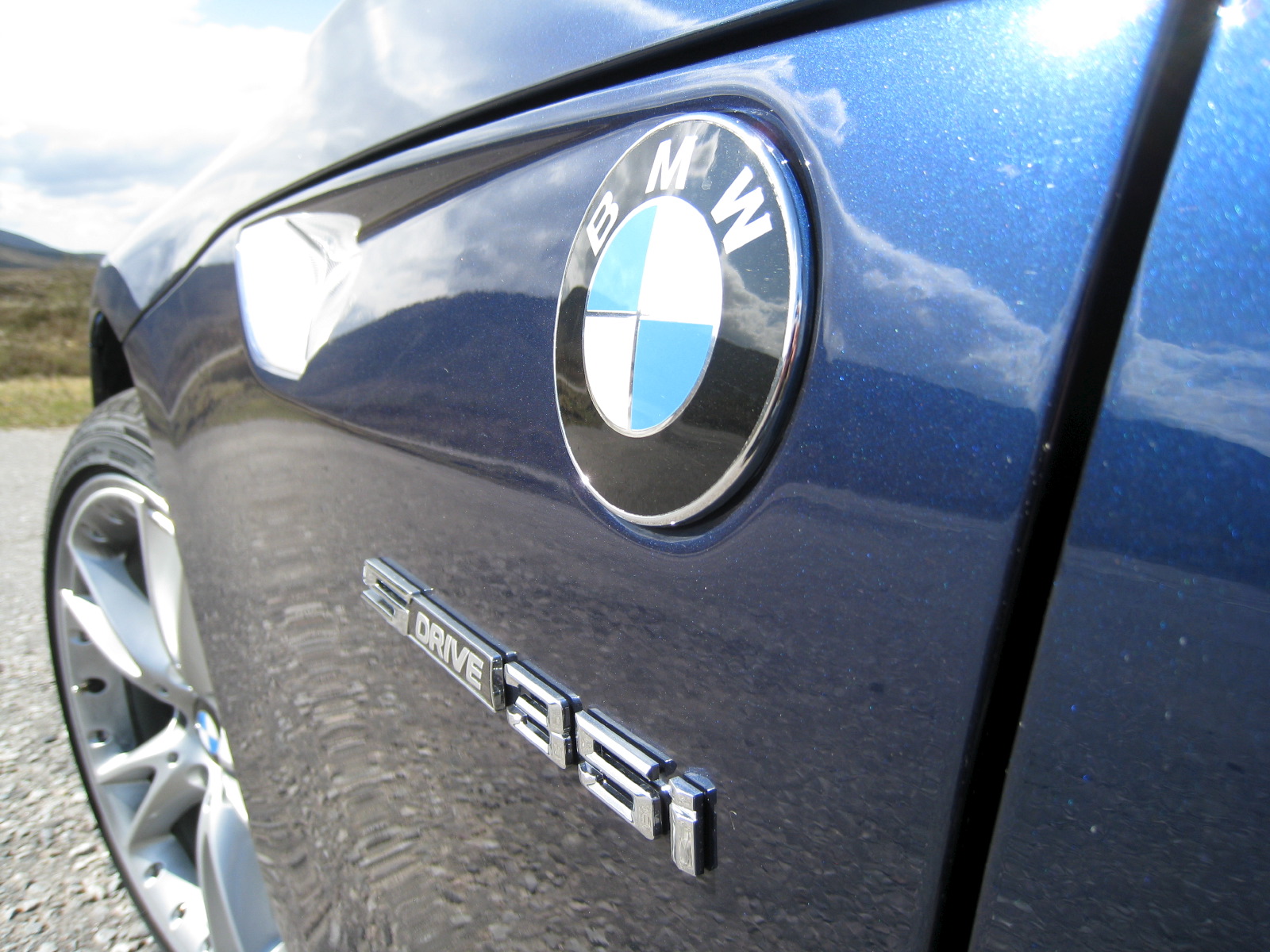
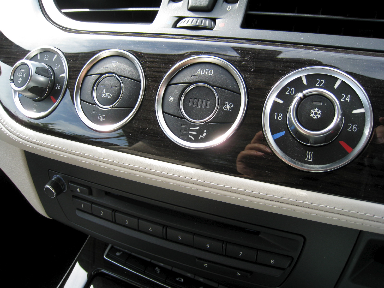
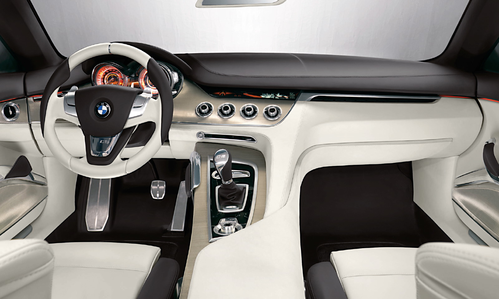
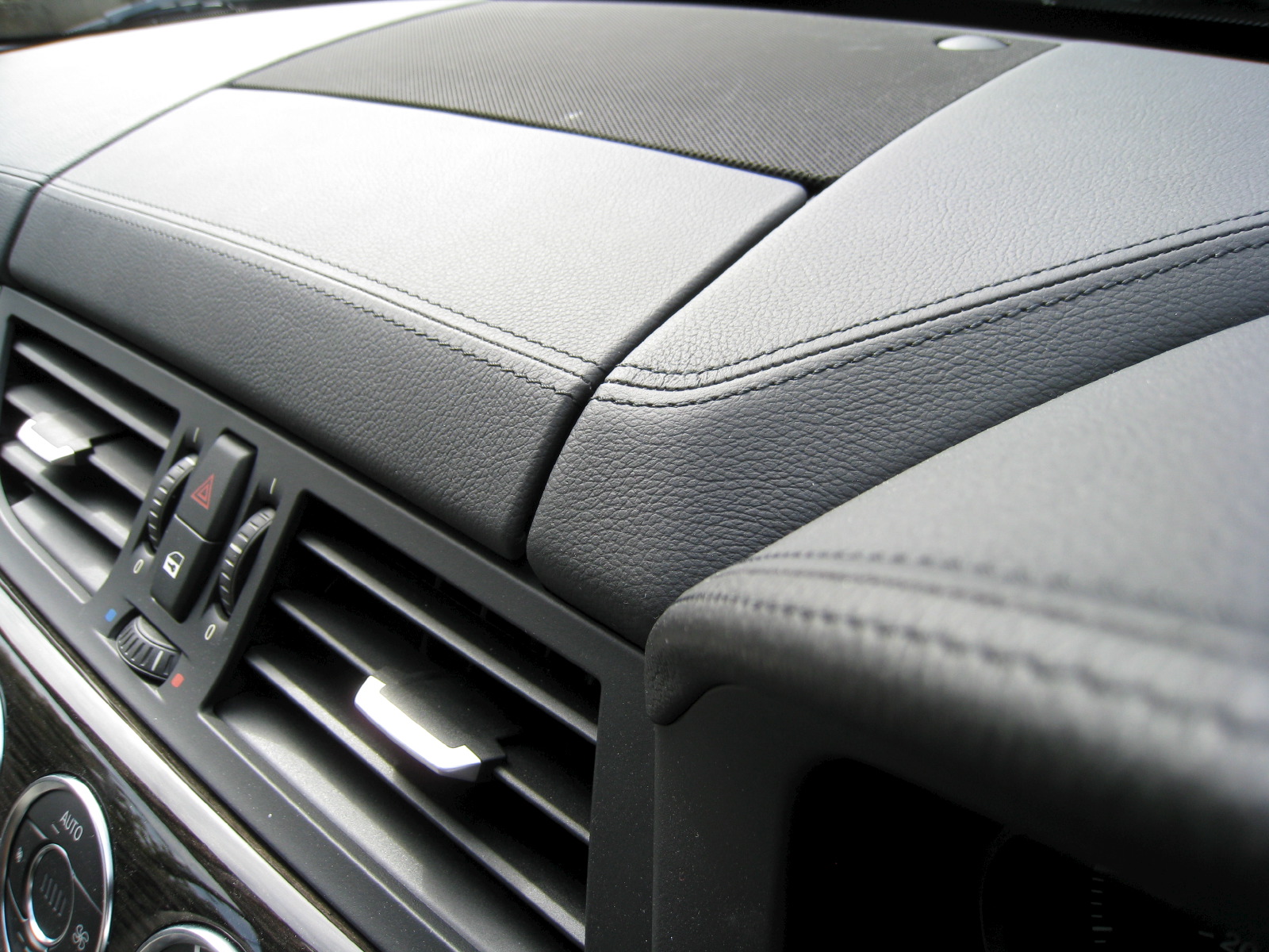
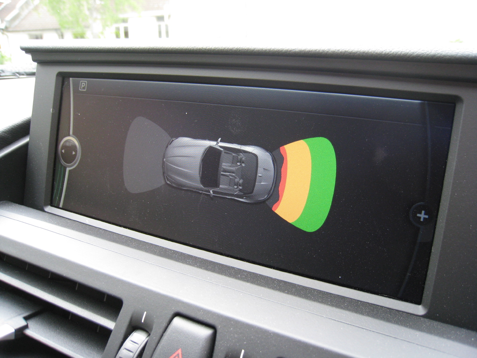
Just as the driving experience majors more on comfort and refinement than before, so does the all-new cockpit design. Borrowing heavily from the Concept CS shown at the 2007 Shanghai auto show (also penned by Z4 interior designer Nadya Arnaout), the IP is defined by a row of four HVAC rotary controls lined up with the center of the steering wheel boss. These sit, along with the air vents and exterior lighting knob, in a gloss black wood veneer panel that looks almost black in low light conditions and contrasted nicely with the Ivory White Nappa leather lower dashboard area on our top-of-the-range sDrive 35i test car. This high-quality finish also surrounds the gearlever, revised iDrive system and electronic handbrake in a CS-style two-tone center console/armrest design between the seats. Together with a pop-up satnav/infotainment screen and tactile stitched black leather trim on the upper IP and door panels, it lifts the Z4's interior ambiance to a whole new level compared to the previous model. And a whole new price level, not coincidentally.
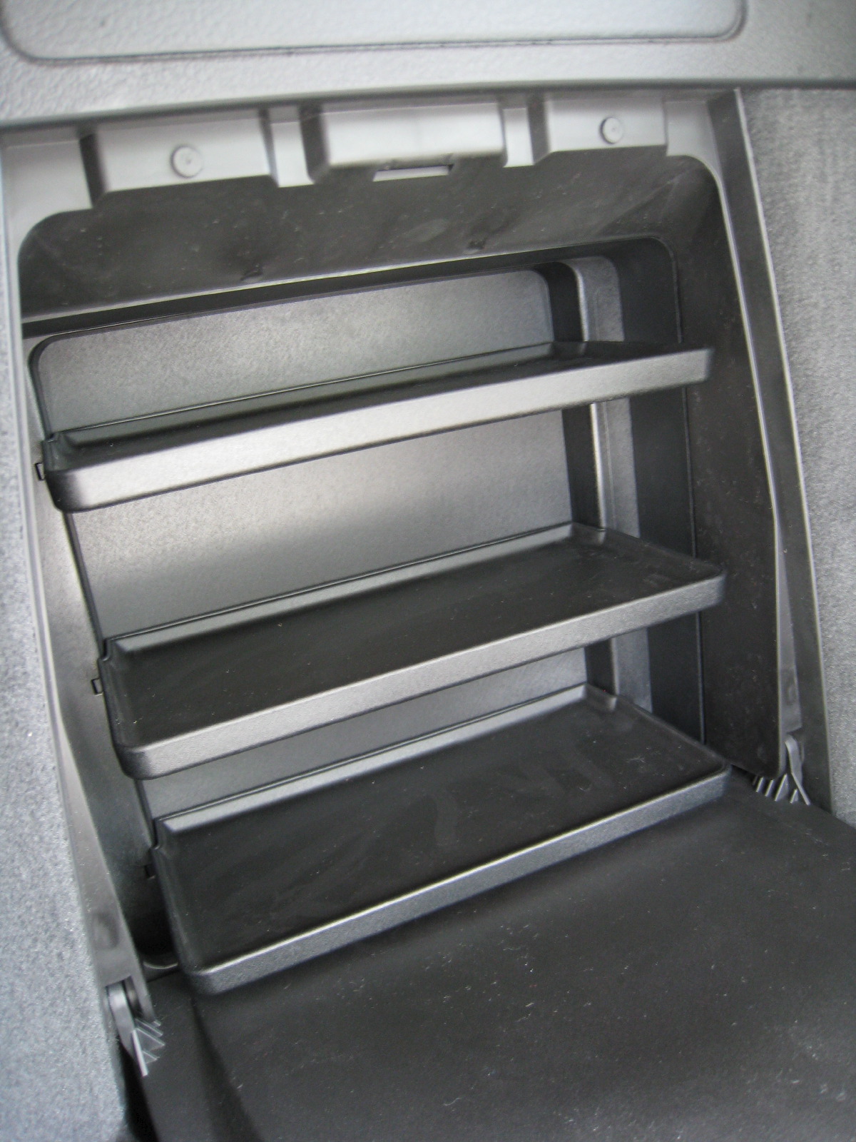
Where you previously struggled to find any meaningful storage areas, the 2009 Z4 is crammed with clever storage solutions. These include a full-width lidded compartment behind the seats (complete with storage nets to stop items sliding around), cupholders hidden under the armrest and an optional shelf system for the space between the chairs.
The BMW isn't without its ergonomic issues, however. The need to package both the gearlever and Drive Dynamic Control system (arranged in a band of buttons below the stereo) ahead of the iDrive controller means that you find yourself pulling your elbows quite far back in order to reach it. And that wide transmission tunnel has shunted the pedals into an offset position, forcing the driver to twist his/her lower torso in order to use them. It's not a major issue, but it takes away from an otherwise very comfortable cockpit by roadster standards. Perhaps this will be less of problem on two-pedal automatic versions.
Designed by an all-female design team (Nadya Arnaout, interior; Juliane Blasi, exterior), the new Z4 boasts a much wider range of talents and a sophisticated, less contentious design that pulls it much closer - both stylistically and conceptually - to the genre-defining sedans and SUVs that have made BMW such a force to contend with in the prestige car market.
Related Articles:
BMW Z4 - Detroit 2009
Design Review: BMW Concept CS ![]()
Design Development: BMW Z4 (2003) ![]()


