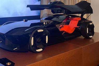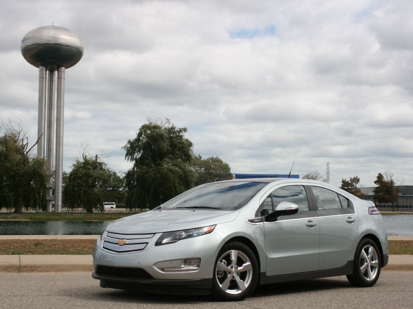


Meeting the Chevrolet Volt could easily have been an anti-climax. This is a design that ‘feels' nearly four years old — the concept first seen in Detroit in 2007. Together with the online hype surrounding it, and the part it plays in GM's renaissance, the weight of expectation is alarmingly high.
In conceptual terms the Volt is important for two reasons. It is the first mass-market ‘range-extended' electric vehicle; distinct from the pure electric or plug-in-hybrids other manufacturers are bringing to market. It is also very much a premium product proposition, its price well documented, largely attributed to its powertrain. Yet in its status and price and as representative of a GM brand's first true premium product, it will compete with an Audi or BMW as much as a Ford or Chrysler.
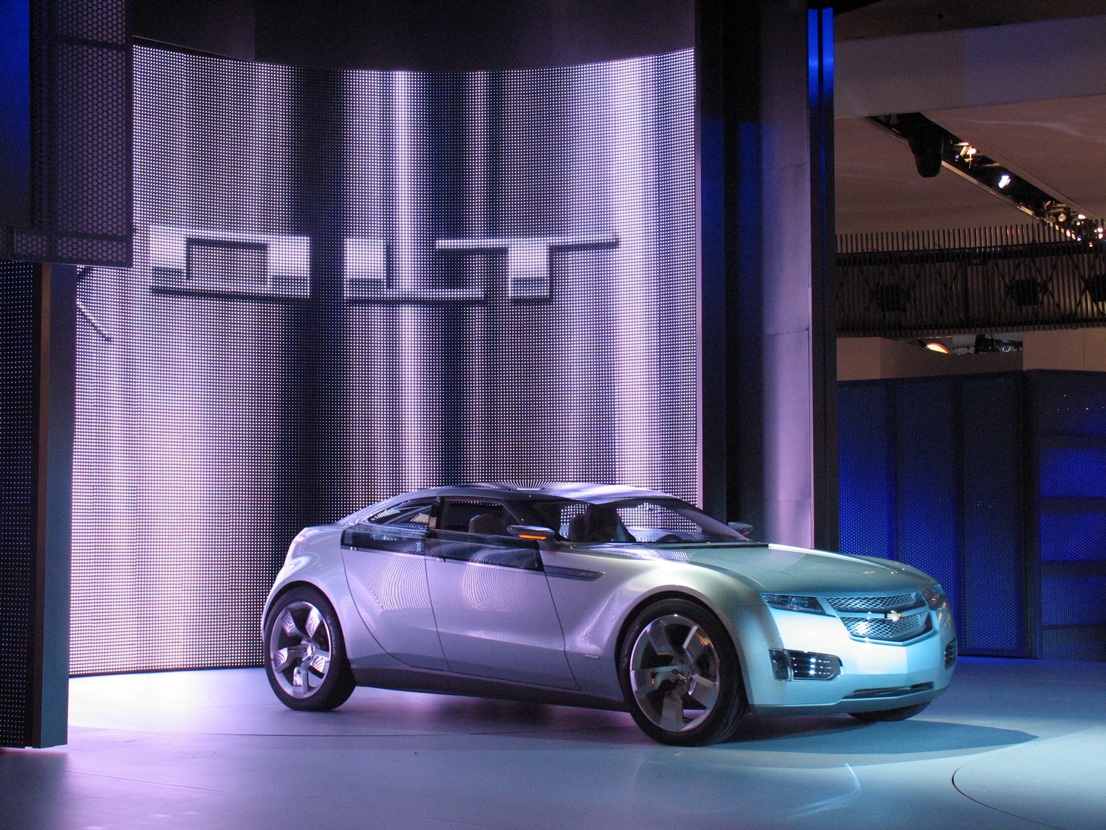
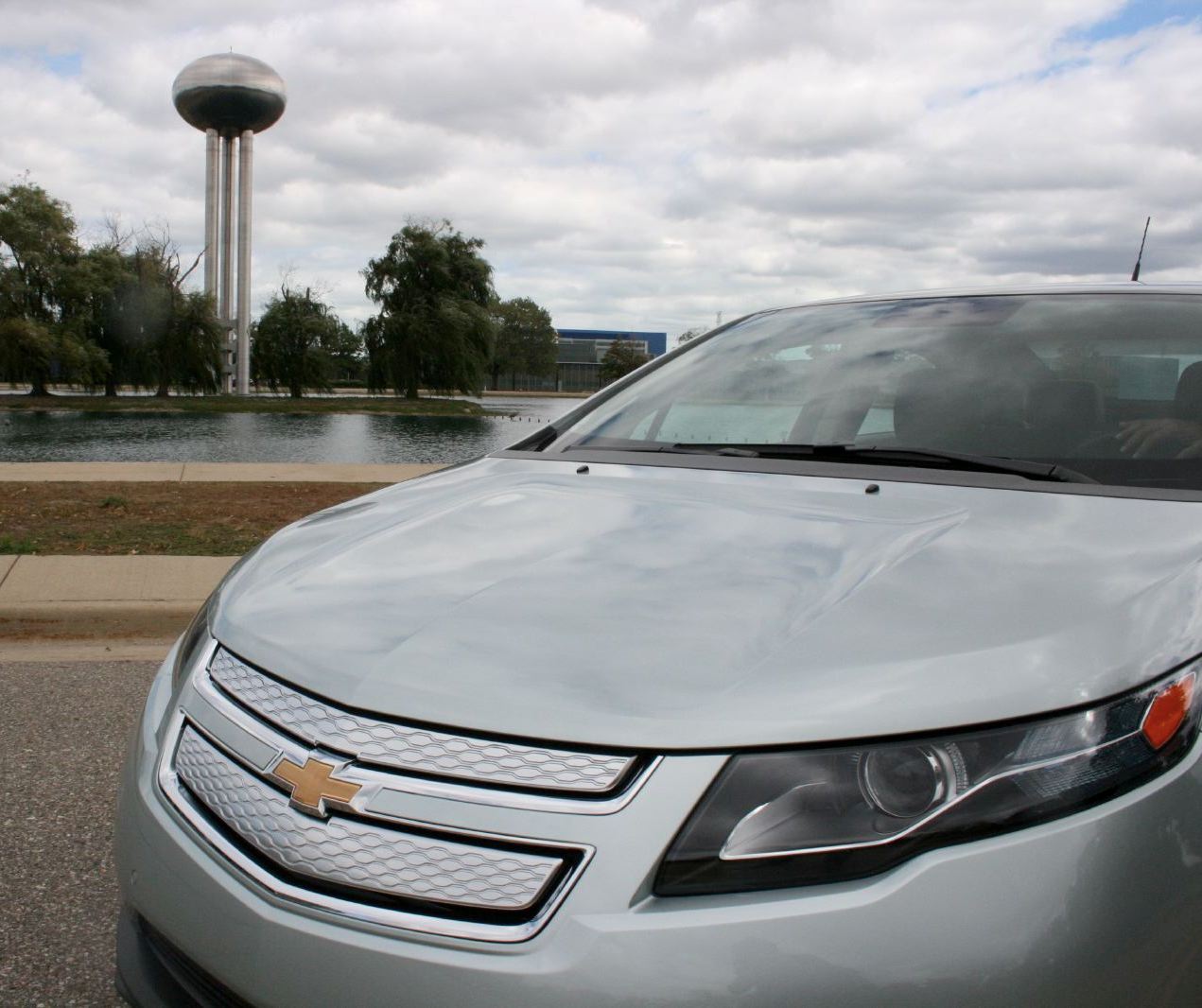
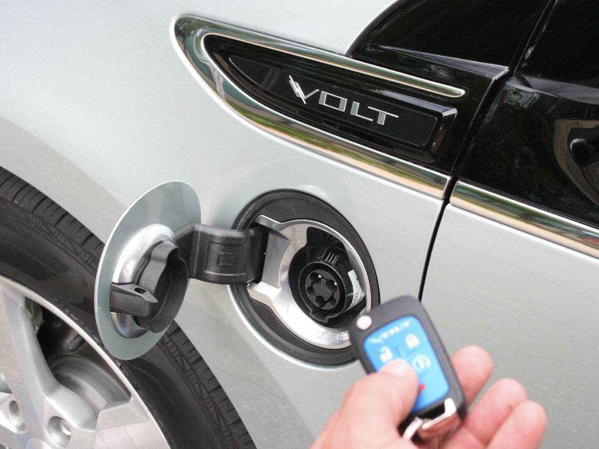
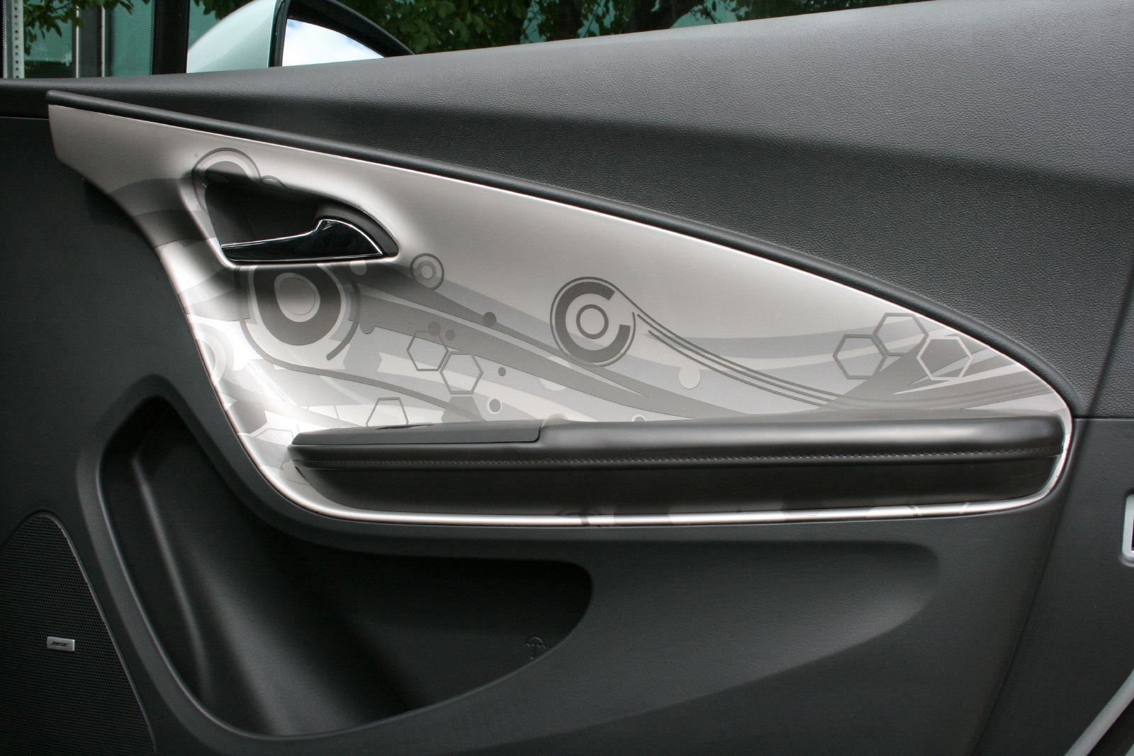

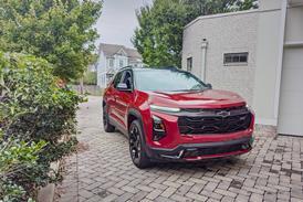
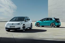
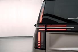
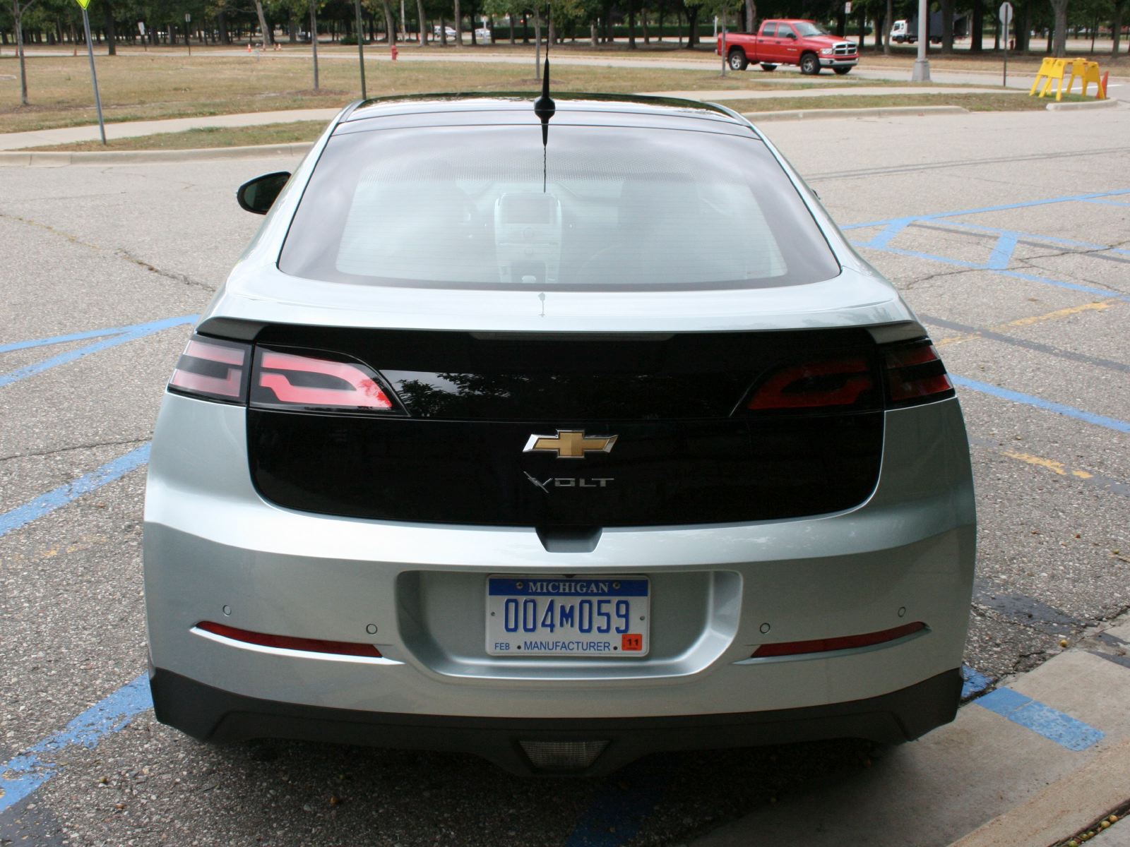
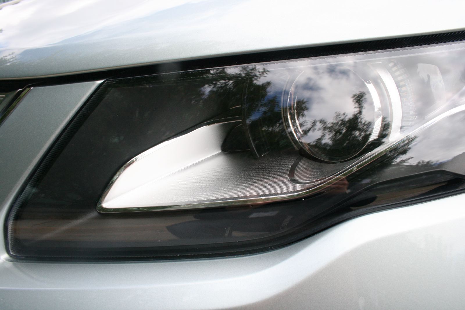
This hybrid-premium feel is initially illusive. Graphical elements — rear lights, gloss band below the DLO, wheel design and the color — create a visual link to the concept car. Yet in every other way, the form is less distinct. Much work has been done to reduce aerodynamic drag, but GM has avoided the distinctive roofline and silhouette of the second generation Prius, which has come to signify ‘hybrid'.
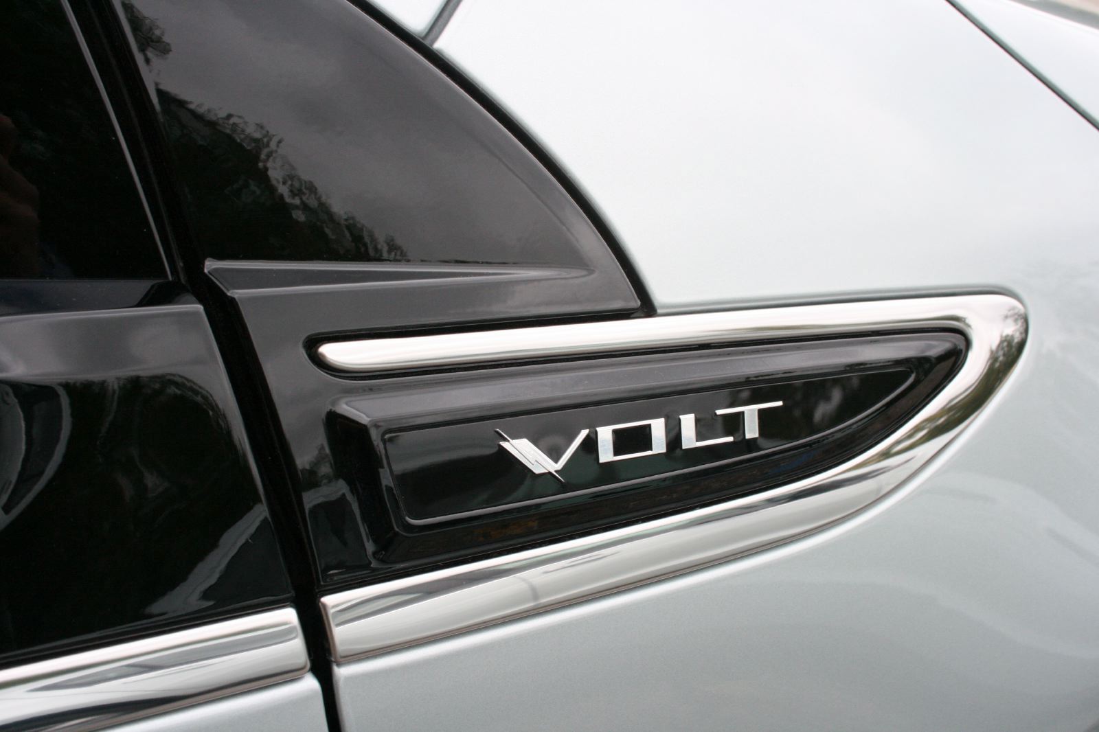
Perhaps, with a new and unproven powertrain, GM felt the need to make the Volt feel and look as conventional as possible. It leaves the possibility for a more radical sequel. Yet there remains an interesting comparison with a series of forthcoming products — Audi's E-trons specifically — whose design signifiers of hybrid/electric drivetrains are rendered in a subtle, premium way. In the Volt, the color blue, the use of Apple-like white plastics, lightning bolt running through the ‘V' of Volt badges and the blade motif used on the wheel, seats, mirrors, etc. all speak of a higher-design plane and increase perceived quality.
But to judge the Volt on exterior design alone would be to miss the point as other elements of the overall proposition offer something new or unique. Explicitly, the Volt feels like the first car to truly capture the zeitgeist of the digital age and use it to its advantage.
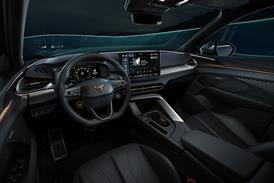
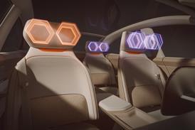
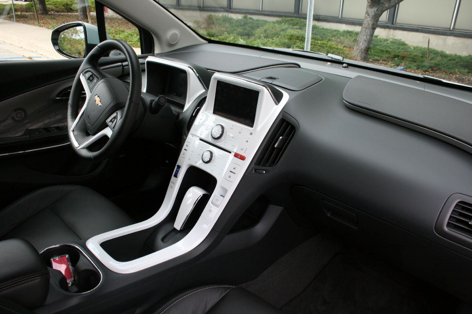
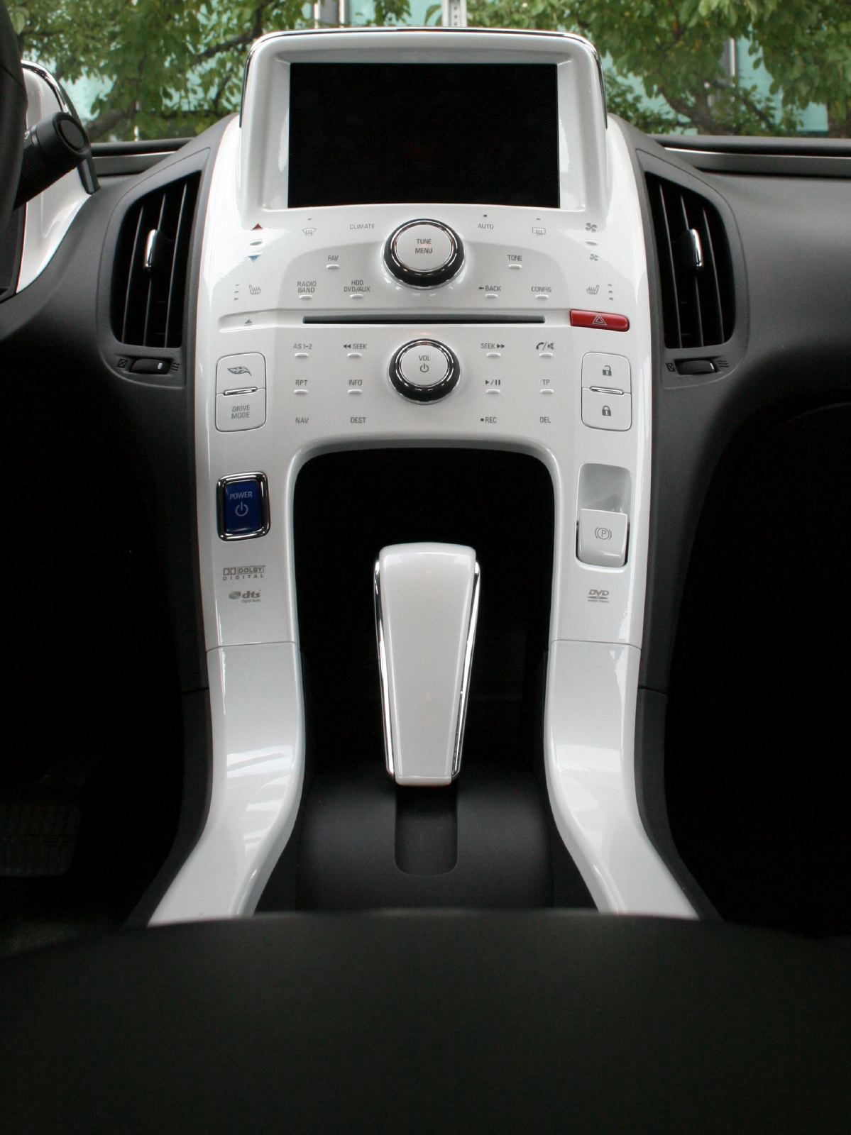
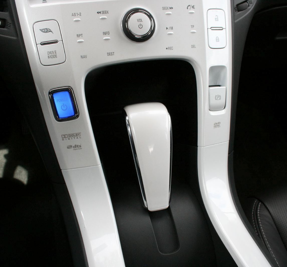
Entering the cockpit, the white center stack and binnacle surround stand out. A dark grey trim is available, but denudes the interior of its most distinctive, clearly iPod-referencing element. Dave Lyon and Stuart Norris from the interior design team openly reference Apple as the standard for UI and screen graphics. With the Volt they have achieved a standard that a team from Cupertino could have signed off and clearly attempted to appeal to the iPhone generation.
Interfacing with the Volt is part click-wheel iPod, part iPad touch screen. The center stack buttons — which forgoes physical movement for touch sensitivity — give a positive feedback ‘click' when touched — exactly like the sound when scrolling through menus in an Apple device.
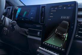
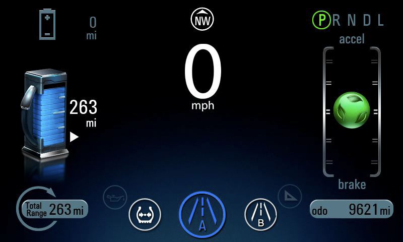
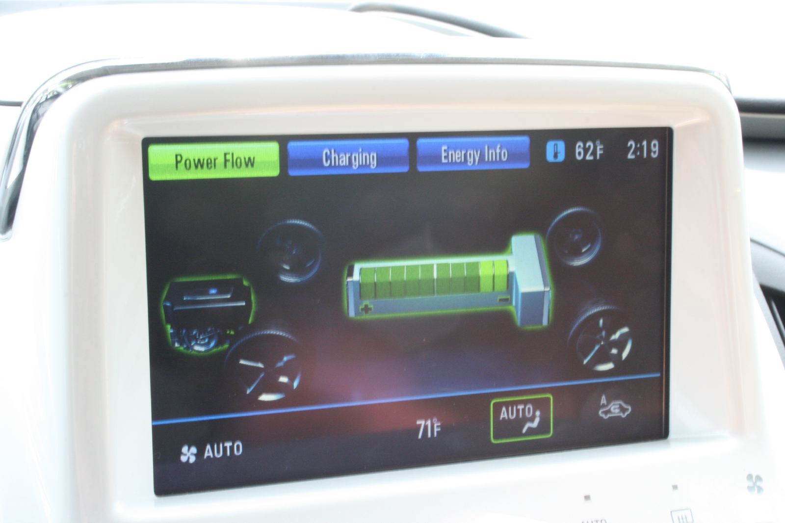
The two 7-inch TFT screens complete the effect. The first, atop the center stack, displays climate, navigation, music and the all-important hybrid-vehicle power flow display. Research has shown this to be a critical element of the hybrid experience for many buyers and here again, the Volt moves the game on. For comparison, the Prius display is to an '80s arcade game as the Volt's is to HD TV.
The digital gauge cluster also impresses. Rather than the anachronism of rendering a set of roundels onto a digital screen, as per the Jaguar XJ, instead, two levels of digital display are offered. One detailed, one simple — with a speed read out surrounded by battery charge level, range, fuel level, and an eco-driving meter, sitting on a beautifully clear HD screen. In a lovely retro touch, the eco-meter has the quality of ball bearing maze game/labyrinth toy — you try to keep the gently spinning green ball in its center ‘hole'. Brake or accelerate too hard and it floats up or down the gauge, ceasing to glow green.
The driving experience itself deserves mention. Not as novel as many will expect, under most circumstances it behaves entirely like any battery-powered car. Aspects like the linearity of the blended power/regenerative braking system and the lack of NVH mark the car out however, the Volt driving how one would expect a small, electric BMW to.
Add a raft of off and on-board digital services via GM's expanded OnStar service, which make the Volt app reality (providing users control via their smartphone of how and when the car is charged and much more), and the entire proposition of this car becomes something that appears fittingly ‘smart'. Not only can it run with no tailpipe emissions, it makes intelligent use of the two most disruptive technologies the world has seen in the past decades (the Internet and mobile phone) in a way no car to date has yet done. Forget the long mused about notion of an Apple ‘i-car', the car for the digital era has arrived — it's called the Volt.


