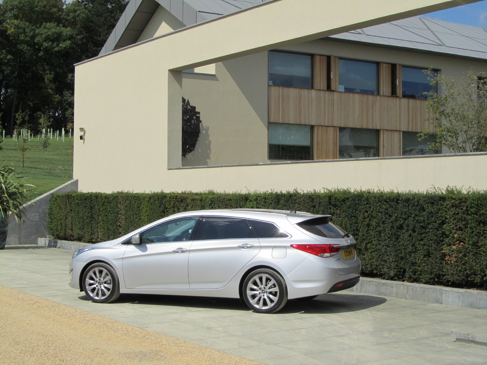
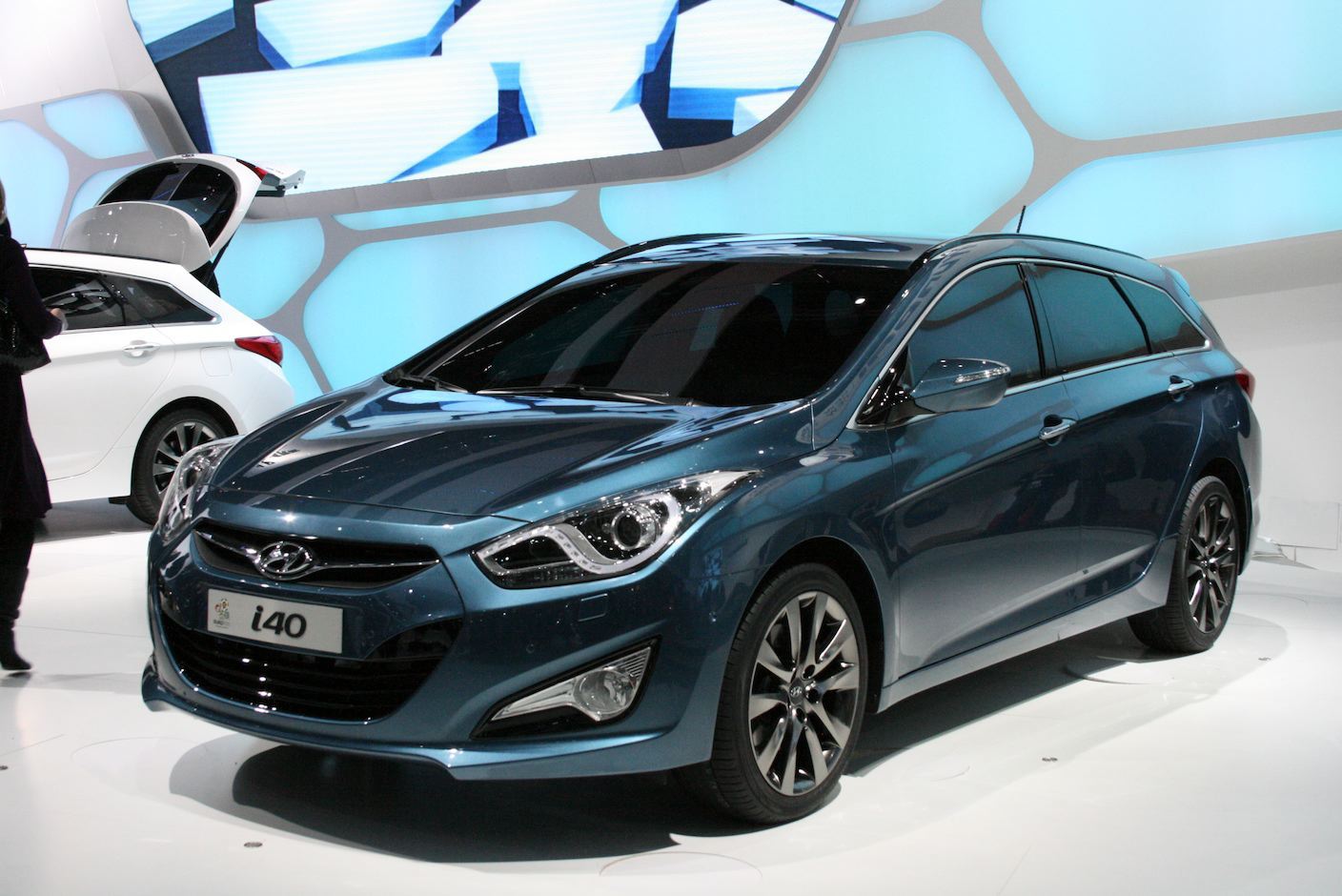
CDN recently spent a day sampling Hyundai’s new i40 Tourer, which has just been launched in Europe. For the launch, Hyundai invited us to Waddesdon Manor, the home of the Rothschild banking family and a venue that has been used for previous Louis Vuitton events. It has recently added a new art gallery with fabulous views across rolling countryside, and contains work by Anish Kapoor, Michael Craig-Martin and bronzes by Angus Fairhurst. The new gallery was chosen to showcase the ‘Fluidic Sculpture’ design philosophy pursued by the European design team, led by chief designer Thomas Buerkle.
We sampled the extremes of the i40 range - an entry model 1.7 CRDi Blue Drive Active and a top spec 1.7 CRDi - and came away impressed with the near-premium specification levels and innovative technology that this car offers in the key D-segment market in Europe, currently dominated by the VW Passat, Ford Mondeo and Opel Insignia.
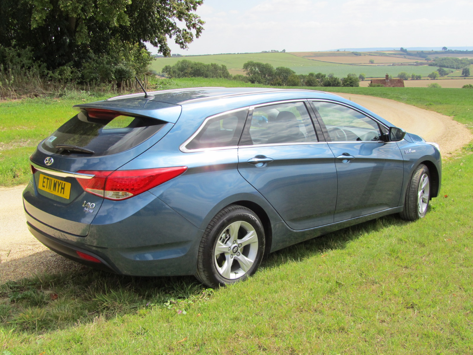
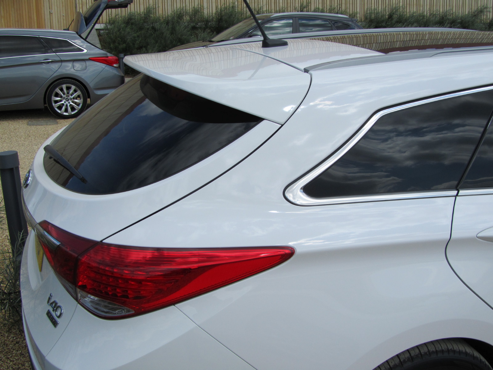
From the rear three-quarters the i40 is similar to other wagons, notably the Citroen C5 or Honda Accord, but with somewhat fresher proportions due to the screen being pushed a long way forward, not unlike the current Toyota Avensis. The D-pillar concave curve adds a distinctive touch, as does the pronounced bone line at the shoulder that visually stretches the body. The overall stance of the car is good, with a tight relationship of tires to body side and little-to-no wheel arch lips for low drag.
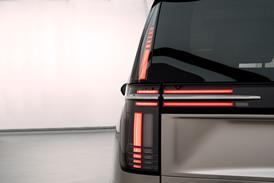
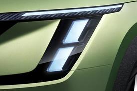
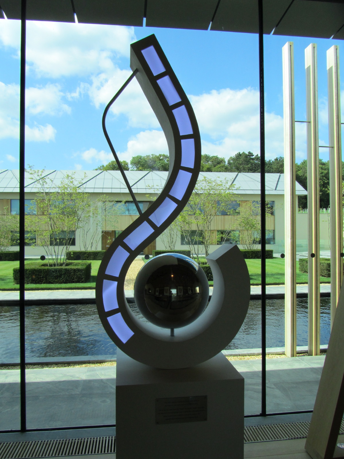
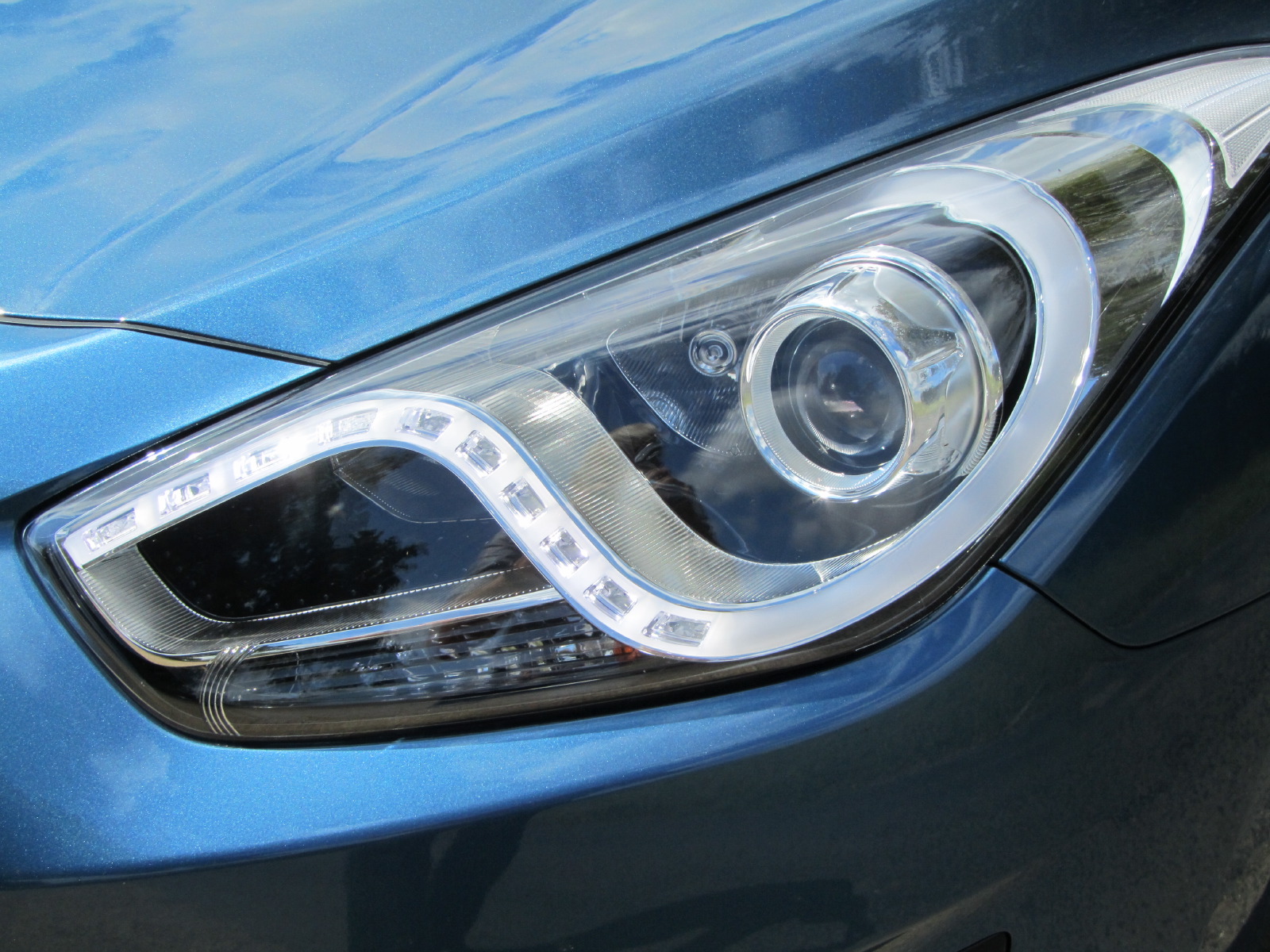
To underline the importance of the LED running lamps in their ‘Falcon’s Eye’ formation, Hyundai commissioned a new sculpture that was displayed in the library of the gallery. The swooping LED strip is certainly the most characteristic motif of the car, even if it is not unlike the versions of the Audi A4 equipped with LED running lights.
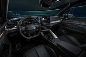
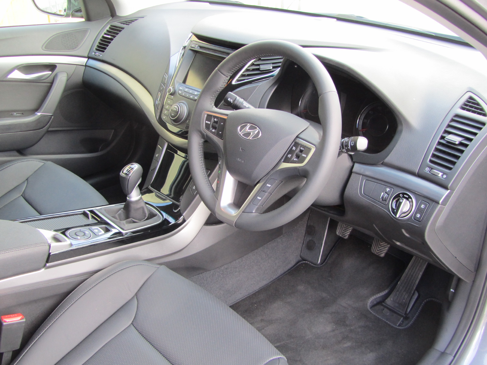
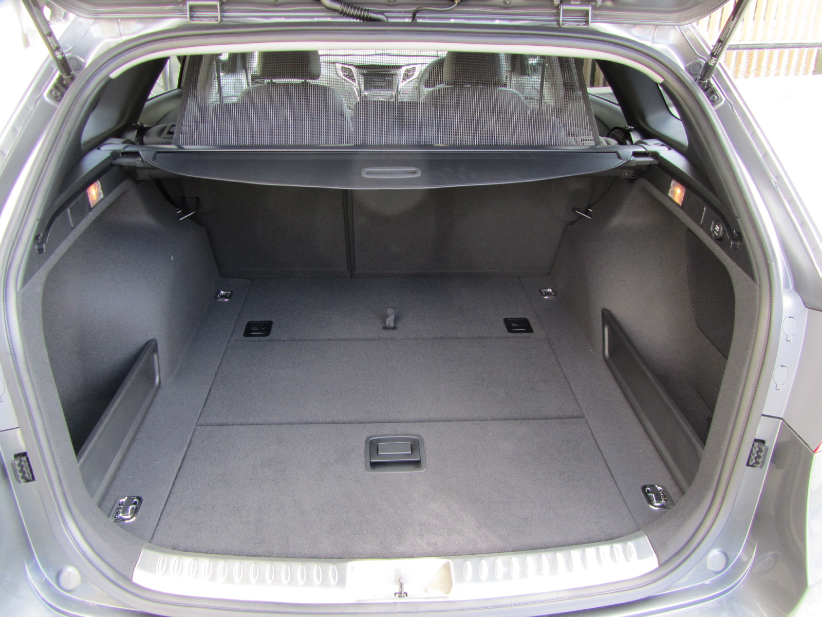
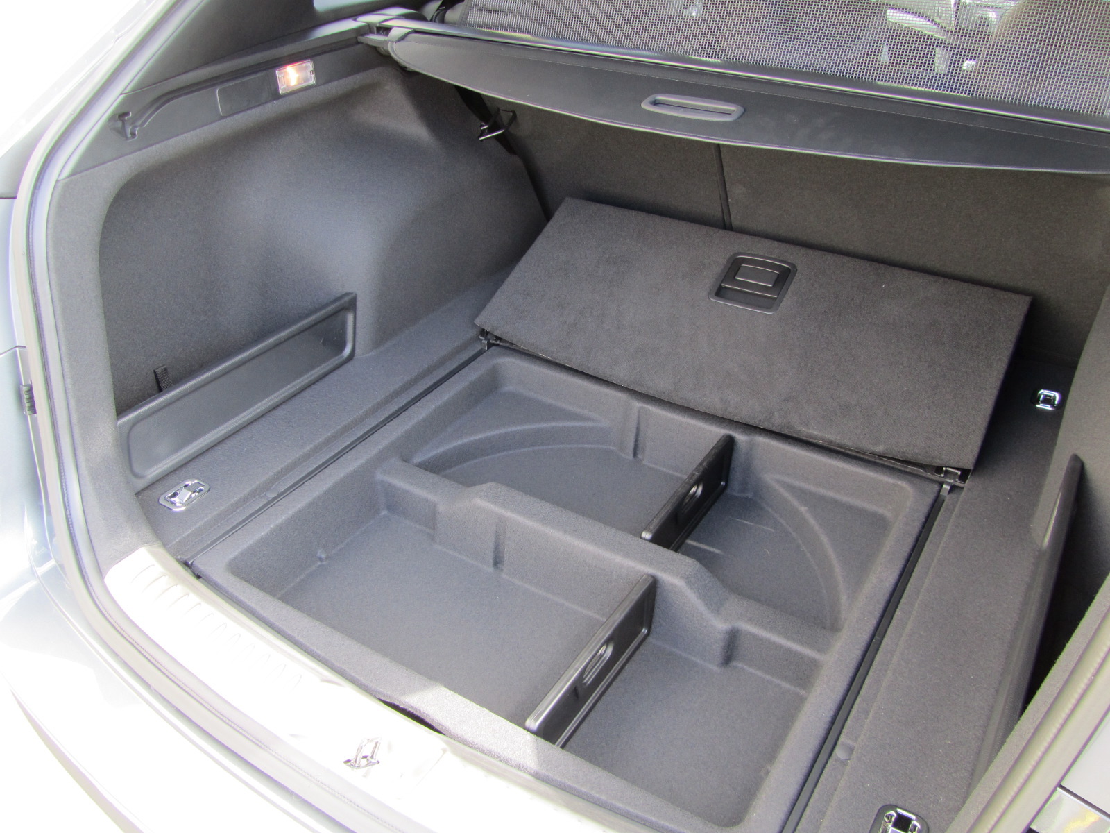
Upon driving the car, one appreciates the spacious cabin and the pleasing relationship between the broad center armrest and the gearlever. The low center tunnel and electric handbrake give real benefits in terms of packaging too, with generous foot room for the third passenger in the rear - unlike most rivals - and a huge storage box underneath the center armrest up front, like many MPVs. Indeed, there’s an excellent range of storage solutions throughout the interior, with small cubbies on each side of the front console for items such as sunglasses, large door pockets all round and small lockers at each side of the trunk behind the wheel arches.
Despite the shallow DLO, the relationship of H-point to interior beltline is good although, from inside, the rear trunk side window is just a small porthole, meaning that reversing the car entails care and attention.
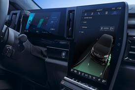
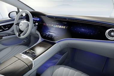
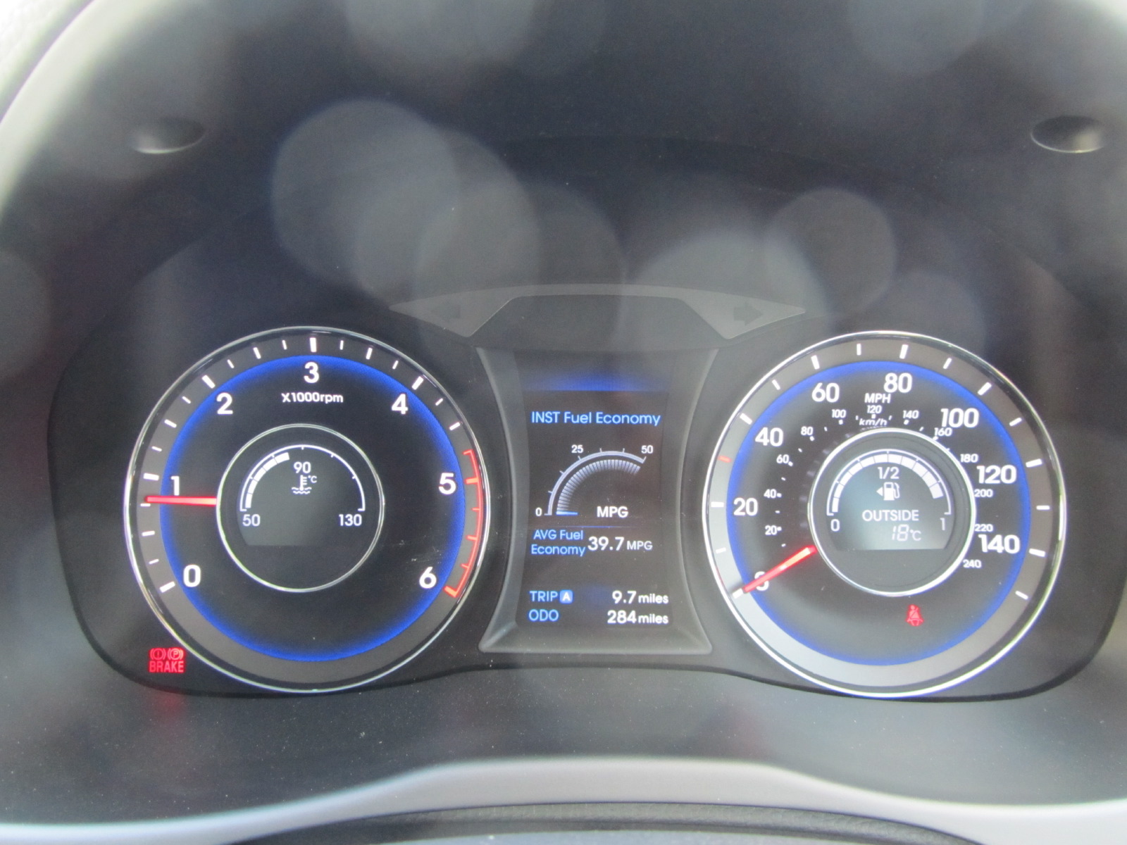
Displays and interface design are becoming a real strength of Hyundai/Kia, using new technologies while retaining an underlying simplicity of haptic control. The instrument pack of the i40 comprises two conventional dials, edge lit in electric blue with pale gray illumination for figures, while the auxiliary meters sit in the center of each dial on a raised plinth. As a mixture of analogue and digital displays it is wonderfully compact yet still very easy to read. We also liked the entertaining graphics used for the touch screen, which uses colored arrows, graphics of the cabin and an excellent color balance in the displays across the different readouts.
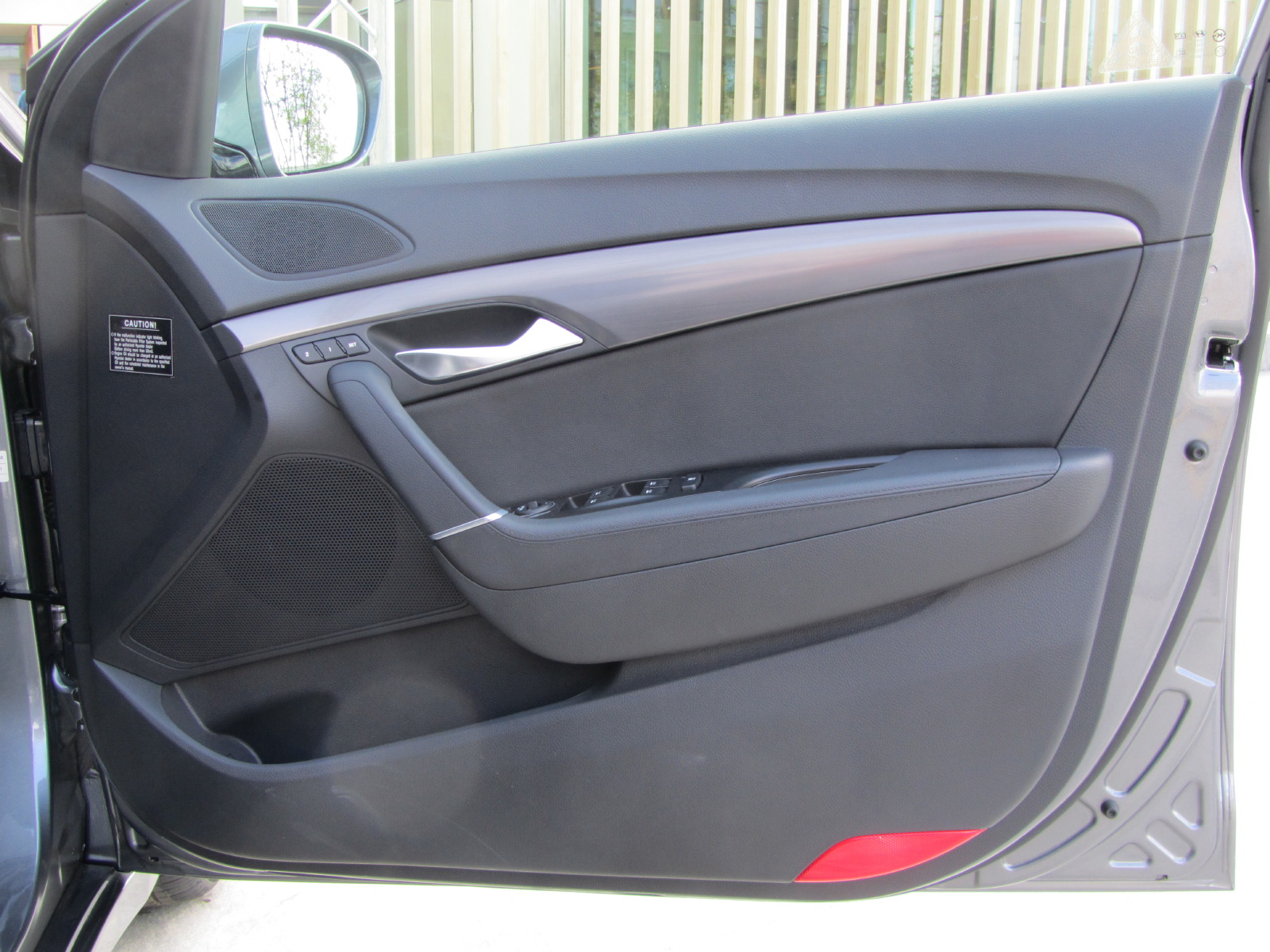
Where the i40 really shows progress is the attention to perceived quality by the design team, particularly gloss levels and grains of plastics. The result is far superior to the Toyota Avensis and the i40 is not far off matching Volkswagen’s quality levels. Highlights include the door grab handles and the window switch surrounds where soft feel paint has used in key tactile areas.
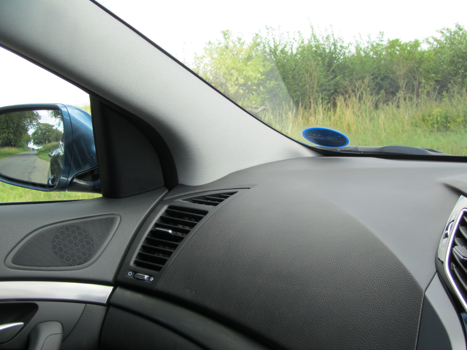
What did we dislike? The far-forward screen and thick A-pillars are enough to block out a large van when pulling out of junctions and there are irritating reflections at the base of the screen from demist vents and the temperature sensor. On the plus side, the remaining car sensors are hidden at the top rather than obscuring the center of the screen as on some other new cars, notably the Ford Focus and Citroen DS4.
Overall, the i40 is a serious new contender in Europe’s D-segment, something that could never be said of the outgoing Sonata. Hyundai’s USP continues to shift from simply Value for Money to Space for Money, sophisticated design and near-premium specification levels, all packaged with a five-year warranty. It may not threaten Ford or VW just yet, but Toyota and Honda should be worried.
Related Articles:
New Car: Hyundai i40
Hyundai at CES 2011

